| Author |
 Replies: 19 / Views: 2,485 Replies: 19 / Views: 2,485 |
|
Valued Member
135 Posts |
|
|
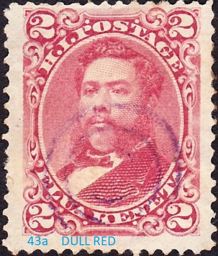
Identify different shades of similar variety stamps is a real weak spot for me. My wife always says that I am partially color blind! LOL. On Friday, I purchased a collection of stamps for $100 from a lady who said that her father had collected stamps. I saw a Hawaii stamp in the collection and she indicated that her father had lived in Hawaii for a bit. Alas, no hyper valuable Hawaii stamps, but there was the cool group of 2 cent "King David KalaKaua". I am hard pressed to identify if any of these are the more valuable #38 or $43a. The #43 is not a particularly valuable item. The #38 and #43a have catalogue values of roughly $20 to $50 in used format. I suspect that most of my stamps here are the less valuable #43, but a few stamps look of a decidedly different shade of color. The #38 = Lily Rose color The #43 = Deep Rose color. The #43a = Dull Red color. Can anyone help with these. One of the great things about having so many of these stamps is that one can line them up and do a color comparison more easily that otherwise possible. Can anyone help? If you have any comments about the stamps, please identify the row and column in which the stamp appears. 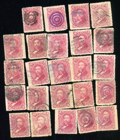 |
|
Send note to Staff
|
|
|
|
|
Valued Member
135 Posts |
|
|
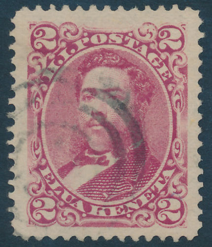
looks to me like the dull red #43a appears more as brown in my pic (eg upper right hand corner stamp). Which ones are lily rose versus deep rose? I think I have some of each type of stamp. I am just not sure which is which. any thoughts. |
Send note to Staff 
|
|
|
Pillar Of The Community
United States
729 Posts |
|
|
Pillar Of The Community
France, Metropolitan
3745 Posts |
|
|
Valued Member
135 Posts |
|
|
Danko,
When I first saw the stamps I automatically assumed that they would all be the least valuable #43's. However when I laid them out to compare, I was struck by the color difference in some of the stamps. In the first row, the third and fourth stamps are without question different shared. It looks obvious to me. Same for the second row, the second and third stamps. In the second row, the first and third stamps look decidedly different in color to me. I know that stamp colors are a tricky thing, but this seems impossible to figure out - even with all the stamps side by side. |
|
Send note to Staff
|
|
|
Valued Member
135 Posts |
|
|
perf12,
thanks for the pictures. The dull red #43a does not look "dull" at all to me. I am not sure what "dull" means in terms of color, but I think that both the stamps you posted look like they are some form of "rose" (deep or lily). If you look at the stamp in my picture in the upper right hand corner, that look "dull" to me. As does the stamp in the second row second column, as do the second and third stamps in the fourth row. I will reorganize hte stamps by my color perception and repost the pic.
Anyone have any comments about the cancellations too? There are a couple of really cool cancellations on these stamps. |
|
Send note to Staff
|
|
|
Pillar Of The Community
United States
3162 Posts |
|
|
Quote:
Anyone have any comments about the cancellations too? There are a couple of really cool cancellations on these stamps SewallH, have you visited the Post Office in Paradise? It has a section on cancels. http://www.hawaiianstamps.com/ |
|
Send note to Staff
|
|
|
Valued Member
135 Posts |
|
|
littleriver,
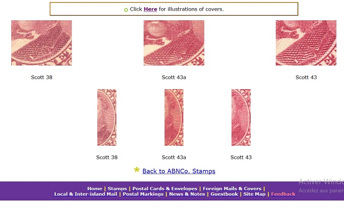
thanks for the link to this Post office in Paradise website. What a great resource. All the cancellations are pretty much identified precisely with some indication as to how rare they are. A number of my stamps have the classic showprint cancellation. The ones that are most interesting are int he top row. In the first row: second stamp has a purple cancel. Very cool color. The third stamp has a circular cancel with a star in the center (this is not identified at the Post Office in Paradise website - I will have to look at my historic cancellations book), and the fourth stamp there is the slanted line grid pattern cancel (this is identified on the Paradise website).
Do you think that the cancels are worth anything? I can not imagine that the shoeprint cancels are worth anything as they are so common. |
|
Send note to Staff
|
|
|
Pillar Of The Community
United States
729 Posts |
|
|
They can be different shades of the same color. Paper toning, gum toning, fading, ink volume, all can make a color look a little different. And off course scanner, and monitor will make it look really different. Comparing your stamps to scans by perf12 they all look like dull red, but since this is more pricey stamp, I doubt they are. I said that is just my opinion (which does not mean much), at a first glance. |
|
Send note to Staff
|
|
|
Valued Member
135 Posts |
|
|
danko,
Thanks for you valuable and thoughtful comments. There is simply no way all of my stamps are the dull red #43a. The chances of that are slim and none as you well point out. But one could also argue that there are some stamps there which are not the common #43, based on all the different shades.
You bring up a great issue about assessing stamp colors. What is a collector to do when stamp color is affected by paper toning, gum toning, fading, ink volume, etc.? And let alone scanner and monitor color shifts. Those factors not only affect my stamps as shown, but any/all other stamps that I am trying to compare against from other sources. So in effect, I am comparing stamp images and colors of my stamps to other stamps that are similarly affected by the same factors. So in the end, the whole thing is a mess and accurate identification is nearly impossible for a set of stamps like this. If my stamps are all the #43, I believe that the stamps are color affected by various factors to the point where there are three clearly different shades.
The one advantage I have is that I have so many of these vignette stamps in my physical possession so that I can compare them all side by side, as opposed to having just one stamp and trying to match it to another on the internet. I have never had such a situation where I had so many of stamps of a type where the color differential between varieties was so narrow. Clearly, there were some astute philatelists that looked at a large number of these stamps with their naked eye and were able to distinguish the minor color differences, despite the problems with toning, fading etc. In the case of per12's two pictures, his #43 simple looks like a faded #43a. I guess I could run a color image histogram on each stamp to see what it turns up, but a faded stamp would probably register differently than a non-faded stamp under image analysis. Your comments are instructive in that it makes me think what color faded and toning affected #38 and #43a stamps look like. If my stamps are all #43's, there sure are at least three visible major color shifts from fade and toning. |
|
Send note to Staff
|
|
|
Pillar Of The Community
United States
729 Posts |
|
|
Been collecting for over 10 years, still struggle a lot with the shades, especially shades of red. From what I learned, there are other differences besides the color that one may look at. The whole story here is something like this, please someone correct me if I'm wrong, but this is the way I understand it. In year A, was a first print of the stamp X. Most likely the same plate was used, the same paper was used, and the same ink was used, but there could be different batches of the same ink, with slightly different color variation, but all considered the same shade. In year B or a different time of year A, there was another print of the stamp X. Here a slightly different paper could be used, a plate impression can be slightly different, and of course a different batch of ink was used. I worked in a printing company, color matching inks, and believe me, even with modern technology, you cannot get exactly the same color from batch to batch. This is only the part of the story. I'm sure someone more knowledgeable will add to this.
There are some color cards available for sale to do color matching, but from what I heard they are pretty useless. What most people do, is to create their own color references from the cheap stamps of a known color. And of course there is an experience. After several years of handling thousands of stamps, one will start recognize color variation on the spot. |
|
Send note to Staff
|
|
|
Pillar Of The Community
France, Metropolitan
3745 Posts |
|
|
Valued Member
135 Posts |
|
|
danko,
What an incredibly insightful post by you. So, in effect, every new batch of stamp ink that is manufactured by the ink company is somewhat different as long as it is a newly mixed batch of ink (even if it supposed to be the same with the previous batch's color). That said, as long as the mixture ingredients are somewhat the same, the color of each batch should be pretty close - but not always. All of that makes perfect sense. But I suppose that there are then preplanned changes in ink ingredient components that leads to somewhat noticeable, but subtle, changes in stamp color. It is really cool that I have so many of these Hawaii stamps because we all can then compare them. I would usually not buy so many of the "same" stamp if were buying them one at a time. I got them as a batch recently and this has lead me to our discussion. Based on the post from perf12 with his excellent reference to the Post Office in Paradise website, it looks like the #38 is slightly more brownish, and the #43a in a more vibrant, brighter red/rose. I am going to have to rescan these stamps at maximum resolution (+600 dots per inch) and then line them up again to sort them. I will report my findings. Thanks for all your help! |
|
Send note to Staff
|
|
|
Valued Member
135 Posts |
|
|
So I did a controlled color separation analysis of the first four stamps. All stamps were scanned at the same time and the analysis was done on one computer. I took color separation measurements at 11 identical spots on each stamp. I achieved excellent color measurement consistency on each individual stamp. Looks to me like I have two #43's and one each of #38 and #43a. The color differences between these three stamp types is too great to be attributed to fading, toning or other. I am going to do the other 20 stamps in the next few days and will report on the outcome. Very cool that I have two of the more valuable varieties just in the first row of four (out of 24 total) stamps. Plus it is nice to have some manner by which to properly identify these. Comments?  |
|
Send note to Staff
|
|
|
Pillar Of The Community
France, Metropolitan
3745 Posts |
|
|
I think one should look at the printing with a magnifying glass.There seems to be small plate différences between them
.(More reliable than just assuming shade différences). 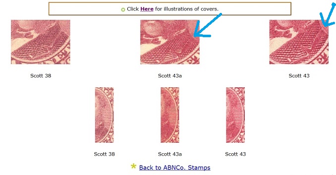 |
|
Send note to Staff
|
|
|
Valued Member
135 Posts |
|
|
Perf. Great point. I will look closely at several of the stamps that have different colors by my analysis and look for the plate differences you point out. I will then run stamp compare software to see if that turns up anything. Much thanks.
|
|
Send note to Staff
|
|
|
Replies: 19 / Views: 2,485 |
|