Thanks so much everyone for all the discussion on this. I hope we can keep it going strong.
Now, for this week's detailed post:
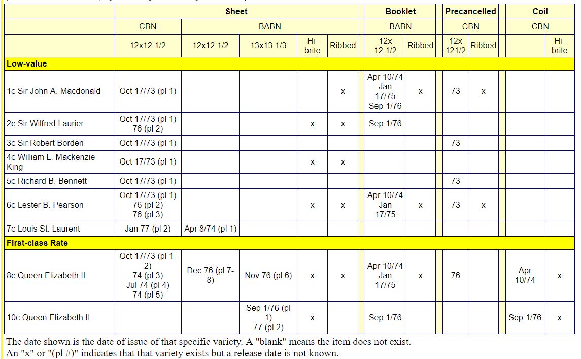
This week, I will examine an aspect of this issue that has received no attention whatsoever in the specialized catalogues, but which nonetheless is significant: variations on shades of colour. What makes the shade varieties on this issue significant is the fact that, over very, very large numbers of stamps, there is a very high degree of uniformity in the colours used to print the stamps. If you spend enough time sorting the stamps of this issue, you will notice that most all values exhibit some distinct variations in colour, but the number of these varieties is quite limited, which, to me, makes them all the more significant.
What I will do for the remainder of this post is show you a large number of the shade varieties that can be found on the stamps of this issue. I suspect that what I am going to show you here probably represents 75-80% of what can be found. I would imagine that patient exploration will turn up a few more varieties. In describing the shades, I will make reference to the colour names given in the Stanley Gibbons Stamp Colour Key.
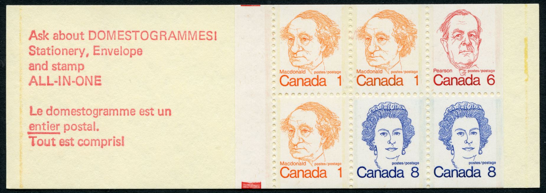
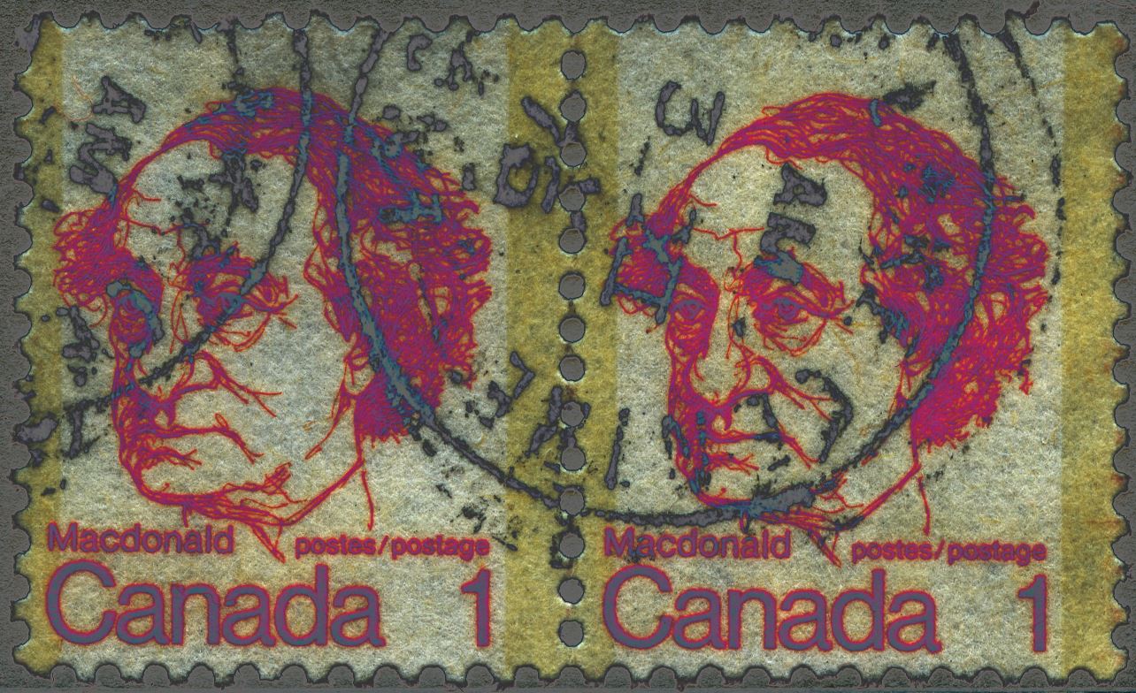
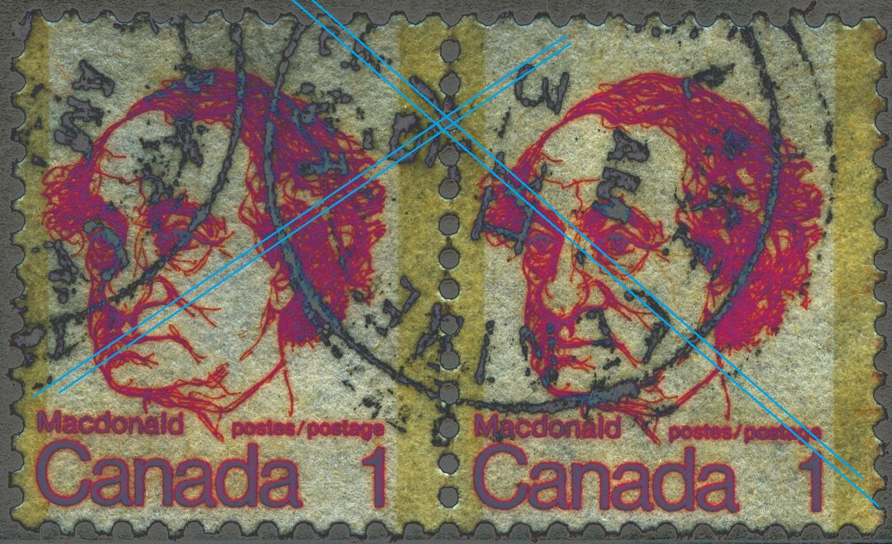
The 1c John A Macdonald Stamp
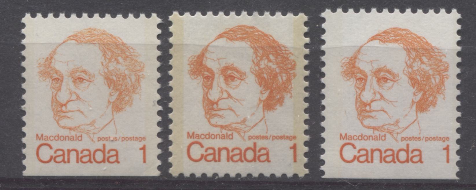
The basic listed colour of this stamp is orange. However, this is a bit too simplistic, as the above scan shows. The most common colour is shown on the right and is a bright orange. The middle stamp is a noticeably deeper shade of bright orange, while the stamp on the left is a dull shade of orange. The stamps on the left and right come from the booklets that were printed by BABN and are representative of all the shades I have seen on these stamps.
The sheet stamps printed by CBN seem to exhibit two shades. The first is the deep bright orange shown above, and the second is a regular, pure orange shade, that lacks the brightness of the other. Both are shown in the scan below:
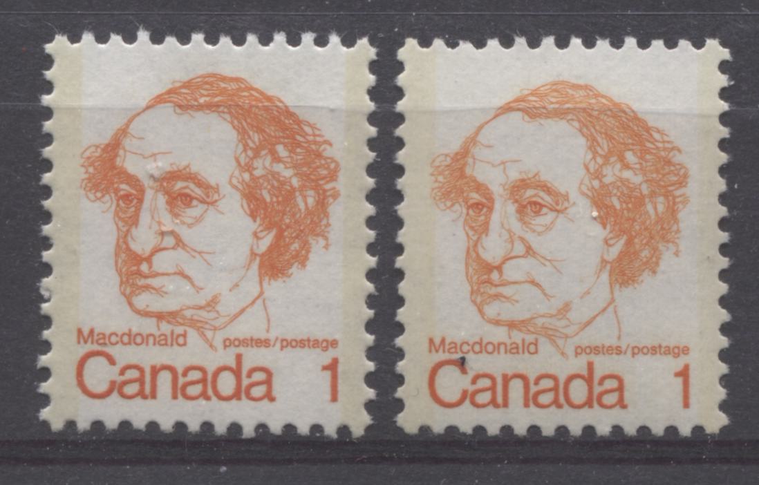
The deep bright orange is shown on the left, while the regular orange shade is shown on the right. The difference is subtle, but once you see it, it is quite distinct.
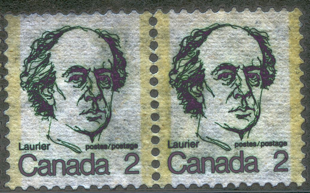
The 2c Wilfred Laurier Stamp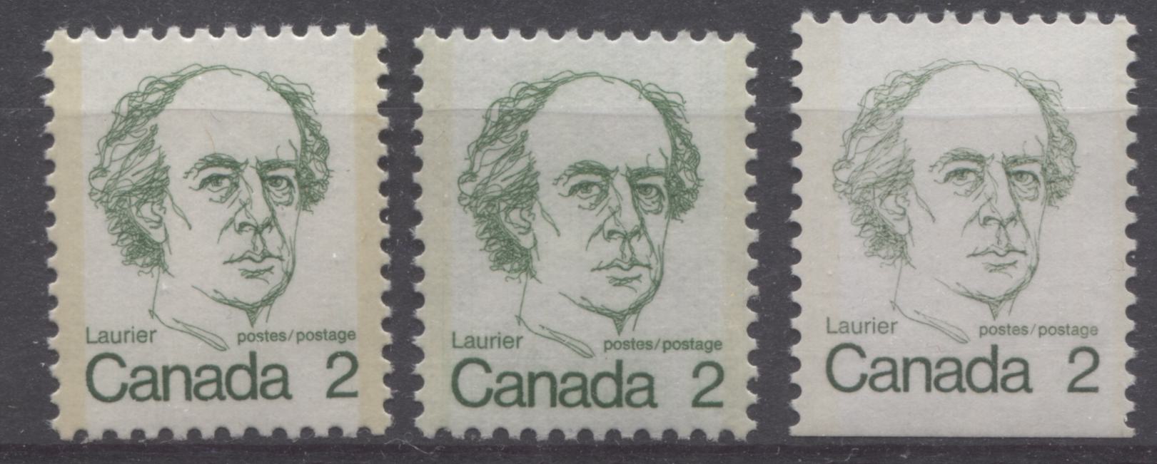
On this value, I have found three shades of green. Two occur only on the sheet stamps, printed by CBN, while the third is only found on the booklet stamps printed by BABN. The common shade, shown on the left stamp is closest to Gibbons' Myrtle green. The shade of the centre stamp is not as dark, and is a very close match to Gibbons' deep green. The booklet stamp on the right is a fairly close match to Gibbons' deep dull green.
The 3c Robert Borden Stamp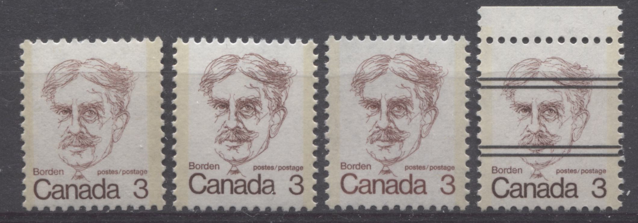
This stamp shows a surprising amount of shade variation. I tend to think of the colour as a maroon, that varies in terms of whether the dominant colour in the mix is purple, or whether it is brown, and whether the colour is warm in appearance or cold.
The stamp on the right is a very cold shade of maroon in which the dominant colour is brown. I have only seen this shade on the precancelled stamps, but I suspect it must exist on non-precancelled stamps as well. The most common shade seems to be the one on the second stamp from the left. This is a pure maroon shade in which no particular colour dominates.
The remaining two stamps are noticeably lighter shades, with the second stamp from the right being a warmer shade than the stamp on the left, which is more brownish, being best described as pale dull maroon, while the second stamp from the right is a pure pale maroon.
The 4c Mackenzie King StampThis is one of two stamps in the set for which I have not come across any significant shade variations. The colour is a charcoal black.
The 5c Richard Bennett StampOn this stamp, which is listed as rose-lilac, I have found two shades, both of which are shown below:
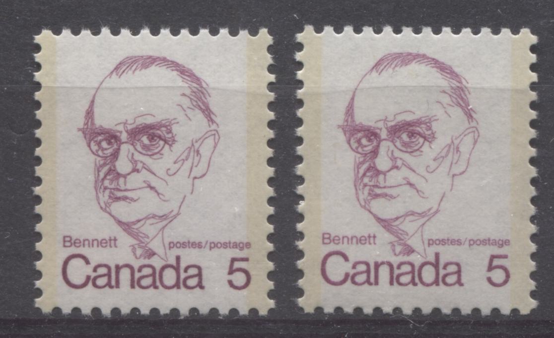
My observations in sorting this stamp lead me to think that both these shades are equally common, and can be found on any printing. The stamp on the left is clearly a deeper shade than the one on the right, and is a very close match to Gibbons' purple shade. The stamp on the right is closest to Gibbons' deep mauve, but is touch lighter.
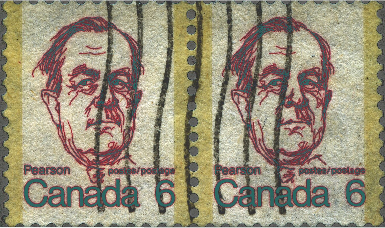
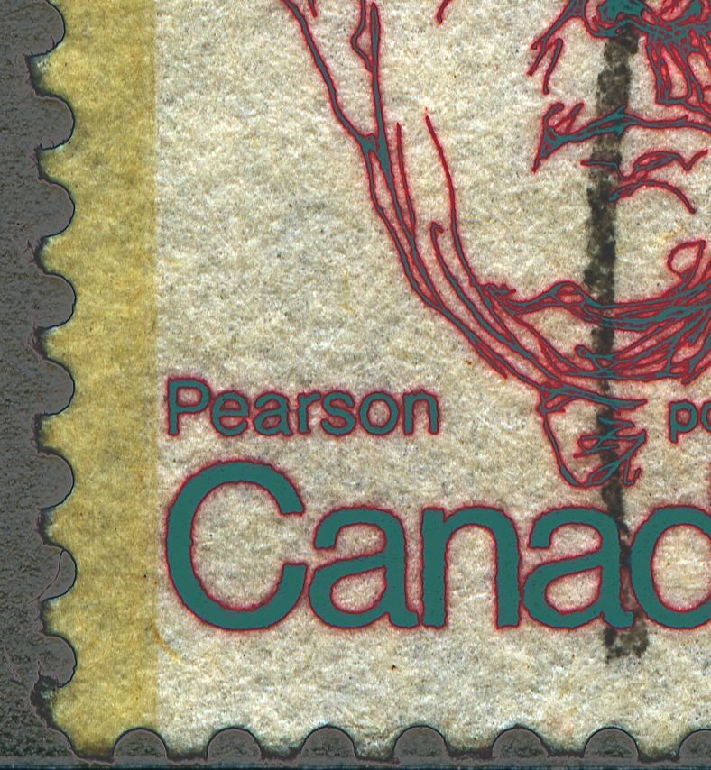
The 6c Lester Pearson Stamp
On this stamp the shades of the BABN booklet stamps and the CBN sheet stamps are different. The colour is listed in Unitrade as red, but it is really closer to carmine-red or scarlet. The sheet stamps are found in three shades, as shown above. On the left, is the deepest shade, which is a very close match to Gibbons' deep rose red. The other two stamps are a distinctly brighter shade, and are shades of scarlet. The middle stamp is a perfect match to Gibbons's scarlet shade, while the stamp on the right is just a touch darker.
The booklet stamps are very similar in terms of intensity to the scarlet stamp in the centre, but if you compare them, they always contain a bit more carmine and less orange in the mix, and so they are shades of carmine-red. I have found some very slight variations, as shown below:
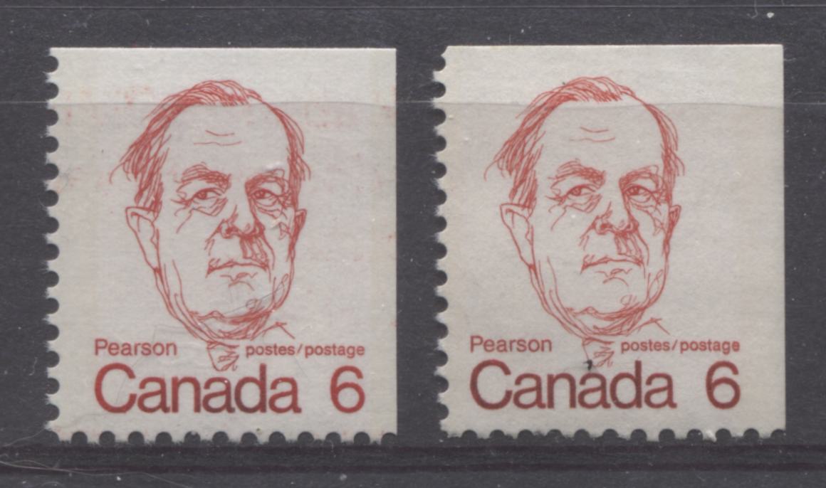
The right stamp is ever so slightly lighter than the left one. The lettering of Canada looks darker on the right stamp, though this is likely the result of ink contamination from the 8c Queen stamps, which occurred commonly on the booklets of this issue.
The 7c St. Laurent StampI have only come across two shades on this stamp, both of which seem to be associated with either the CBN or BABN printing, but not both. Both shades are shown below:
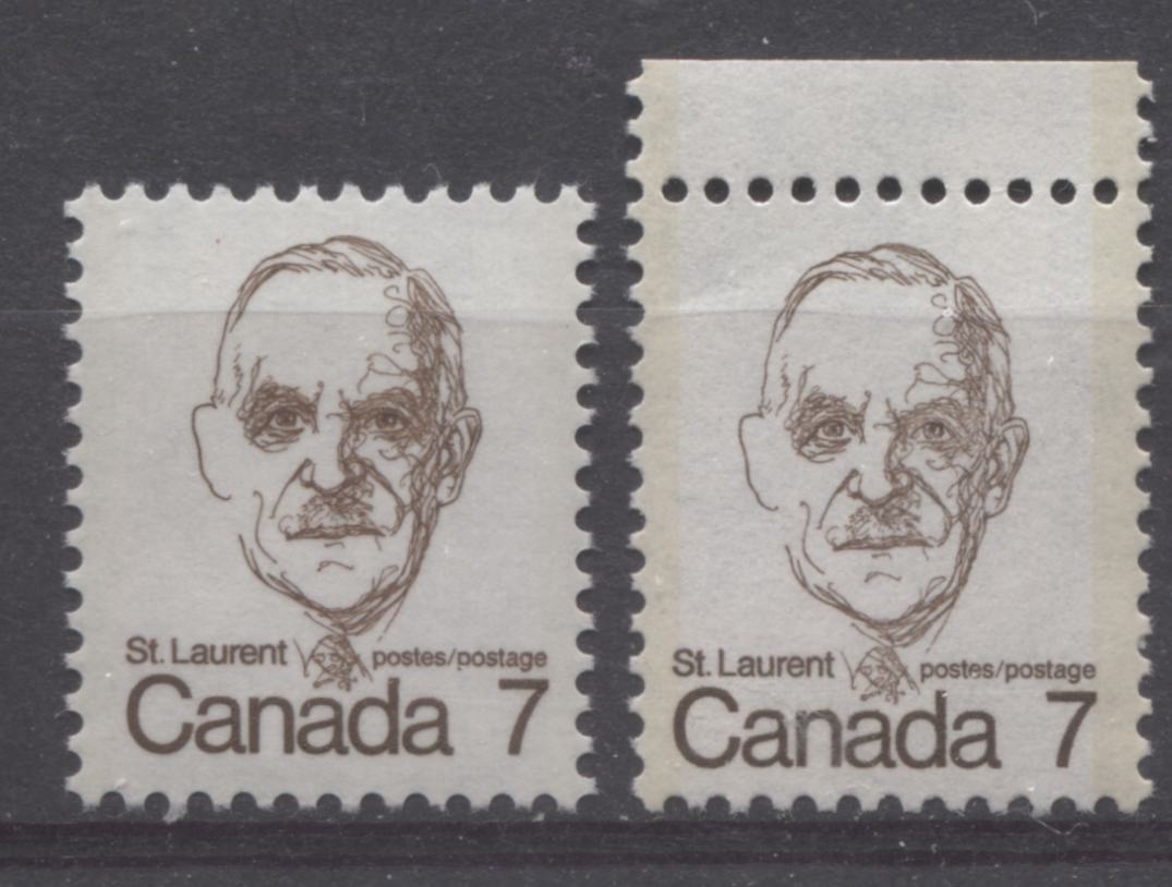
The stamp on the left is the original BABN printing, and is a blackish brown. The stamp on the right is the later CBN printing and is a noticeably duller shade. It is actually a very close match to Gibbons' sepia.
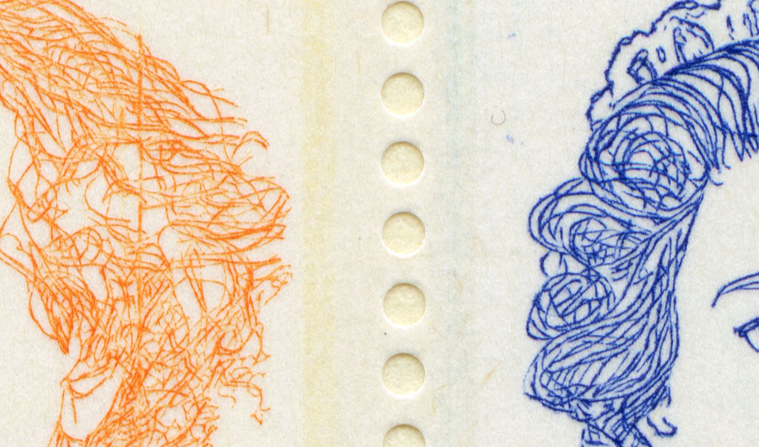
The 8c Queen Elizabeth II Stamp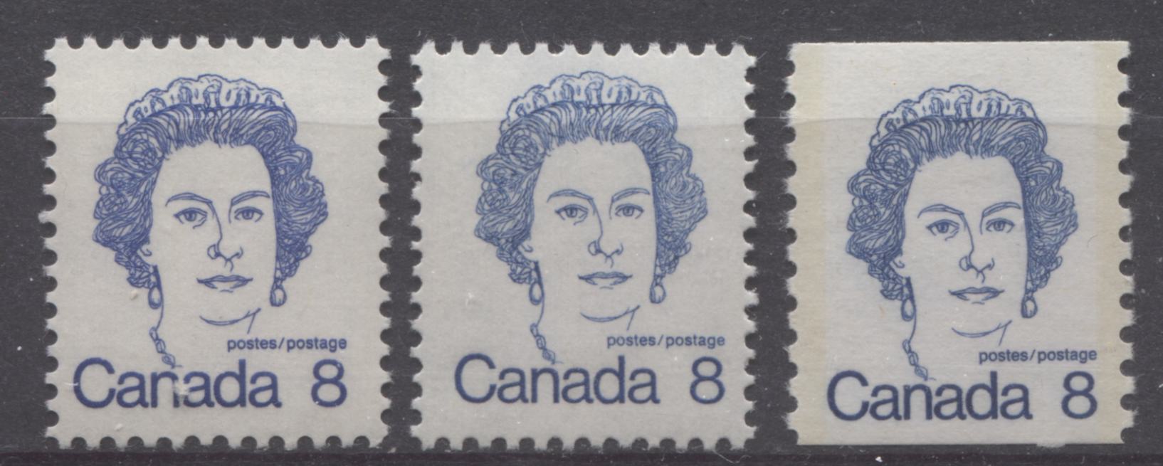
This stamp is listed in Unitrade as being either ultramarine or milky blue. Both shades, like the 7c St. Laurent stamp, are confined to specific printings, with the ultramarine typically being associated with the BABN printings, and the other shades being associated with the CBN printings.
The stamp on the left is a typical BABN sheet stamp from plates 1-5. The colour is very uniform on this stamp, and I have yet to see any significant variation. It is a perfect match to Gibbons' deep ultramarine. At first glance, the coil stamp on the right looks similar, but a closer look at the hair reveals that it is duller than the left stamp, and is not a shade of ultramarine. The middle stamp is a typical CBN sheet stamp in the listed "milky blue" shade. However, it is really closest to Gibbons' blue shade on the colour key. The coil stamp on the right is really just a slightly deeper and brighter version of the blue shade that appears on the centre stamp.
The 10c Queen Elizabeth II StampLike the previous 8c stamp, I have found two shades, which are both confined to their respective BABN and CBN printings. The shade is described in Unitrade as carmine, and both shades are shown below:
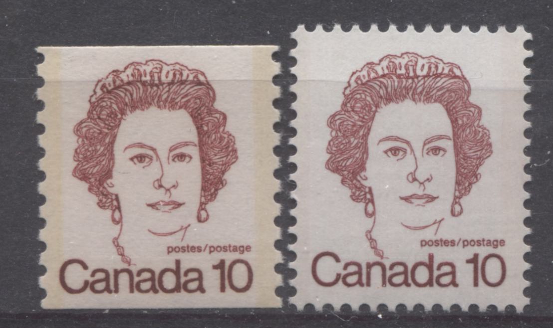
Both shades are similar, but the shade on the left stamp, which is a coil, printed by CBN is warmer than the shade of the BABN sheet stamp, shown on the right. I have not found any difference between the BABN booklet stamps and the coil stamps. The CBN shade is a shade of carmine-red that contains a slight hint of brown, whereas the BABN shade is a pure carmine-red.
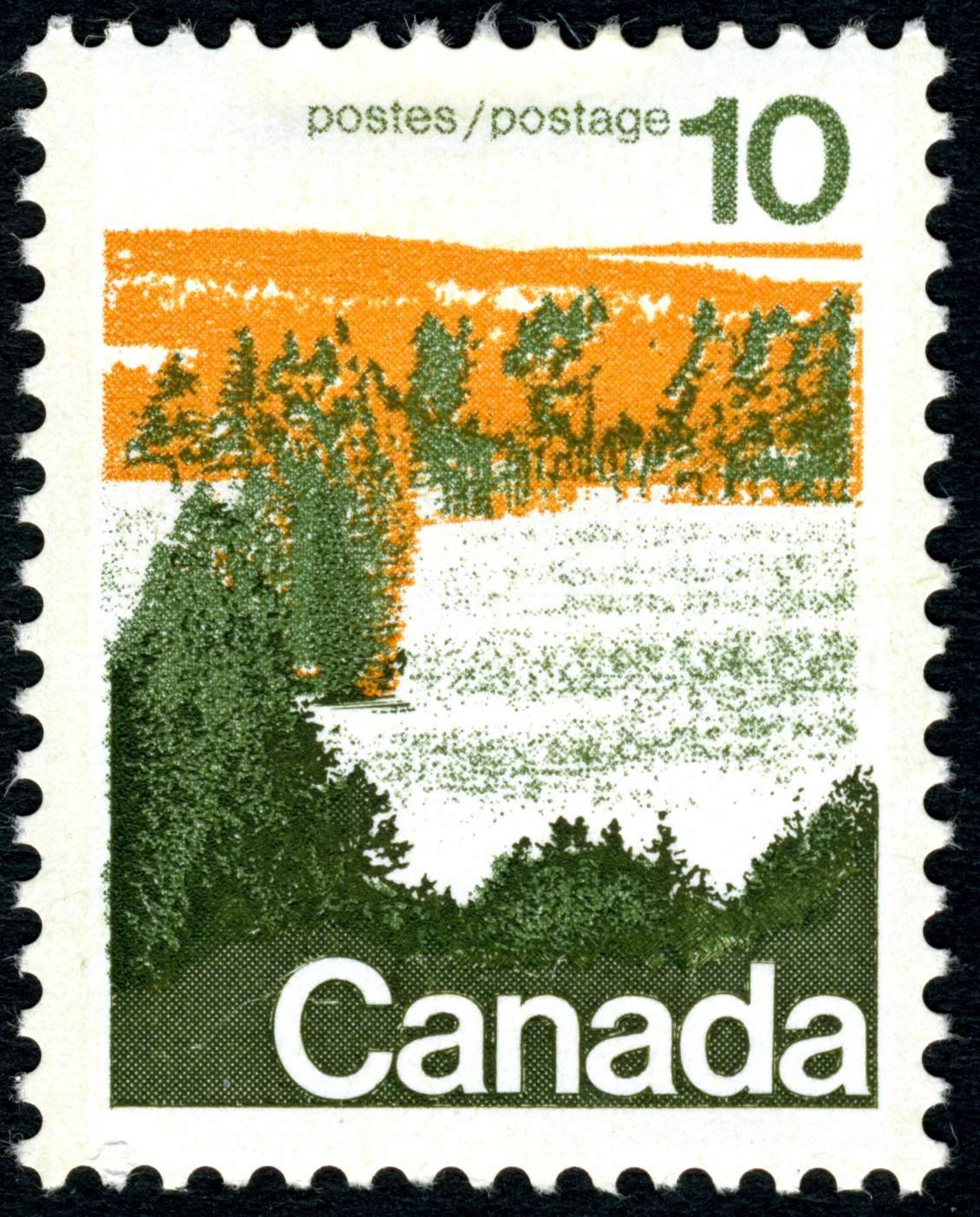
The 10c Forest StampOn this stamp, I have found very little variation in the green colour, but quite a bit for the orange. The largest range of shades seems to occur on the type 1 printings, while the type 2's are fairly uniform for both the perf. 12.5 x 12 and perf. 13.3, but are different for both.
The scan below shows three different shades found on the type 1 stamps:
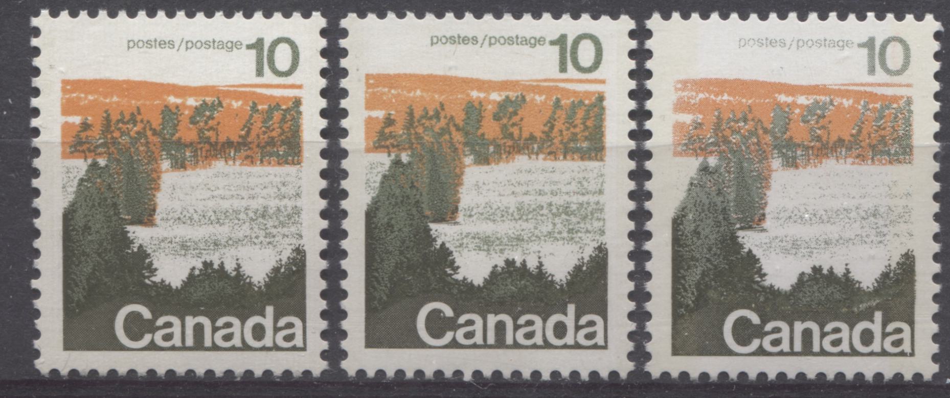
The left stamp and the middle stamp both show the same shade of green, but the orange is very slightly paler on the middle stamp, compared to the left stamp. The right stamp shows a slightly deeper and duller green and the orange is less yellowish than the first two stamps.
Here are some very distinct differences on the type 2's:
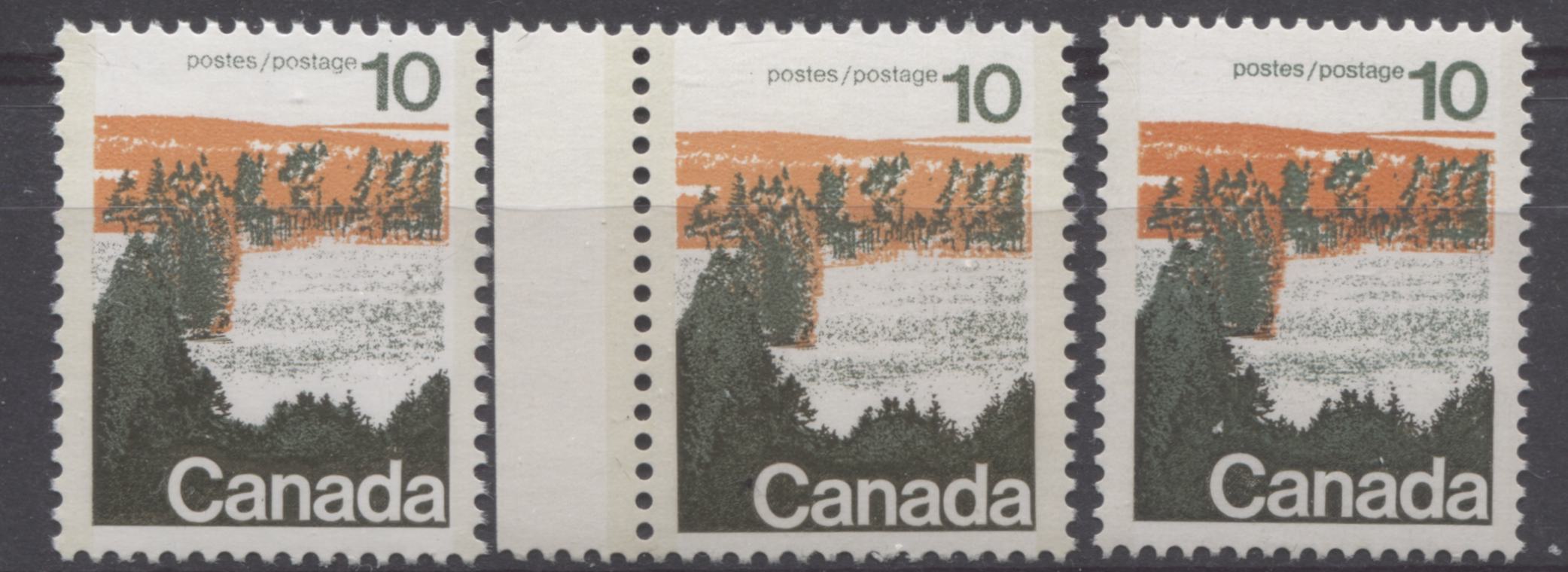
All of the type 2 stamps are printed using a green that is noticeably deeper than the ink that was used for the type 1 stamps. The orange ink is also less yellowish on the perf. 12.5 x 12 printings, while at the same time being paler than the orange on the type 1's. The orange on the perf. 13.3 type 2 printings is much deeper and brighter than on any of the previous printings, and it is only found on the perf. 13.3 type 2 stamps. The orange of the middle perf. 12.5 x 12 type 2 stamp shown above is very slightly paler than the type 2 stamp shown at the left.
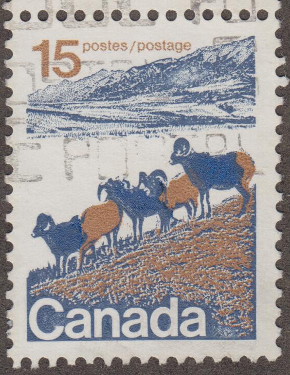
The 15c Mountain Sheep StampThe only real variation I have seen on these stamps has to do with the brown that is on the bodies of the sheep and the grass. The two blue shades used to print the design, being the dull blue that was used for most all of the mountains and the outlines of the sheep, and the bright blue that was used to fill in the spot on the mountain for the type 2's and the bodies of the sheep, does not seem to show much, if any variation at all.
The scan below shows the two different brown shades that I have found on these stamps:
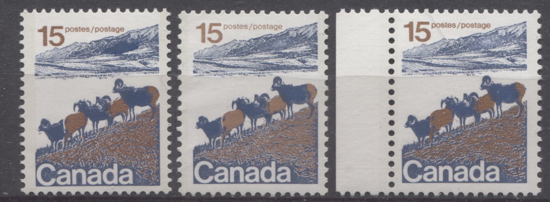
The first shade of brown, found on all the perf 13.3 type 2's ad some of the type 1's is closest to Gibbons' reddish brown, but is slightly paler. This shade is shown on the two outer stamps in the scan above. The second shade is duller and is shown on the middle stamp. This is a very close match to Gibbons' light brown.
The 20c Prairies Stamp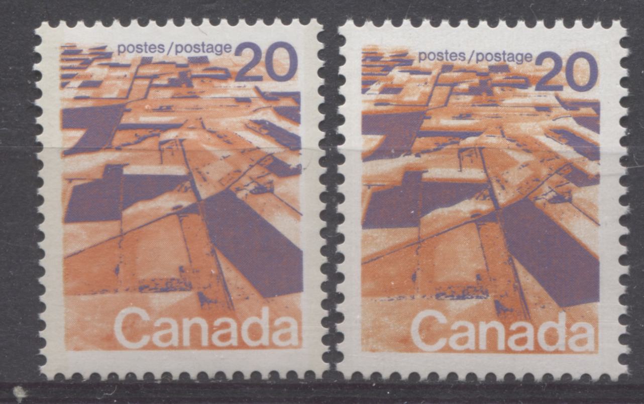
There is a high degree of uniformity regarding the colour on this stamp, with the only difference that I can see occurring with the orange colour. The lilac appears the exact same tone on all the printings I have looked at. The orange however on all the perf. 13.3 stamps that I have looked at is both duller and redder than on the earlier printings. It is more of a salmon colour than the earlier printings, which are more of a bright orange. The perf. 13.3 printing is shown on the left, while an earlier printing is shown on the right.
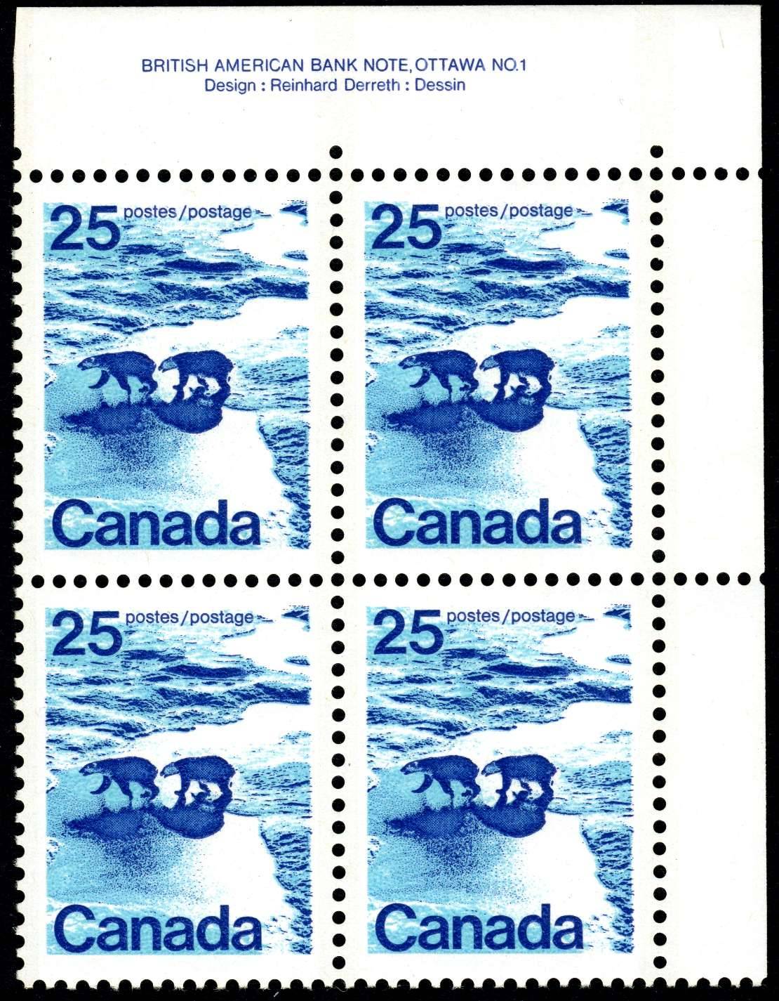
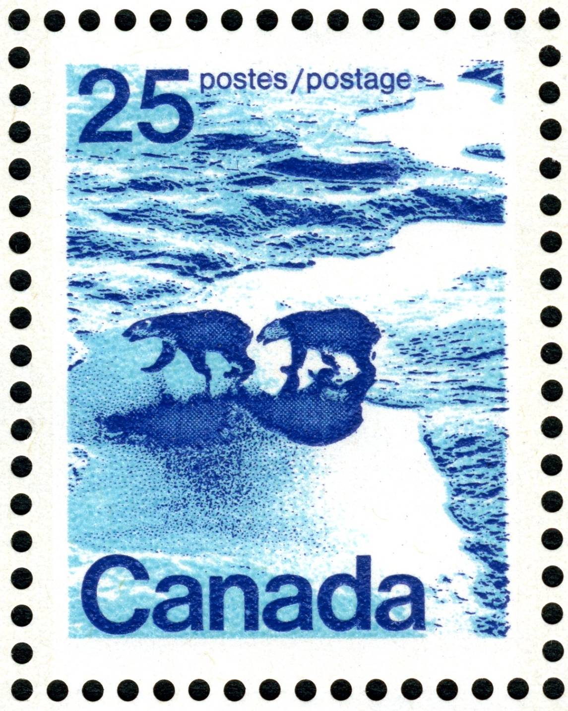
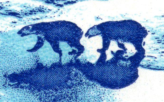
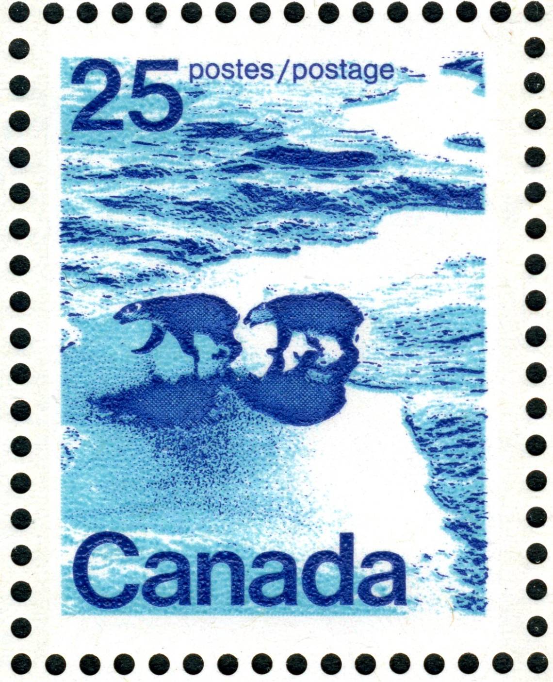
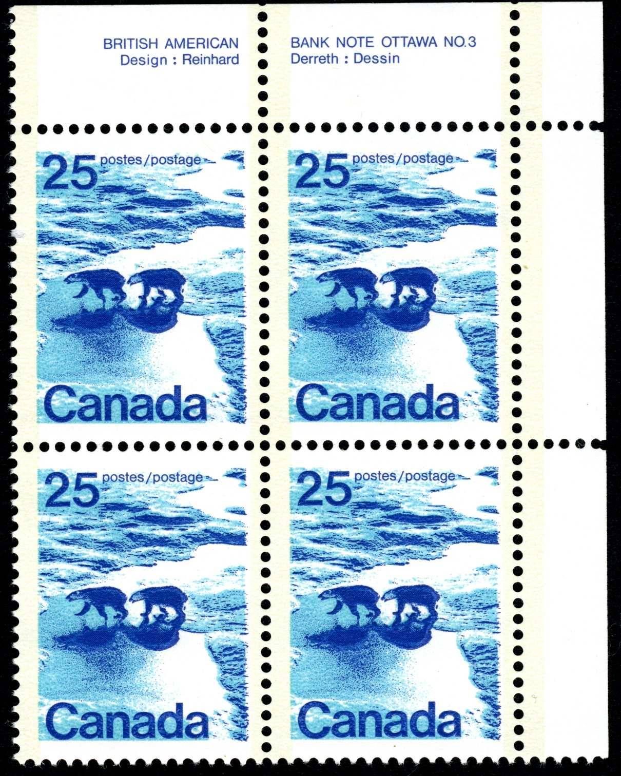
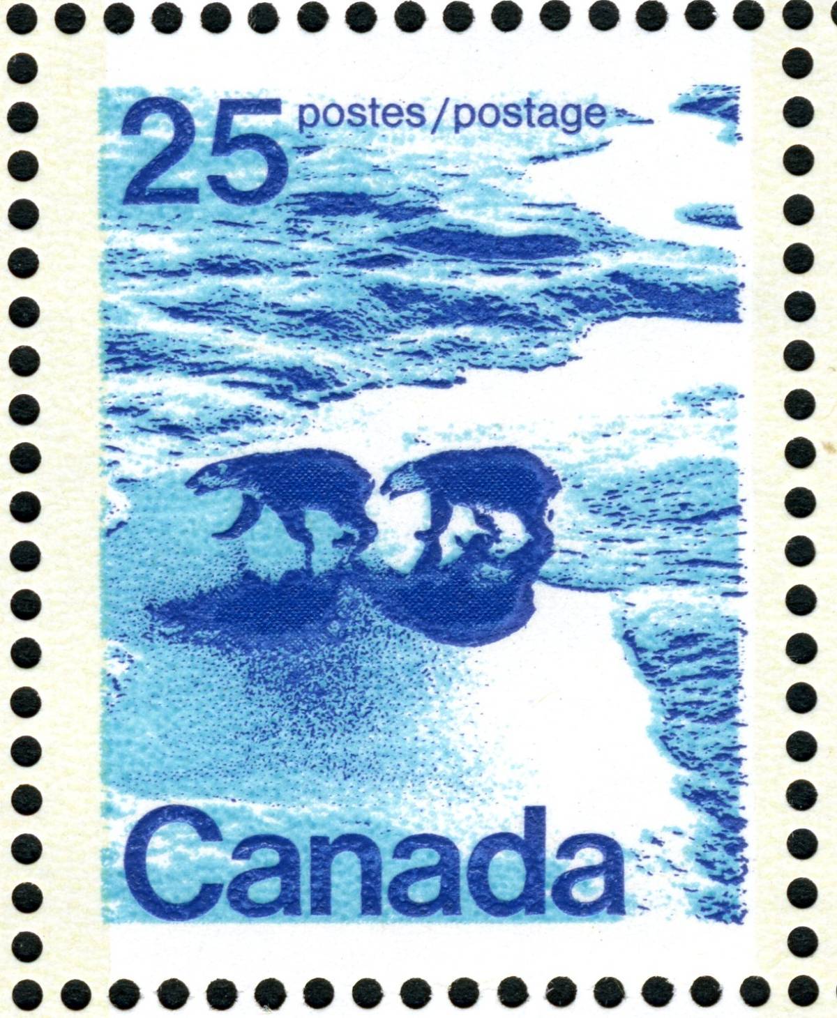
The 25c Polar Bears StampOn this stamp the colour that varies the most noticeably is the light blue, while the perf. 13.3 type 2 stamps are found to also be printed in a slightly duller shade of the dark blue than the type 1 and perf. 12.5 x 12 type 2 stamps.
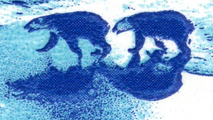
On the type 1 stamps, I have found two, very distinct shades of the light blue, as shown below:
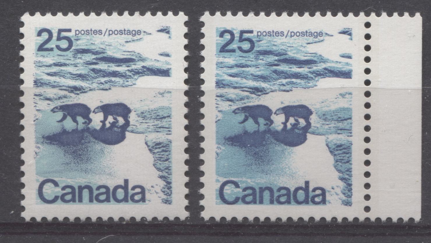
If you compare these two stamps, you should be able to see that the light blue on the left stamp is both paler and greener in tone than the light blue on the right stamp. It is similar in tone to Gibbons's turquoise blue, but it is much, much paler. The stamp on the right is closest to Gibbons' greenish blue, but is paler.
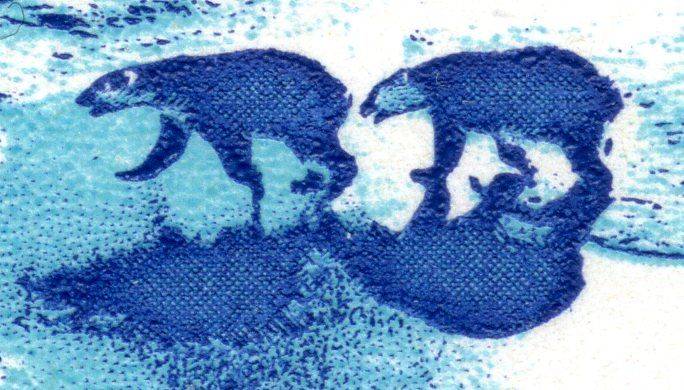
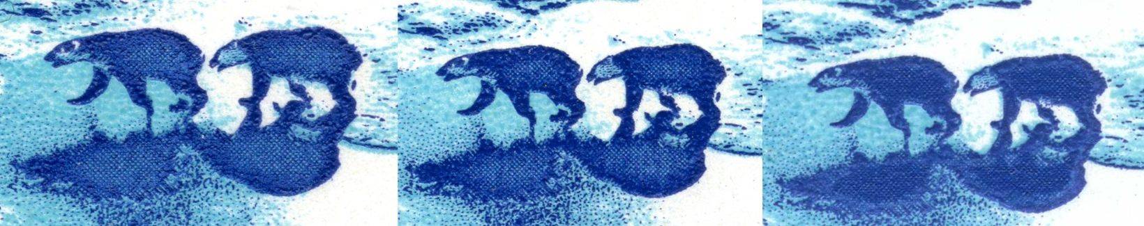
The type 2 stamps all seem to show light blue shades that are most similar to the greenish blue shown above, but with slight variations in brightness. Below is an example of the type 2 in each of the perforations, 12.5 x 12 and 13.3:
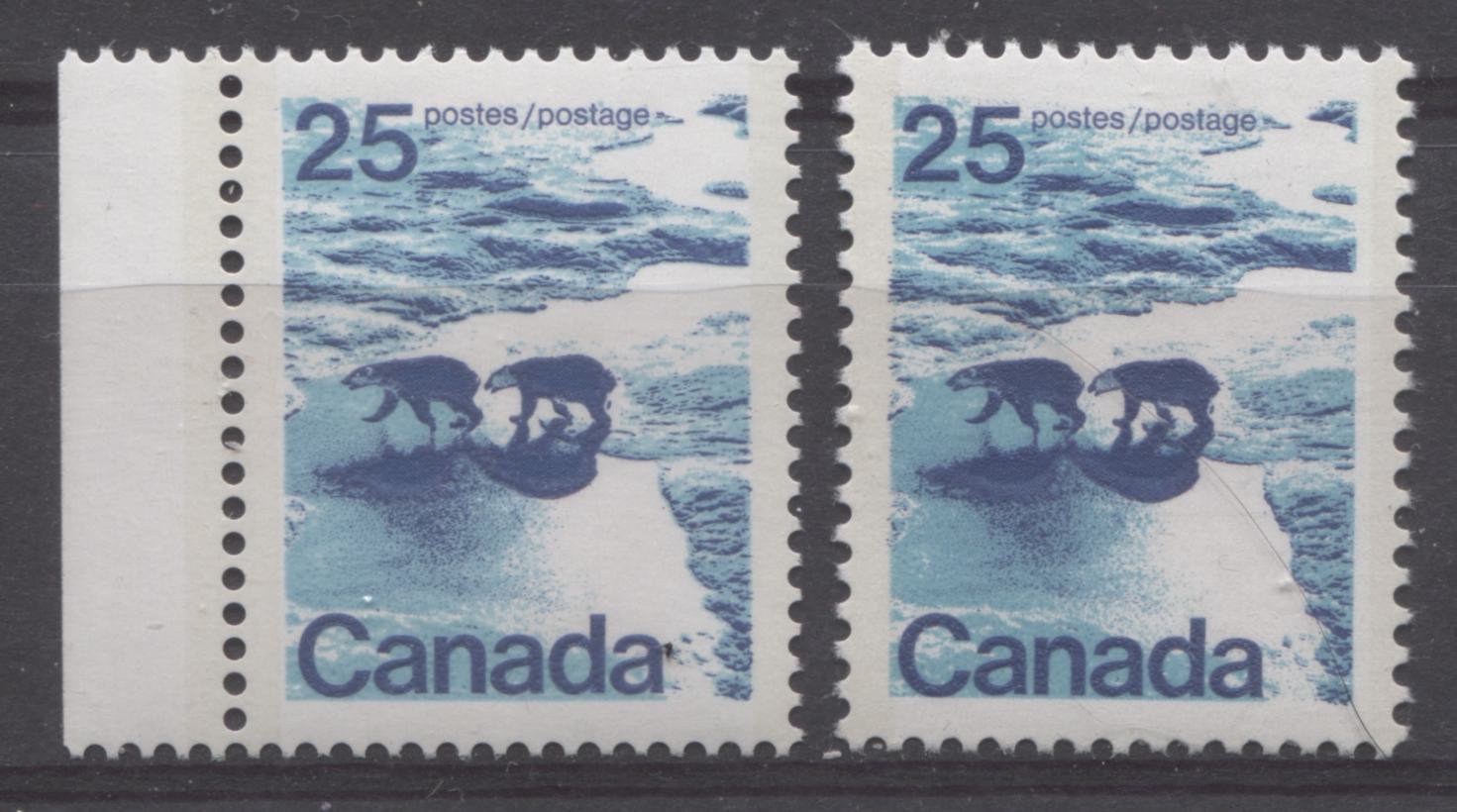
The later perf 13.3 printing is shown on the left, while the perf. 12.5 x 12 printing is shown on the right. If you carefully compare the dark blue ink on both stamps, you can see that while the intensity is approximately the same for both stamps, the ink on the perf. 13.3 stamps is slightly duller. Also the greenish blue ink on the later printings is not quite as vibrant as it is on the earlier printings.
The 50c Seashore StampOn this stamp I have found four distinct shade combinations. Two of these occur on the perf. 12.5 x 12 stamps and comprise the type 1 and type 2 printings, while the other two occur on the perf. 13.3 type 2 stamps.
First, here are the the basic type 1 and type 2, that are both perf. 12.5 x 12:
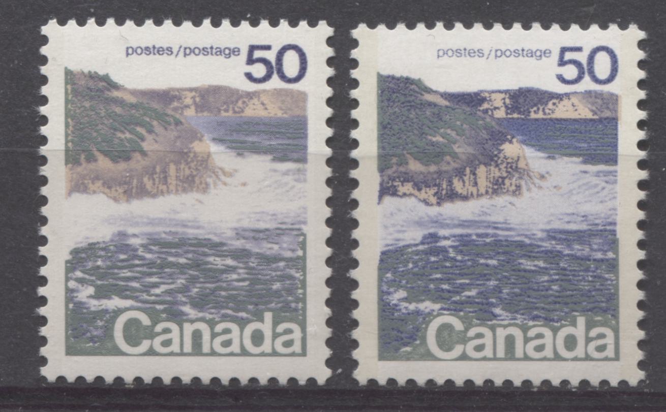
The grey-green engraving shows little to no variation on these stamps, but the blue and tan colour are different on both printings. The type 1 stamps the blue is a violet blue which is heavily printed on the value and inscription, but very lightly printed for the rest of the design. On the type 2 stamps the blue is a deep royal blue and is more evenly printed across the entire design, making it appear much darker than on the type 1. The cliffs on the type 1 stamps are closest to Gibbons' cinnamon shade, while on the type 2 stamps they are closest to Gibbons' buff shade.
On the perf. 13.3 stamps, the grey green appears the same as in the perf. 12.5 x 12 stamps, and the cliffs appear a slightly lighter shade of the buff. The main difference between the shades on these stamps lies in the blue, as shown on the two stamps shown below:
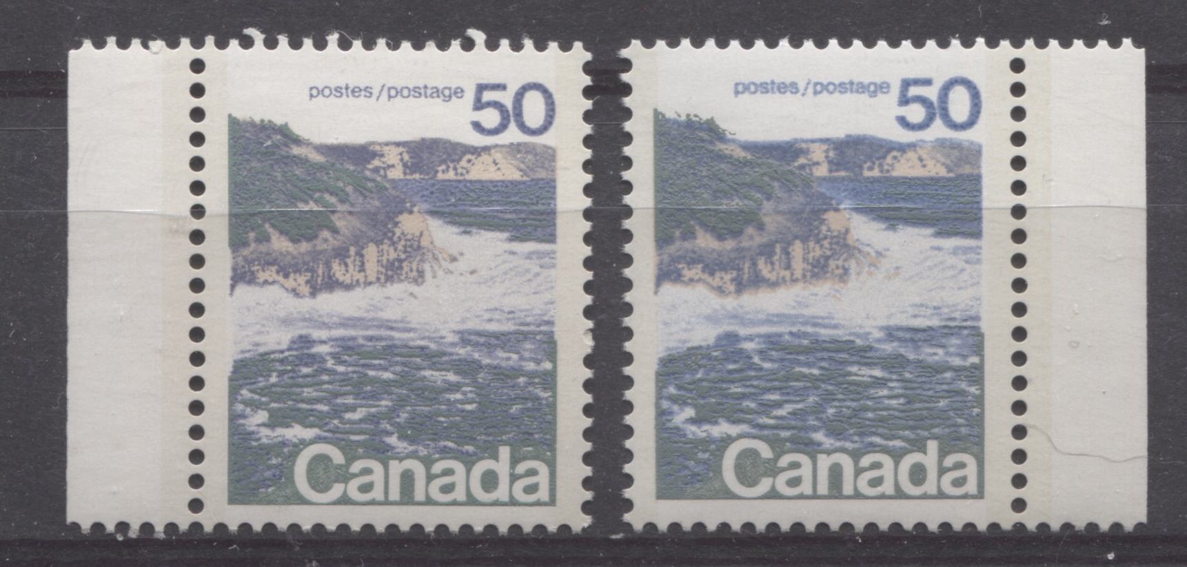
The blue ink of the left stamp is an almost perfect match to Gibbons' deep blue shade, while that of the right stamp is closest to Gibbons' blue shade, but a touch duller.
The $1 Vancouver StampI have not seen any significant variation in the shades found on the lithographed and engraved Ashton Potter/BABN printing of this stamp, nor have I seen much variation on the perf. 12.5 x 12 BABN printings, but I have found a lot of variation on the later perf. 13.3 printings.
On the perf. 12.5 BABN printings, the mountains always contain some of the lilac ink underneath the deep grey blue, so that they appear a dull violet blue. The green of the rocks in the foreground is always brighter than it is on the perf. 13.3 printings, being closest to deep yellow green on the Gibbons colour key. I have found two variations of the stamps from this printing, which differ according to the main colour of the rocks in the foreground. The two shades are shown below:
The stamp on the left has rocks which appear to be a more brownish colour, being closest to deep brown on the Gibbons colour key. The stamp on the right has deeper rocks which are more of a paler agate colour.
Most of the perf. 13.3 printings also contain lilac in the mountain, making them appear dull violet blue. However, there are some printings for which this lilac is very understated, making the mountain appear closer to deep grey-blue. The green of the rocks in the foreground is always duller on these printings, being closest to olive-green on the colour key. The rocks are always quite a lot darker than on the perf. 12.5 x 12 printings, being shades of blackish brown and agate.
The scan below shows four shade varieties on these printings:
The stamp on the left is the dull grey blue mountain, while the others are the dull violet blue mountains.
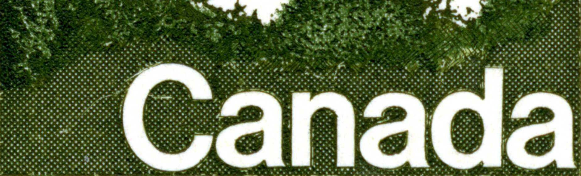
The $2 Quebec StampThis is the second stamp in the set, for which I have not found any significant variations in shade.
This completes my examination of the shade variations that can be found on this issue. Next week I will look at the perforations found on the stamps and some of the issues that occurred.