Stamp Community Family of Web Sites
Thousands of stamps, consistently graded, competitively priced and hundreds of in-depth blog posts to read


Stamp Community Forum
 
Username:
Password:
Save Password
Forgot your Password?

This page may contain links that result in small commissions to keep this free site up and running.

Welcome Guest! Registering and/or logging in will remove the anchor (bottom) ads. It's Free!

Canadian Stamp Production In The Post-1937 - Pre Self-Adhesive Period

Previous Page | Next Page    
 
To participate in the forum you must log in or register.
Author Previous TopicReplies: 64 / Views: 5,025Next Topic
Page: of 5
Rest in Peace
Netherlands
963 Posts
Posted 01/31/2019   09:52 am  Show Profile Bookmark this reply Add Galeoptix to your friends list  Get a Link to this Reply
Quoting Adminware as to the National Parks:

http://adminware.ca/checklist/chk_env_park.htm


Quote:
The British American Bank Note Company took over the printing of these National Parks from the Canadian Bank Note Company - three designs were affected. Fortunately for the stamp collector, the two different printings can be differentiated: the inscriptions are more pronounced on the BABN printings, compared with the CBN printings.


Is this explanation for the difference between BABN and CBN enough???? And what about the two plates for CBN?? Just the papers?


Send note to Staff  Go to Top of Page
Edited by Galeoptix - 01/31/2019 09:53 am
Rest in Peace
Netherlands
963 Posts
Posted 01/31/2019   09:55 am  Show Profile Bookmark this reply Add Galeoptix to your friends list  Get a Link to this Reply
CBN:


BABN:


How to tell them apart?!?!
Send note to Staff  Go to Top of Page
Rest in Peace
Netherlands
963 Posts
Posted 01/31/2019   10:00 am  Show Profile Bookmark this reply Add Galeoptix to your friends list  Get a Link to this Reply


BABN:


CBN:


Inscriptions more pronounced!!!!

Crude "hit the nail" recess by CBN!


Send note to Staff  Go to Top of Page
Rest in Peace
Netherlands
963 Posts
Posted 01/31/2019   11:15 am  Show Profile Bookmark this reply Add Galeoptix to your friends list  Get a Link to this Reply


As judged by the colour, the first from the left is BABN?!
Send note to Staff  Go to Top of Page
Edited by Galeoptix - 01/31/2019 11:16 am
Rest in Peace
Netherlands
963 Posts
Posted 01/31/2019   11:27 am  Show Profile Bookmark this reply Add Galeoptix to your friends list  Get a Link to this Reply


SO not only the colours,but also the thickness of the "-" in"A".... And of course the "hitting nails"!
Send note to Staff  Go to Top of Page
Pillar Of The Community
Canada
5821 Posts
Posted 01/31/2019   5:48 pm  Show Profile Bookmark this reply Add lithograving to your friends list  Get a Link to this Reply

Quote:
The BABN seems to have a decent engraver around, the CBN makes a mockery out of this recess!


The BABN did have a couple of very good engravers George Gundersen (1910-1975) and Charles Gordon Yorke (1917 – 1980)who were mainly banknote engravers.

The CBN of course had Yves Baril (*1932) who IMO was the best
Canadian stamp engraver.
Baril also worked on some banknotes over the years.


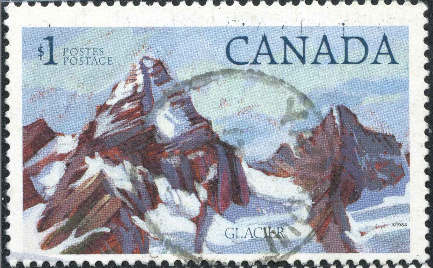
The engraved portions of those high values in the seventies and eighties was minimal and usually there is no engraver on record.
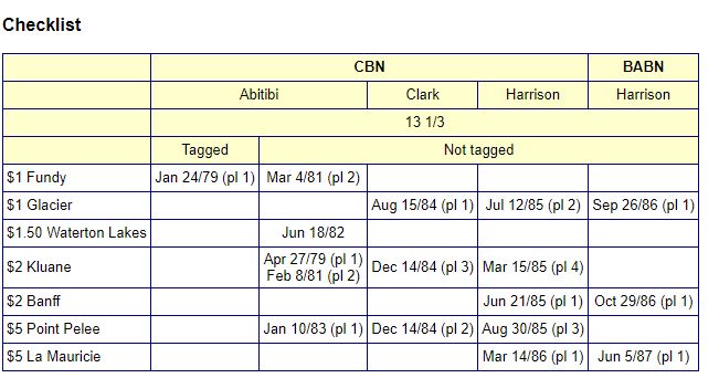
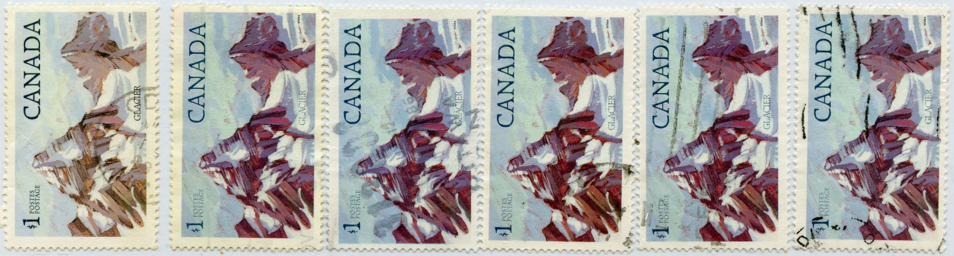
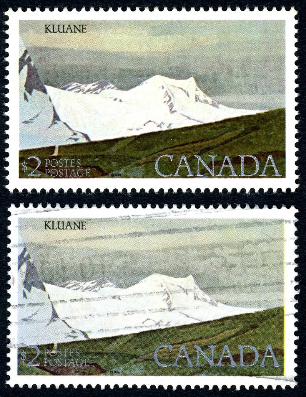
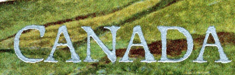
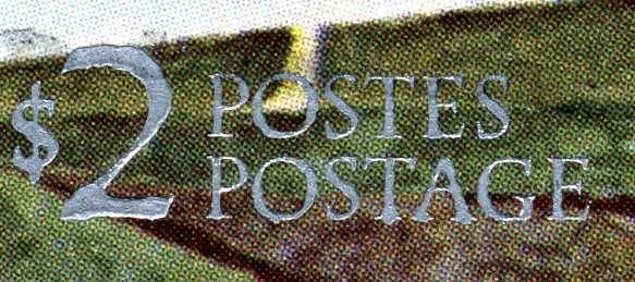
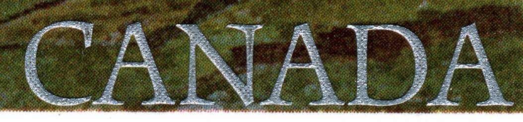
Except for the CBN 1979 $1 & $2 where Unitrade mentions Lettering engraved by Yves Baril
Not exactly a great effort but work is work.

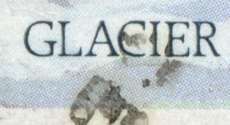
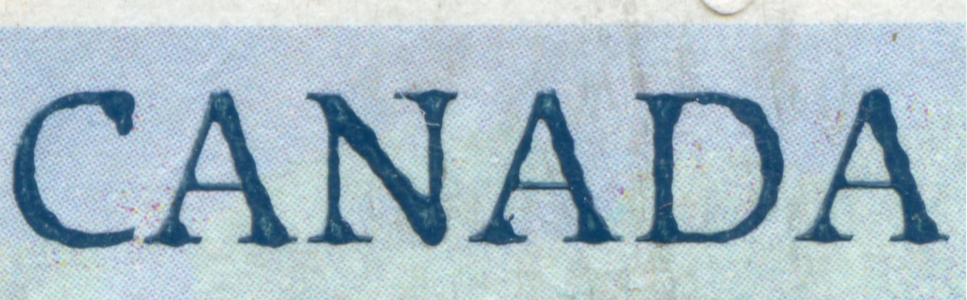
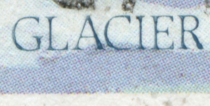
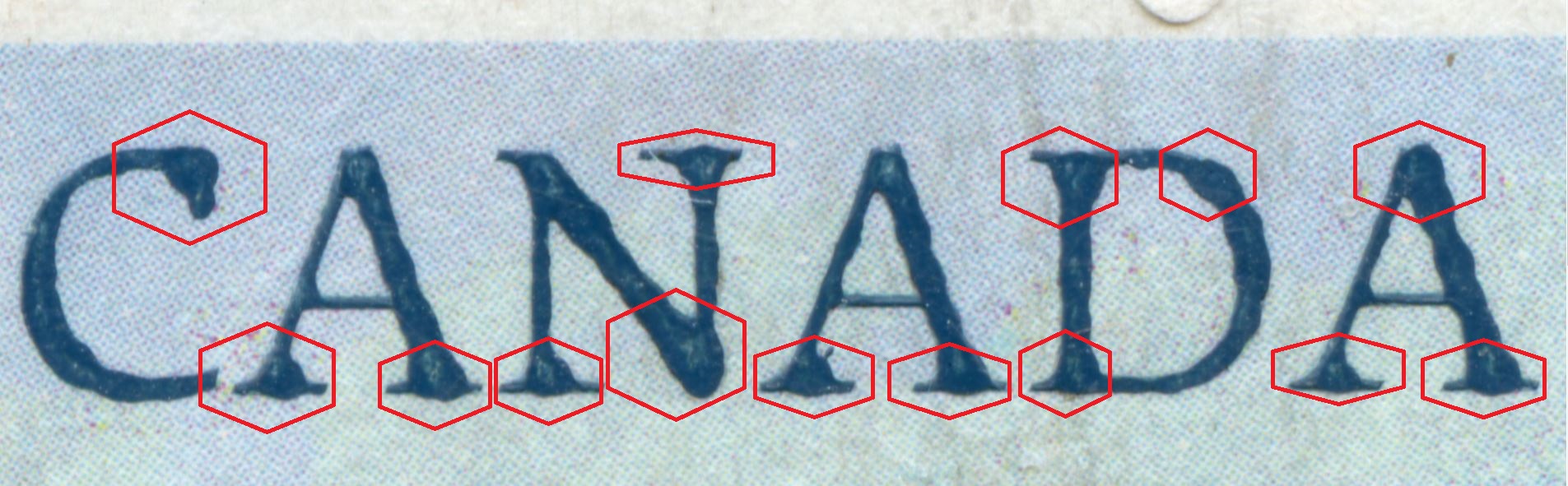
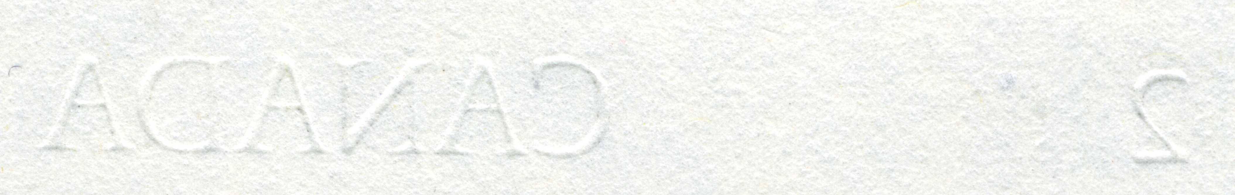
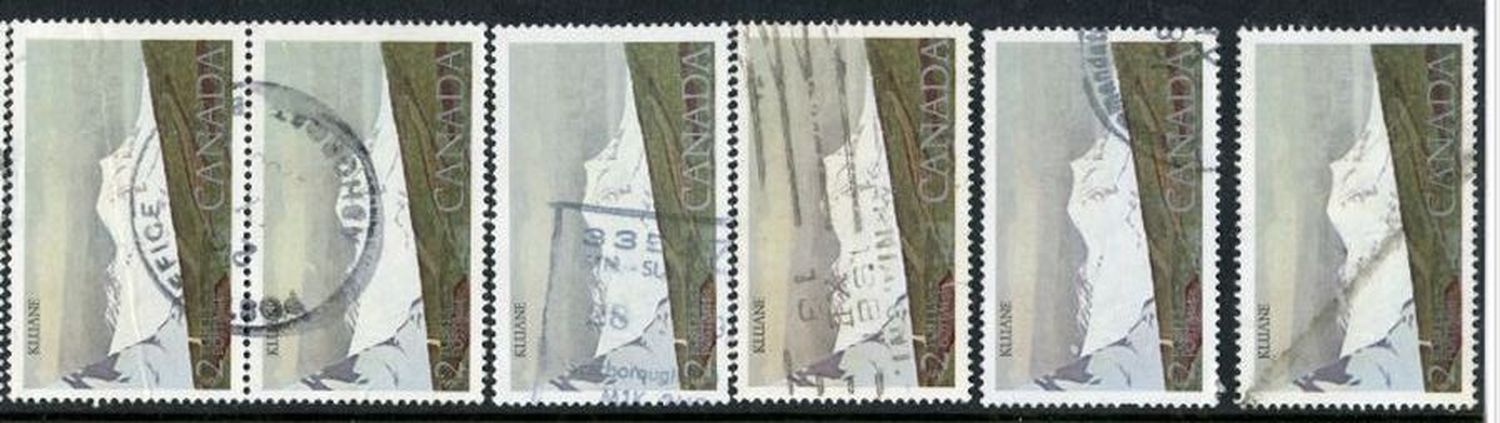
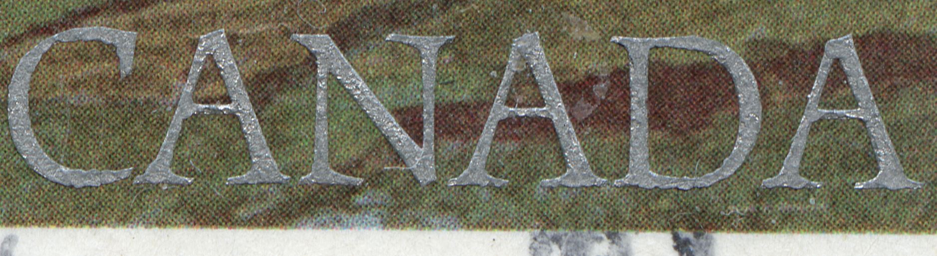
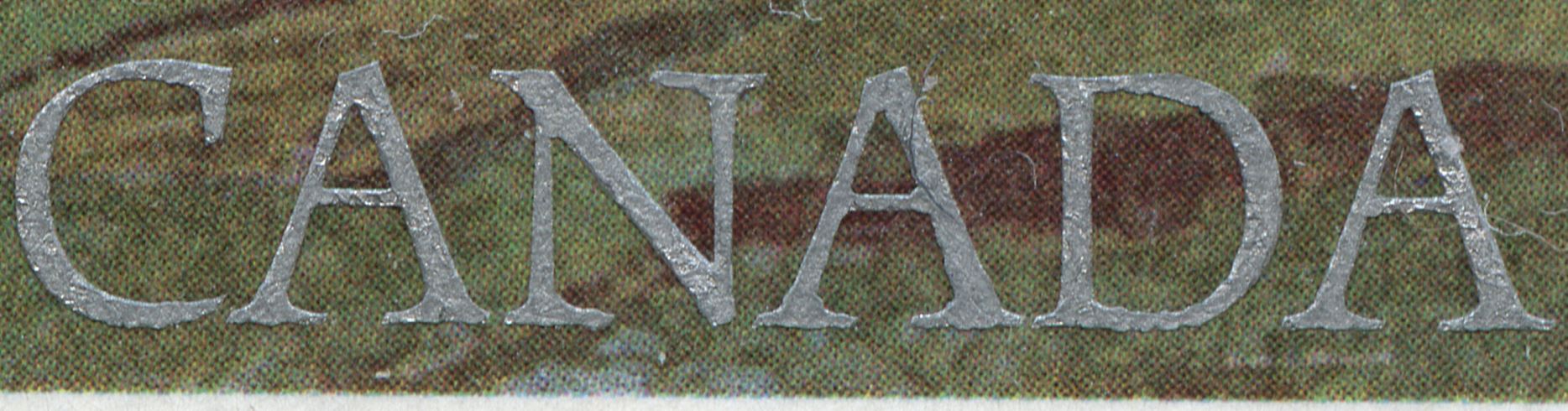
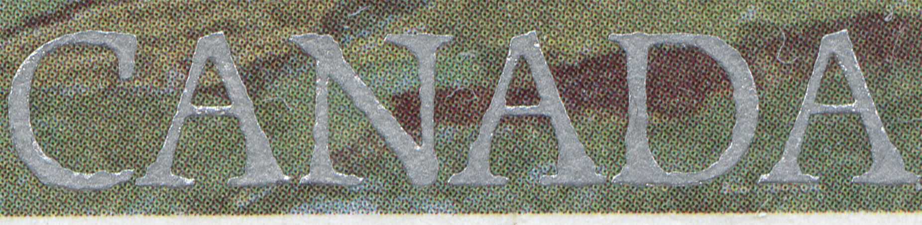
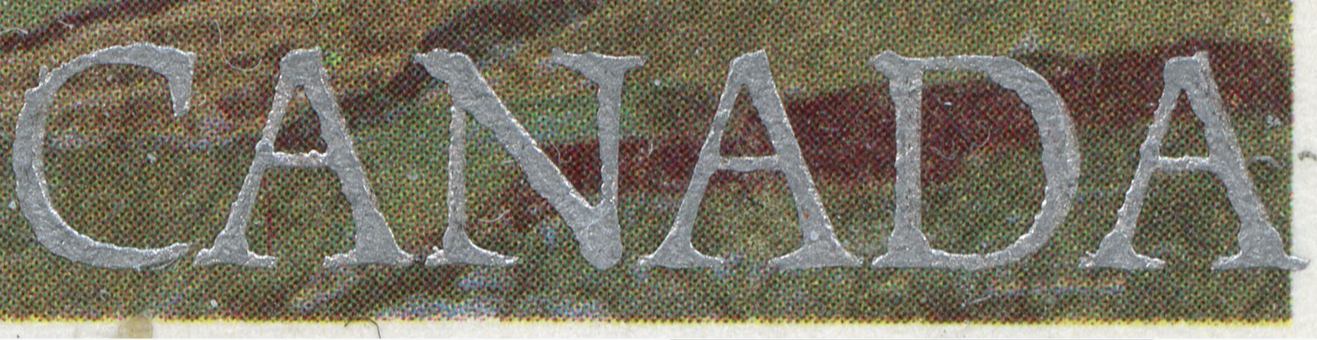
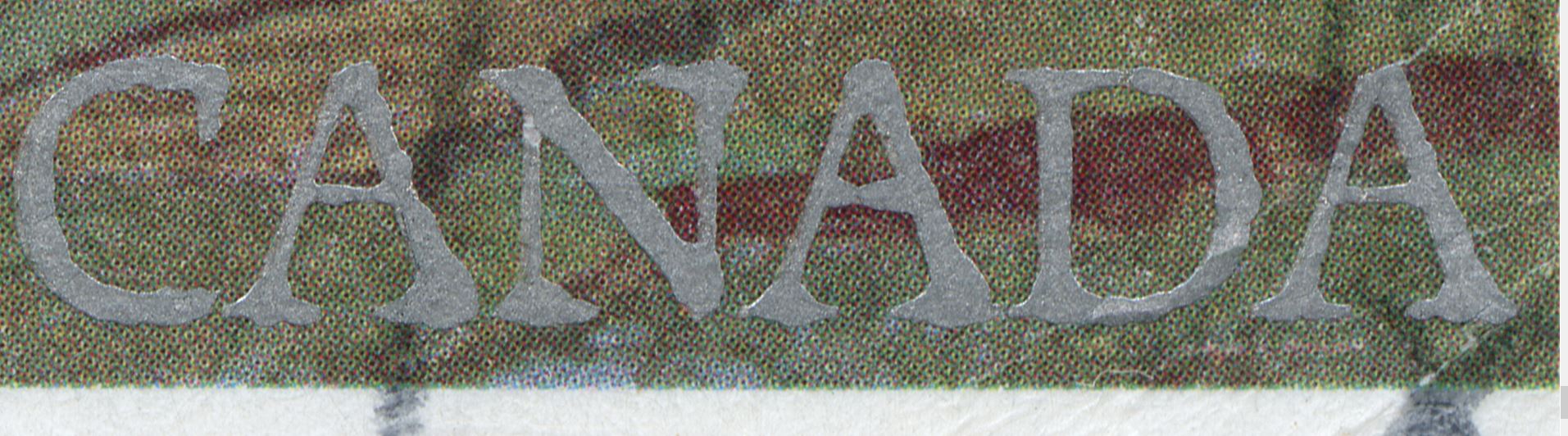
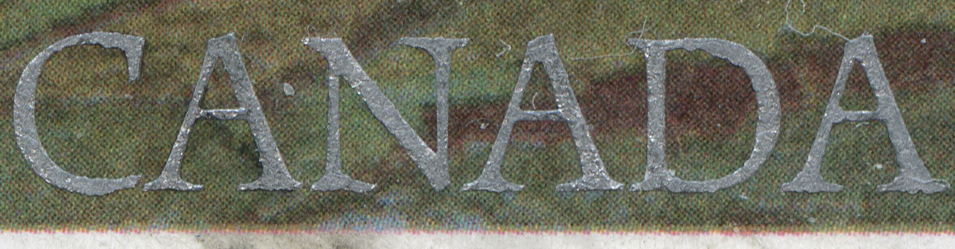
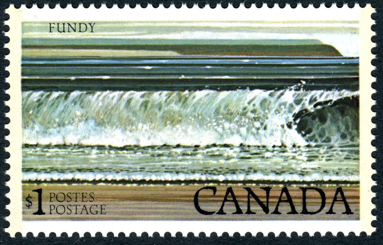
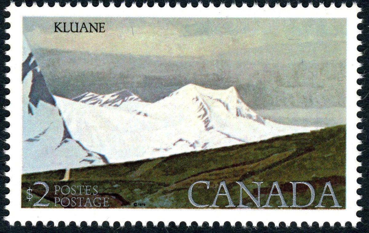
Scott/Unitrade 726 - 727


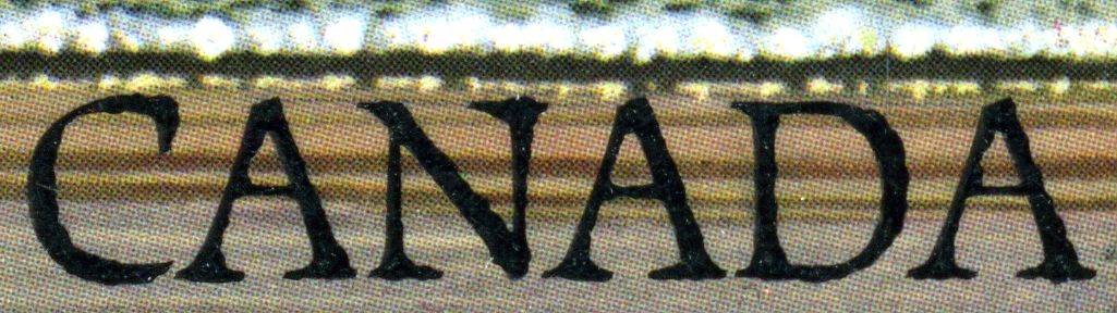
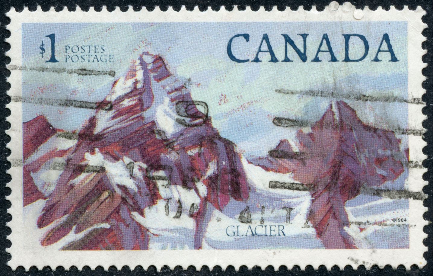
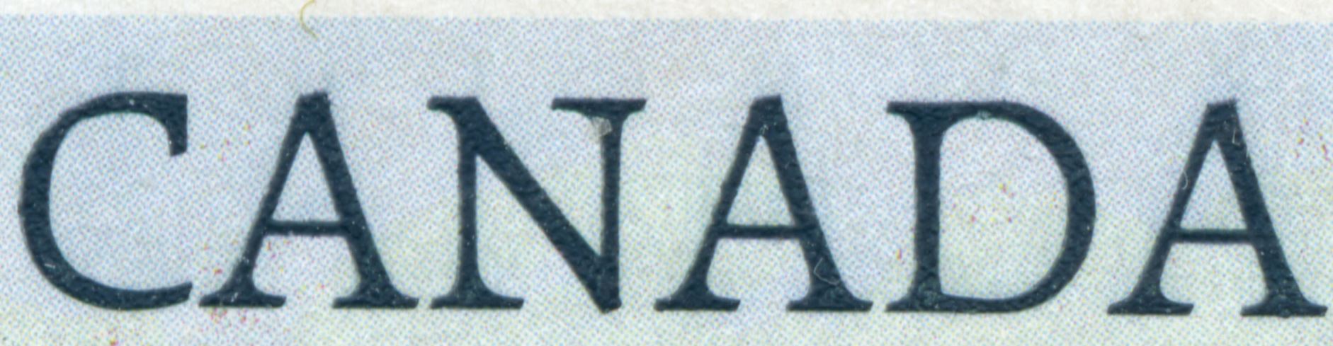
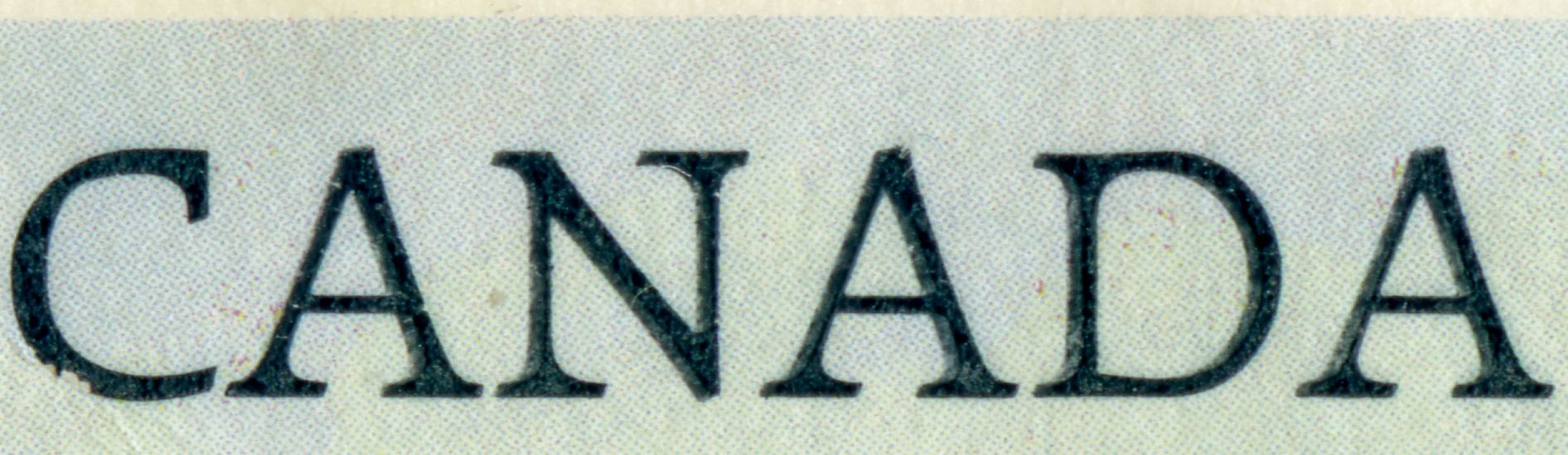
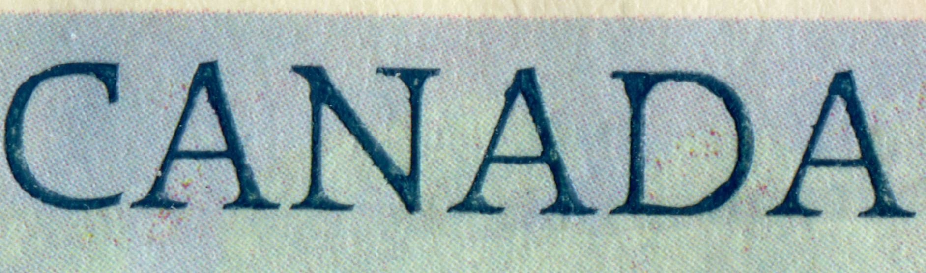
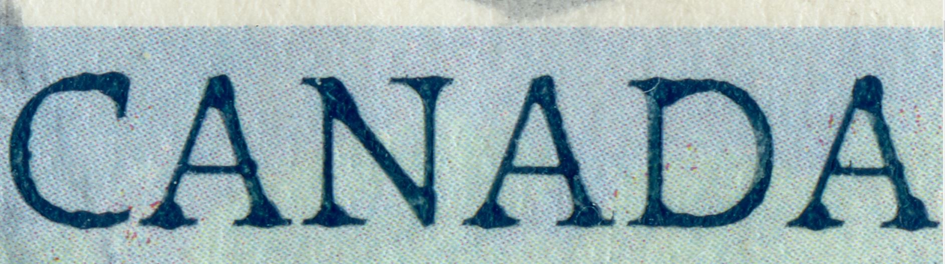
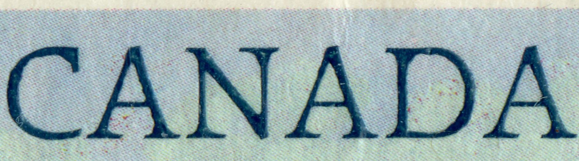
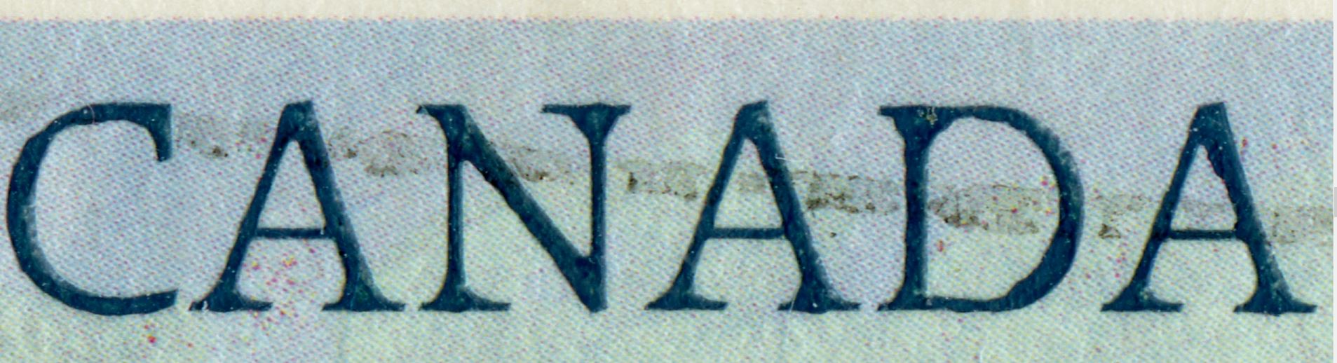
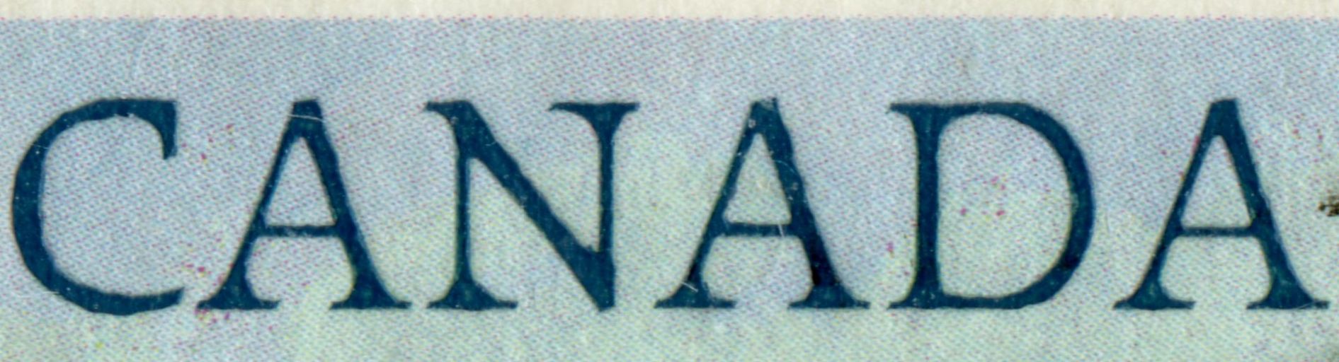
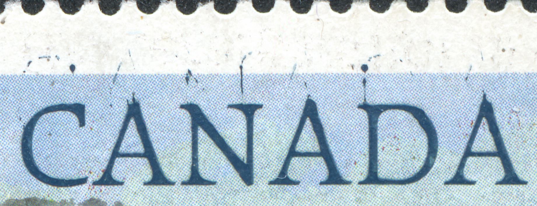
The CBN lettering looks to be very rough, as if it was "engraved" on the die using a hammer and chisel.
Maybe that's the look the designer wanted.

I'm more interested in finding out as to what printing press(es)
BABN used to print their combination recess/offset stamps.
Did they have an affiliate or subsidiary print the offset/litho first and then run it through the Goebel press for the engraved portion?

Or were they printed by the BABN banknote division?
BABN and CBN shared the printing of Canadian banknotes for decades using a combination of recess and offset/lithography.

Why didn't BABN print them in combo recess/photogravure on the Goebel?
Maybe the Post Office Department wasn't happy with their reprinting the Floral definitives using photogravure and wanted more uniformity?


Send note to Staff  Go to Top of Page
Edited by lithograving - 01/31/2019 5:56 pm
Rest in Peace
Netherlands
963 Posts
Posted 01/31/2019   6:17 pm  Show Profile Bookmark this reply Add Galeoptix to your friends list  Get a Link to this Reply
Martin,

have a better look at your $2 stamps "Kluane" - there is a clean,neat one [your copy] and the ones I will show to-morrow and look like the crappy $1. There must have been a "special" method to produce this!

The $2 has 4 "plates" of which 1 and 2 are on Abitibi paper, 3 on Clark and 4 on Harrison paper.

I don't think Yves Baril was responsible for the dies but for the first one!?

Pay some attention to the back of stamp and see the deep relief of the lettering [or not!]...

Rein
Send note to Staff  Go to Top of Page
Edited by Galeoptix - 01/31/2019 6:23 pm
Rest in Peace
Netherlands
963 Posts
Posted 01/31/2019   6:29 pm  Show Profile Bookmark this reply Add Galeoptix to your friends list  Get a Link to this Reply
The hitting nails "engravings" were systematically applied in the 1977-1986 period by the CBN, starting with the offset-litho flowers!
Send note to Staff  Go to Top of Page
Rest in Peace
Netherlands
963 Posts
Posted 01/31/2019   6:44 pm  Show Profile Bookmark this reply Add Galeoptix to your friends list  Get a Link to this Reply

Quote:

Why didn't BABN print them in combo recess/photogravure on the Goebel?
Maybe the Post Office Department wasn't happy with their reprinting the Floral definitives using photogravure and wanted more uniformity?


The Street Scenes were in recess + photogravure [50c, 75c, 80c], but in recess+offset-litho [50c, 60c]. Same crappy recess as well ...
Send note to Staff  Go to Top of Page
Rest in Peace
Netherlands
963 Posts
Posted 01/31/2019   6:50 pm  Show Profile Bookmark this reply Add Galeoptix to your friends list  Get a Link to this Reply


Any quality controll???
Send note to Staff  Go to Top of Page
Pillar Of The Community
Canada
5821 Posts
Posted 01/31/2019   9:00 pm  Show Profile Bookmark this reply Add lithograving to your friends list  Get a Link to this Reply
Here I scanned a mint Scott/Unitrade 727 together with a
used one.


Noticeable difference in the offset colour shades but also
in the silver lettering.

I'm not sure about the used one, probably Plate 3 Clark paper
but the mint one is definitely Plate 1 since I got it
from the philatelic centre shortly after it was issued.

Rein, you're right about the deteriorating quality of
the engraving when you compare the two.

Below 2 scans of the used stamp


and of the mint $2

Send note to Staff  Go to Top of Page
Pillar Of The Community
Canada
5821 Posts
Posted 01/31/2019   9:18 pm  Show Profile Bookmark this reply Add lithograving to your friends list  Get a Link to this Reply

Quote:
Pay some attention to the back of stamp and see the deep relief of the lettering [or not!]...


On the gum side debossing is quite visible on the mint $2


less so on the $1 mint


and on the used $2 even less

Send note to Staff  Go to Top of Page
Rest in Peace
Netherlands
963 Posts
Posted 02/01/2019   02:18 am  Show Profile Bookmark this reply Add Galeoptix to your friends list  Get a Link to this Reply
Martin,

this is NOT the engraving, it is the process!

Not recess but die-stamping?!


Double impression as I look at it after a good night's sleep :)

You can recognize the fragments of "CANADA"

Rein
Send note to Staff  Go to Top of Page
Rest in Peace
Netherlands
963 Posts
Posted 02/01/2019   07:32 am  Show Profile Bookmark this reply Add Galeoptix to your friends list  Get a Link to this Reply


6 different "engravings"!?


The numbers 1,2 and 6 may have the same source, but the others???

This is NOT recess!

Send note to Staff  Go to Top of Page
Rest in Peace
Netherlands
963 Posts
Posted 02/01/2019   07:46 am  Show Profile Bookmark this reply Add Galeoptix to your friends list  Get a Link to this Reply
At the back:

1+2 and 6 are similar indeed!


Send note to Staff  Go to Top of Page
Page: of 5 Previous TopicReplies: 64 / Views: 5,025Next Topic  
Previous Page | Next Page
 
To participate in the forum you must log in or register.

Go to Top of Page

Disclaimer: While a tremendous amount of effort goes into ensuring the accuracy of the information contained in this site, Stamp Community assumes no liability for errors. Copyright 2005 - 2026 Stamp Community Family - All rights reserved worldwide. Use of any images or content on this website without prior written permission of Stamp Community or the original lender is strictly prohibited.
Privacy Policy / Terms of Use    Advertise Here
Stamp Community Forum © 2007 - 2026 Stamp Community Forums
It took 0.21 seconds to lick this stamp. Powered By: Snitz Forums 2000 Version 3.4.05