| Author |
 Replies: 64 / Views: 5,094 Replies: 64 / Views: 5,094 |
|
Rest in Peace
Netherlands
963 Posts |
|
|
|
|
Rest in Peace
Netherlands
963 Posts |
|
|
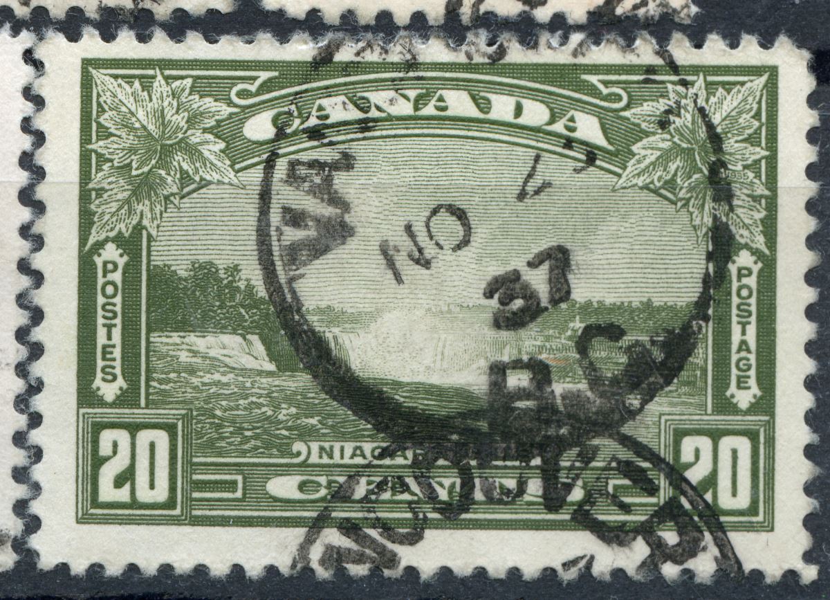
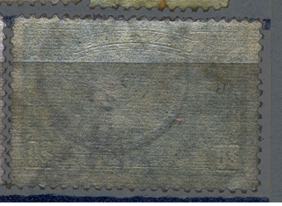
The year 1937 reflects the world-wide introduction of the twill-binding to papermachines long sieves!
So far, I had only found 1938 related changes from linen-binding to twill-binding, but as Canada may be ahead of everybody in the paper industry, the first now stamps with a twill binding are from Canada in 1937!
|
Send note to Staff 
|
|
|
Rest in Peace
Netherlands
963 Posts |
|
|
The introduction of the "Quick Sticks" self-adhesives in 1989 also coincides with the end of the British American Banknote Company in stamp production. The use of self-adhesives led to an explosion of new issues. The Quick Sticks having Scott numbers 1191-1193, the last given Scott numbers in my 2019 Unitrade exceeds the 3100! Or some 1900 main numbers in 30 years.... |
|
Send note to Staff
|
|
|
Pillar Of The Community
Canada
5821 Posts |
|
|
One question to start off with here is:
What recess printing press or presses did the Canadian Bank
Note Company use during those years?
I remember reading somewhere awhile back that CBN built
and/or assembled their own printing press(es).
|
|
Send note to Staff
|
|
|
Rest in Peace
Netherlands
963 Posts |
|
|
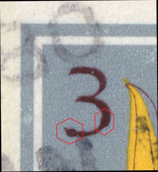
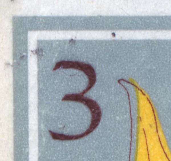
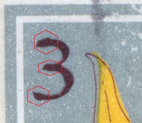
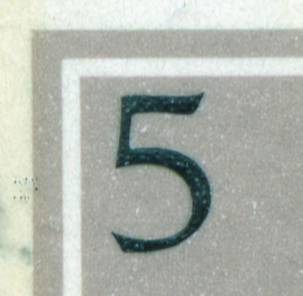
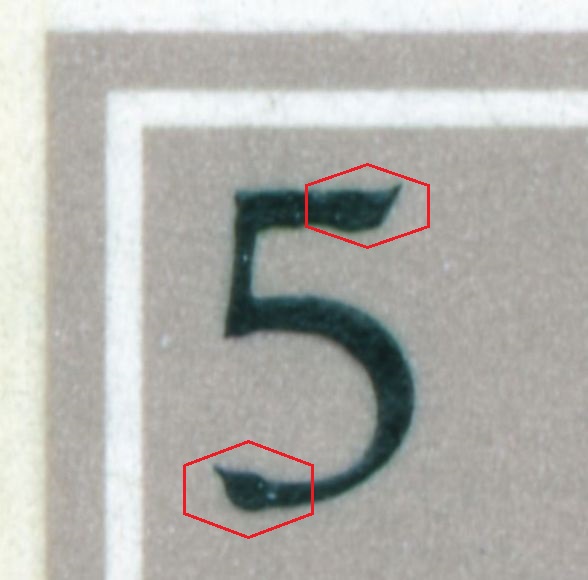
Unlike the BABN they probably did not use reel-fed recess presses. And neither did they use th Giori-method of printing more colours from one plate/cylinder. During the 1970/1980-ies some of their "recess printing" did not look like recess at all! In my newly bought Unitrade [2019] in some series like the 1977 Flowers, Street Scenes and National Parks the recess lettering rather looks like "hitting nails". I will come to these particular aspects later on.  Rein |
|
Send note to Staff
|
| Edited by Galeoptix - 01/28/2019 6:37 pm |
|
|
Rest in Peace
Netherlands
963 Posts |
|
|
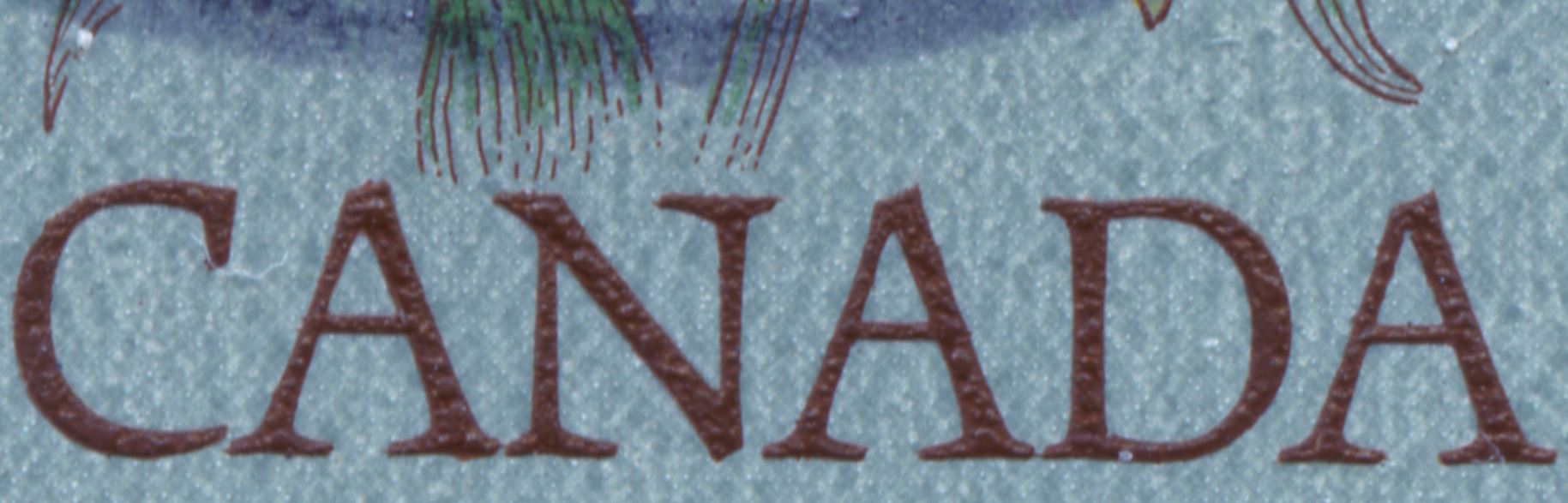
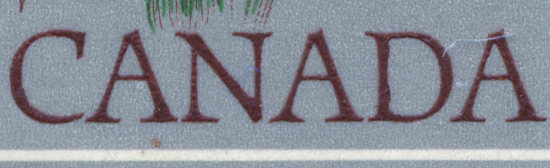
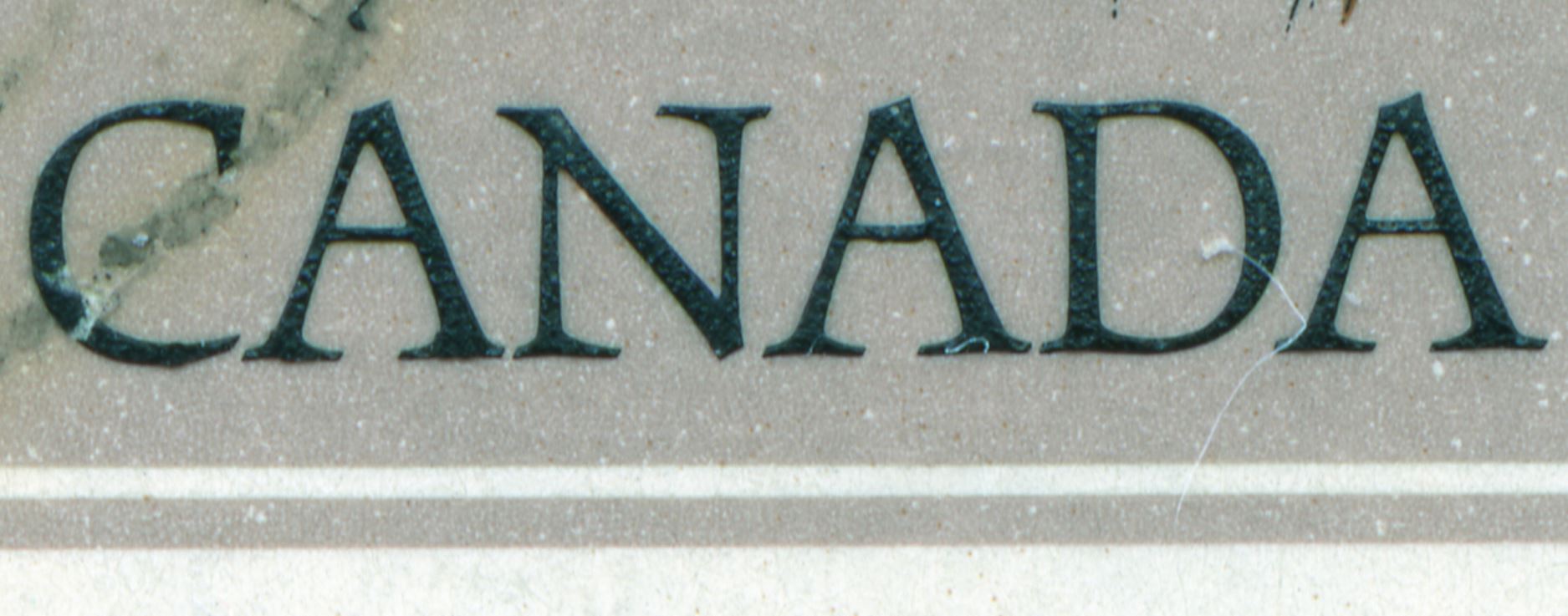
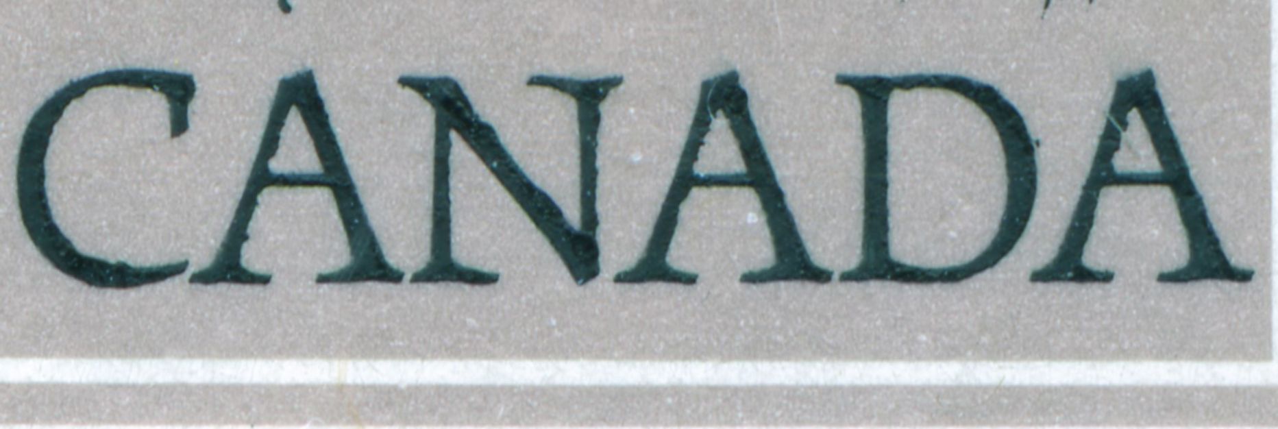
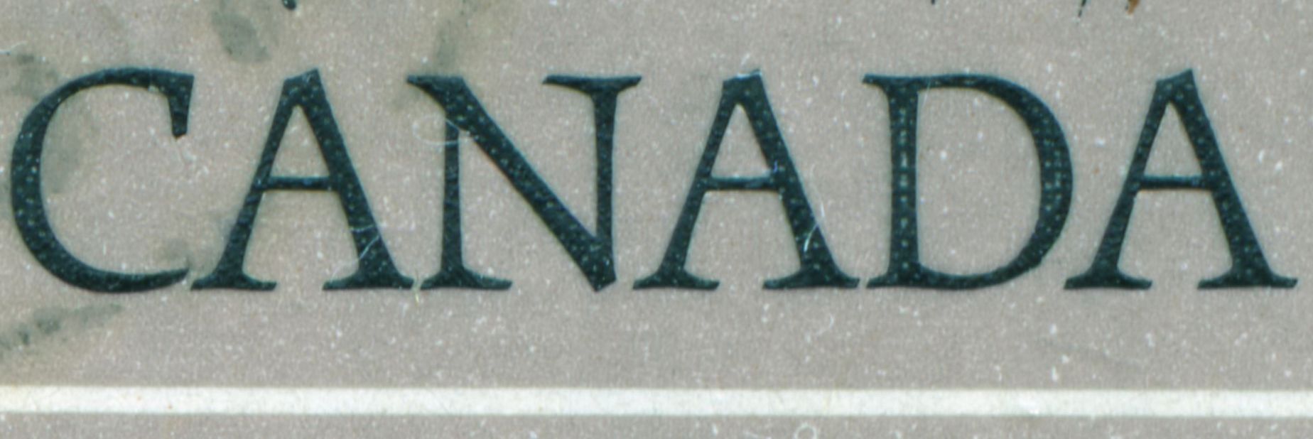
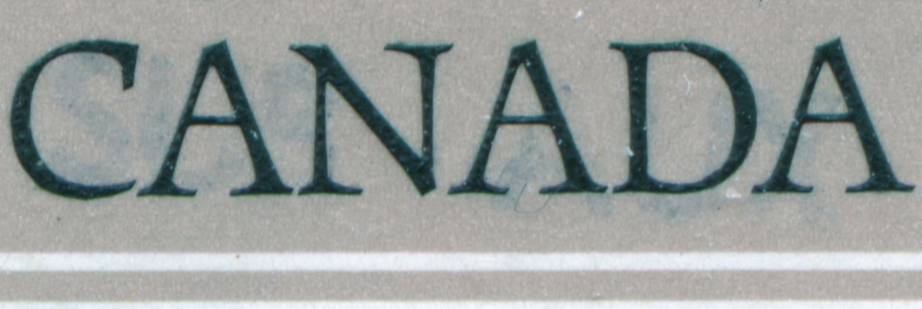
Lithograving, referring to your posting: "One difference I see is in the engraving of CANADA. Plate 1 has mottled lettering, raised bumps while on Plate 2 the letters appear smoother. For some reason this is more evident with a low power magnifying glass than on this scan below. Plate 1 on top of plate 2  Plate 1  Plate 2  The interesting part though is in the make up of the individual rosettes. On plate 1 most green rosettes in the area around the da have light centers whereas on Plate 2 they have dark dots for centers. Same goes for some of the green roofs and also for the blue in the hills, below postes/postage. I only have these 2 PBs and a single of each so this isn't conclusive obviously but if other collectors check their stock then maybe we will get the answers." The "hitting nails" looks a lot more weird! Rein |
|
Send note to Staff
|
|
|
Pillar Of The Community
Canada
5821 Posts |
|
|
Quote:
And neither did they use th Giori-method of printing more colours from one plate/cylinder. If CBN had Giori type presses there would have been no Seaway invert. |
|
Send note to Staff
|
|
|
Rest in Peace
Netherlands
963 Posts |
|
|
Quite right!
CBN was printing mostly in single colour reess in the 1937-1967 period.
Occasionally 2-colour recess from separate plates [cylinder?]; since 1952 also recess combined with 1 or 2 colours in offset-litho. Since 1965 occasionally offset-litho only upto 3 colours.
The 1968 Inuit carvings and the 1969 Suzor-Cote stamps were in photogravure by the CBN! Did they employ subcontractors for these?
The BABN started with their Goebel press in 1968, but also printed stamps in offset-litho only [1968 Meteorology] or a combination of recess plus offset-litho occasionally.
Was there any change in the way CBN printed in recess since 1968??? |
|
Send note to Staff
|
|
|
Rest in Peace
Netherlands
963 Posts |
|
|
Rest in Peace
Netherlands
963 Posts |
|
|
Rest in Peace
Netherlands
963 Posts |
|
|
Pillar Of The Community
Canada
5821 Posts |
|
|
Quote:
The BABN started with their Goebel press in 1968, but also printed stamps in offset-litho only [1968 Meteorology] or a combination of recess plus offset-litho occasionally.
Unitrade mentions that the 1972 Krieghoff Scott 610 was printed by a BABN affiliate in Winnipeg namely Saults & Pollard Ltd.Perhaps this company also printed the other offset/litho BABN stamps such as Scott/Unitrade 479,480,481,513-14,533,534, 553. |
|
Send note to Staff
|
|
|
Rest in Peace
Netherlands
963 Posts |
|
|
https://en.wikipedia.org/wiki/Pollard_BanknoteQuote:
Pollard Banknote Income Fund traces its roots back to 1907 to the Saults & Pollard commercial printing company in Winnipeg, Manitoba, Canada. In the mid-1970s, the company made a move into security printing which entailed production of stamps, stocks, bonds and government documents. In the mid-1980s Pollard Banknote began printing for government lotteries in Canada, the United States and the world.
The company has five facilities with approximately 1,200 personnel serving over 45 lotteries.
The corporate head office is in Winnipeg, Manitoba, Canada. |
|
Send note to Staff
|
|
|
Rest in Peace
Netherlands
963 Posts |
|
|
https://www.ottawaphilatelicsociety...tive-stamps/Quote:By 1902, Eddy was manufacturing more than 70 varieties of paper product. E B Eddy was a major supplier of paper to the Canadian Bank Note Company for their Centennial printings. From its founding 04 December 1912, Abitibi Power and Paper Mills Limited was among the largest producers of paper in the world. Abitibi Provincial Paper supplied recycled paper to the Canadian Bank Note Company for the production of all of their stamp issues from 1971 onward. From 1972 to 1983 Abitibi was the sole supplier of paper to Canada Post. However, in 1983 Abitibi decided to discontinue its paper line from which stamps were being made forcing CP to obtain its papers from other sources. In 2008, Abitibi decided to close its operations in Newfoundland Labrador, prompting the NL Government to expropriate all of the holdings of the company in that Province. |
|
Send note to Staff
|
|
|
Pillar Of The Community
Canada
5821 Posts |
|
|
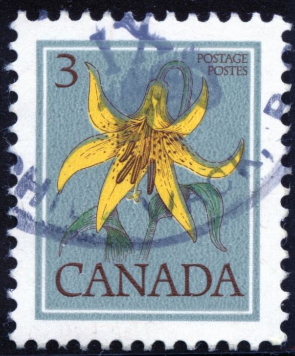
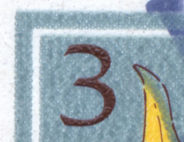
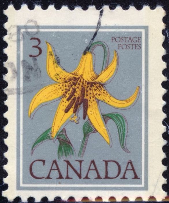
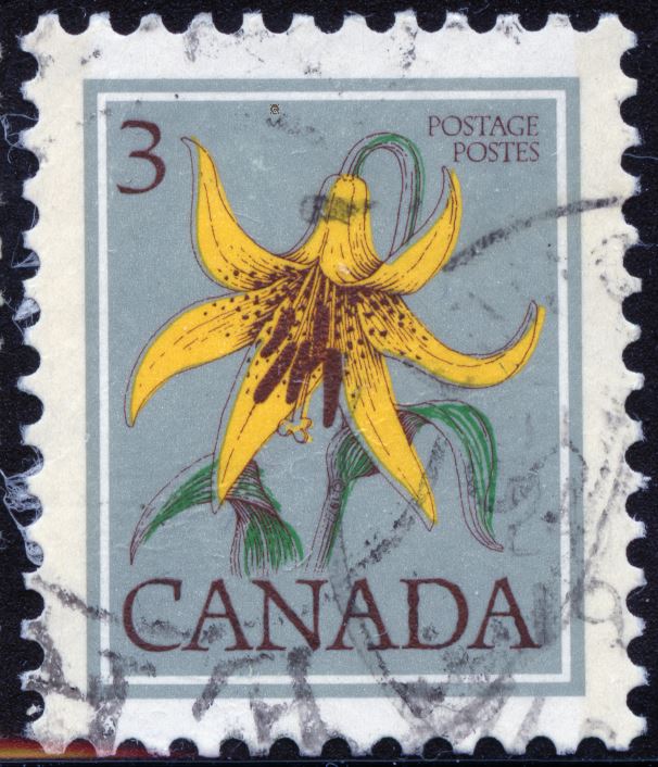
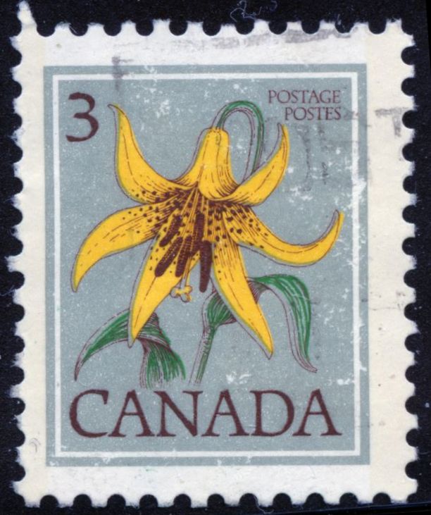
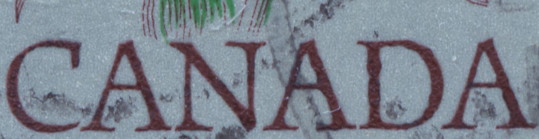
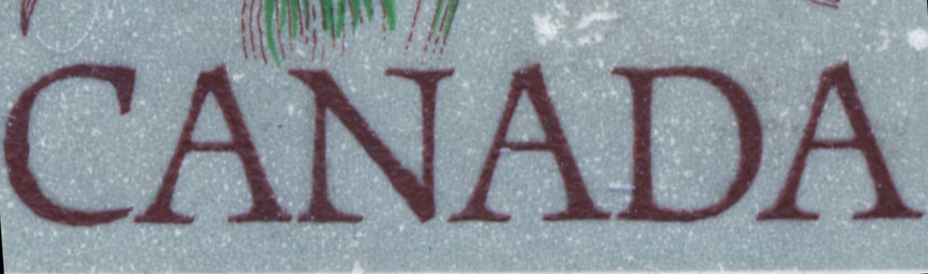
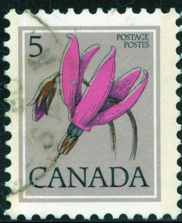
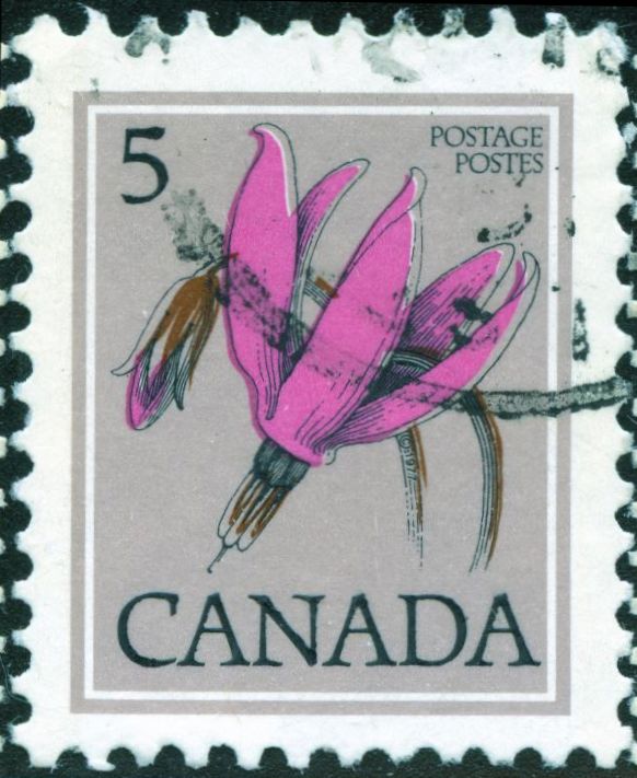
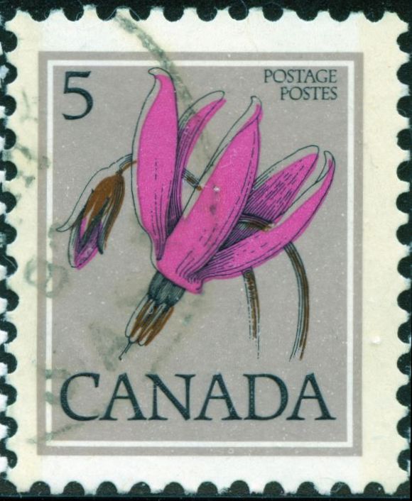
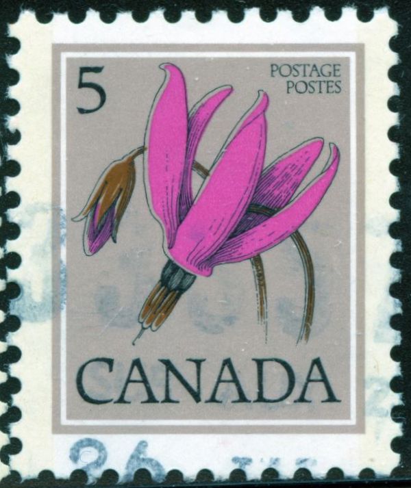
The Canadian Floral Definitives were quite interesting and shows the difference between offset/litho and photogravure quite well I believe. First issued in 1977 printing by the Canadian Bank Note Company using 1 colour steel engraving and 3 colours offse/litho Scott/Unitrade 705 - 711.They were reprinted and issued in 1979. This time the printer was the British American Bank Note Company using 1 colour steel engraving and 3 colour photogravure Scott/Unitrade 781 - 786.BABN also printed a 12c and 15c value which had not been previously printed by CBN. Here are the six values, offset on left photo on right. 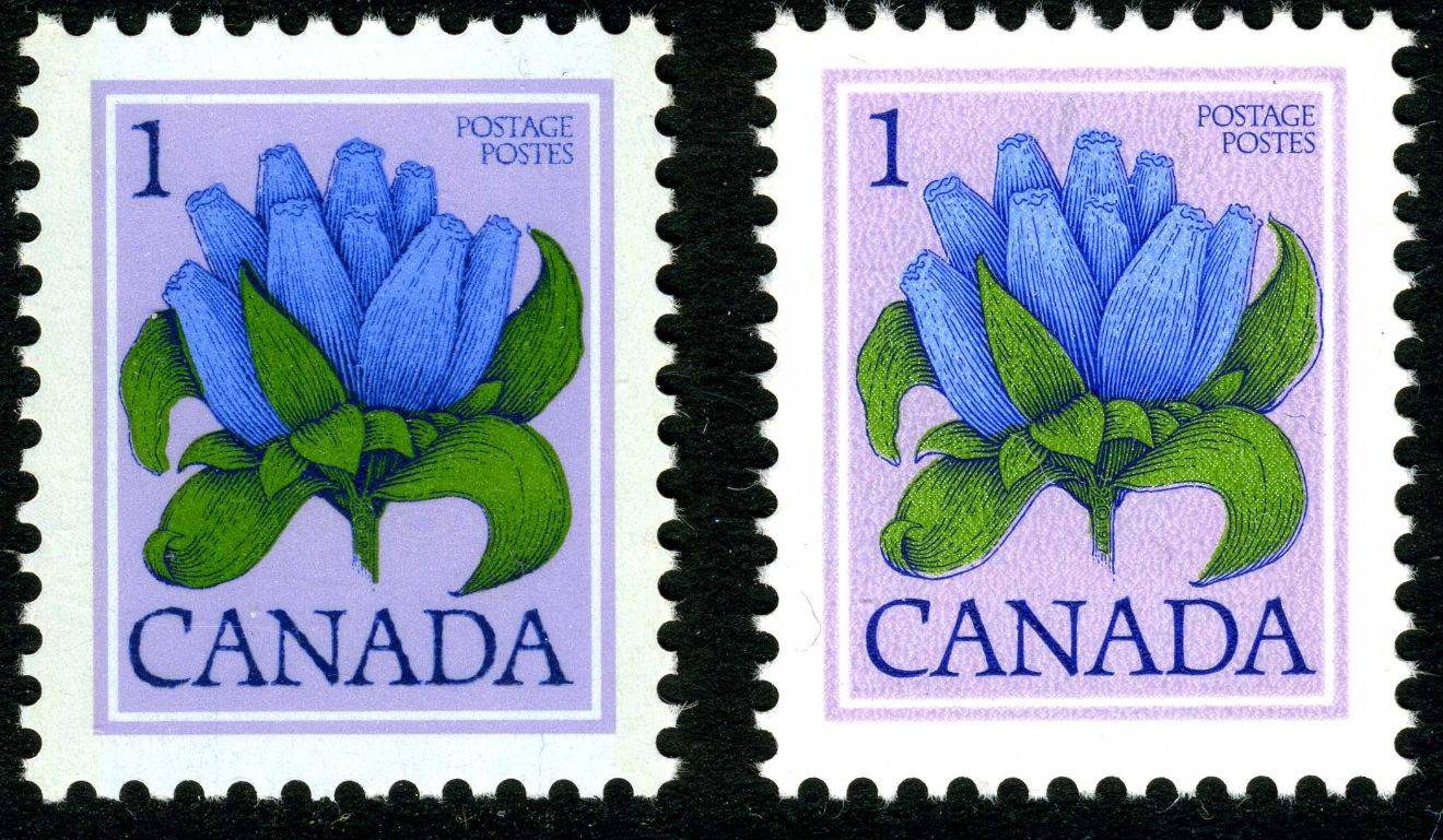 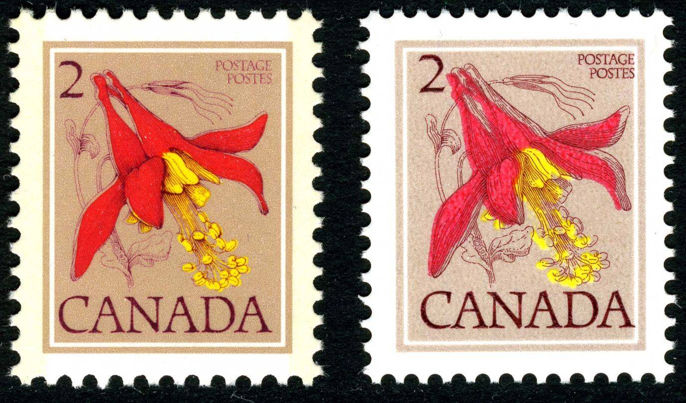 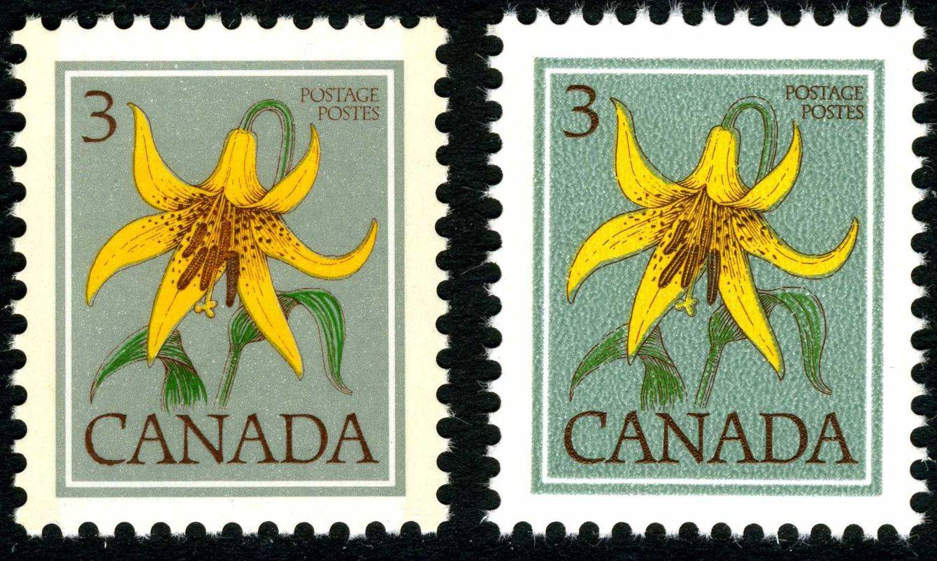 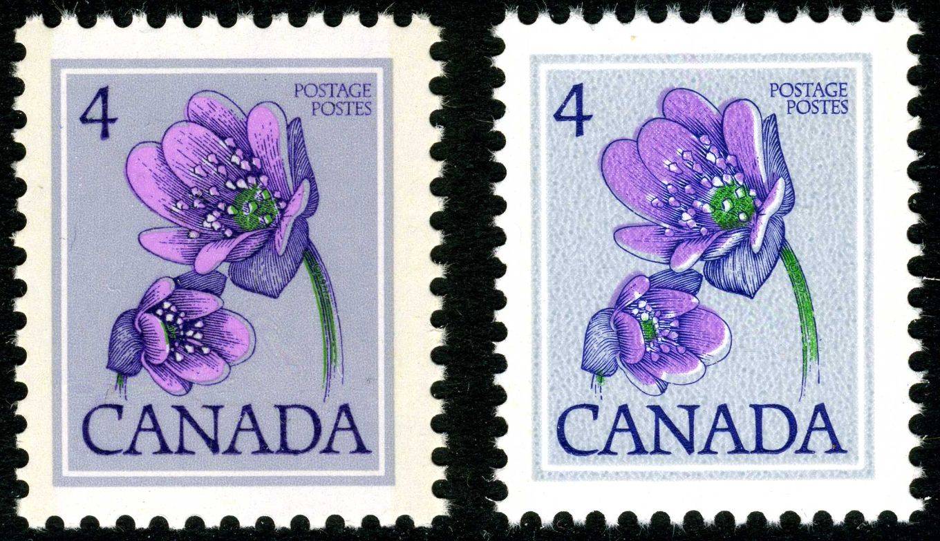 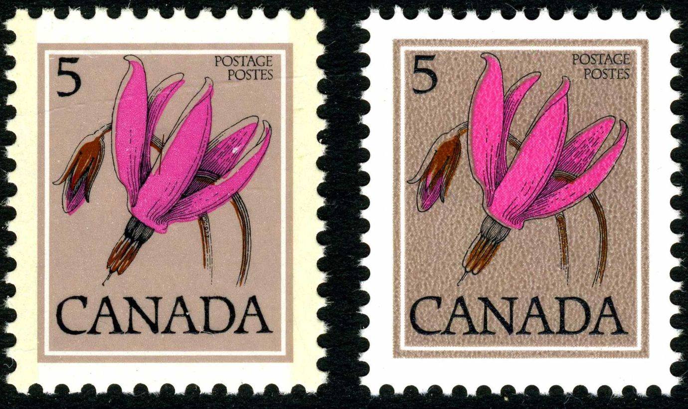 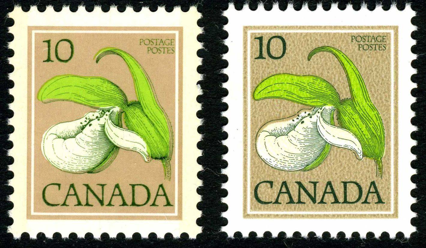 |
|
Send note to Staff
|
|
|
Rest in Peace
Netherlands
963 Posts |
|
|
Martin,
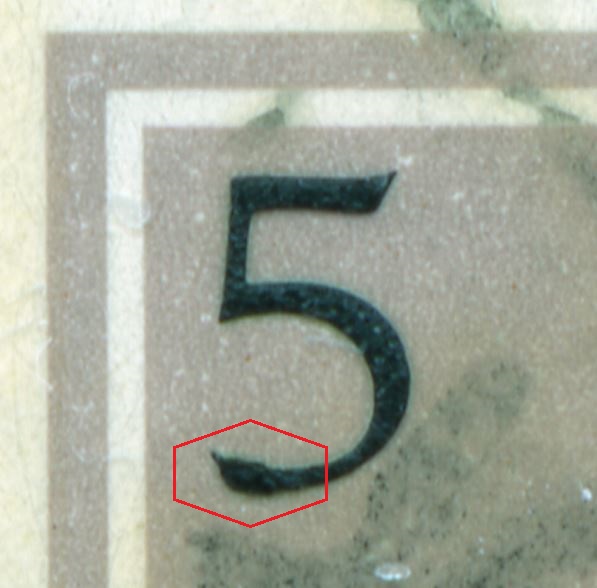
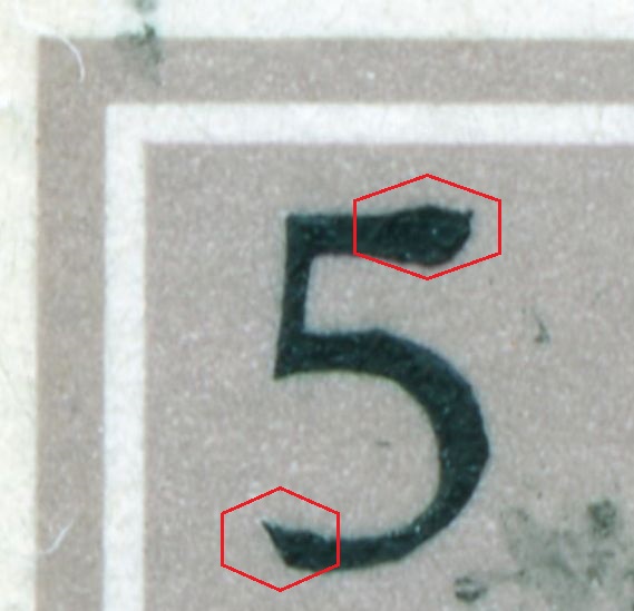
the main reason for showing the flowers in offset-litho was the so-called engravings of the lettering. You will NOT see these blow-ups in traditional recess! And even in this flower set not all values seem to have this!
It gets worse even with the Street Scenes and the National Parks. The BABN seems to have a decent engraver around, the CBN makes a mockery out of this recess!
Rein |
|
Send note to Staff
|
|
|
Replies: 64 / Views: 5,094 |
|