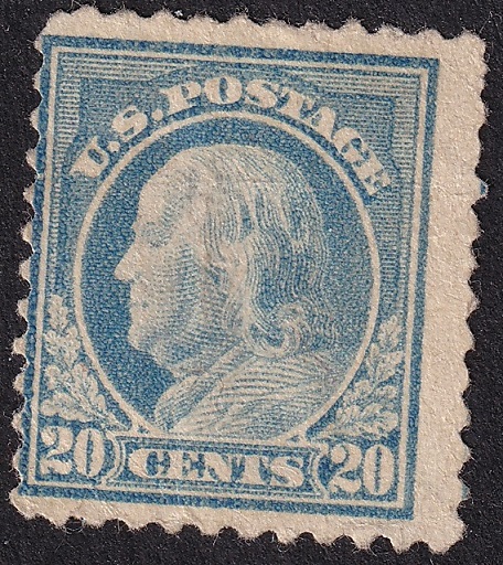
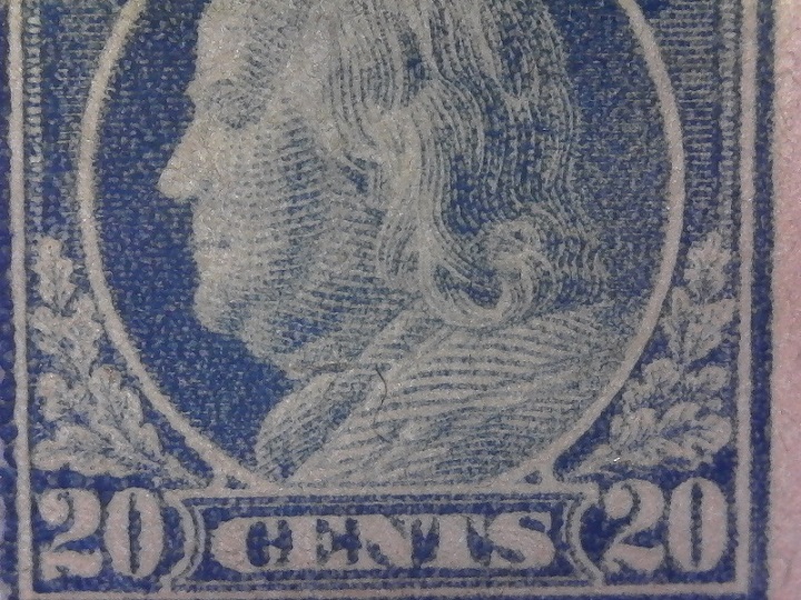
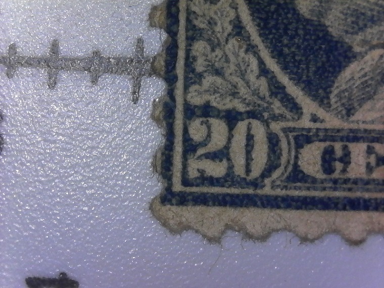
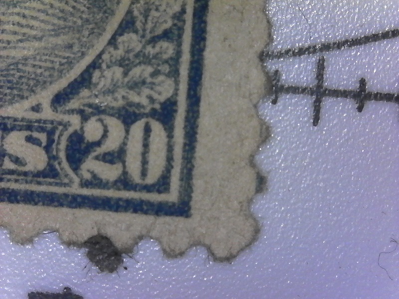
Is the impression of this stamp typically this bad? Numerals on the left and lettering of CENTS are not as sharp as those of other stamps I've seen. I went on the PF website and looked at other Scott 515 examples and couldn't find one like this. It has the look of a forgery even though I don't believe it is.
This stamp has lived a very hard life and it's tired. Something may have been stuck to it, the paper may have been a bit too wet when it was printed, the plate might have been a bit worn as well. It's 100 years old, who knows what has happened to it along the way.
Disclaimer: While a tremendous amount of effort goes into ensuring the accuracy of the information contained in this site, Stamp Community assumes no liability for errors. Copyright 2005 - 2026 Stamp Community Family - All rights reserved worldwide. Use of any images or content on this website without prior written permission of Stamp Community or the original lender is strictly prohibited. Privacy Policy / Terms of UseAdvertise Here





 Posted 02/25/2019 9:35 pm