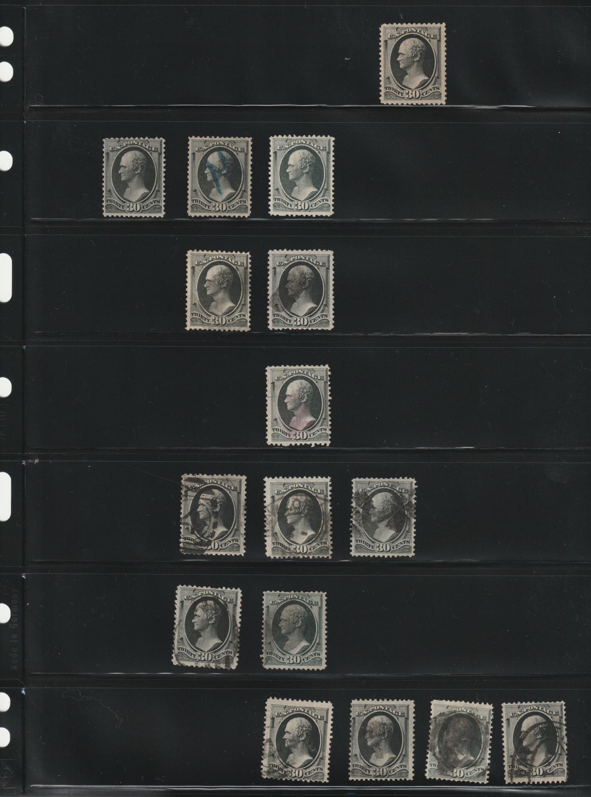
rlsny,
For identification of the of the 30c Hamilton's the only way to differentiate the 154 from the 165 is by color.
But... you have some help.
The 190 should be easy for you to identify as a "Full Black" stamp.
Take your 190 and put it next to your "stamps in question".
I assume you have more than 2 you are trying to ID.
With the 190, use it as a guide to identify which two different "piles".
One pile will be slightly darker, and the other will be slightly lighter in appearance. Don't worry about the "color definitions" in Scott at this point.
Usually, when IDing color, I recommend finding the point on the stamp that has the most color available in it. But with these blacks, I don't suggest doing that.
There is a better color indicator. Look in the ribbon and the 30 at the bottom of the stamp.
The 154 while appear "lighter" in color in this area, the 165 (ironically) looks darker, but that is your "gray black" at work.
The only other issue to look out for then is are any of your "154's" grilled? If they are then they are either 143 or 143A depending on H or I grilling.
Here is an image of the 3 stamps (don't worry so much about "color match", look instead the clarity of line to the right of the E).
At left is a 143, middle a 165, right 190.
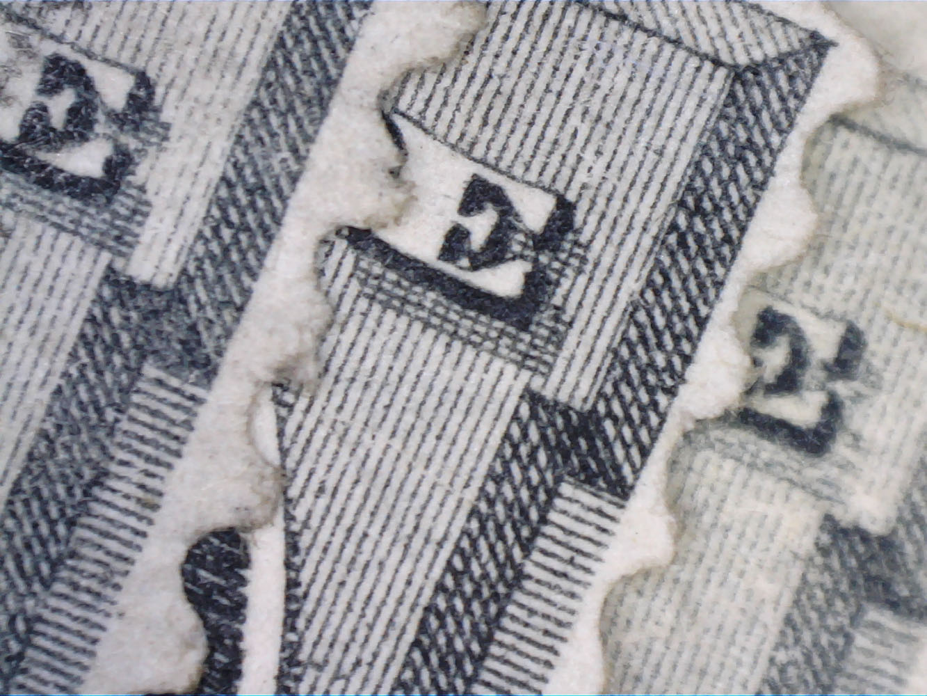
The printing process and the type of paper make a difference to how the strike is defined. Interestingly, the Continental papers seem to provide the best combination of absorption of ink and definition of strike. Note that the National is similar, the best place to see this is in the lines that follow and are contained in the E. In the National, all of the top 5 lines after the E are clear, but the lines inside the E are fainter. In the Continental, those lines are all clear. In the American printing, the lines that follow and are inside the E are very muddy, sometimes even appearing to be fused together. This is a result of the soft porous paper, absorbing the ink more readily, and resulting in bleeding.
R.H. White's color review notes that greenish black, and bluish black exists both in Continental and American printings in some examples where a second colorant is introduced. Copper or was added into the ink, resulting in the greenish tinge, and iron was added resulting in the bluish tinge. However the color naming committee decided on calling this grayish black.
Ranges of gray black examples exist for all three printings.
So relying on specific color is somewhat unreliable. As you work with 100's of copies it will also start to make sense, and I would stress that my mentioning of the review of the printing is not 100% accurate, but will get you there 80%+ of the time. You'll still want to be careful in making a final call.
And no, it is not safe to assume that if the stamp color doesn't match a 143 it's not a 154, for the reasons I mention in the color variations above, particularly grayish black versus black. The 143 in my image above seems to be more grayish black variety, but this is more likely the result of color changeling over the past 150ish years. Black color will fade just like other stamp colors. What you have to learn is, what those fadeings may look like across the family of 30c Hamiltons. I use this test first to get a good feel of the 30c and then begin to evaluate their color.
Regarding secret marks, when Continental took over the contract to produce stamps, they did make new plates for the 24c, 30c and 90c which had secret marks. But it's not clear why these were never used. (There are proofs that have the marks visible on them, but stamps produced by them were still made from the original plates). It then became the difference in inks, as batches never "match" one to another.
If you become a learned student of the papers, this may also help. Note that both National and Continental printed on white wove paper, both in the "thin", but National papers could vary to medium thick, while Continental papers reached to thick. This paper is more easily identified, it appears as a transition paper between the thin white wove, and the heaver soft porous. (The stamp in a luminosity test may seem to have a similar pattern visible in it to that of soft porous, but still the type of thickness that the white wove paper has). If you can identify these (and be clear, not all of the Continental printings are on this type of paper), then you can be certain that those on the thick wove paper are Continental issues. I have 1 or 2 examples that meet this criteria.
Lastly, a note on grills.
Grills do appear on National and Continental banknote issues. On National printings (white wove paper), both H and I grills appear, with H grill being larger (H = 11 to 13 x 14 to 16 points) while I grill is smaller (I = 10 to 11 x 10 to 13 points). These are easily identified. However, I have seen many examples of grills on these issues that are incomplete. As few as 2 rows wide, but maybe only 8 - 10 down. These grills identify the fact that the stamp is a grill issue, but if the full grill cannot be identified, then it must be assumed to be the lower value stamp. I see this a lot in the 2c Jacksons.
J grill appears only on Continental issues, and was an experimental grill that had very limited use. The grill was more aggressive than the H and I grills, and often times punctured the stamp. It is most widely seen on the 5c Taylor, but I have seen it on the 6c Lincoln and it is known on the 30c Hamilton (unique).

The image above is from a J grill essay. You can see how several of the grill points result in a square hole in the stamp.
It is my opinion that less than 1,000 J grill appear on the Taylor, and fewer on other denominations, though I don't have an exact census, this is an estimation.





 Posted 04/05/2019 12:04 pm