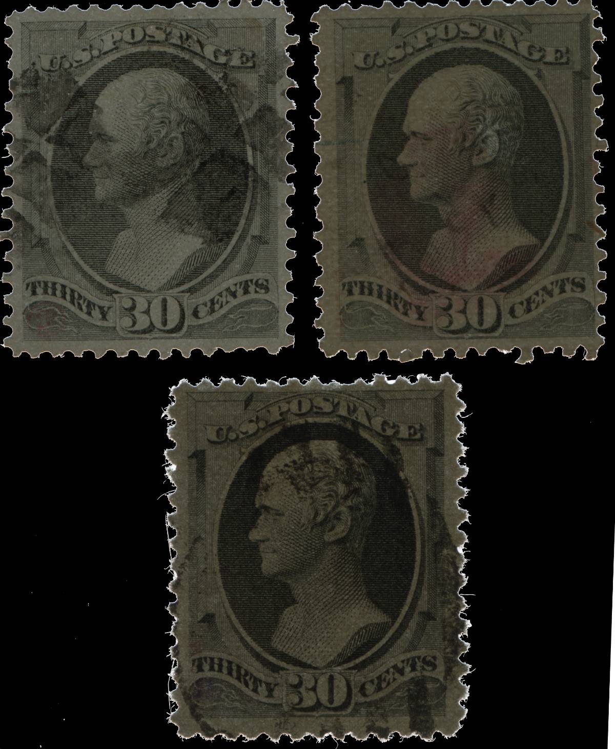
tough issue for me but would like to discuss a "philatelic educational card" I found with a bunch of other philatelic stuff. No secret mark and similar paper make these issues tough to properly identify.
Colors fade over time so distinguishing by color alone is just very difficult. Some cases it is obvious but many it is just tough.
Now for card:
This card (number 120) has a copyright 1974 Voncorp?
Not sure who produced it
The card explains how to distinguish National versus Continental bank notes:
Under 30c value:
"Here again is color difference. National's printing is definite black, and the white spaces in the face and numerals appear white; while the Continental equivalent areas have a grey appearance. Comparing the proofs of these stamps, we find both have a position dot, opposite nose of vignette, in the clear oval surrounding the portrait. On the National printing, there is a
position line which extends from that dot, left, to the edge of the stamp design. This line must have been removed for the Continental printing."
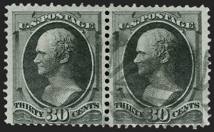
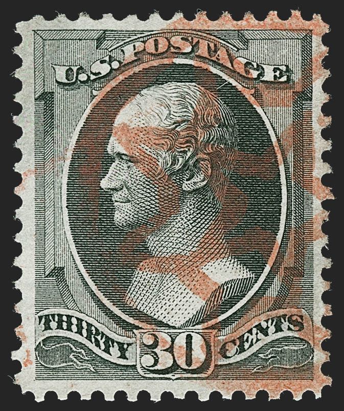
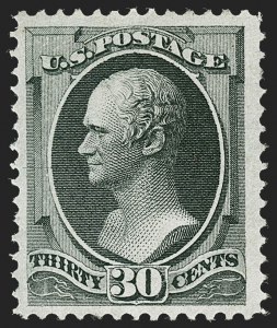
above samples from Siegel
Now in 1974 I was all of a year or so old.
I have never seen this "line" discussed as a way to distinguish National from Continental 30 c issue banknote
I have noticed that Scott 165 Continental does not have this line
However it seems more than half of 154s have it as well as some grilled 143s
Has this "line" been proven to be useless or just helpful and not definite?





 Posted 04/06/2019 8:26 pm