| Author |
 Replies: 27 / Views: 2,728 Replies: 27 / Views: 2,728 |
|
Pillar Of The Community
United States
805 Posts |
|
|
|
|
Valued Member
United States
178 Posts |
|
|
That is the most impressive thing, philately speaking, that I have seen in a while. Nicely done. |
Send note to Staff 
|
|
|
Bedrock Of The Community
12569 Posts |
|
|
Phil - Thank you for sharing. Very nice! We are at almost the same place completion wise. I am now chasing down the last pieces to the puzzle but as you know it will take a while. Hard to find one or two of them and some others are a bear to find well centered. |
|
Send note to Staff
|
|
|
Rest in Peace
7742 Posts |
|
|
Pillar Of The Community
United States
635 Posts |
|
|
Valued Member
United States
249 Posts |
|
|
Valued Member
224 Posts |
|
|
Really interesting and comprehensive way to handle these issues. Great looking pages! Thanks for sharing. |
|
Send note to Staff
|
|
|
Pillar Of The Community
United States
1851 Posts |
|
|
Innovative and truly impressive - Thanks for sharing.
Consider dividing page 1 into two pages and remounting. That page feels "crowded" whereas the others with four or fewer "rows" look really good. |
|
Send note to Staff
|
|
|
Pillar Of The Community
6330 Posts |
|
|
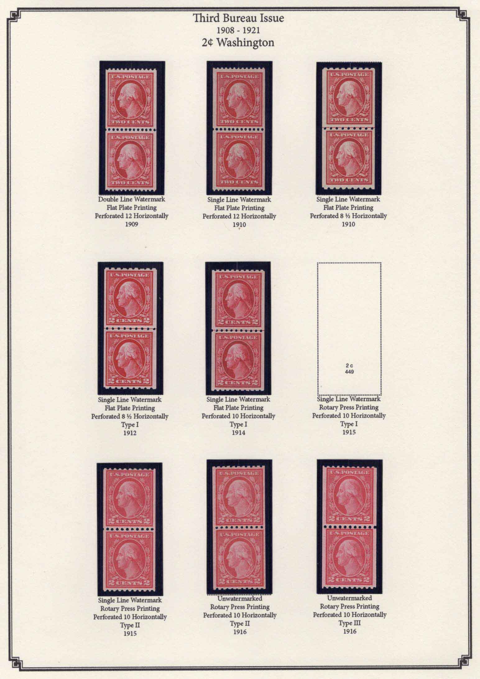
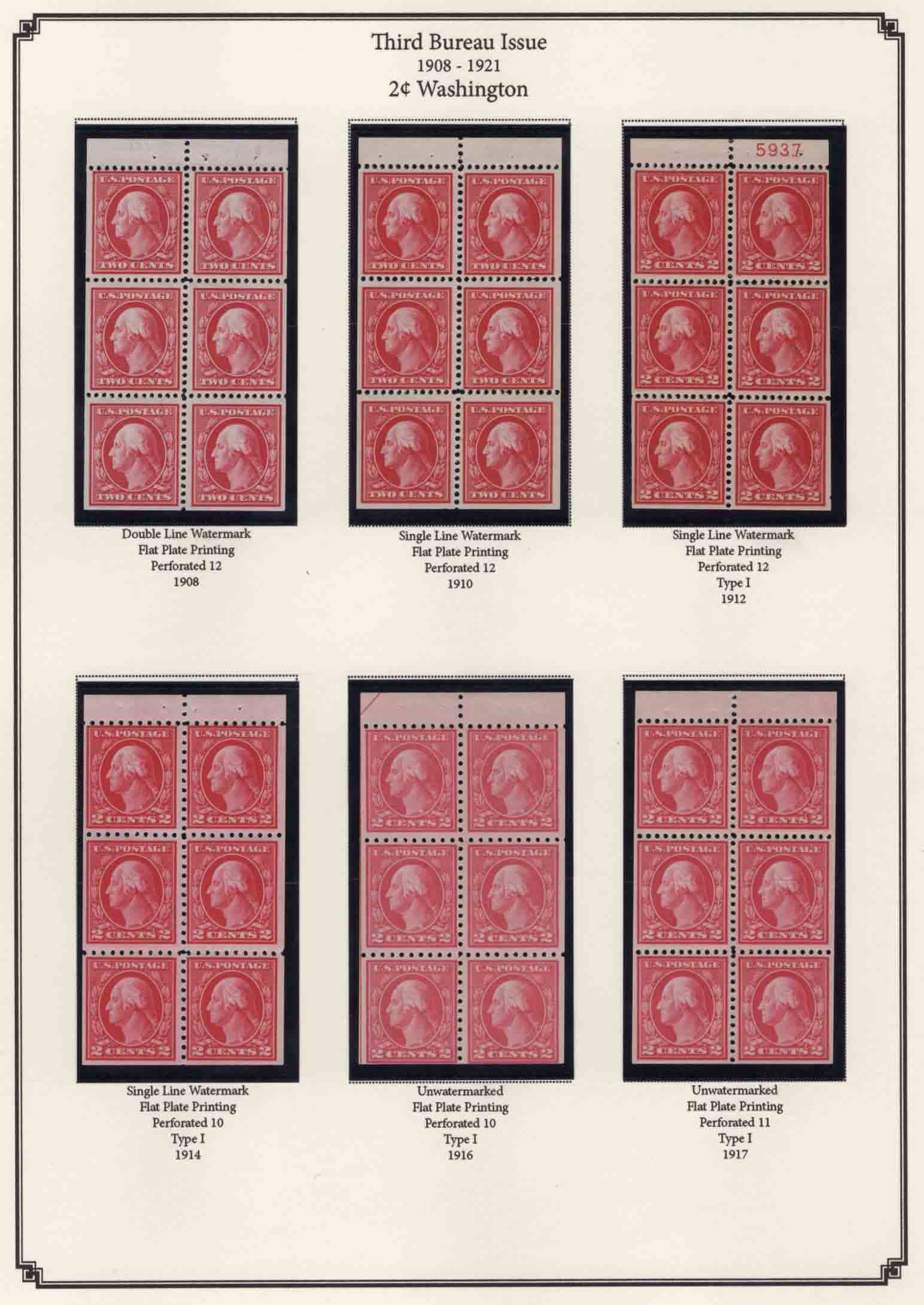
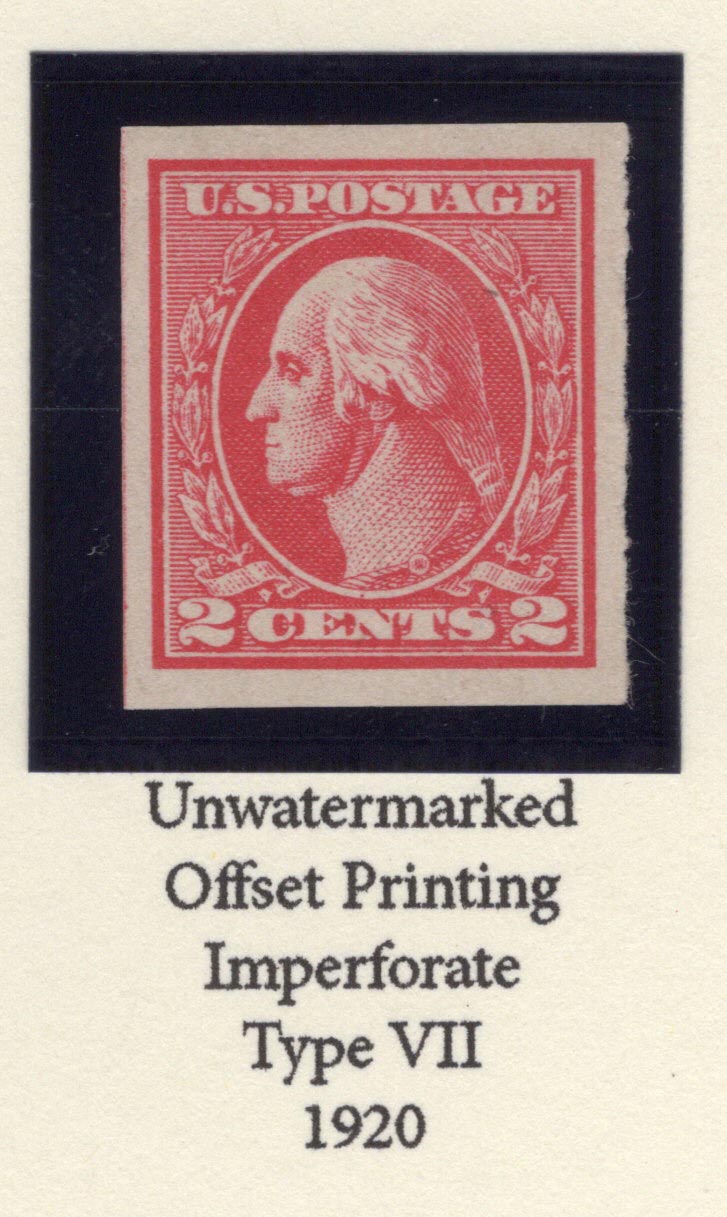
To add a tangent to cjpalermo's post ... some of the crowding effect is due to repeated wording, which is often typical of album page design. For example, the offset page above states "Unwatermarked / Offset Printing / 1920" a total of 14 times, and "Perforated 11" and "Imperforate" a total of 7 times each. It is hard to pick out what is the difference from stamp to stamp.
More along the line of exhibit page design where wording tends to be sparse ... include the repeated factors of "Unwatermarked / Offset Printing / 1920" only once in a header and "Perforated 11" and "Imperforate" in two subheaders for the two groups of stamps, then the individual differentiating type information below the stamp to make the stamps stand out more - rather than being buried in a sea of nearly repetitious labels.
But of course each collector has his own preferences. |
|
Send note to Staff
|
|
|
Valued Member
United States
55 Posts |
|
|
Pillar Of The Community

United States
1951 Posts |
|
|
Philazilla,
Don't change a thing. Looks beautiful. Am envious.
Jack Kelley |
|
Send note to Staff
|
|
|
Valued Member
United States
216 Posts |
|
|
Pillar Of The Community
United States
805 Posts |
|
|
I thought this posted before, but I don't see it. . . .Thank for the advice on cleaning up these pages. I think I will update them. I'll need to make a lot of updates. . . it isn't just the 2c or just the 3rd Bureau. but If I can get these arranged, the others should be a lot easier. |
|
Send note to Staff
|
|
|
Valued Member
97 Posts |
|
|
Others have given good constructive criticism. But FWIW I find your pages are very nice as is. The verbose descriptions appeal to my desire for consistency. It doesn't bother me at all to see the words "flat plate printing" repeated under every item on a page.
The page of booklet panes in particular strikes me as a crystal clear illustration of the changes the BEP made to the "normal" production standards during this period. Thanks for sharing. |
|
Send note to Staff
|
|
|
Valued Member
224 Posts |
|
|
Pillar Of The Community
Canada
1462 Posts |
|
|
Replies: 27 / Views: 2,728 |
|