| Author |
 Replies: 27 / Views: 2,726 Replies: 27 / Views: 2,726 |
|
|
|
Pillar Of The Community
United States
805 Posts |
|
|
Pillar Of The Community
United States
805 Posts |
|
|
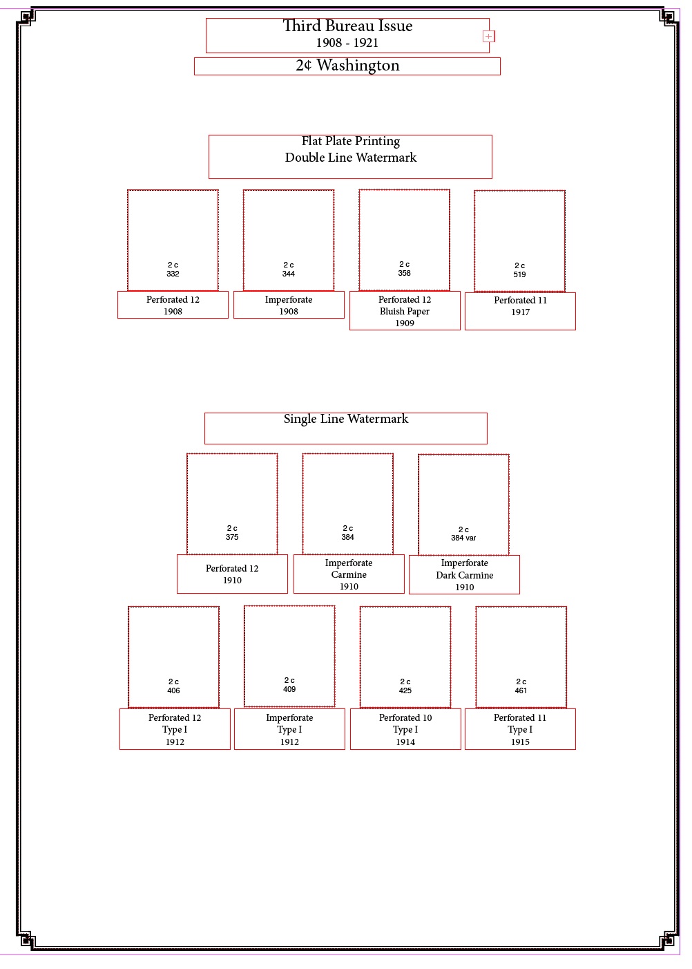
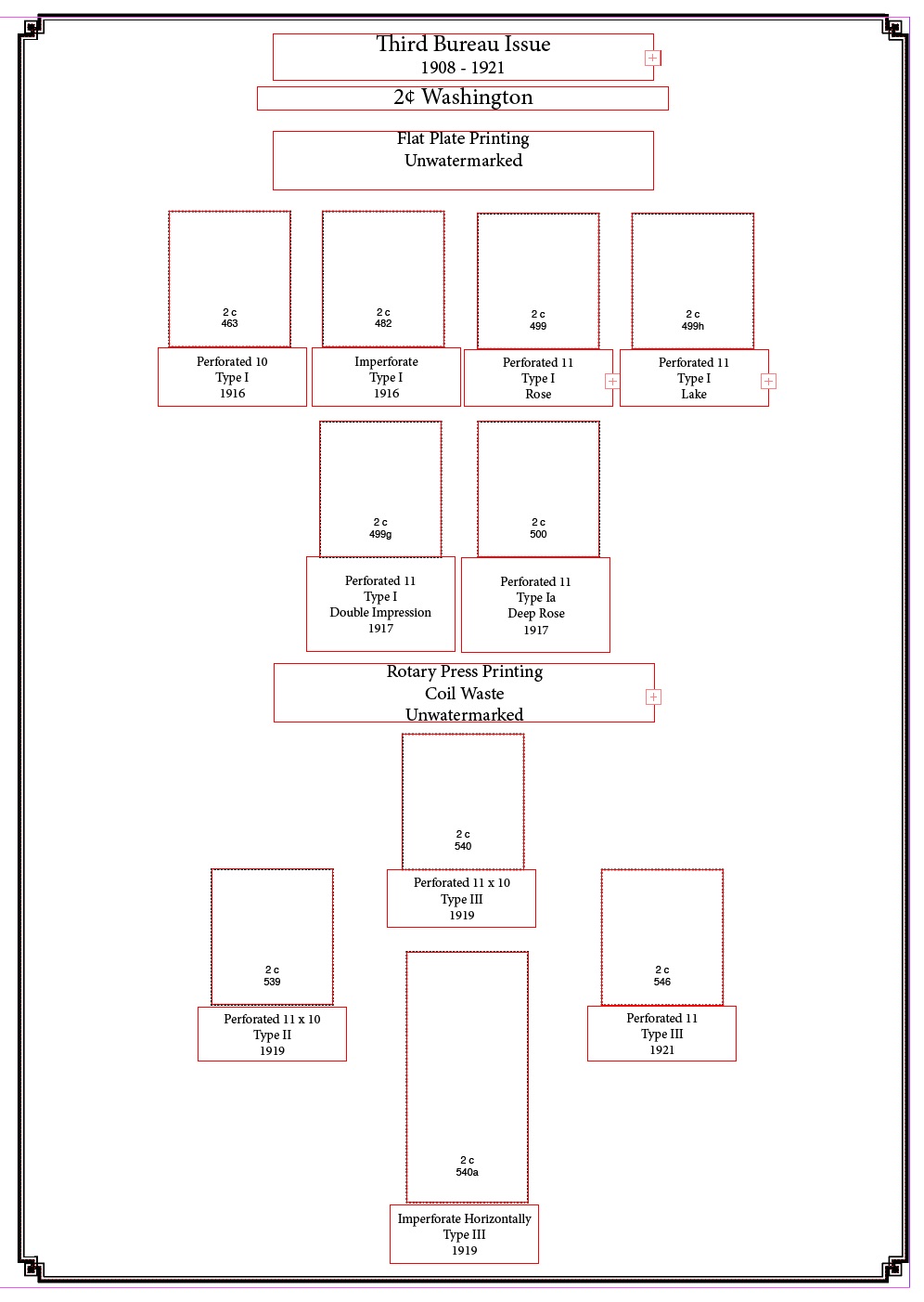
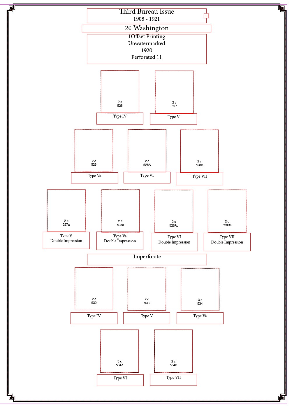
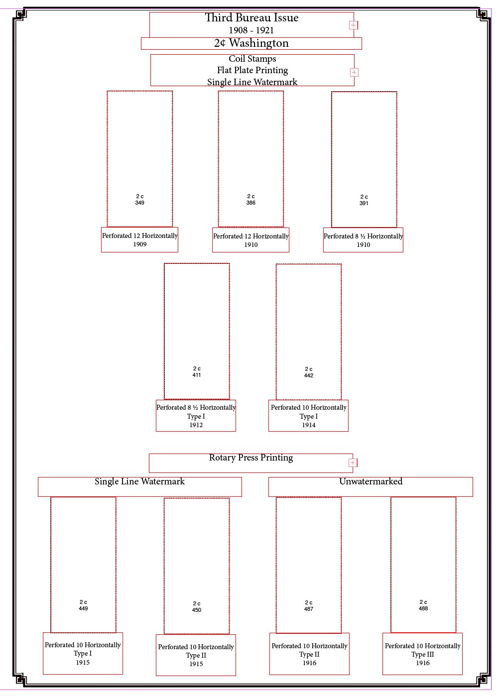
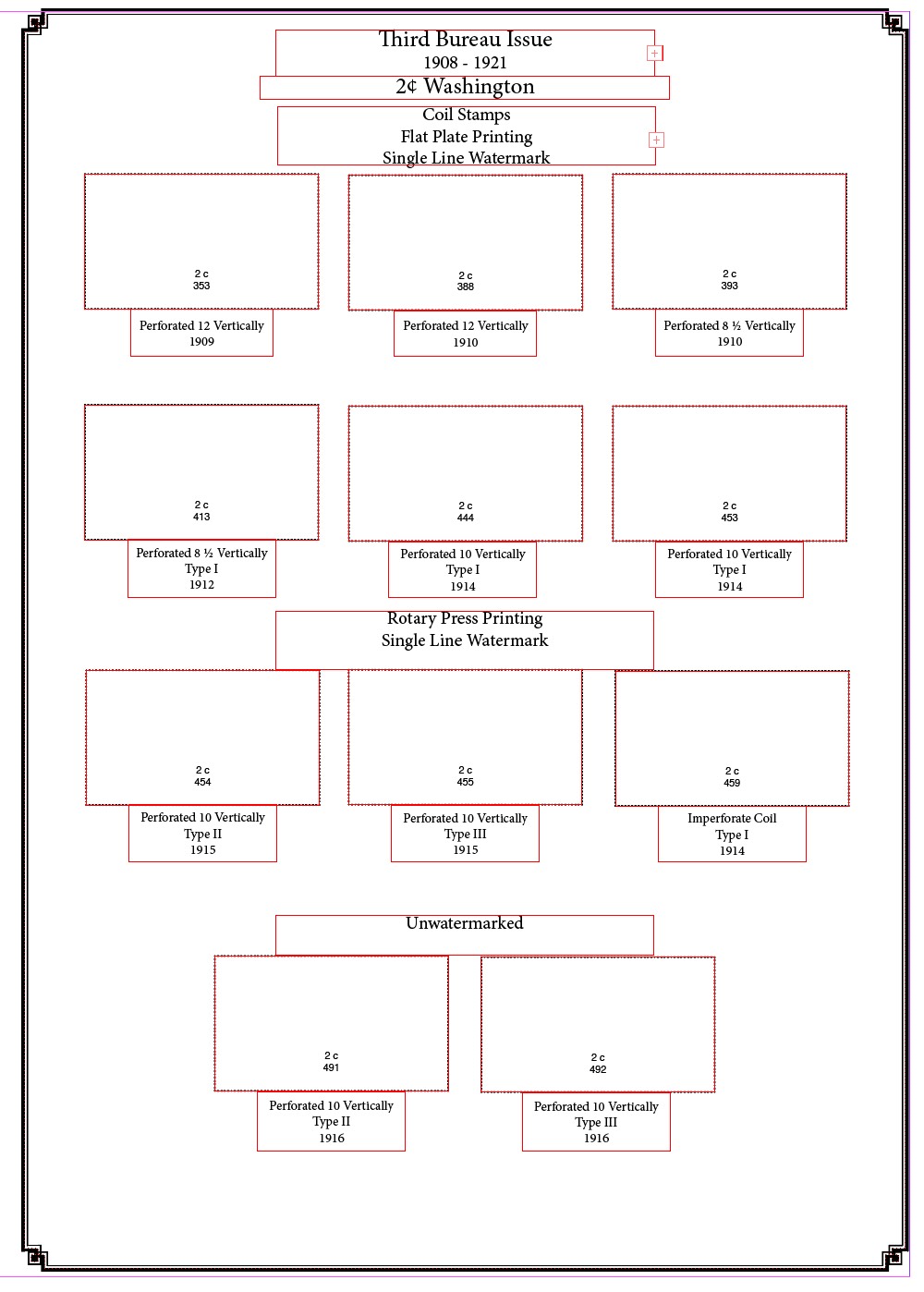
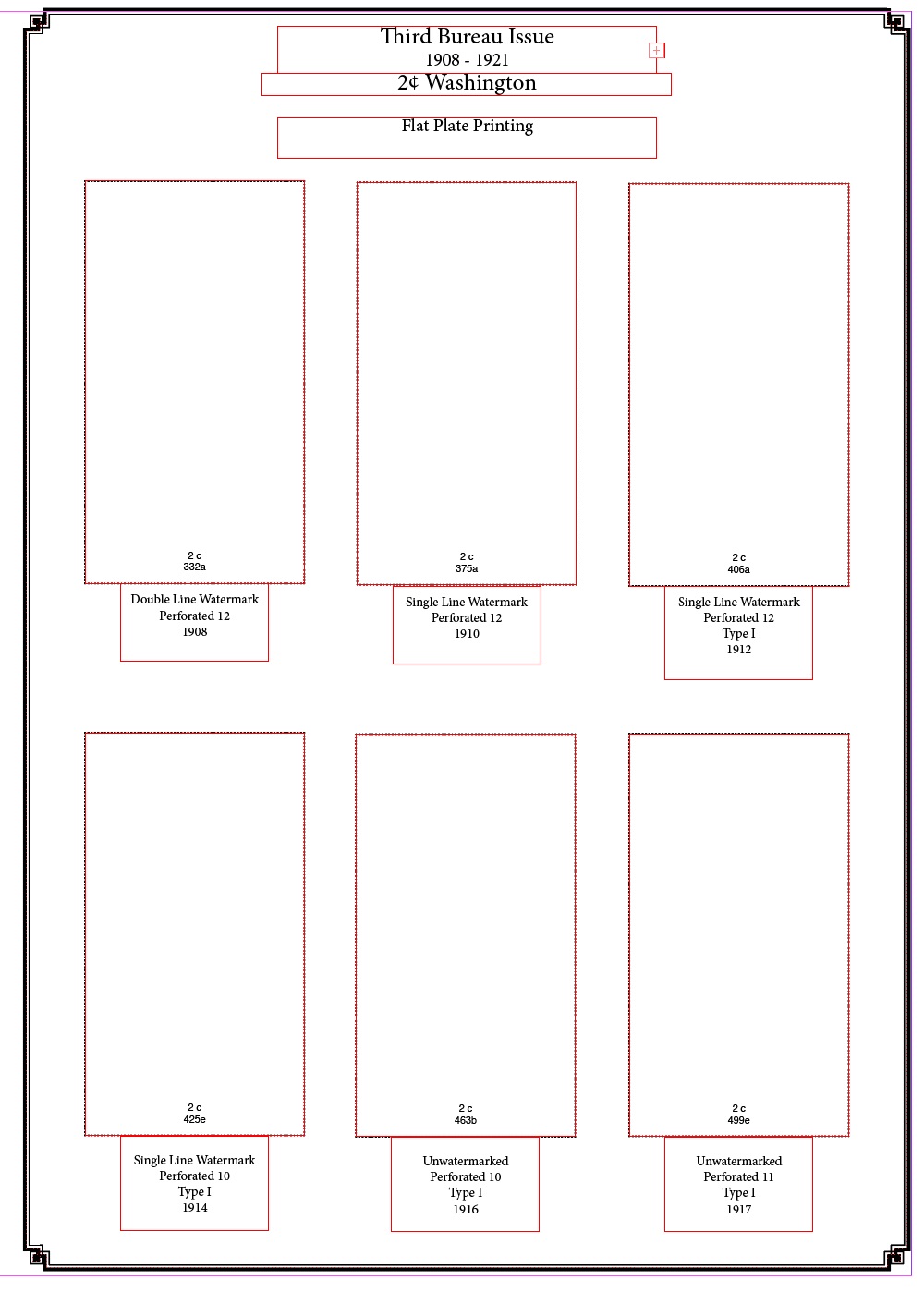
Putting headers is actually harder on the less complicated denominations since there are fewer varieties and fewer stamps to go under possible headings. Here's my layout for the 5c stamp. 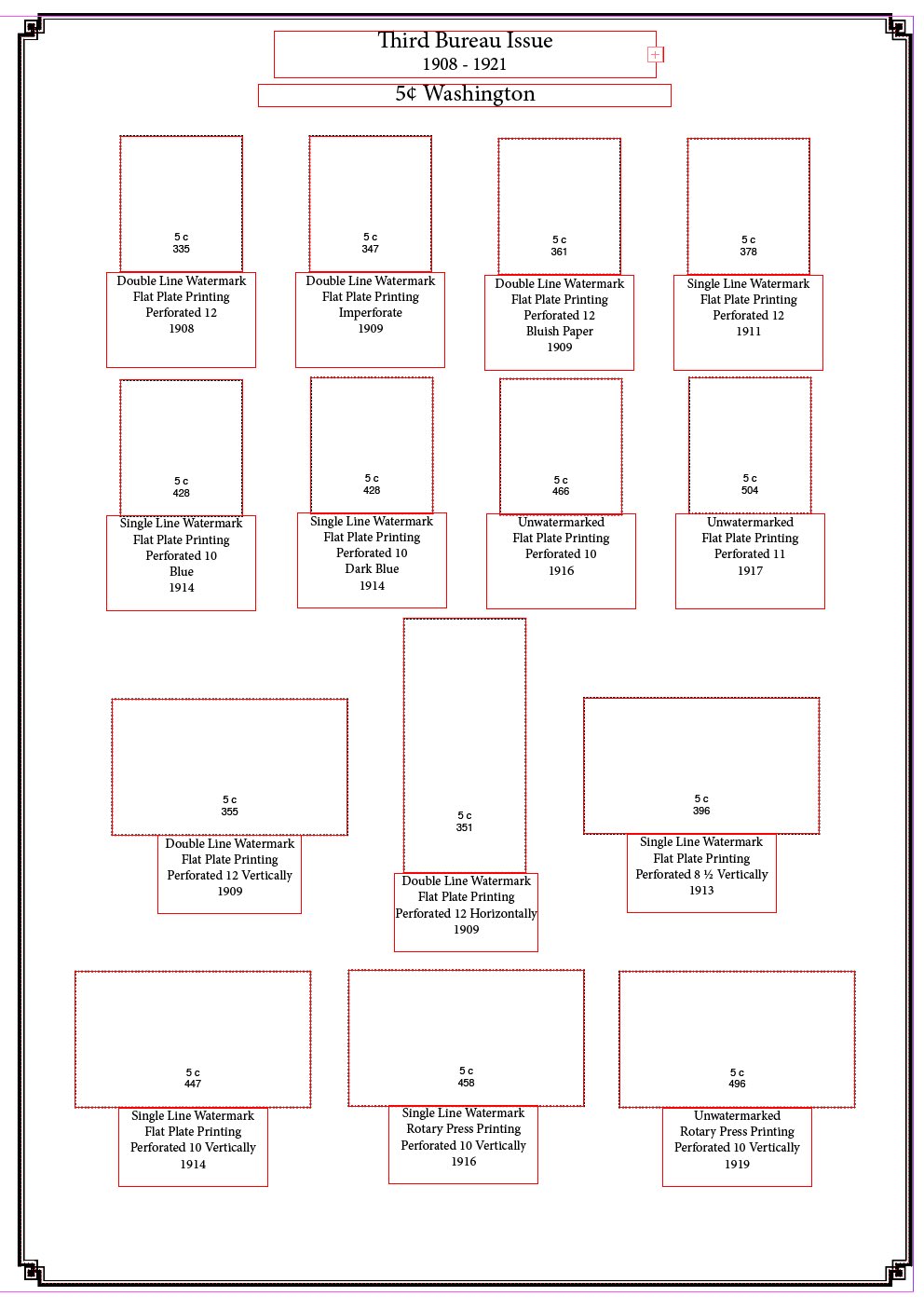 |
Send note to Staff 
|
|
|
Pillar Of The Community
6330 Posts |
|
|
Yes, that would be a layout using headers containing common information to decrease the amount of repetition - particularly noting the page for the offset issue, the decrease of words lets the stamps shine through as the stars rather than the text. (My opinion of course, your mileage may vary.)
On another tangent ... any reason to mount denomination by denomination? Again using the offset printings ... why not have the 1 cent and 3 cent stamps with the 2's?
Bottom line, you have to mount your stamps the way which pleases you. Any dozen collectors would do it a dozen different ways. |
|
Send note to Staff
|
|
|
Pillar Of The Community
United States
805 Posts |
|
|
I prefer to show the variations on a design together. The conventional way of pages by catalog number / sets results in multiple boring near-identical pages, and no room for creativity. I like to see (and collect) varieties, including colors, interesting plate variations, errors, etc. I think the Scott catalog is super inconsistent about what gets catalog numbers (major and minor), what gets noted as varieties,etc. I consider all of these stamps to be varieties of the same stamp - just like I do the colors, plate positions, and perforation varieties of the 1851 issues. This method lets me easily incorporate a new "find" into my collection, and also allows me to skip varieties that I'll never have. I intend to fill every space someday, but I don't even make a space for, say, a 363 (the $85K 8c blue paper). |
|
Send note to Staff
|
|
|
Bedrock Of The Community
12569 Posts |
|
|
Phil - I like both of your layouts. The issue that I have with these stamps in general is that they do all look the same. They end up looking like pages of the same thing repeated. You cannot see a watermark and flat plate vs rotary is not readily apparent. The major thing though that I like about these stamps are the Types and lets face it, unless you know what sets apart a Type VI from a Type VII or a Va from a V you are looking at the same darn stamp. You need a magnifying glass and a good reference book for it to mean anything. That is why I stick with conventional layout. I am not being critical of your presentation. For a knowledgeable collector it is awesome. For myself if I ever went in the direction that you did I would probably add an illustration of each Type on the page(s) and put rotary and flat plate dimensions on as well. The other thing that I would do is add the relevant certificate info to each stamp space. I might give it a try. On the other hand non-collectors do not look at my albums so why bother? Thoughts? |
|
Send note to Staff
|
|
|
Valued Member
United States
10 Posts |
|
|
I have always wanted to do this with the Washington/Franklin series. I really like your pages. Great job. Are you willing to share your other pages? |
|
Send note to Staff
|
|
|
Pillar Of The Community
United States
805 Posts |
|
|
Well, nobody looks at my pages unless I post them here. An occasional relative will humor me. They always want to know how much they are worth, and which one is the most expensive. I do like telling people that "that one is worth about 50 cents. . . .and that one there that looks exactly the same, except that it has a different number of ink dots under Washington's nose, is worth $2000."
Adding cert information right on the page is an interesting idea, but that takes up more real estate, but might be interesting to see, but that seems like displaying catalog numbers. . .maybe useful, but unnecessary. I definitely don't like albums that have the actual certs included. . .those looks like albums of certs, not stamps. . .useful only if you want to buy them.
Without the varieties, even the face-indistinguishable ones, I'd be done with my US collection since chasing Scott numbers is silly since the only way to even get close is to be a billionaire who was born at the right time to be collecting stamps when the previous billionaires want to give up their one-of-a-kind rarities.
I can share other pages. Which ones do you want to see? I've organized all my stamps this way - not just the 3rd bureau.
|
|
Send note to Staff
|
|
|
Valued Member
224 Posts |
|
|
Have you done anything with vignette shifts of US classics? If so, would love to see how you've handled. Thanks for sharing! |
|
Send note to Staff
|
|
|
Valued Member
United States
94 Posts |
|
|
Pillar Of The Community
United States
805 Posts |
|
|
I only have a handful of vignette shifts on the C3. I have not collected others. I have a fast plane and a low plane, but not a grounded one. I might have a high one - would need to check. |
|
Send note to Staff
|
|
|
Valued Member
224 Posts |
|
|
Reason I ask is that I have about 50 mint or unused #294's and I'm thinking about whether to build a page display showing the progression of shifts. Not sure how interesting it would be to do. I have some shifty #295's as well, but not nearly as many. Thoughts/suggestions welcome! |
|
Send note to Staff
|
|
|
Valued Member
United States
10 Posts |
|
|
Philazilla,
Interesting to know you do all your stamps organized in this way. I have only started creating my own album pages, and I applaud your efforts.
I would be interested in seeing all your Washington/Franklin pages. Plus, purhaps an example of another page(s) other than the W/F that you are especially fond of. |
|
Send note to Staff
|
|
|
Replies: 27 / Views: 2,726 |
|