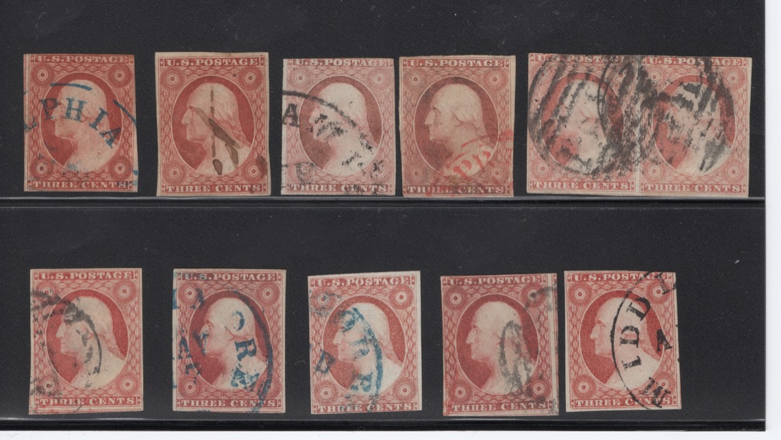
Followup:
top stamp left side is initial specimen (10a- thanks txstamp and others for nailing it down)
now placed next to comparable 11/11as
Richness of OB is more obvious when you scan next to multiple other 11s. (at least on my computer screen!) When asking color questions in future, such as Scott 1, Scott 10/11, pinks, etc, I think we should be placing specimen next to multiple others to compare. Color is just so difficult without comparisons unless you are a super specialist and seen thousands. Not here to get into discussion re: image processing and different screens, scanners, etc.
by the way, green cancel in lower row is fake (imho)
Just think I should have posted initially next to other 11s and this 10a would be easier to see. Because it was on a piece and I had to soak it off, it did not cross my mind initially.