Stamp Community Family of Web Sites
Thousands of stamps, consistently graded, competitively priced and hundreds of in-depth blog posts to read


Stamp Community Forum
 
Username:
Password:
Save Password
Forgot your Password?

This page may contain links that result in small commissions to keep this free site up and running.

Welcome Guest! Registering and/or logging in will remove the anchor (bottom) ads. It's Free!

Finland 1921 Overprint 30 P Variety

 
To participate in the forum you must log in or register.
Author Previous TopicReplies: 3 / Views: 918Next Topic  
Valued Member
Canada
78 Posts
Posted 04/30/2020   4:22 pm  Show Profile Bookmark this topic Add Vanchester to your friends list Get a Link to this Message
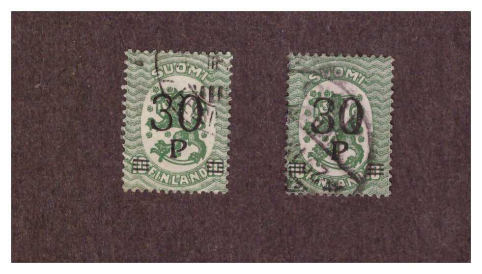
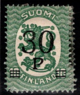
Hello all. I have these 2 overprints that are definitely different with the right stamp having a thicker 3 than the left stamp. Since I am not a serious Finnish stamper just wondering if someone out there has any information on this particular variety.


*** Moved by Staff to a more appropriate forum. ***
Send note to Staff

Pillar Of The Community
United States
7239 Posts
Posted 04/30/2020   4:36 pm  Show Profile Bookmark this reply Add bookbndrbob to your friends list  Get a Link to this Reply
Neither Facit nor Norma catalogs mention such a variety. The skips on the bars and the overly thin numerals seem to indicate underinking.
Send note to Staff  Go to Top of Page
Pillar Of The Community
Learn More...
United States
808 Posts
Posted 05/01/2020   9:31 pm  Show Profile Bookmark this reply Add EMaxim to your friends list  Get a Link to this Reply
Looks to be Scott #123, from 1921, wch would be Michel #107, Yvert #95. None of these says anything about varieties of the surcharge for the 30P on the 10. Scott and Michel, however, do mention thick and thin varieties of the 2 for the 1 ½ M value. So perhaps there were other examples of under-inking.

Here's my copy for comparison:


Seems more like your thicker version, no?
Send note to Staff  Go to Top of Page
Edited by EMaxim - 05/01/2020 9:32 pm
Pillar Of The Community
United States
1017 Posts
Posted 05/02/2020   12:03 am  Show Profile Bookmark this reply Add billsey to your friends list  Get a Link to this Reply
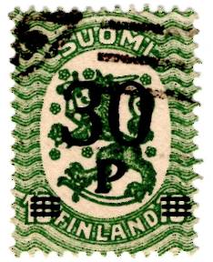
And here is mine:

I wouldn't be surprised if there weren't lots of variation in the inking as these were printed. The thick/thin 2 in the 1½M is an actual difference in the lettering.
Send note to Staff  Go to Top of Page
  Previous TopicReplies: 3 / Views: 918Next Topic  
 
To participate in the forum you must log in or register.

Go to Top of Page

Disclaimer: While a tremendous amount of effort goes into ensuring the accuracy of the information contained in this site, Stamp Community assumes no liability for errors. Copyright 2005 - 2026 Stamp Community Family - All rights reserved worldwide. Use of any images or content on this website without prior written permission of Stamp Community or the original lender is strictly prohibited.
Privacy Policy / Terms of Use    Advertise Here
Stamp Community Forum © 2007 - 2026 Stamp Community Forums
It took 0.11 seconds to lick this stamp. Powered By: Snitz Forums 2000 Version 3.4.05