| Author |
 Replies: 3,821 / Views: 252,950 Replies: 3,821 / Views: 252,950 |
|
|
|
Valued Member
United States
60 Posts |
|
|
Oiman, a quick look at the blue Franklin..........recut oval lines both top and bottom? |
Send note to Staff 
|
|
|
Valued Member
United States
144 Posts |
|
|
The Franklin I posted with the red cancel is almost certainly a 9/Type IV yes |
|
Send note to Staff
|
|
|
Valued Member
United States
342 Posts |
|
|
I recently became the proud owner of this cover. It was described as a Scott #26. I scanned it, checked it out, and it is a Scott #25A. Anyone want to assist with plating it? I could use a confirming opinion. Or a contrary opinion, if that is all you have. I came up with 75R3 - so it isn't like I didn't put in any time on it. My internet has been extremely slow this evening and it has become grueling to continue checking other examples to rule them out. Enjoy this beauty! And thanks in advance! Stan Shepp 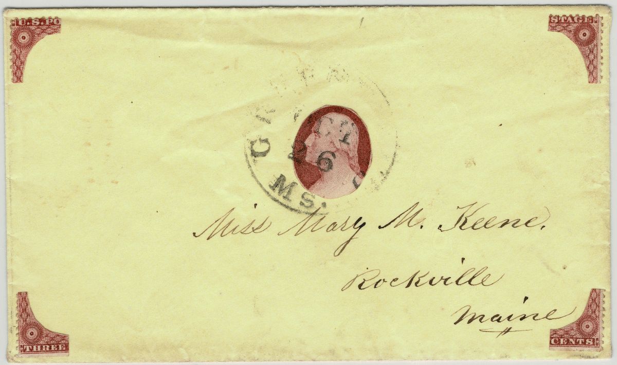 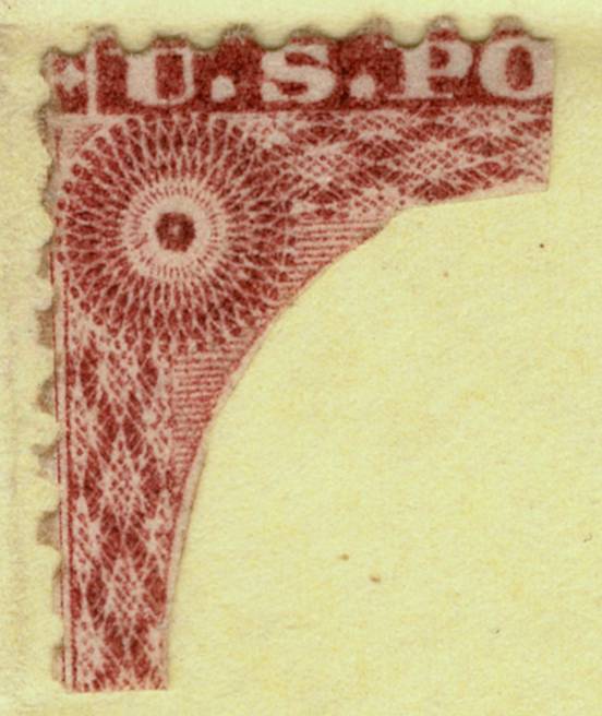 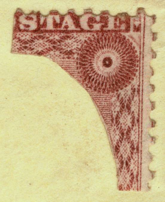 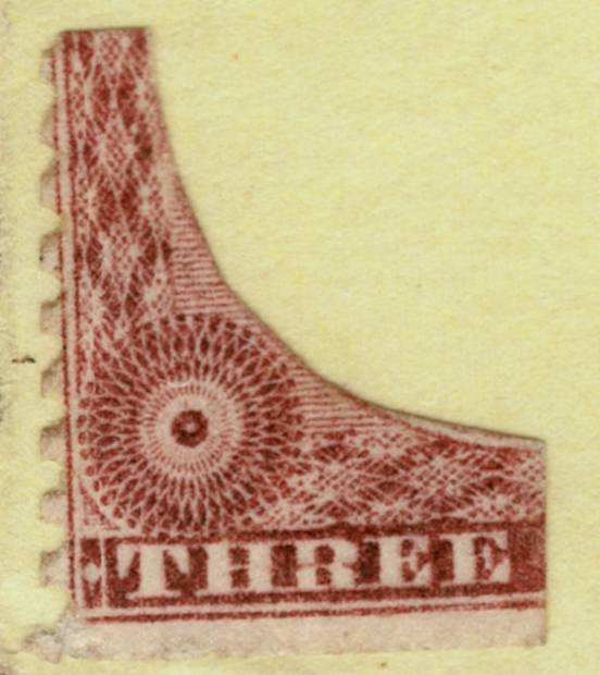 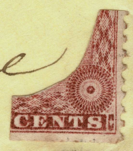 |
|
Send note to Staff
|
Stan Shepp |
|
|
Valued Member
United States
342 Posts |
|
|
Oops. It is perforated. Wrong thread.
You would think that I could tell the difference between perforated and imperf.
:( |
|
Send note to Staff
|
Stan Shepp |
|
|
Pillar Of The Community
United States
2230 Posts |
|
|
Here's a partial reconstruction of the Toppan, Carpenter, Casilear & Company imprint on the right pane of plate 4, positions 50R4 and 60R4. I acquired the 50R4 showing the plate number in 2017, and the 60R4 last month. Carroll Chase wrote in his book, In October, 1854, Casilear left the firm, the name being changed to Toppan, Carpenter & Company. But it was not until more than two years later (1857) that the attempt was made to omit the name "Casilear" from the imprint.The earliest documented use of a stamp from plate 4 was on March 28, 1855.  |
|
Send note to Staff
|
|
|
Valued Member
United States
144 Posts |
|
|
I got this 11A with a cancel I've been trying to identify for a while. It is blocky red lettering, and I originally thought it said WAY, but now I am considering it could be STEAM was well. It doesn't help that the original cover is not present, but I am curious if anyone has seen anything similar to this cancel. 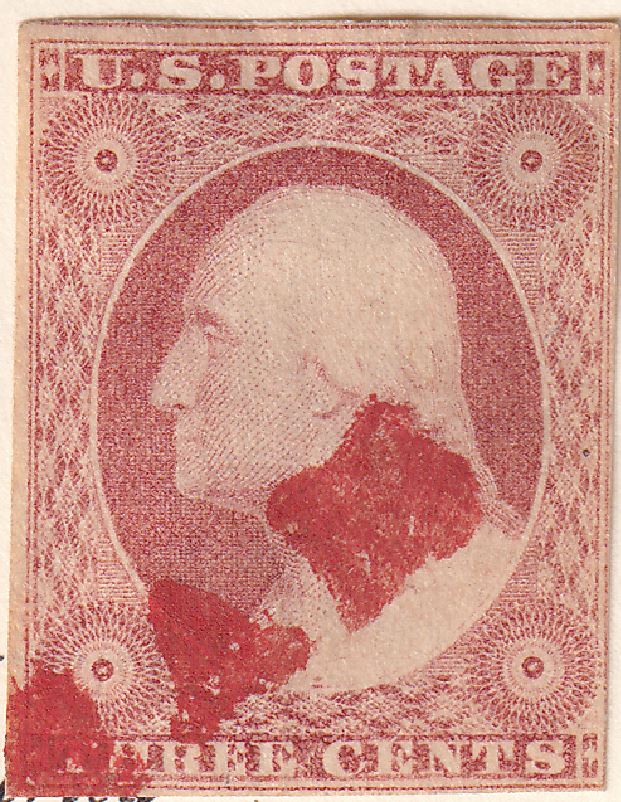 |
|
Send note to Staff
|
| Edited by Oiman - 10/27/2024 9:17 pm |
|
|
Pillar Of The Community
United States
4166 Posts |
|
|
Valued Member

United States
327 Posts |
|
|
Classic Coin,
Very nice pair showing the imprint with plate number. I saw that Siegel's auction last weekend had a stamp that would match up nicely with one of these.
Oiman,
My guess is "EAM" in steam. |
|
Send note to Staff
|
|
|
Pillar Of The Community
United States
2230 Posts |
|
|
Thanks for the note on last weekend's Siegel auction, Harper1249. I took a look at it today. Closing bids on some of the orange browns seemed kind of low. |
|
Send note to Staff
|
|
|
Pillar Of The Community
United States
2230 Posts |
|
|
Here's a #11 from position 3L4 showing a faint gash on shoulder. The color is a deep shade of purplish claret, although the scan makes it look more brown than it actually is. 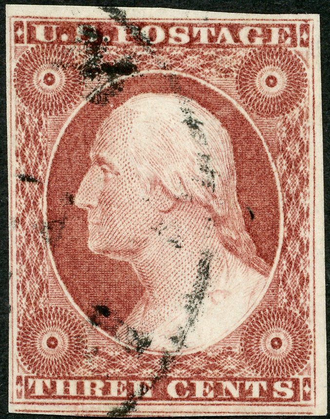 |
|
Send note to Staff
|
|
|
Pillar Of The Community
United States
2230 Posts |
|
|
If anyone has any more information on this blue Colliersville CDS, I would appreciate you sharing it. This stamp is from a bulk lot I bought at a September stamp show that had a lot of Memphis, Tennessee, postmarks in it. There is a Collierville, (without an S) Tennessee, which is a suburb of Memphis, and Wikipedia mentions some history of Collierville, Tennessee, being spelled both ways. There are communities named Colliersville in New York and Pennsylvania. However, the blue line in the bottom of the CDS looks more like part of an N (TEN or TENN) than part of a Y or A to me. 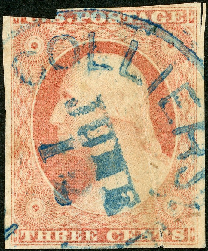 Here is a 97R1L 98R1L pair from the same lot, possibly with a Nashville cancel. 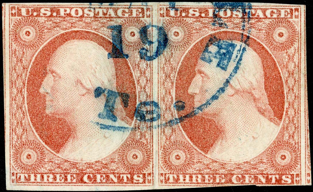 |
|
Send note to Staff
|
|
|
Pillar Of The Community
United States
2230 Posts |
|
|
Here is an 11A, position 14R1L. It appears to be a fairly early printing from plate 1L, with a color that looks closest to claret, but the ink texture doesn't look like the ink of the early 1852 clarets or the late 1852 clarets in my collection. I thought it might be a deep rose red, but that would place this printing at least a year and a half into the life of plate 1 late, and this stamp isn't showing much wear in the triangles. There is a short TA in POSTAGE variety on plate 1L due to heavy recutting along the top of the top label block (6L1L for example). This 14R1L shows the typical heavy recutting along the top of the top label block and the upper-right diamond block, but the recutting has noticeably shortened the G in POSTAGE on 14R1L. The documented recut varieties for 14R1L are as follows: Variety #1 – Two Inner Lines Variety #23 – Left Inner Line Runs Up Too Far Variety #28 – Top Label & Upper Left Diamond Block Joined at Top Variety #29 – Bottom Label & Lower Right Diamond Block Joined at Bottom  |
|
Send note to Staff
|
|
|
Pillar Of The Community
United States
2947 Posts |
|
|
CC I'll have to look and see if I have this position.
Could it be the print quality that's giving the look of flattened letter tops? On a sharper printing the recut upper label would be sharper and may not have the appearance of intruding on the tops of the letters. That's more a question than a statement. |
|
Send note to Staff
|
|
|
Valued Member
97 Posts |
|
|
Pillar Of The Community
United States
2230 Posts |
|
|
Thanks for your observations, stampcrow. Thanks for the 14R1L image, ttreen. The ink/print quality on the ttreen stamp is better than on my stamp, and I see a slight shortening of the G on the ttreen stamp. Since the engraver's burin was V-shaped or wedge-shaped, the tool likely shaved off part of the top of the G during recutting. Maybe the ink on my stamp spread a little further into the top of the G due to wiping or natural spreading of the ink after removal of the paper from the plate. The composite image below shows a #10A at the top showing no shortening of the G, with our two stamps below.  |
|
Send note to Staff
|
|
|
Replies: 3,821 / Views: 252,950 |
|



 Posted 10/10/2024 10:31 pm