| Author |
 Replies: 3,764 / Views: 245,429 Replies: 3,764 / Views: 245,429 |
|
|
|
Pillar Of The Community
United States
2226 Posts |
|
|
Pillar Of The Community
United States
3489 Posts |
|
|
Oct 1852 is a fairly early use of the 1c Ty IV, #9.
Really early ones are rarities.
EKU June 5, 1852.
The color is not the rich absolute earliest color, but quite close - just a bit less deep than the very early color.
I also quite like circulars that have an indication on the front of "circular" as this one does. |
Send note to Staff 
|
|
|
Pillar Of The Community
United States
2226 Posts |
|
|
txstamp, Thanks for sharing your expertise and observations. I don't have a lot of experience with the 1-cent imperforates.
I've plated most of the ones in my collection, but haven't taken a crack at this one. |
|
Send note to Staff
|
|
|
Pillar Of The Community
United States
606 Posts |
|
|
Pillar Of The Community
United States
939 Posts |
|
|
I'm a fan of the leap year cds! That's pretty sweet!
Thanks for sharing, ioagoa. |
|
Send note to Staff
|
|
|
Pillar Of The Community
United States
2226 Posts |
|
|
I like the leap year CDS, too. A scarce cancel, and a nice strike. Thanks for showing it, ioagoa. |
|
Send note to Staff
|
|
|
Pillar Of The Community
United States
3489 Posts |
|
|
Pillar Of The Community
United States
1162 Posts |
|
|
I, too, am a fan of calendar collections. Of course the hard ones are the gems in the collection - IF you have them. As you do, it appears, ioagoa. the tough ones are so scarce that (like other scarce things in the 3c 1851's - plums, pinkishes, yellow cancels, FDU's, etc) one usually must 'settle' condition-wise for whatever can be found. Your 3 toughies, though, look to be premium examples - you must have looked hard and long. Congrats on those beauties, and thank you for sharing! |
|
Send note to Staff
|
|
|
Pillar Of The Community
United States
606 Posts |
|
|
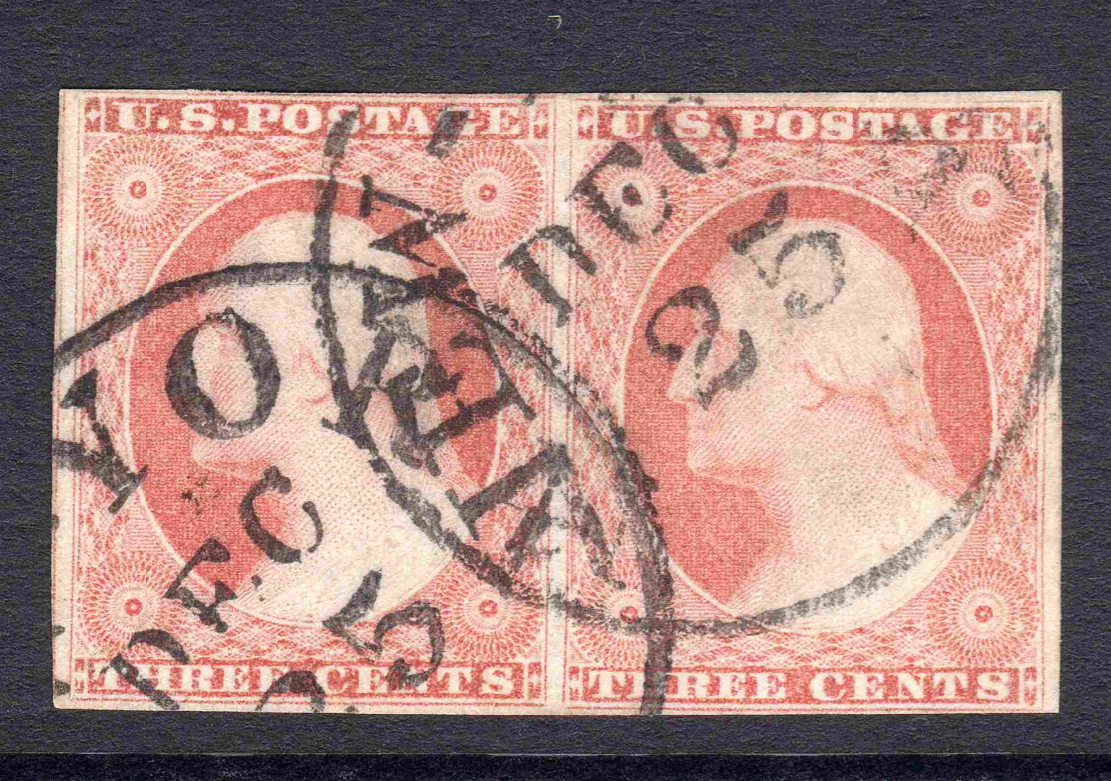
Here is an interesting variety of impression -- Scott #11A in a block of 4 -- positions 85-86R3 // 95-96R3 with black segmented grid cancels and typical 1852 brownish carmine color. The interesting thing about this block is that the bottom half of 95-96R3 is wiped too clean (and thus under inked) -- and the entire block is also a bit of a dry print. Regarding recut varieties -- 86R3 is a nice example of recut variety #15 -- one vertical line recut in the URT -- and 95R3 shows a combination of recut varieties #11, #16, and #17 -- one vertical line recut in each of the ULT, LLT, and LRT, respectively (although a couple of these recuts might be hard to see due to the 200kb SCF file size limit). Note -- the usual disclaimer regarding identification of colors vis-à-vis online scanned images applies. More specifically -- because of variations in scanner settings, and because different display screens render colors differently, this image is not suitable for confirming colors of other stamps in hand or in other images. Regards // ioagoa 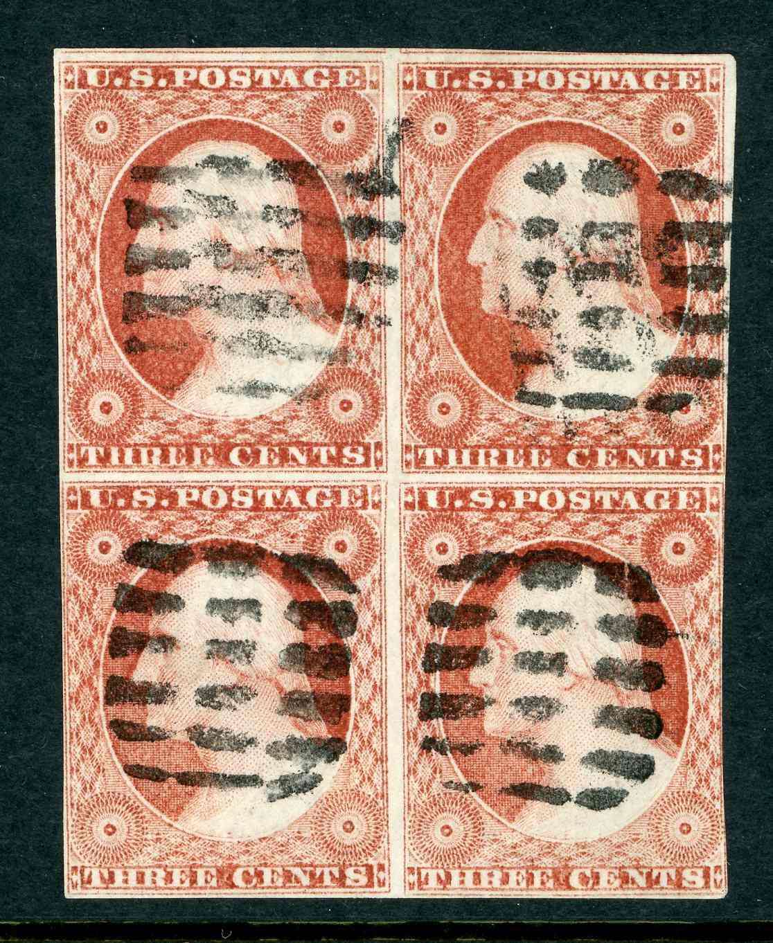 |
|
Send note to Staff
|
|
|
Pillar Of The Community
United States
2942 Posts |
|
|
Great block!! It's like a color fade top to bottom because of the plate wiping. Very nice.
Something I don't know is the postal history of, what would 12 cents be paying for? |
|
Send note to Staff
|
|
|
Pillar Of The Community
United States
3489 Posts |
|
|
Could be overweight - 4X rate.
Before about Apr? 1855 a 2X 6c rate over 3000 miles.
Part of some foreign mail rate, etc... |
|
Send note to Staff
|
|
|
Pillar Of The Community
United States
2226 Posts |
|
|
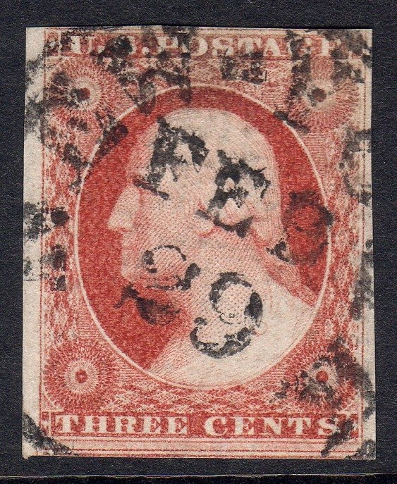
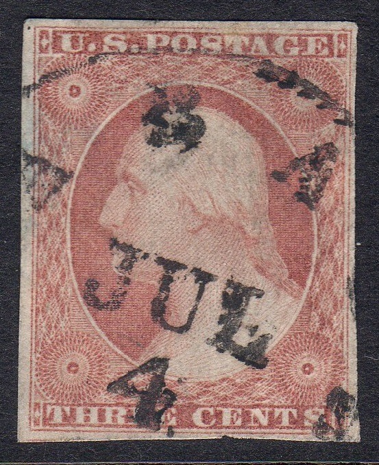
ioagoa, Your block of four is a superb showpiece! With all the different recuts, it would be textbook material for plating 101! Thanks for showing it. The under-inking of the bottom label blocks reminded me of some images I posted four years ago here: https://goscf.com/t/51392In that post, I noted that on some under-inked printings, consistent radial lines could be seen coming from under the C of CENTS. ttreen confirmed that these gouges were on the master die, as they can be seen on India proofs. Here are three of those images reposted, with one new image:     |
|
Send note to Staff
|
|
|
Pillar Of The Community
United States
606 Posts |
|
|
Hi ClassicCoins -- Those concentric radial lines to the left of the C of CENTS in the bottom label block are really interesting -- and something I have never noticed before you pointed them out. And, you are correct -- they were on the original die -- as I found an image using Siegel's "Power Search" utility of a Panama Pacific small die proof -- Scott # 41P2a (reference Siegel Sale #1116, Lot #3010) that shows these lines very well. The image as downloaded from Siegel is posted below -- along with a cropped image showing only the subject area. Not sure what would have caused this -- but based on the shape of the lines, I suspect that the engraver was using a hand tool in an attempt to deepen the area where there should have been solid color -- and missed a couple of spots -- but again -- only a guess? Thanks again for pointing out this interesting characteristic. Regards // ioagoa 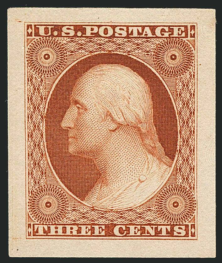  |
|
Send note to Staff
|
|
|
Pillar Of The Community
United States
2226 Posts |
|
|
You're welcome, ioagoa. Thanks for fetching and posting the 41P2a die proof image. It's a nice quality image, and I saved it for future reference. |
|
Send note to Staff
|
|
|
Pillar Of The Community
United States
2226 Posts |
|
|
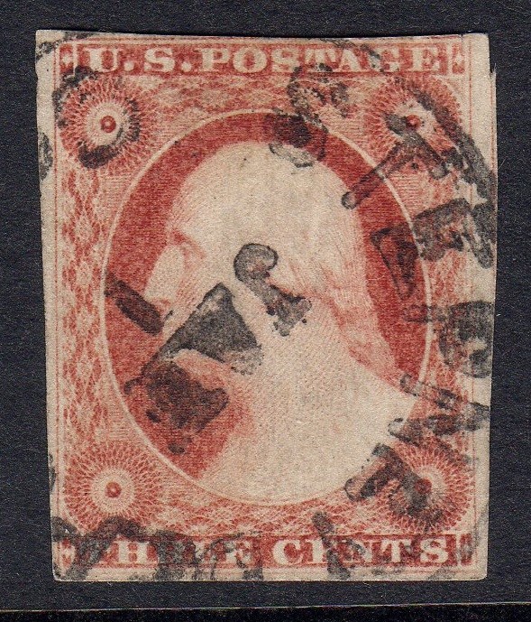
3-cent stamps from position 86R4 have double guide dots at bottom right, and an accidental dot in the top-right corner. 86R4 shows a weak right frame line transferred from the master die via the transfer roll just to the left of the stronger recut right frame line. This isn't classified as an extra line at right position (Variety #10), likely because it is a remnant rather than a recut. The right frame line was simply recut too far to the right at this position.   |
|
Send note to Staff
|
|
|
Replies: 3,764 / Views: 245,429 |
|