| Author |
 Replies: 19 / Views: 1,723 Replies: 19 / Views: 1,723 |
|
Pillar Of The Community
Romania
596 Posts |
|
|
The Mi # 310 stamp (Scott # 270) is registered with a black green overprint. I think it's a mistake. If you have a newer Michel catalog from the 2011 edition, please let me know the color of the overprint. All my stamps have a black overprint. 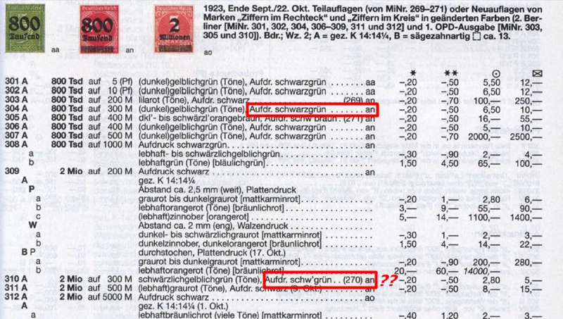 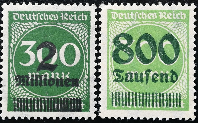  |
|
Send note to Staff
|
|
|
|
|
Pillar Of The Community
United States
764 Posts |
|
|
My 2014 Michel is the same as your catalog. Have you looked at the overprint under magnification? It may not be perfectly black, hence the catalog designation blackish-green.
These stamps were overprinted at 10 different printing shops. Michel does note differences in overprint sheen. If you have the specialized catalog check the 6-page section entitled "OPD-Drucke (sog. Lokaldrucke) 1923". |
Send note to Staff 
|
|
|
Pillar Of The Community
Romania
596 Posts |
|
|
Thank you Germania. I looked with the Bresser minimicroscope at the overprint and I am convinced that it is black. I noticed that the type of overprint is also incorrectly written in the catalog: "an" instead of "ao". I'm curious if the mistake is maintained in a more recent Michel specialised catalog. 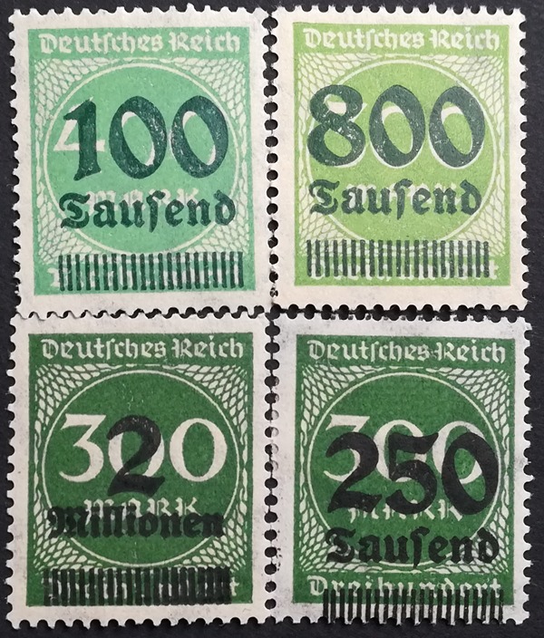 |
|
Send note to Staff
|
|
|
Pillar Of The Community
United States
2830 Posts |
|
|
To my eye, the 100 and 800 do seem to have some green in the overprint. They are noticeably different than the color of the 2 and 250, which appear to be black. |
|
Send note to Staff
|
|
|
Pillar Of The Community
Netherlands
797 Posts |
|
|
Just an observation:
The green color in the overprint is easier to see as green on the bright red, pinkish red en light green stamps.
With the dark green stamps it becomes more difficult and looks black.
The darkness of the stamp is of influence on what color we think we can see
Maybe a simple explanation, but I believe that is all there is.
|
|
Send note to Staff
|
|
|
Pillar Of The Community
Romania
596 Posts |
|
|
Same for me, shermae.
The problem is that in the catalog for the stamp with 2 the color of the overprint is the same as those with 100 and 800 (black-green). |
|
Send note to Staff
|
|
|
Pillar Of The Community
United States
2830 Posts |
|
|
Very interesting thread. Hope others will add additional knowledge to the discussion. |
|
Send note to Staff
|
|
|
Pillar Of The Community
Romania
596 Posts |
|
|
Johan Buvelot-You're right.
That's why I posted the stamp with 2 (black green in catalog) next to the stamp with 250 (black in catalog). The overprints being on the same type of stamp should look different in color. Which is not the case. |
|
Send note to Staff
|
|
|
Pillar Of The Community
United States
764 Posts |
|
|
cupram,
I did some more reading and research.
In the introduction to the Inflation issues in the specialized catalog, entitled "Notausgaben der Hochinflation (24.8.-30.11.1923)" variations in the overprint color is noted. Translated it states:
The overprint color is black, also blue, green and brown, more or less black tones. The black varies between greenish black and brown black. With this, as well as with other differences, for example, matte, shiny and sooty, one can, in part, determine which OPD printed the overprint. The OPD was one of the 10 main post offices. (I called them print shops in my earlier response).
Lastly, "an" refers to the stamp design, not the overprint. "an" is correct. Hope this helps. |
|
Send note to Staff
|
|
|
Pillar Of The Community

United States
809 Posts |
|
|
Thank you, Germania. Nice explanation on all points. Also Johan Buvelot for pointing out the visual effects of the underlying stamp's color. |
|
Send note to Staff
|
|
|
Pillar Of The Community
Romania
596 Posts |
|
|
Germania - Thank you for the translation (I don't know German and it's difficult to translate the comments in the catalog) EMaxim - I consider that I have not yet been convinced of the color of the overprint for stamp 2. The shades for black are very difficult to differentiate if you do not have the stamp and Michel Color Guide under your eyes. 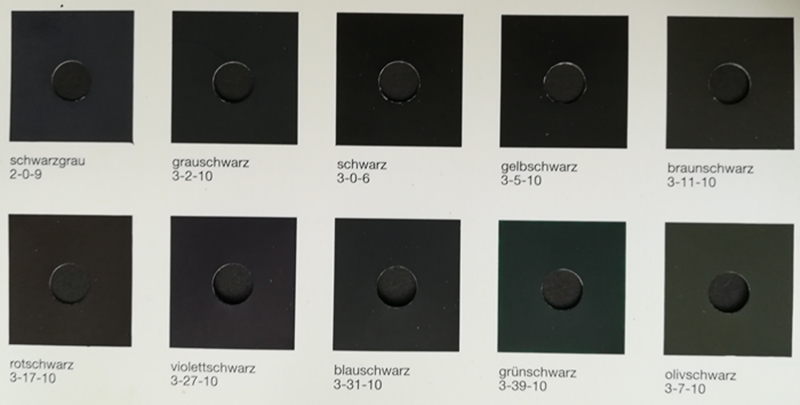 The color of the overprint for the stamp 2 has the main color green and as you can see the difference is big between blackish-green and green-black. 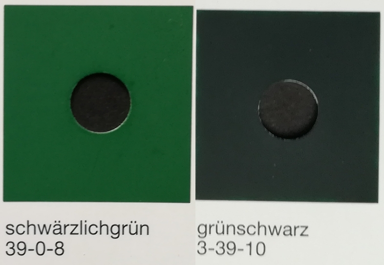 I tried to take pictures with my mobile phone of what my minimicroscop looks like (not very good) but please believe me that the color green is also clearly visible (in the overprint on the left-stamp 800) and in the one on the right you can't see either a shade of green (stamp 2). 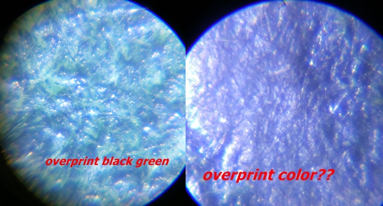 Hence my belief that the overprint of stamp 2 is not blackish green as mentioned in the catalog. |
|
Send note to Staff
|
| Edited by cupram - 07/23/2020 03:10 am |
|
|
Pillar Of The Community
United States
809 Posts |
|
|
I agree that it is always best to have the stamp in question before one's eyes. Nevertheless, the upper right portion of the photo on the right (2 mil.) seems to show some green.
More generally, on stamps this old, that have endured through who knows what conditions, discerning slight differences between shades of black, particularly on an overprint, will generally be difficult and subject to disagreement. If you remain convinced that Michel has in this case erred, you might contact the editors and ask for a correction. If you do, let us know their response.
|
|
Send note to Staff
|
| Edited by EMaxim - 07/23/2020 8:37 pm |
|
|
Pillar Of The Community
Romania
596 Posts |
|
|
The value of these stamps is very small, hence the small interest of the editors of the Michel catalog or of the collectors.
EMaxim-the green color you see is the color of the stamp on which the overprint is printed.
There are 2 answers I hope to receive from German stamp collectors:
1. If after comparing these stamps with overprint they noticed this overprint color difference.
2. Owners of specialized catalog Michel (editions after 2018) to communicate to me the color of the overprint for Mi # 310A.
Thank you in advance.
|
|
Send note to Staff
|
|
|
Moderator

United States
12330 Posts |
|
|
There is limited value in posting color images of stamps. Not only is having the stamp in hand the only reliable way to determine a stamp color, but discussing color without a discussion of ambient lighting is a waste of time. Color is reflected wavelengths which are coming from ambient lighting. Also note that color guides suffer from the same issue as stamps; the inks and colors change over time so the color guides should be replaced every few years.
Don |
|
Send note to Staff
|
|
|
Pillar Of The Community
Netherlands
797 Posts |
|
|
I fully agree with Don.
I would like to add a thougth of me personally.
If enviromental influences makes for changing your color guide regularly, does the same not apply for the stamps themselves.
I understand that back in the day(mostly more than 100 years ago) a lot of color shades were produced and therefore mentioned in catalogues(For instance German Empire).
These colors must also have changed, so it leaves the question if the colors mentioned in catalogues are still up to date and realistic. An overhaul in the future can probably not be avoided.
How? I have to be honoust I do not know. But it is a problem that does not go away, it only becomes more and more difficult with the passing of the years.
|
|
Send note to Staff
|
|
|
Moderator
United States
12330 Posts |
|
|
Agreed, even a piece of steel changes color over time.
I think that technology will one day evolve to be able to do a non-destructive chemical analysis of the inks and paper; only then will we be able to 100% accurately ID stamp colors.
Don |
|
Send note to Staff
|
|
|
Replies: 19 / Views: 1,723 |
|


