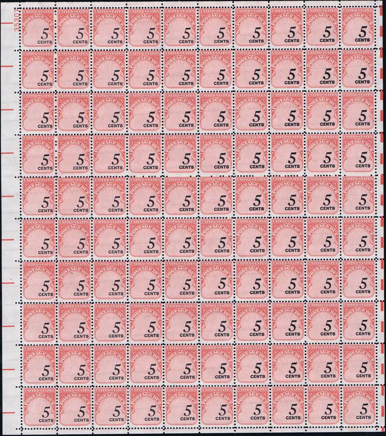
Here's a J93 sheet I just acquired with the denomination offset to right. If you compare position 1 to position 100 you'll see that position 1's denomination is almost touching the frame while 100 is a bit farther to the left. If you compare position 1 with position 90 you'll see that 90's denomination is farther to the left the frame while as I said before 1 is almost touching. If you look from position 90 across to position 100 you'll see that the denominations gradually drifts slightly back to the left which is pretty much the case in all the rows. Also, notice that positions 10 and 20 are more heavily inked than the other stamps in the rest of this sheet.
J93 plate 35307 shinny gum type 1 sheet denomination offset to right
Quote: The whole upper right sheet looks heavily inked.
Very nice!
Thanks. You're right the denominations on the upper right side of the sheet are a bit more heavily inked that the rest. Postage due stamps were only utility stamps and not seen very often by the general public so quality control was not a top priority at best and/or ignored at worse. Here's one of my posts with some examples: https://goscf.com/t/64891&whichpage=3. Please have a look.
Disclaimer: While a tremendous amount of effort goes into ensuring the accuracy of the information contained in this site, Stamp Community assumes no liability for errors. Copyright 2005 - 2026 Stamp Community Family - All rights reserved worldwide. Use of any images or content on this website without prior written permission of Stamp Community or the original lender is strictly prohibited. Privacy Policy / Terms of UseAdvertise Here