Stamp Community Family of Web Sites
Thousands of stamps, consistently graded, competitively priced and hundreds of in-depth blog posts to read


Stamp Community Forum
 
Username:
Password:
Save Password
Forgot your Password?

This page may contain links that result in small commissions to keep this free site up and running.

Welcome Guest! Registering and/or logging in will remove the anchor (bottom) ads. It's Free!

Netherlands 1 Gulden 1898 Or 1899?

 
To participate in the forum you must log in or register.
Author Previous TopicReplies: 6 / Views: 2,060Next Topic  
Valued Member

Netherlands
83 Posts
Posted 02/14/2021   1:57 pm  Show Profile Bookmark this topic Add Bloemzee to your friends list Get a Link to this Message
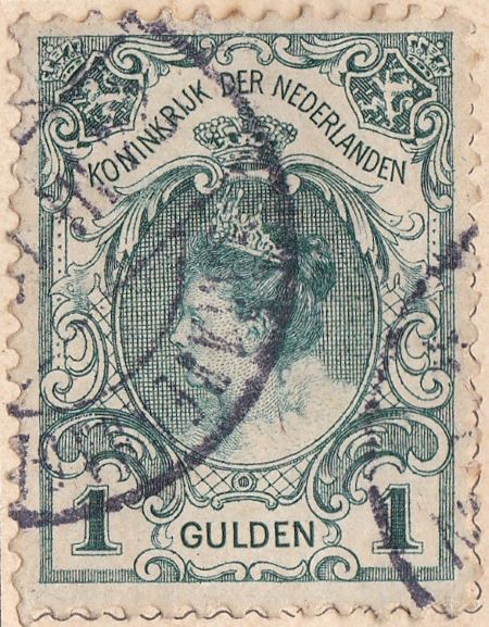
Hi, I got this 1 gulden from the Netherlands. Now, there seem to be a couple of types, distinguished by the thickness of the font 'GULDEN', the distance of the numerals '1' from the bottom, and the width of the '1'. Which one is this?
I included a picture from an earlier Stamp Community discussion (3/23/2015) for guidance.
Send note to Staff

Pillar Of The Community
Netherlands
6527 Posts
Posted 02/14/2021   2:15 pm  Show Profile Bookmark this reply Add NSK to your friends list  Get a Link to this Reply
Could it be you forgot to post your example?

The top one has the "1" in the value tablet set lower than the bottom one.
The top one has a more slender "GULDEN" that is similar to the type used for "KONINKRIJK DER NEDERLANDEN."
The bottom one has a bolder "GULDEN" unlike the type used for "KONINKRIJK DER NEDERLANDEN."

The top one is the "Kroningsgulden" issued in 1898 to commemorate the inauguration of Queen Wilhelmina. The bottom one is part of the 1899 definitives set and comes with different perforation gauges.
Send note to Staff  Go to Top of Page
Edited by NSK - 02/14/2021 2:16 pm
Valued Member
Netherlands
83 Posts
Posted 02/14/2021   3:37 pm  Show Profile Bookmark this reply Add Bloemzee to your friends list  Get a Link to this Reply
Yes, here is my stamp, sorry something's gone wrong - I thought it picked it up but it was too big. I reduced resolution a bit.
Send note to Staff  Go to Top of Page
Pillar Of The Community
Netherlands
6527 Posts
Posted 02/14/2021   3:40 pm  Show Profile Bookmark this reply Add NSK to your friends list  Get a Link to this Reply
1899,definitive issue with high setting of numeral and bold typeface of "GULDEN;" i.e., the bottom one in the earlier picture. Compare the bold typeface of "GULDEN" at bottom and thin typeface of "KONINKRIJK DER NEDERLANDEN" at top.

Check the perforation gauge.
Send note to Staff  Go to Top of Page
Edited by NSK - 02/14/2021 3:44 pm
Valued Member
Netherlands
83 Posts
Posted 02/14/2021   3:47 pm  Show Profile Bookmark this reply Add Bloemzee to your friends list  Get a Link to this Reply
11x11,5
Send note to Staff  Go to Top of Page
Pillar Of The Community
Netherlands
6527 Posts
Posted 02/14/2021   4:02 pm  Show Profile Bookmark this reply Add NSK to your friends list  Get a Link to this Reply
NVPH 77C, the "Kroningsgulden" (NVPH 49) has perforation 11 1/2 x 11.
Send note to Staff  Go to Top of Page
Valued Member
Netherlands
83 Posts
Posted 02/14/2021   5:28 pm  Show Profile Bookmark this reply Add Bloemzee to your friends list  Get a Link to this Reply
thanks NSK, much appreciated
Send note to Staff  Go to Top of Page
  Previous TopicReplies: 6 / Views: 2,060Next Topic  
 
To participate in the forum you must log in or register.

Go to Top of Page

Disclaimer: While a tremendous amount of effort goes into ensuring the accuracy of the information contained in this site, Stamp Community assumes no liability for errors. Copyright 2005 - 2026 Stamp Community Family - All rights reserved worldwide. Use of any images or content on this website without prior written permission of Stamp Community or the original lender is strictly prohibited.
Privacy Policy / Terms of Use    Advertise Here
Stamp Community Forum © 2007 - 2026 Stamp Community Forums
It took 0.13 seconds to lick this stamp. Powered By: Snitz Forums 2000 Version 3.4.05