| Author |
 Replies: 28 / Views: 3,338 Replies: 28 / Views: 3,338 |
|
Valued Member
United States
14 Posts |
|
|
|
|
Pillar Of The Community
United States
7239 Posts |
|
|
They look nice. I would go for the first one.
I am curious about your alignment on the last two lines. I know it is difficult when you have two different-sized stamps in the same set. Since there is only one small stamp (the lowest value) the page might be more visually pleasing if you move this box/space to the middle of the first line of the set. By doing this, the centering and balance of the title and two lines of stamp spaces may "work" better.
Just a suggestion. |
Send note to Staff 
|
|
|
Pillar Of The Community
United States
1162 Posts |
|
|
I like the second one most, but all three look good. In the end (as is the case with everyone that you are asking), it comes down to personal taste/preference. It does appear to me that the centering of the 'insides' is different on the top choice compared to the lower two. I prefer the centering of the top choice. ACTUALLY, I would prefer to see the bottom set of 9 stamps re-formatted. If you have 9 spaces, I would prefer 4, then 5 (or vice-versa) stamps per row, or 3x3. Based on the space on your page, 3x3 doesn't seem possible, unless you start the next page with 3x3 and spread out the first 2 sets vertically. I am making my own pages and have found myself thinking in those terms all the time. Sometimes there is no perfect solution, though. |
|
Send note to Staff
|
|
|
Valued Member
United States
14 Posts |
|
|
Bedrock Of The Community
12595 Posts |
|
|
Bedrock Of The Community
Australia
38679 Posts |
|
|
Pillar Of The Community
United States
2941 Posts |
|
|
Pillar Of The Community
6341 Posts |
|
|
Building on the "less is more" theme. I would edit the text to eliminate duplicated words whenever possible. The middle group of three is particularly repetitive between the header and footer. |
|
Send note to Staff
|
|
|
Pillar Of The Community
1337 Posts |
|
|
I doubt this will be of any use to you, but I'll give it a shot. If you're determined to print on small 8.5 x 11" regular printer-size paper, a border takes up so much room that I don't see it as at all useful. I've printed Steiner pages on paper this size with his borders and without, and without just looks much better to me. It's much less crowded looking. Lately, I print them onto blank Scott Specialty bordered pages and I end up with a really good looking page on that larger-size of paper, less crowded but still with the Scott border which I like. Larger paper allows stamps to "breathe" because it's less crowded. It's also more elegant looking.
Steiner's page borders, as you probably know are two straight lines around the page. It's very simple. Even he overcrowds pages too often inside those borders. If I were using any of your page borders, I'd reduce the number of stamps per page to the minimum so they're much less crowded. Fewer than you have on this page. And, yes, that lonely single stamp at the bottom of the page really belongs in the line above, making it five stamps instead of four. Lines of stamps do not have to be the same number. Just center them both so that the longer line of boxes is out the same distance on both sides of the shorter line.
As for which border, I like fancy borders. They make a page of stamps look more classic, more elegant. Plain borders always look like the borders on account books or invoices, not albums of beautiful stamps. An album page is an aesthetic presentation and it needs an elegant frame like an elegant old painting. But on pages that small, that's hard to do since they take up a lot of space. So we're back to the "small page problem". I'm inclined toward the third fancier border, but maybe not on those small pages. I'd try printing without any border and see if that didn't look maybe even better. Some expensive album publishers omit page borders entirely. I think Lighthouse does that, and it looks clean and simple.
You use more words than are necessary and this takes up even more space. Cut out unnecessary words since they overcrowd pages. For example:
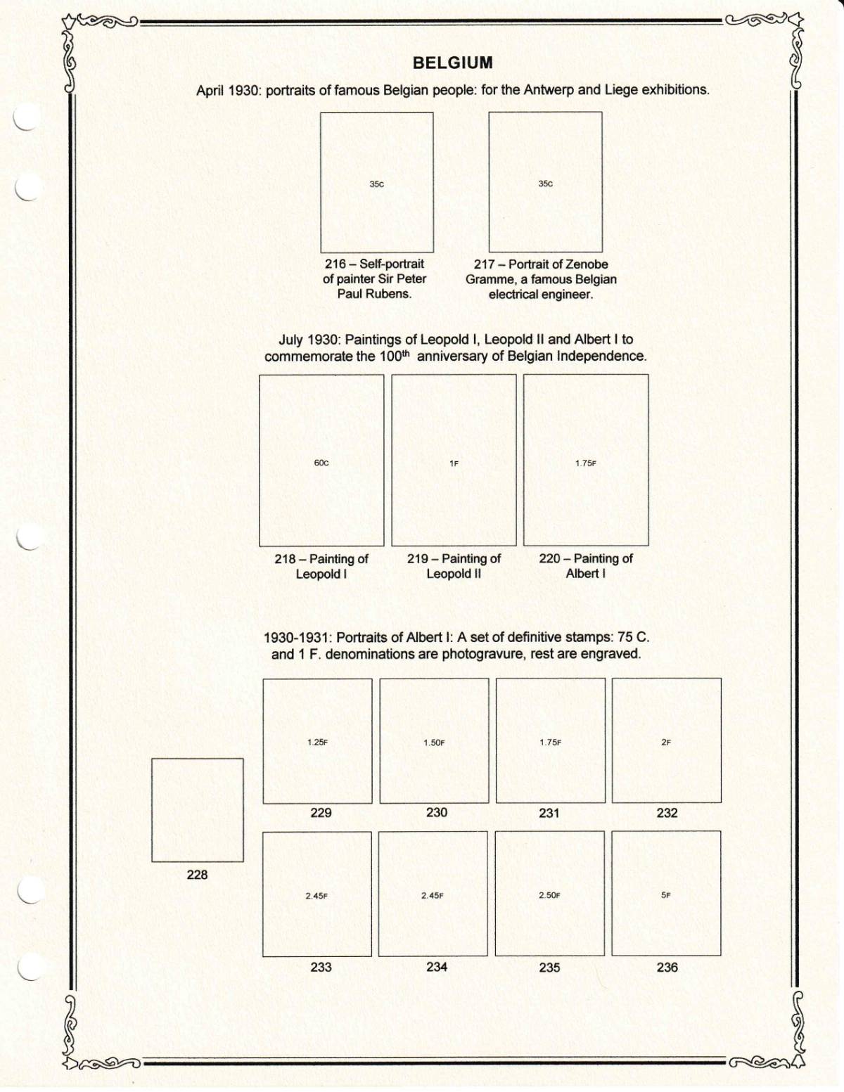
Famous Belgians-- for Antwerp and Liege Exhibitions. ("Portaits" is clearly what these are, so no need to say that. Famous "people" is pretty obvious since they're obviously not dogs.)
216: Self-Portrait. Peter Paul Rubens. ("Sir" is pointless, "Painter" is redundant since he clearly painted this picture and he's very famous. I mean he obviously wasn't a writer.)
217: Zenobe Gramme, Belgian electrical engineer (You don't need "portrait of" or "famous" since he is, after all, on a stamp)
Why add the month dates of stamps? Maybe use only numbers as with 4/1930 or shorter words as with Apr 1930, but I'd leave off the months. It's not normal for albums.
Leave out "Paintings of" as we can all see that they're paintings. I've seen albums where the collector has said "Stamp illustrating . . . " which seem particularly silly. This isn't that bad, but it isn't needed.
Leopold I, Leopold Ii, Albert I: 100th Anniv Belgian Independence. That's clear and really all you need.
On the lower captions, omit "Painting of"
For the last caption, I'd write:
1930-31 (don't repeat the century a second time): Definitives. Albert I. Engraved except 75c (always written in lower case) and 1F (always in upper case), photogravure.
Personally, I prefer catalogue numbers go underneath my stamps to further de-clutter my pages, but it's your album. I almost never need to know the catalogue number of a stamp in my album, and if I need a stamp, no stamp is covering the number yet so I can see the number.
Your choices. In my experience, as I've made pages I've simplified them more and more and made other changes. Sometimes I feel like I really should go back and reprint a whole album of pages. That's something you want to avoid, so keep it simple and uncluttered from the beginning. |
|
Send note to Staff
|
| Edited by DrewM - 03/11/2021 01:18 am |
|
|
Pillar Of The Community
United Kingdom
8602 Posts |
|
|
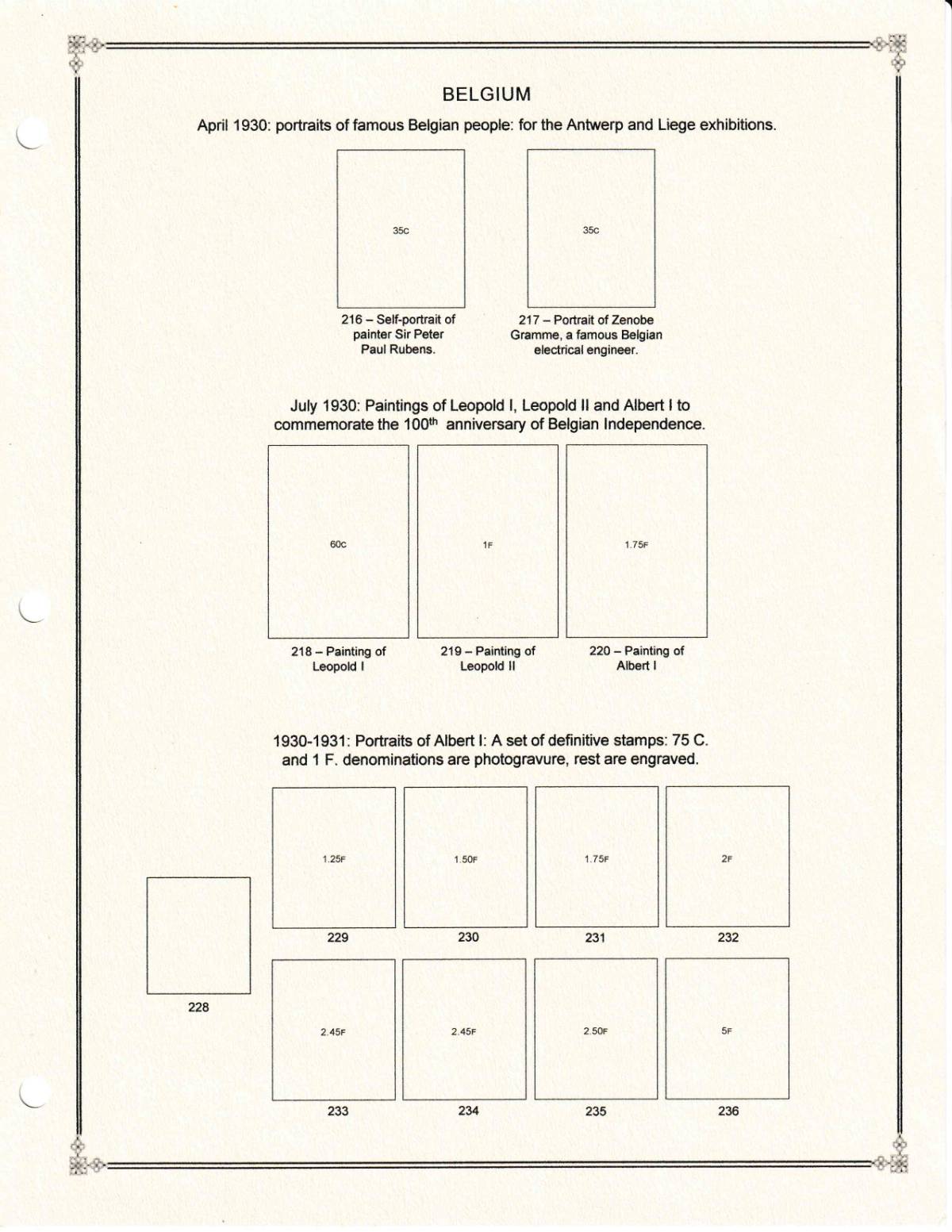
The Scott-style, art nouveau-style borders rather clash with the bland, sans-serif font you've used for the rest of the pages. I'd aim for mutually complementary styles. I'd make the text more telegraphic, and get rid of the repetition. Placing "228" to the left of the other stamps upsets the lay-out - perhaps move this set to another page and replace with something else if you have another set of three or so shortly afterwards. Starting the stamps just below the "Belgium" title also makes the page seem crowded. My usual practice is to come up with a design, then replace it a year or two later.  |
|
Send note to Staff
|
|
|
Pillar Of The Community
United States
716 Posts |
|
|
 classic_era_noob, Custom album page design is a very personal decision. There is no right or wrong answer. Choose what most pleases your eyes. Enjoy customizing your album(s) with your personal touch. |
|
Send note to Staff
|
| Edited by hoosierboy - 03/11/2021 08:44 am |
|
|
Valued Member

United States
119 Posts |
|
|
I prefer the second border as it is clean and simple. If you are going for baroque I'd use number 3. I think the advice to edit your captions is good. I like the month and date info.
Ultimately, it is your project. Do it the way you find most appealing. They all look good.
Good luck with your project. I hope we see some filled pages soon. |
|
Send note to Staff
|
|
|
Pillar Of The Community
United States
886 Posts |
|
|
Valued Member
United States
442 Posts |
|
|
I'm a big fan of the Art Deco feel of the Blues, and agree with GeoffHa - perhaps a different typeface (something serif?) might be better in all cases, rather than Arial/Helvetica. Personal taste overrides all, though, as everyone else has said.
This is an impressive effort: do you plan to do this for the entire Big Blue? |
|
Send note to Staff
|
|
|
Pillar Of The Community
United States
3224 Posts |
|
|
I like the first since it has the feel of old albums to match Big Blue-era stamps.
I'd also prefer a serifed font for the same reason. You might consider the many free font download sites, but you need to test drive before using anything. Since they are each created by different designers, there are some that are only in fixed sizes plus there are ones that don't work well/get clunky when resized. You might also try making the Scott numbers just a bit smaller and therefore less prominent. I know it's slightly more work and you want to be able to read them, but test it out and see if it floats your boat. And you might try italic numbers if the font has good-looking italic numbers. |
|
Send note to Staff
|
|
|
Pillar Of The Community
United States
4441 Posts |
|
|
I prefer the border on example 2. There can be two extremes - minimal information on page to almost reference book. You have to decide where in this spectrum you want to go. I consider the reference book types like literature,
I also prefer to put catalog numbers inside the box. One idea to make room is to move the country name up so it overlaps the top frame.
I have noticed that when I use black mounts (prefer clear as a rule) I prefer to have the stamps spaced further apart.
There is a style decision on layouts - stamps on baseline at top or bottom. For your third group, I would place the stamp on the baseline of the bottom row and not center between.
Good luck. I have always made various mockups and actually added stamps to assess and have refined as I created pages. |
|
Send note to Staff
|
Al |
|
|
Replies: 28 / Views: 3,338 |
|