| Author |
 Replies: 11 / Views: 1,147 Replies: 11 / Views: 1,147 |
|
|
Pillar Of The Community
United States
1033 Posts |
|
|
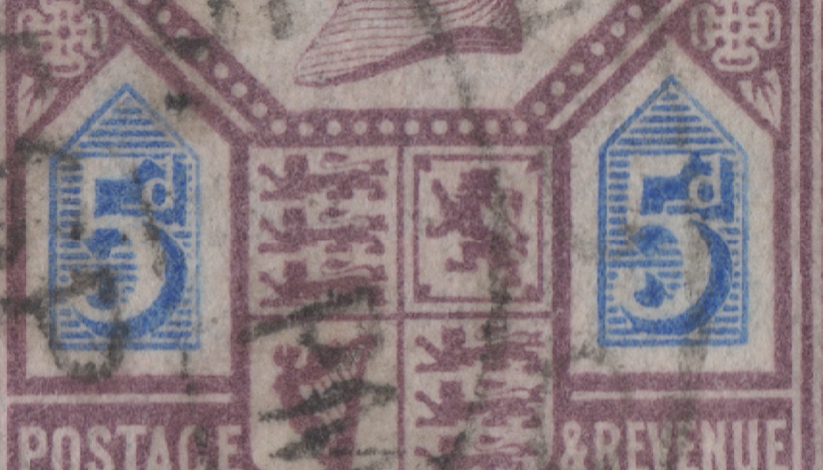
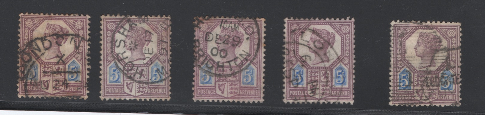 I am not sure how to tell the difference I only have Scott catalog, not Stanley Gib Scott says there are 2 types of this stamp Type 1 squares dots adjacent to d Type 2 vertical dashes adjacent d ?? biggest difference I see is in hair behind head- different hair style between 5 th stamp and rest Can someone describe the difference(s) between the two types and tell me which is which here? thanks |
|
Send note to Staff
|
|
|
|
|
Pillar Of The Community
Australia
3282 Posts |
|
|
Hi rgstamp,
The difference is seen to the right of the 'd' in the value panels.
We'll need bigger scans to determine which types you have.
I had to use a magnifying glass just to get a better look at the illustrations in my SG catalogue! |
Send note to Staff 
|
|
|
Moderator

United States
5094 Posts |
|
|
Scott 118a are the ones that are more rectangular/square. They are tough to see without higher magnification. You want them to look closer to this style: 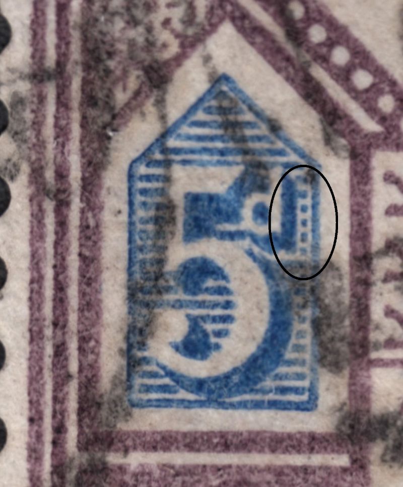 |
|
Send note to Staff
|
| Edited by Partime - 03/13/2021 4:55 pm |
|
|
Pillar Of The Community
Netherlands
6526 Posts |
|
|
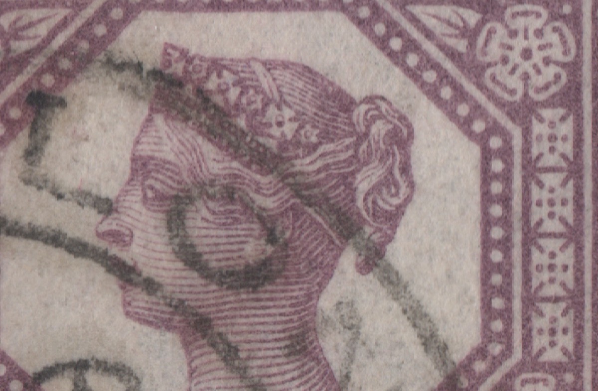
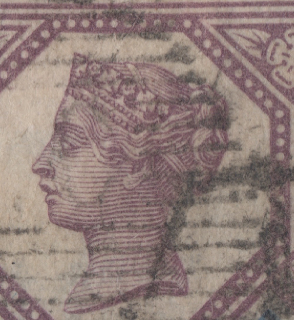
That fifth stamp has a strange appearance. Maybe, it is the cancel that does this. The type II stamp dates from 1888. Cancellations after 1888, most likely, are on type II stamps. 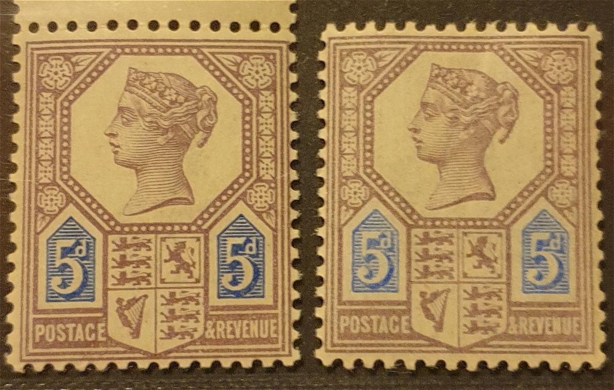 Not mentioned in the catalogue is the 5 in both value tablets of the type I touches the bottom frame. It does not do so in the type II stamp. SG Specialised Vol. 1 remarks that the "5" in the left value tablet is aligned to the left on type I and more centred on type II. Most catalogues concentrate on the engraving to the right of the "d" in the value tablet. On type I these are squares, on type II, these are thin lines.  |
|
Send note to Staff
|
| Edited by NSK - 03/13/2021 5:28 pm |
|
|
Moderator
United States
5094 Posts |
|
|
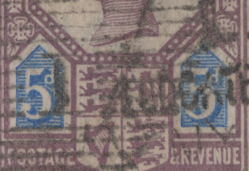
I have a mint copy of Scott 118, but it is still very hard to see the difference. Here is the right numeral block. You should be able to see that the area to the right of the "d" are now thinner, more dash-like. Tough to tell the difference unless you have them side-by-side: 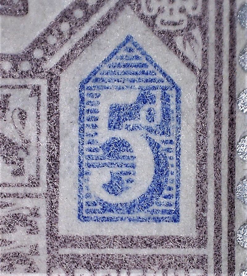 |
|
Send note to Staff
|
| Edited by Partime - 03/13/2021 5:10 pm |
|
|
Moderator
United States
5094 Posts |
|
|
NSK wrote: Quote:
Not mentioned in the catalogue is the 5 in both value tablets of the type I touches the bottom frame. It does not do so in the type II stamp. Now THAT makes it much easier to see the difference. Thanks for the heads-up. |
|
Send note to Staff
|
|
|
Pillar Of The Community
Australia
3282 Posts |
|
|
Pillar Of The Community
Netherlands
6526 Posts |
|
|
I revisited my 2001 Specialised Vol. 1. I also had a look at the online Stoneham. https://c1f5b0d7-6b6f-4089-be67-be4...b93de6df.pdfThe illustrations in those also show this difference. Since these types are from two dies of the value tablet - hence the hair cannot be a feature: it is from a separate die for the frame and portrait - it should be constant. A little overinking might cause the "5" in type 1 to actually touch the lower line when it does not on the die, but the difference appears very clear. I think, it would be the most visible difference between the two. I have written a mail to Stanley Gibbons to ask their opinion. We will see what happens. As far as I am aware, they still do not refer to the Williams lines to distinguish dies 1 and 2 of the penny red. |
|
Send note to Staff
|
| Edited by NSK - 03/14/2021 04:23 am |
|
|
Pillar Of The Community
United States
1033 Posts |
|
|
  This is 5th stamp from original post, the one with funny hair compared to others.(may just be cancel making it look strange) Looks to me it is Type I (Die I) with square dots right of "d"? |
|
Send note to Staff
|
|
|
Pillar Of The Community
United States
1033 Posts |
|
|
Pillar Of The Community
Netherlands
6526 Posts |
|
|
The bi-coloured stamps were printed from a head and separate duty plates. There is no mention of a second die for the head plate. Only the duty plates were made from two dies. Consequently, any variation in the hair must be due to wear, damage or sheer coincidence (ink transfer, foreign matter on the plate).
The stamp has a strange look to it, but I cannot see anything wrong in the close up. I do think the cancel is playing tricks on the eyes.
Your fifth stamp does appear to have the low "5" and the square dots. I also note the examples of the type I stamps tend to have a deeper blue colour, tending towards ultramarine. This also seems to be the case with your fifth stamp. However, this is only comparative as you cannot tell exact colours from scans.
|
|
Send note to Staff
|
| Edited by NSK - 03/14/2021 11:35 am |
|
|
Pillar Of The Community
Australia
3282 Posts |
|
|
Quote:
As far as I am aware, they still do not refer to the Williams lines to distinguish dies 1 and 2 of the penny red. Being a new kid with penny reds I had to look this up. http://pennyreds.co.uk/Tips-for-platers offers an illustrated explanation of the Williams lines  |
|
Send note to Staff
|
|
| |
Replies: 11 / Views: 1,147 |
|