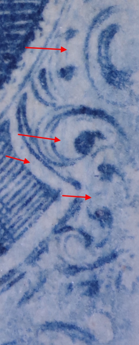
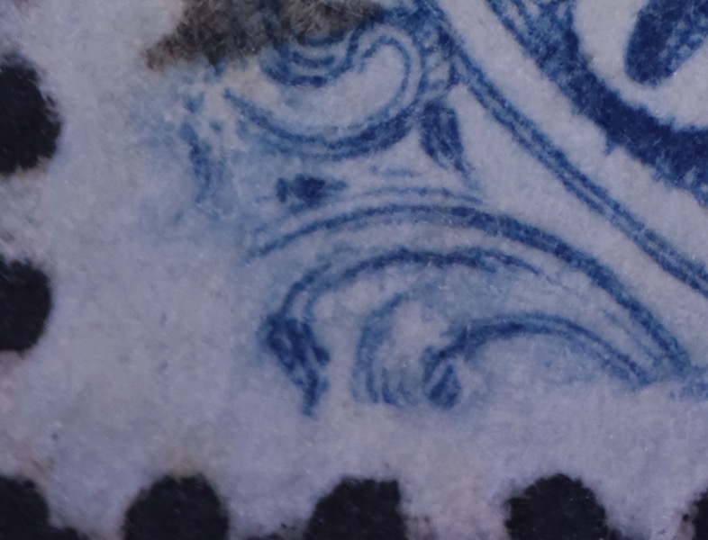
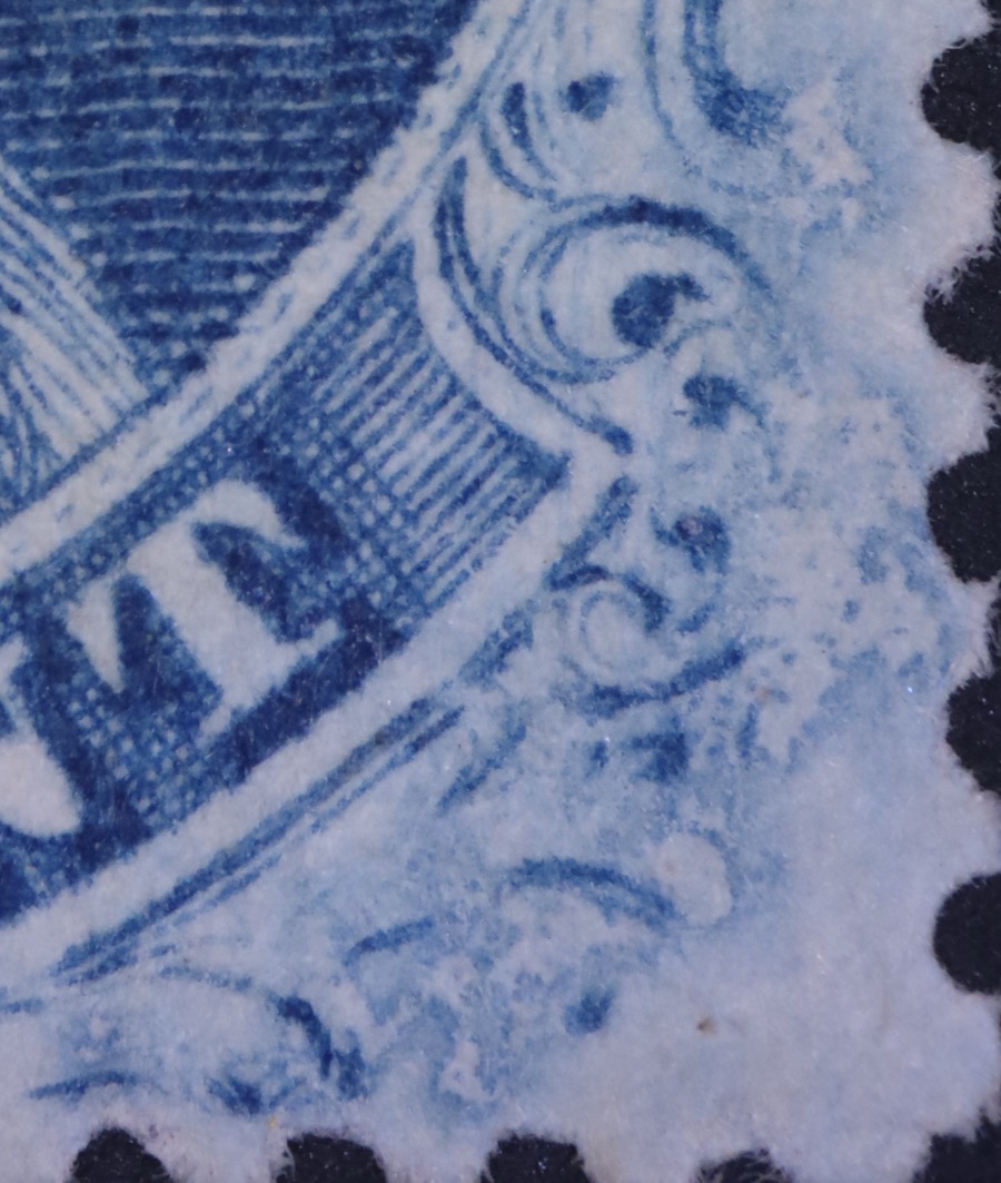
Dudley - I think you must be correct! Thanks so much for pointing me back to 86L5. The Neinken map for 86L5 certainly pops out because of the blotched right lower corner, and I guess that I initially dismissed it because it lacked a blur over ornament "V". I think now that I put too much weight on that one marking.
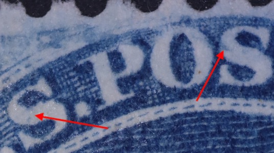
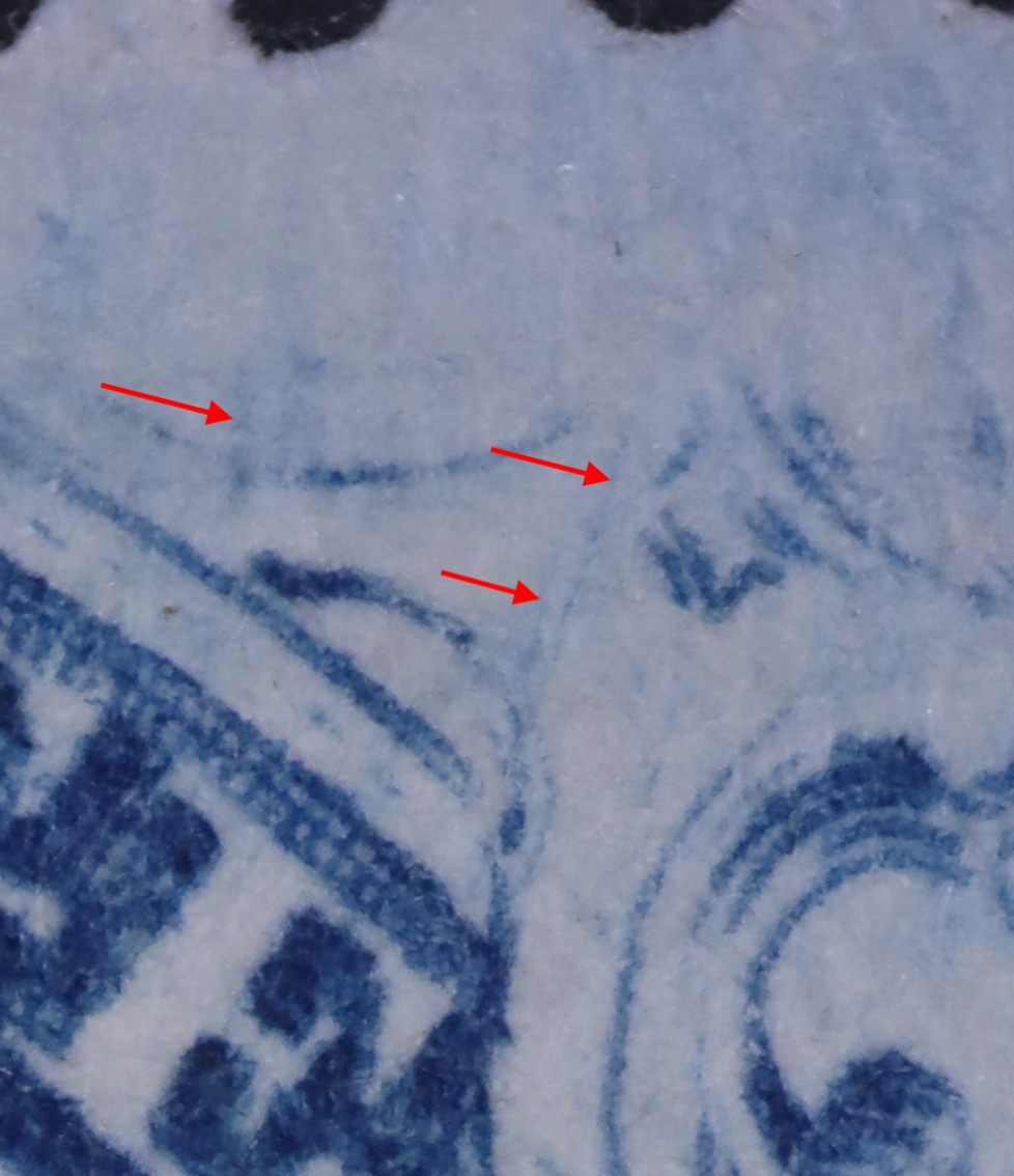
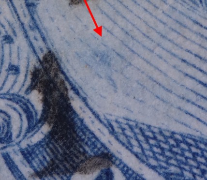
Looking at it again for about the tenth time, you have to be right. Not only is the right lower corner a great match (note also the arrow in the image below at prominent vertical line), the plate marks in the "S" of "U.S." and the "S" of "POSTAGE" are there, too. Lastly, there is a blur over the left bottom corner ornaments.
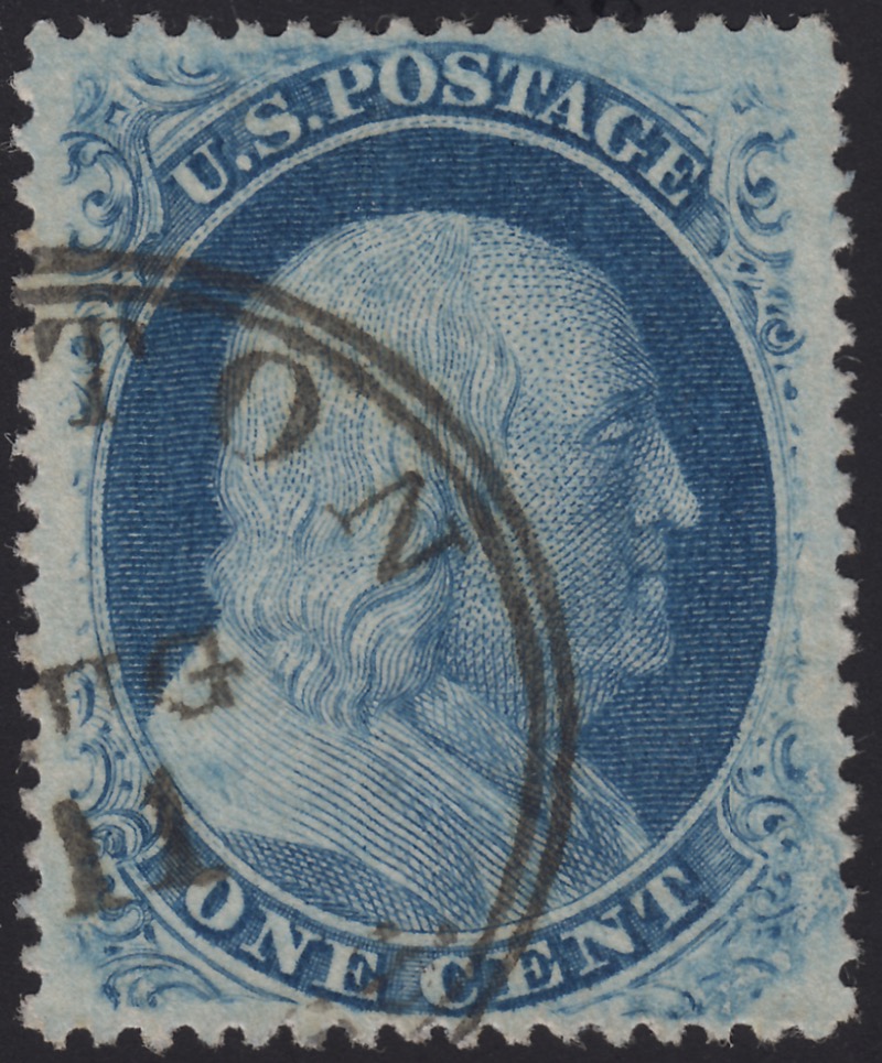
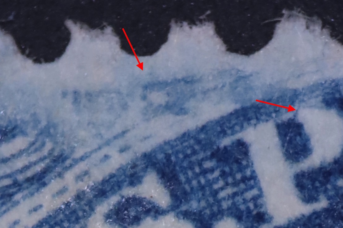
Ashbrook wrote that of all the stamps from plates 5 to 10, those from Plate 5 are the most beautiful. I can understand why he said that now - this #24 has the best color and impression of any I own.