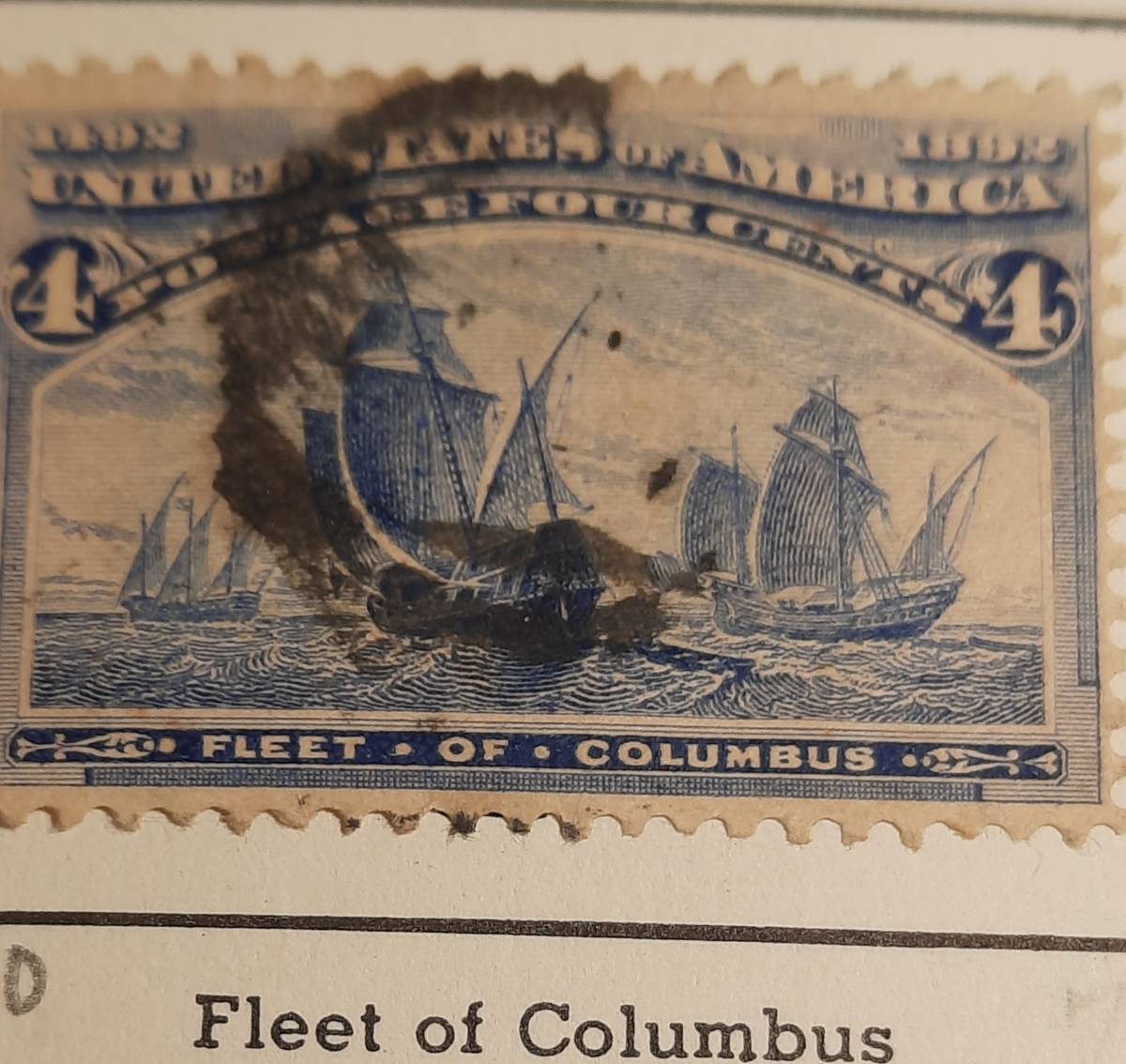
... and you meant to say ultramarine, not aquamarine.
Agree with NSK, both shown are ultramarine. If you happen to have the 1c Columbian, the blue error is closer to the color of that, not quite as dark/deep.
Ultramarine is quite vivid though aged paper will throw off color perception generally. Some people say they can see a bit of yellow in ultramarine.
The site linked above lists near the top of the left column the basic information of ultramarine (not aquamarine), dull ultramarine, and deep ultramarine. The same three shades are listed in the Scott U.S. Specialized catalog, (and the blue error, of course.) Some natural shade variation is not unexpected during a print-run as ink is formulated, replenished, stirred (or not), etc. Most of the Columbian issue have 2-4 very close shades listed.
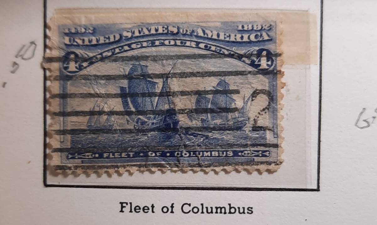
I see no difference between your stamps. If there is a difference which you see, they should be scanned in the same scan, side by side to have identical scan conditions to best illustrate it. Lastly, color studies with used stamps introduce another level of variability over unused stamps. I wouldn't get too lost in the weeds with these two stamps. You don't have the blue error.
As a mom and author, I hope you consider this hobby in terms of intrinsic value. Especially for kids, this hobby can offer significant learning opportunity for learning about history, geography, other cultures. It has a layperson reputation as a financial investment but many here would tell you that this is very rarely true. Don
Disclaimer: While a tremendous amount of effort goes into ensuring the accuracy of the information contained in this site, Stamp Community assumes no liability for errors. Copyright 2005 - 2026 Stamp Community Family - All rights reserved worldwide. Use of any images or content on this website without prior written permission of Stamp Community or the original lender is strictly prohibited. Privacy Policy / Terms of UseAdvertise Here