| Author |
 Replies: 82 / Views: 8,447 Replies: 82 / Views: 8,447 |
|
|
|
Bedrock Of The Community
United States
10633 Posts |
|
|
It would depend on whether the reperferation made it a different Scott number or not. If it did, then it is not genuine. But if it only took a straight edge and changed it, then the stamp is still genuine, but altered. |
Send note to Staff 
|
|
|
Valued Member
195 Posts |
|
|
Valued Member
195 Posts |
|
|
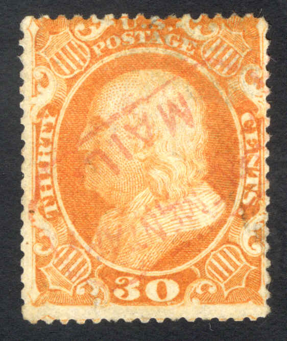
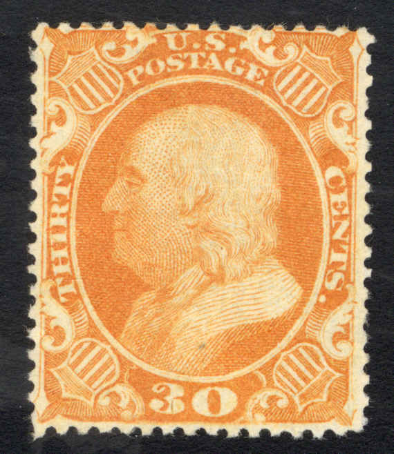
Here's the other example of a faux-bottom-frameline stamp that was posted about previously on SC: https://goscf.com/t/72893&whichpage=18#672503This one has an interesting story, in that the OP got a good cert from the PSAG and then a bad cert from the PF, as discussed in the above-linked thread. Both certs are pictured there too. It wasn't hard to trace the seller, whom I recently contacted to see if it was still available for sale (I explained the backstory and said I was interested in it specifically because it did have a bad cert). He wrote back and said "it's gone." :( The comparison images are of items from my collection. Perforation sliced into the top part of the stamp, so I'm using the die proof as a reference to highlight the ding in the upper LHC.  |
|
Send note to Staff
|
|
|
Pillar Of The Community

United States
1064 Posts |
|
|
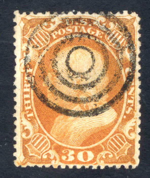
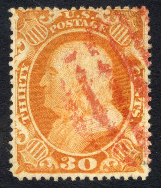
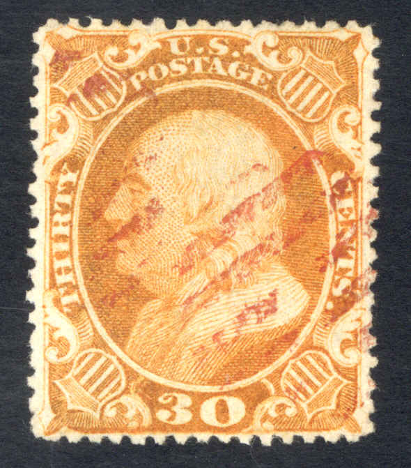
Another contribution to the #38 Hall of Shame. Besides being reperfed, the little nub in the lower left corner is a lighter shade of orange, and the detail is much more mushy than the crisp lines (rays) coming out of the shield in the lower right. So part of that lower left corner has been added and redrawn. 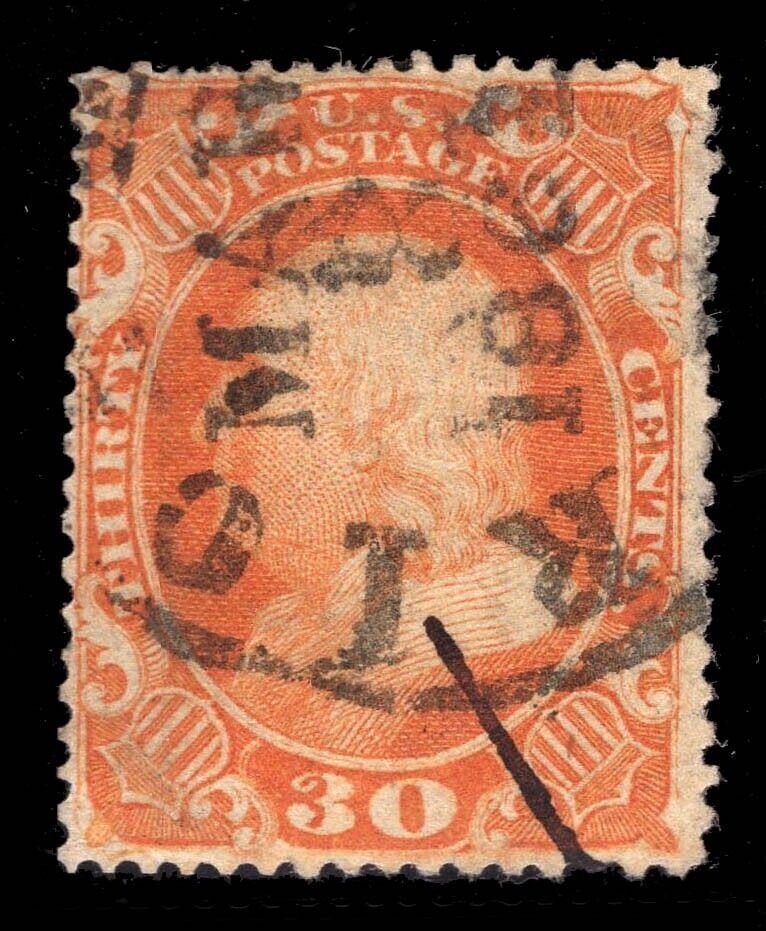 Now look at the back  The reperfing stands out much more from the reverse. Look at how sharp the 5 perfs at the bottom right (and the entire right side) are compared with the rest of the bottom perfs. While a faint part of the orange image is seen over the entire stamp, an entire quarter circle right underneath the pencilled catalog number at the bottom right appears more opaque with none of the image showing through. Was that entire corner (6x6 perfs) repaired/replaced and drawn in, or am I imagining things? Additionally, and it is probably just a messy/smeared cancel, but the last digit of the year date doesn't look right. Did someone try to change the 1862 year date to look like an 1861? If so, and if you can convince someone this is a 3/8/1861 cancel from Rio Grande City, Texas then that makes this a $1000 stamp rather than a $500 stamp. The Scott Specialized catalog says that Texas was admitted to the Confederacy 3/5/1861 and there is a high premium for US stamps used in the Confederacy during the short period before they became invalid in May 1861. Probably just a crude cancel, that the 2 doesn't look fully like a 2. Anyway, it was interesting to see another example of how often this stamp is fiddled with. |
|
Send note to Staff
|
|
|
Pillar Of The Community
United States
3490 Posts |
|
|
Richmond, VA comes to a fairly close match for this CDS.
I see what you are saying about the last digit in the YD. My first reaction was, and still is that it is likely 1861. There are very few, very few #38's used past 1861.
I've seen too many smudged numerals on cancels, such that they look like something else, and sometimes you have to factor in other data like -- does it even make sense to be what it kind of looks like? Nevertheless, I agree it merits some close in-person inspection.
This stamp certainly appears to be a #38 with modifications as you suggest. |
|
Send note to Staff
|
|
|
Pillar Of The Community
United States
1064 Posts |
|
|
OK, yeah, Richmond is more likely. Because the "R I ..." was wrapped so low around the dial (starting near the 8 on a clock face) it felt like the city name had to be a lot longer than Richmond. Looking at other examples of Richmond though, the letters are so bold and widely spaced that I see that it fits. Thanks for the quick reply. |
|
Send note to Staff
|
|
|
Pillar Of The Community
United States
1064 Posts |
|
|
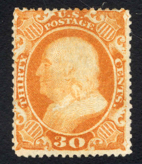
Look at this beautiful piece of artwork. 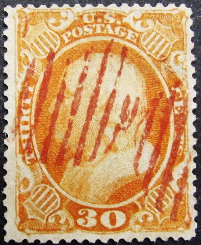 This #38 sold today on ebay for about $350. A good price, if it were sound and genuine. Unfortunately it appears rebacked with additional parts of the design drawn in. The giant margins and clean perforations screamed rebacked, and upon further study, readers of this thread will quickly notice the arrowheads/diamonds look a bit wonky, and the diamonds and extra frame line at the bottom should not exist. For comparison, here is a mint block with PFC currently listed on ebay by usastampshop, showing the tight vertical margins and the reason the bottom diamonds and frameline had to be trimmed off the design. 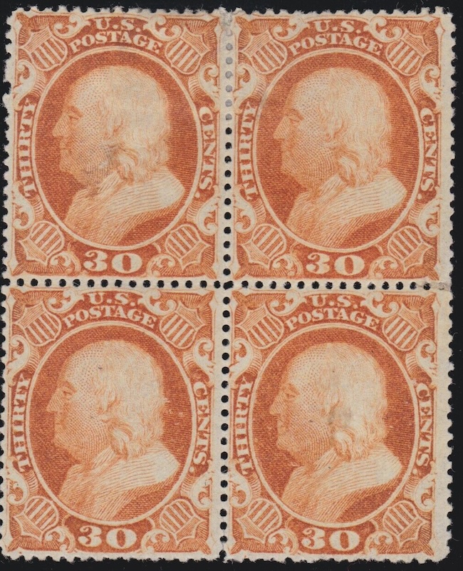 For completeness, here is the back of the first stamp. 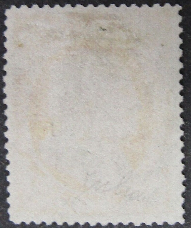 |
|
Send note to Staff
|
|
|
Valued Member
United States
79 Posts |
|
|
ZM, re the last example you posted: all 3 frame lines have been redrawn (left, top, right). And as you rightly pointed out, the lines at bottom should not exist. On the example before that, with the Richmond cancel, what appears to be a line below the 30 tablet starting from the little "spur" on the right side and extending but fading out to the left is legitimate. Ashbrook illustrated this variety in the 1920s, though it's only found on perhaps 2 plate positions. As for the redrawn "nub" on the left, good catch! What caught my eye about this example was the arced line above the perf hole. That ink should not be there, though the cloudy areas of ink elsewhere along the bottom of the stamp are typical of many plate positions.  |
|
Send note to Staff
|
|
|
Pillar Of The Community
United States
1064 Posts |
|
|
Valued Member
United States
79 Posts |
|
|
ZM, all of the examples you posted are legit variations of the bottom portion of the stamp. I've attempted plating this stamp and its ex-TREEEEEE-mely difficult. The attached image shows positions L83 and L93 from the Ashbrook proof pane photos, from 600 dpi scans obtained by special arrangement with the APS. The differences between the bottoms of these stamps are quite clear. I could go on at length about why it's difficult to plate this stamp, but let me start from the opposite end of that spectrum. It's easy to identify stamps (and proofs) from the 10th row by way of a position dot below the left notch. In this example it's seen as a black speck below the left notch in L93. There are no other position dots on the 200 subject plate other than those along the bottom row. But determining plate position along the 10th row then becomes quite a challenge. It's also possible to ballpark which row other stamps came from based on how clean or occluded the design is at the bottom. There is a pattern to it that's consistent between the L and R panes. But from there, determining which position it might be in that row, and determining L or R pane, is highly problematic. There are a few distinctive double transfers that can be plated, a characteristically shaped retouched arrow (L52 if memory serves), and perhaps a few others. 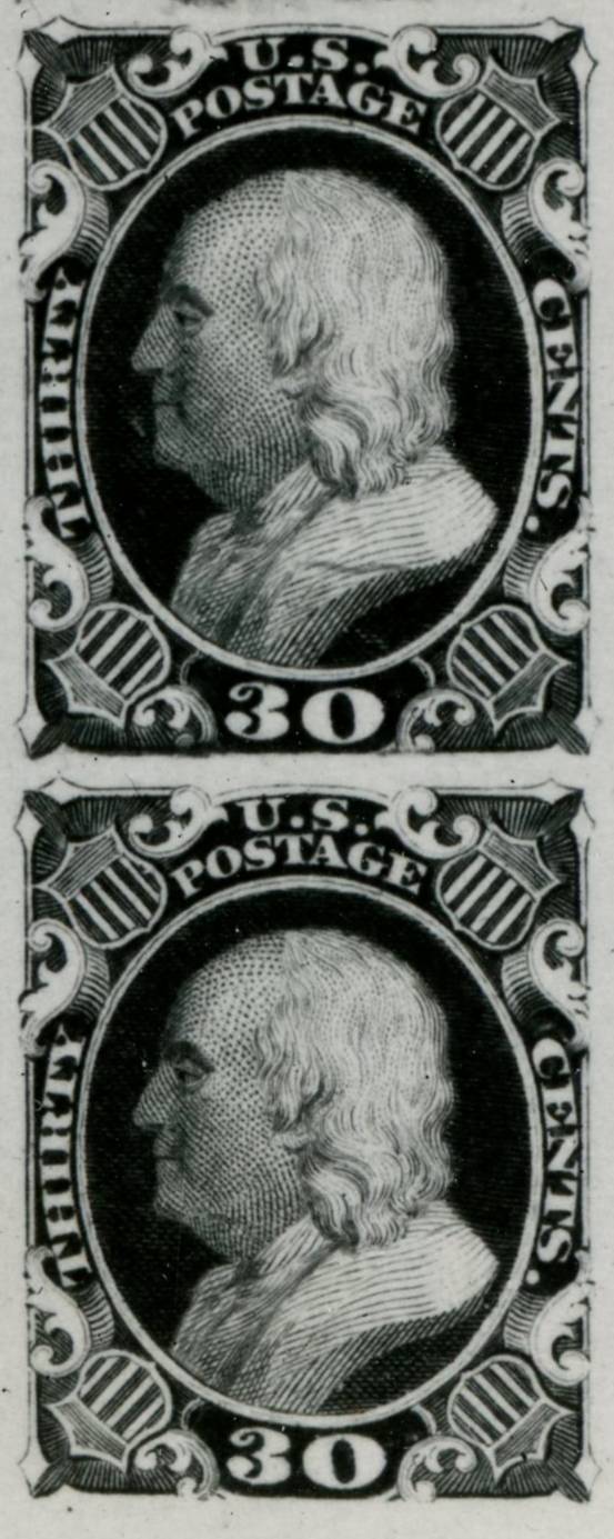 |
|
Send note to Staff
|
| Edited by PhilaFactor - 09/15/2024 4:23 pm |
|
|
Valued Member
United States
79 Posts |
|
|
You asked if the differences reflect an inking issue or a design issue. On one hand it's a design issue. The bottoms of each the 4 reliefs on the transfer roll were burnished differently. Then there are "clouds" of ink below the design which are characteristic of certain rows. I think these reflect plate bruising (depressions which picked up ink and printed), not necessarily caused by metal projections below each relief on the roll. I say this because the shapes of these "clouds" are inconsistent between subjects in any given row. In other words, no two clouds are alike. Part of the difficulty of plating these clouds is that they are amorphously shaped, so they're hard to define. And when comparing stamps to the B/W plate proof photos, the photos have much greater contrast than the stamps (orange on white). Most of the stamps delivered to the stamp agent were printed in one batch (around 320,000 if memory serves). But then again, I don't think we can assume that every sheet printed in that run was exactly consistent in terms of plate wiping before printing. 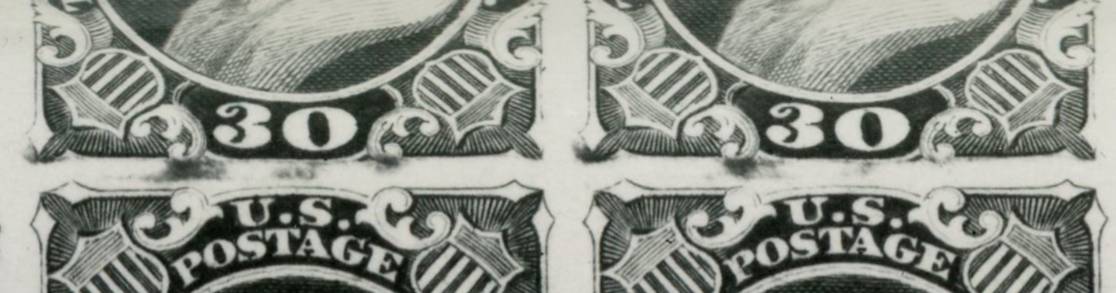 |
|
Send note to Staff
|
| Edited by PhilaFactor - 09/16/2024 12:46 am |
|
|
Pillar Of The Community
United States
1064 Posts |
|
|
Fascinating. Thanks for all that additional information. So Scott gives top-level catalog numbers to basically different plate positions of the 1c and 10c but doesn't even mention this obvious design difference on the 30c. Looking at the mint block I posted above, the UR position has the 'flat bottom border' as I call it, and the other 3 have the 'rounded 30 tablet'. While browsing Siegel PowerSearch for more blocks of #38 I ran across this amazing piece that I thought was worth posting again. Sale 1000 lot 1025 sold for $21k, less than half what it sold for in the 2005 Rarities sale #895. 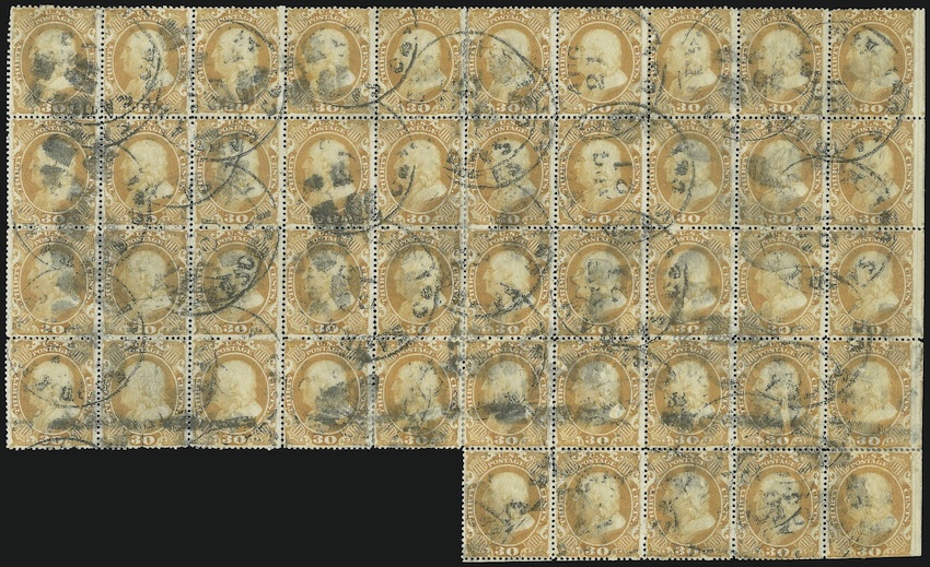 |
|
Send note to Staff
|
|
|
Valued Member
United States
79 Posts |
|
|
Yes, that block is a marvel. Turns out that there was an additional block of 4 attached to that piece, which I believe Stanley Piller detached at some point (or so the story goes). If you look back far enough in the Siegel sales you'll find an image of the full original and even-more-irregular block.
A little heads-up! I've written a monograph on the subject of this stamp and all of these details, including an essay/proof history with new discoveries, an expose of the numerous "repaired" copies on the market, regular misidentification of die and plate proofs, and much more. It's slated for publication in The Chronicle and it's just a matter of time before it appears in print. Should be fun!
As for why the differences aren't noted in Scott, perhaps it has to do with the difficulty of plating this stamp. |
|
Send note to Staff
|
|
|
Valued Member
United States
79 Posts |
|
|
Quote:
Looking at the mint block I posted above, the UR position has the 'flat bottom border' as I call it, and the other 3 have the 'rounded 30 tablet'. That one's easy to identify as being from rows 9 and 10. You can see position dots below the left notches in the lower two stamps. The "rounded 30 tablet" is the normative version; it reflects the original intention of the stamp design. What's missing is a thin continuous line underneath the tablet that traces its contour. That line was truncated on each relief of the transfer roll. The flat bottom borders are a deviation. In fact, the design as seen even in normative examples of the stamp is, in effect, an unauthorized variation of the approved design. The POD approved the design seen in the die proofs, with complete bottom frame lines the very frame lines errantly added to the various "repaired" copies. After the design was approved, Toppan, Carpenter & Co. took it upon themselves to alter the design by removing the bottom frame lines. This was done to reduce the possibility of perforations eating into the design of the printed stamps. And it wasn't the first time that TC&C altered an approved stamp design for that purpose. |
|
Send note to Staff
|
|
|
Pillar Of The Community
United States
1064 Posts |
|
|
Congrats on the article. I look forward to reading it and learning more about this issue. As long as we are veering off-topic, here are some of my more interesting copies of #38. A pre-printing fold, a specimen / presentation cancel, and a couple of other nice cancels. Gosh, seeing them all together like that, seems that a couple could use a peroxide bath. 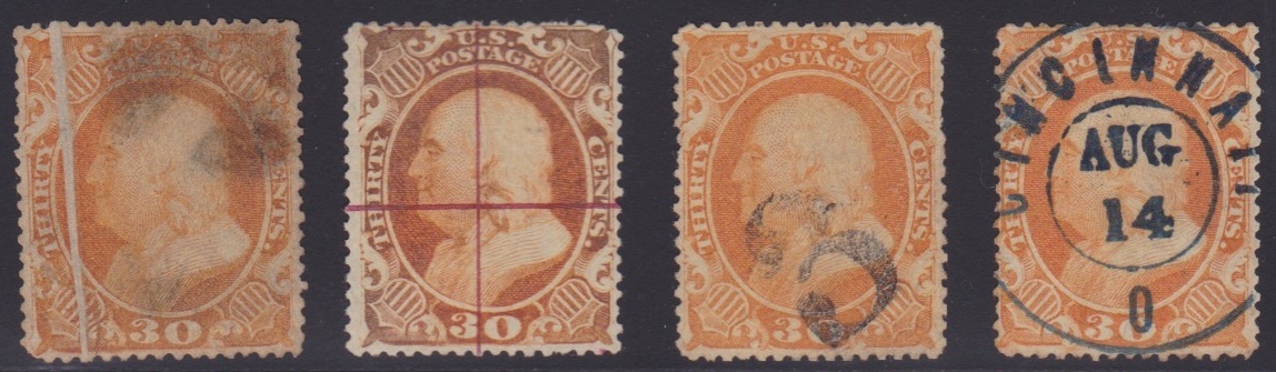 |
|
Send note to Staff
|
|
|
Replies: 82 / Views: 8,447 |
|