| Author |
 Replies: 18 / Views: 1,104 Replies: 18 / Views: 1,104 |
|
Valued Member
Japan
385 Posts |
|
|
|
Dan's site mentions varying degrees of thickness found in the 'old paper' varieties.
Assuming we're looking at well-preserved, post-office fresh pieces:
Could the design elements be larger or smaller depending on the paper's thickness? Or would that only be caused by a different paper type (i.e. silk..)?
Could the thickness also be identified by the paper's color, or how the ink sits on it?
|
|
Send note to Staff
|
|
|
|
|
Bedrock Of The Community
United States
10599 Posts |
|
|
The paper thickness varies, but it usually is not very significant between the types. Very occasionally one will come across very thick paper that is almost card like, but usually the differences are really only noticed by comparisons unless one has a lot of experience in handling them. The design elements only change based on how the stamps dried, and the grain of the paper. I have never noticed any differences relative to the thickness of the paper in that sense. Butler & Carpenter were in far too much of a hurry to try and use the shades or impressions in this regard. Both are important in looking at imperf and part perf stamps because they were generally issued early in the series, but the paper was coming from at least 3 different sources, so variations are the norm. |
Send note to Staff 
|
|
|
Valued Member
Japan
385 Posts |
|
|
Valued Member
Japan
385 Posts |
|
|
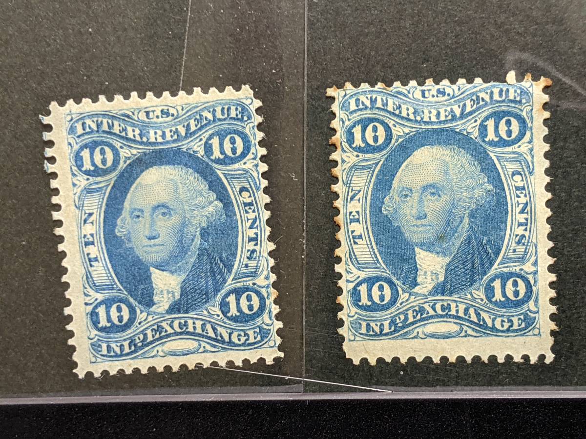
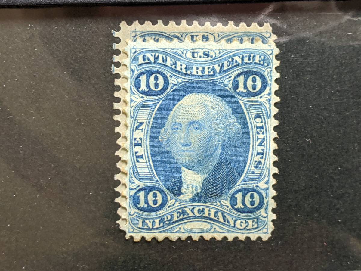
The size comparison photos above are only from one of the stamps. Here's the other one just to be clear: 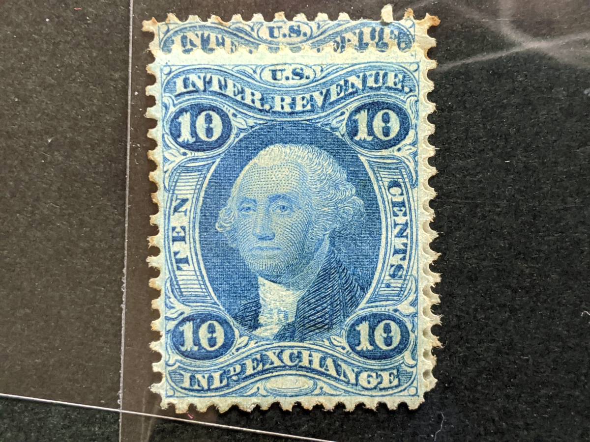 |
|
Send note to Staff
|
|
|
Bedrock Of The Community
United States
10599 Posts |
|
|
Remember, these stamps are at best 151 years old. And we don't know how they have been treated during that time, so paper shades are always a bit of an unknown. These stamps were not given the status of the postage issues at the time in terms of how they would be received by the public, so the paper is often dirty (various bits of detritus are often found). Some early paper is very white, but there was not a huge amount of that used; this was the time of the changeover from rag paper to wood pulp because of the war.
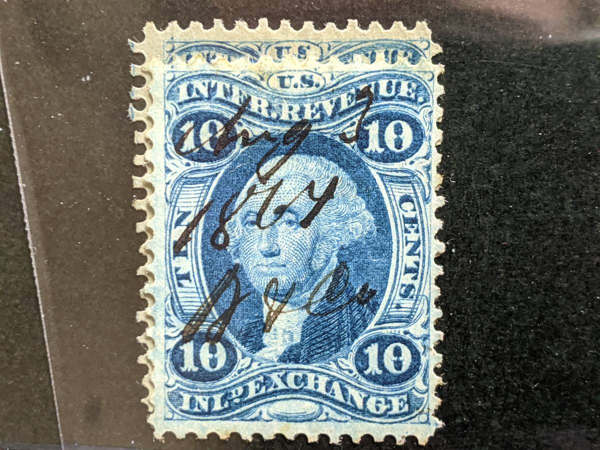
The stamp on the left in the first scan was a much earlier printing then the stamp on the right. Notice how much less plate wear there is. And the stamp with the 1864 cancel is much sharper still. The original intent was to use each stamp according to it's label to pay specific taxes, but it soon became obvious that this was impractical. Once the decision was made to only keep the proprietary and playing cards stamps specific to proprietary articles, B&C tended to go with certain plates much more often over the years for the documentary uses. The various values of the inland exchange plates were used very frequently, so it's easy to find examples in the various states. Size differences are the result of shrinkage, as I stated earlier. |
|
Send note to Staff
|
|
|
Pillar Of The Community

692 Posts |
|
|
I will have to look through piles of stuff, but will scan and post several examples of thick paper printed stamps later.
There is no doubt there is a thick paper period where I have several examples of a thick paper on 2 cent revenue stamps. If memory serves me they are all dates in a few month period.
Almost card like paper. Different look, feel and sound. The flick test is an easy test with these. More to come when I can find them. |
|
Send note to Staff
|
|
|
Bedrock Of The Community
United States
10599 Posts |
|
|
I have a $3 that is almost on card, but I will have to look later and see whether it is dated. |
|
Send note to Staff
|
|
|
Bedrock Of The Community
United States
10599 Posts |
|
|
The only stamp that is pretty much always on a very thick paper is the imperf $200. |
|
Send note to Staff
|
|
|
Pillar Of The Community
United States
790 Posts |
|
|
In most variations are due to paper shrinkage, the amount of moisture present and the grain direction of the paper. except for a couple of short transfers and foldovers or pre-printing creases the sizes are pretty consistent,
|
|
Send note to Staff
|
| Edited by m and m - 03/02/2023 11:34 am |
|
|
Moderator

United States
12330 Posts |
|
|
Quote:
most variations are due to paper shrinkage, the amount of moisture present and the grain direction of the paper... Agreed. https://goscf.com/t/76973Especially true with First Issue Rev's; I doubt that if a roll(s) of paper were deemed more moist than what they typically would run, they would not go to print. When the heat was on to ship revenue stamps, imagine a production worker walking into the boss's office and telling him that they couldn't run today because the paper was too moist. Don |
|
Send note to Staff
|
|
|
Bedrock Of The Community
United States
10599 Posts |
|
|
Quote:
When the heat was on to ship revenue stamps, imagine a production worker walking into the boss's office and telling him that they couldn't run today because the paper was too moist. The quantities of both muddy prints (too moist) and dry prints (not moist enough) prove that that conversation never occurred. |
|
Send note to Staff
|
|
|
Pillar Of The Community
692 Posts |
|
|
Quote:
will scan and post several examples of thick paper printed stamps later OK - found them! Pardon my misrememberizations on a detail or two: 1. They are dated from Jan - Dec 1871 (except for the poss "Jan 1870" example) 2. There are no silk fibers, despite being whiter and brighter than other stamps of the era 3. Paper is not thick like card, but it is stiff; definitely has a loud sound when flicked and doesn't bend like normal revenue stamp paper ("old paper") I am not sure anyone will be able to glean anything from these two scans without being able to touch the paper or hear the sound, but here you go.  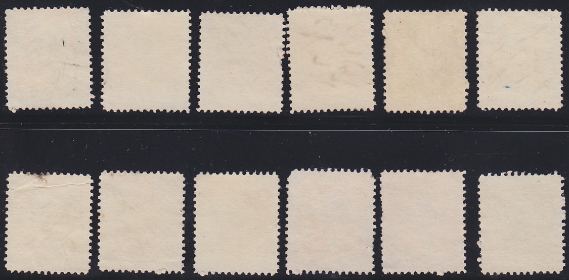 |
|
Send note to Staff
|
|
|
Valued Member
Japan
385 Posts |
|
|
According to what your saying Don, I should be able to measure the "current moisture content" on both these stamps and find that the moisture level is significantly lower than the others. Is this correct?
If this is true, the science is extremely easy to show rather than having to assume it must have been the case, which I never like to do.
INCREDIBLE insight, btw. What an underrated essay that is, and one that should be 'pinned' somewhere, somehow. |
|
Send note to Staff
|
|
|
Valued Member
Japan
385 Posts |
|
|
Thank you StateRevs! No, that's extremely helpful... You wouldn't believe it but I had all my R15s pulled out because I found one like you showed here.
I know what you mean about the "loud sound". Just lightly graze it with your fingernail and you can hear it across the room!
What's also noticeable is that you can't see any design elements from the reverse. |
|
Send note to Staff
|
|
|
Moderator
United States
12330 Posts |
|
|
There are two moistures levels involved; that at the time of printing and what it might be at time of current measurement.
For example, a stamp printed with X% paper moisture level would be dimensionally different than one printed at Y% paper moisture level if they were both in the same environment at a later date and the paper in both stamps had then normalize to the surrounding RH.
Don |
|
Send note to Staff
|
|
|
Valued Member
Japan
385 Posts |
|
|
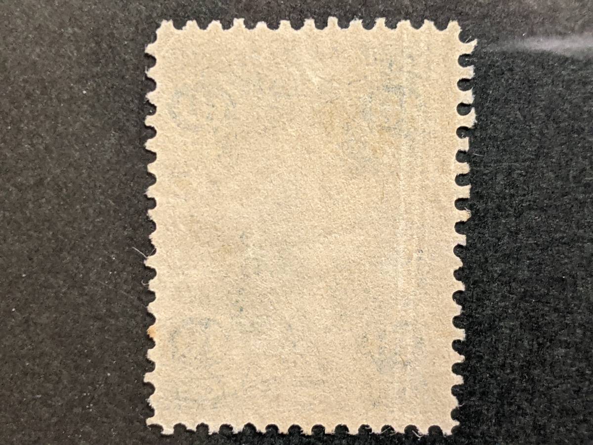
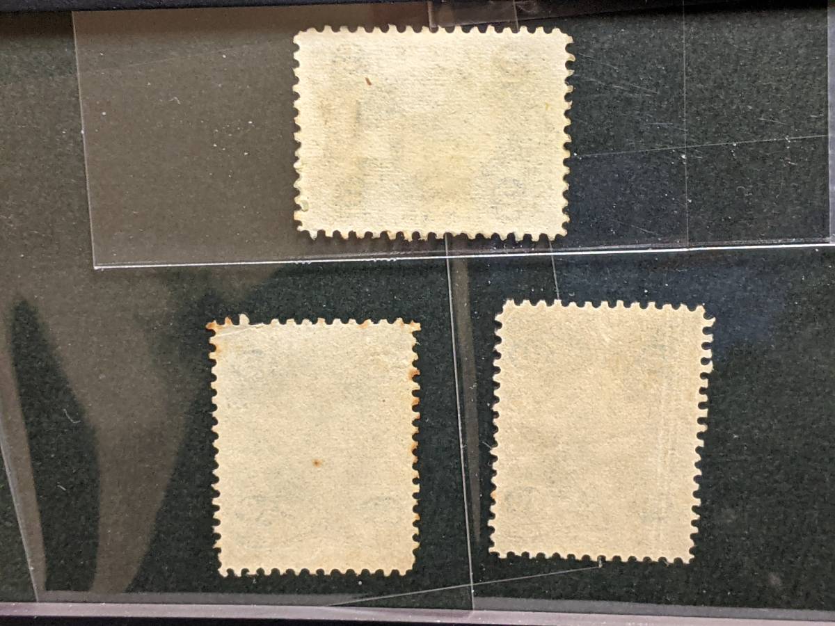
I've lined up three examples from the thickest to thinnest I could find, with a silk in the middle: 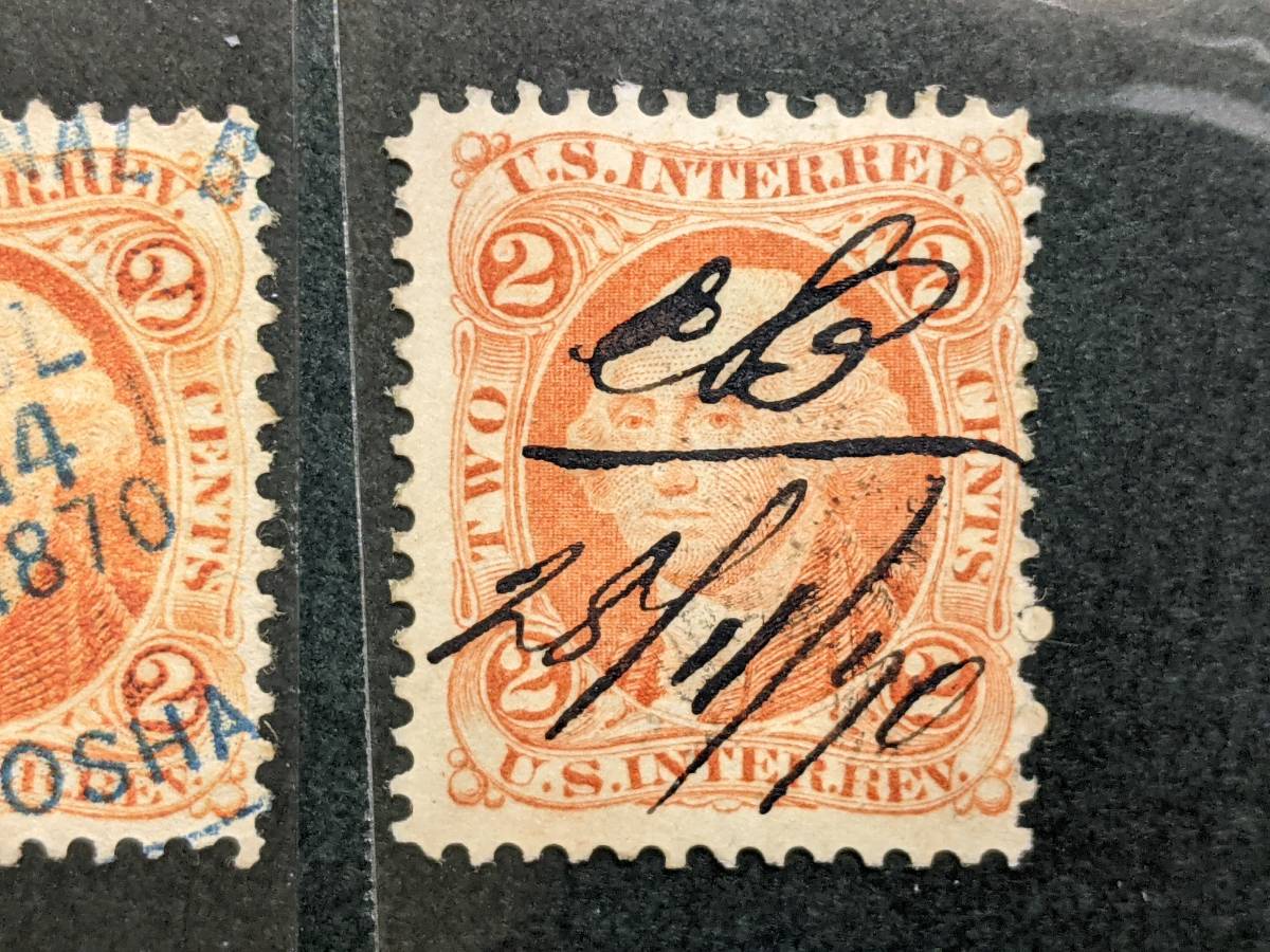 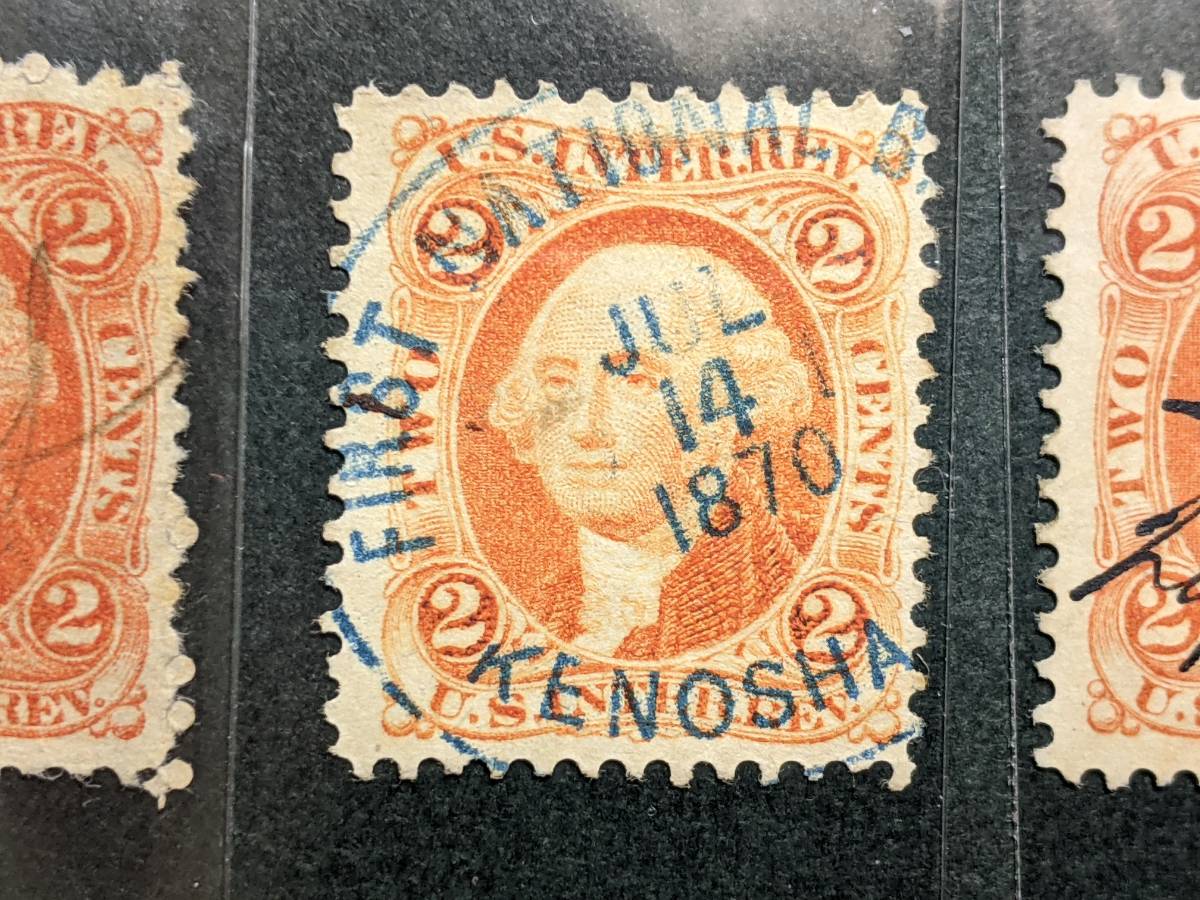 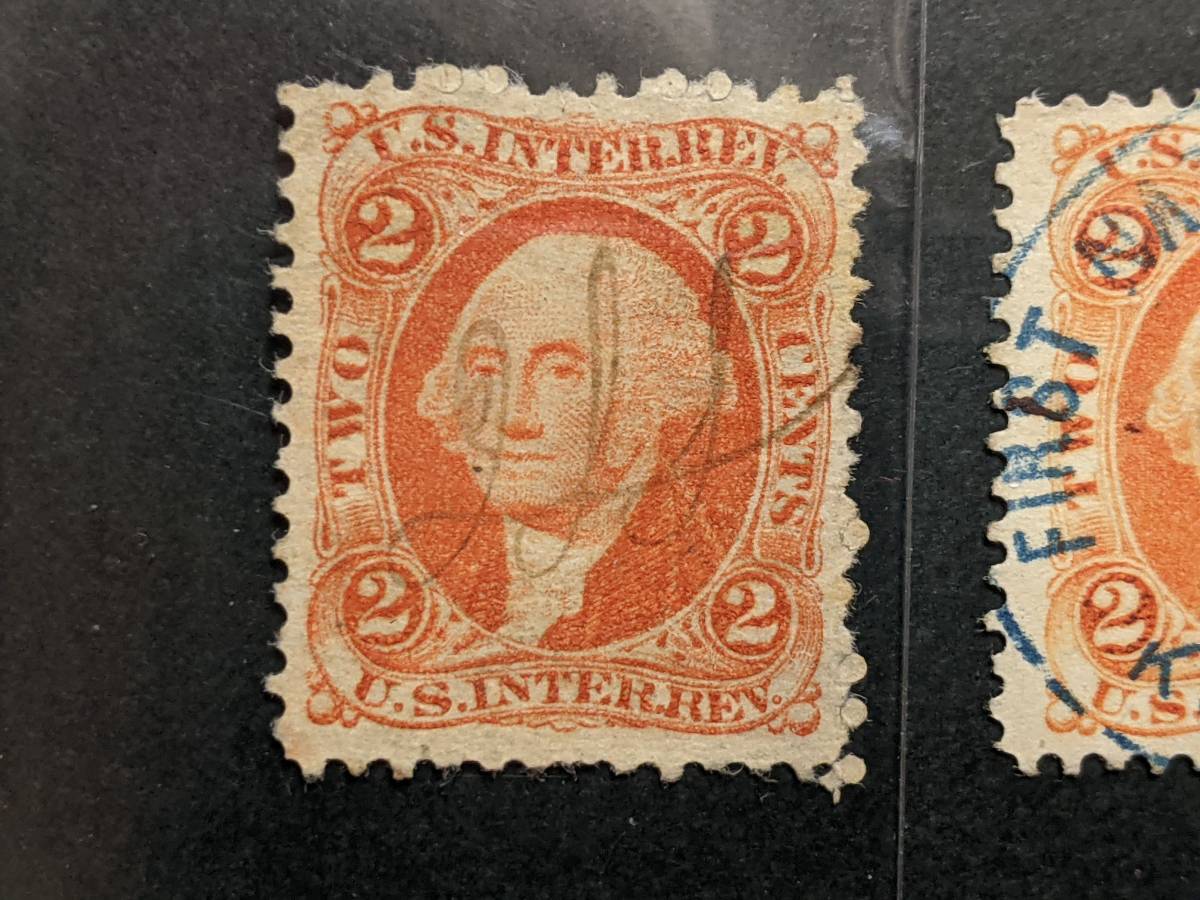 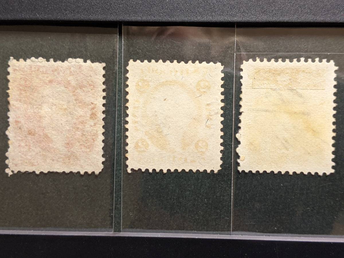 Thick paper is whiter than typical silk, doesn't show design elements from the reverse, and usually shows proof-like details. Silk paper is of middle-thickness, and commonly sports a brighter, neon hue to the original color. Design elements shown through on the reverse are also distinctive in how they capture the silhouette of the obverse. The thin paper I found here is VERY thin, and actually has the same translucence as the obverse portion of a double paper variety. I may be wrong, but it seems like the thinner the paper is on revenues, the less 'tight' the details will be on the design. |
|
Send note to Staff
|
|
|
Replies: 18 / Views: 1,104 |
|