| Author |
 Replies: 10 / Views: 955 Replies: 10 / Views: 955 |
|
|
Valued Member
United States
22 Posts |
|
|
|
Greetings! It's been a while...been very busy. I was catching up with some of the topics here, and realized I could beg some assistance.
I am a collector of only Newfoundland, and have been fascinated by the 1897 overprint for years. Currently looking for various examples, particularly different shades, overprint issues, centering, multiples (especially used), and covers. Perhaps if I get the time I will put together a display of some of my findings. I've really gotten into the weeds with this one...any thoughts on how to enhance what I already have?
Also looking for used blocks of various issues, mostly 1931 and before. Looking forward to comparing collections...
|
|
Send note to Staff
|
|
|
|
|
Pillar Of The Community
United States
1434 Posts |
|
|
Quote:
any thoughts on how to enhance what I already have? Well, I don't have any advice because you haven't described what you already have; you've only listed the things you're looking for. |
Send note to Staff 
|
|
|
Valued Member
United States
22 Posts |
|
|
"Currently looking for various examples, particularly different shades, overprint issues, centering, multiples (especially used), and covers. "
I have a significant number of these...looking for others for comparison, possibly to organize a presentation. For starters, I currently have:
75 mint block
75 mint block with 2mm and 3mm
75-76 mint block w/inscription
76 mint pair w/inscription
75-6-7 mint block/4 (3); block/8 (2)
76i (pos. 41)
76-77 mint strip/4
75 used block/4
76 used block/6 with 2mm and 3mm
75-77 used block/4
75 used pairs (several)
various singles both mint and used
Mint sheet/50 without inscription
A handful of covers with usage date clearly marked
***
Currently looking to obtain, to be specific:
Any mint/used blocks are of interest, particularly those with multiple fonts.
Different shades (working from the various shades of the #60 issue)
Any displaced overprint issues
Any covers with usage date of 75-76-77, particularly multiples - I understand the issue was mostly used between October-December 1897, after which the overprints were recalled (?) with the arrival of the new 1c Royal family issue. Would love to find covers with usage after 1897
Hope that helps...
|
|
Send note to Staff
|
|
|
Pillar Of The Community
United States
576 Posts |
|
|
As a Newfoundland collector also, I'd love to see pictures of some of your material! |
|
Send note to Staff
|
|
|
Pillar Of The Community
United States
1434 Posts |
|
|
Have you considered finding examples of these on cover? You could explore the popularity or scarcity of certain issues on specific routes, or foreign use vs domestic, singles vs multiples, etc. Perhaps you'd be able to say that you have the only known use of a two-multiple of #76 from Gander to Corner Brook, or what have you. |
|
Send note to Staff
|
|
|
Valued Member
United States
22 Posts |
|
|
Valued Member
United States
22 Posts |
|
|
I'm up for any suggestions...I just started branching out into covers.... |
|
Send note to Staff
|
|
|
Valued Member
United States
22 Posts |
|
|
Valued Member
United States
22 Posts |
|
|
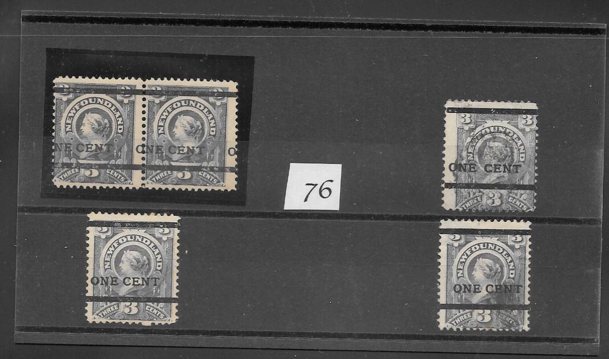
On the left side are mint; the right are used. The mint 76 pair overprint is offset, affecting the next stamp. Centering is always a challenge, since badly-centered sheets of #60 were primarily used. A couple shades are visible...
Used 75's are both examples - 2mm (row 1 of sheet) and 3mm (rows 2-4) between bottom line and text |
|
Send note to Staff
|
| Edited by Dadof3 - 08/03/2023 11:51 am |
|
|
Valued Member
United States
22 Posts |
|
|
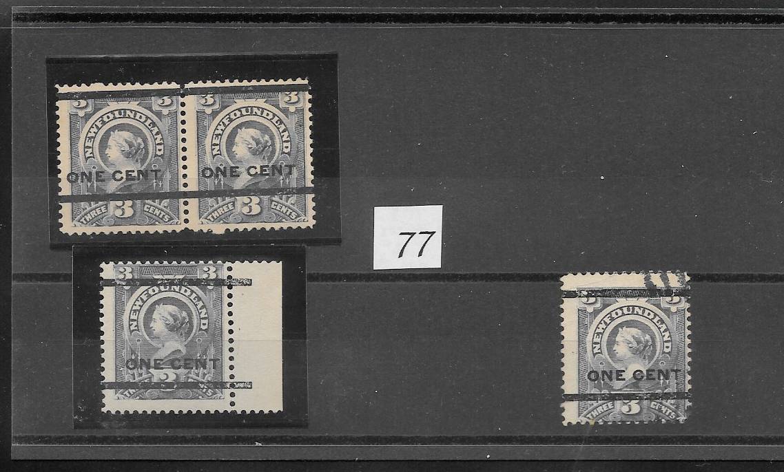
 The left block is a mint #75 bl/4 - top row is 2mm, bottom row 3mm Right block is a used #75 bl/6 - again, top row is 2mm, other rows are 3mm |
|
Send note to Staff
|
|
|
Valued Member
United States
22 Posts |
|
|
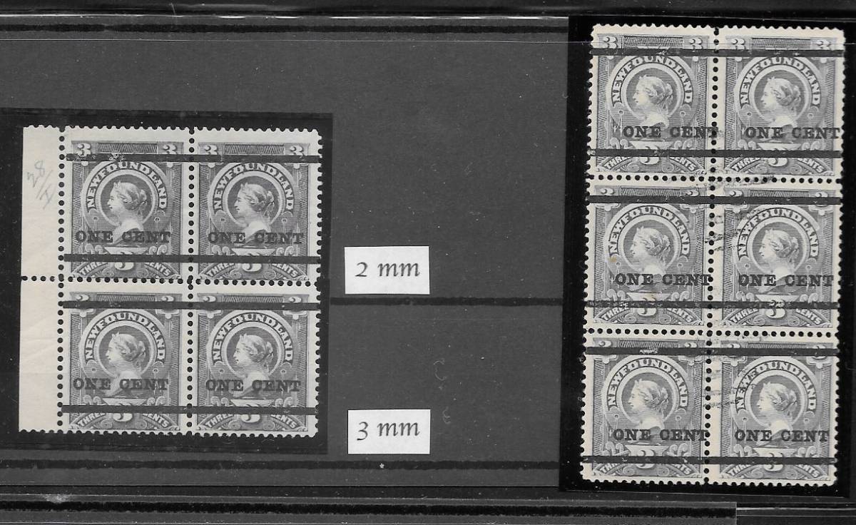
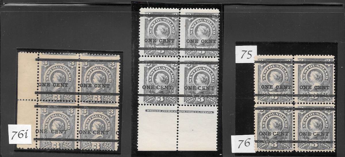 This one is fun...three mint blocks from the bottom 2 rows of the surcharge sheet, with #75 on top and #76 on bottom. LH block is from position 31-2 and 41-2, with #76i. #76i is the first in the row, with a larger distance between "one" and "cent". The other two blocks have a smaller gap between the words. Middle block is a special one because it has the BABN margin inscription (only 800 sheets were surcharged; some did not have the inscription since the 1890 sheets of 100 were broken in half for application of the surcharge). Typical for the issue, the centering is poor, although the block on the right is about as good as I have seen, and the surcharge position is ideal. Again, slight differences in the shades are noted. |
|
Send note to Staff
|
|
| |
Replies: 10 / Views: 955 |
|