| Author |
 Replies: 14 / Views: 970 Replies: 14 / Views: 970 |
|
|
Valued Member
19 Posts |
|
|
|
|
Pillar Of The Community
6326 Posts |
|
|
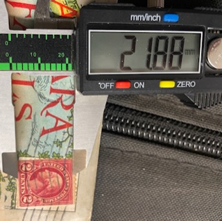
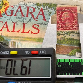
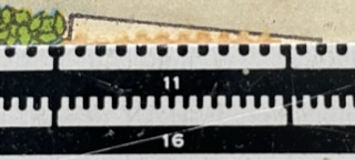
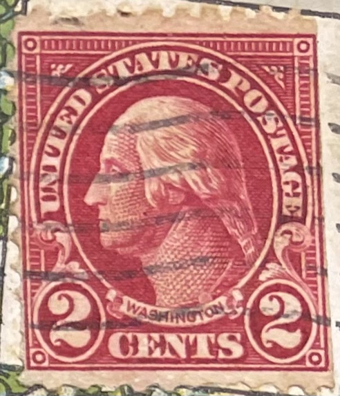
1. What Scott # do you think this is?
2. It would be extremely helpful to have a closeup image of just the stamp itself.
3. The stamp appears to have a straight edge along the right side. What evidence do you have to eliminate this from being a booklet pane stamp? |
Send note to Staff 
|
|
|
Valued Member
19 Posts |
|
|
Bedrock Of The Community
United States
10594 Posts |
|
|
Pillar Of The Community

United States
1493 Posts |
|
|
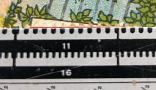
I actually think it probably is perf 11. But given the condition of the stamp, does it really matter? Other than as a learning experience?
In any event, a look at the back of the stamp might help. |
|
Send note to Staff
|
|
|
Valued Member
19 Posts |
|
|
Thanks for the responses.
As a novice in stamps I appreciate the insight, I find these postcards at antique shops and try to Id them. It's really hard!! |
|
Send note to Staff
|
|
|
Pillar Of The Community
6326 Posts |
|
|
revcollector: The stamp is clearly perf 11.
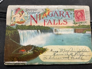
JLLebbert: The stamp is on cover.
Oregon Rory: The reason why I mentioned booklet pane stamps before is that booklets of this era are printed on paper turned 90 degrees from sheet stock. The paper is slightly damped for printing and when it dries after printing, the grain of the paper shrinks differently "with the grain" vs "cross-grain", resulting in booklet stamps showing an image slightly shorter and wider than the corresponding sheet stamp of the same Scott ID. Scott is mostly silent on this dfference. Bottom line, "treasure hunting" is hard work ... even for the experienced. I would recommend enjoying the hobby and let the $$ happen when the lightning choses to strike. |
|
Send note to Staff
|
|
|
Pillar Of The Community
United States
1493 Posts |
|
|
The stamp is indeed on cover. Sort of skipped to the last post & ignored the first. I knew I should have gone to bed sooner. Must be more observant! |
|
Send note to Staff
|
|
|
New Member
United States
4 Posts |
|
|
I just joined, specifically to ask a "Perf 11" question, and here's a thread already! And maybe John Becker's info on shrinkage has answered my question. I have a block of four US Postage Due 3-cent stamps. I'm using StampCollectingBlog's in-browser digital gauge to measure perfs. It gives the same results as a printed perforation guide, and the check line on that measures out to exactly 20mm. So I trust the gauges though neither is a traditional physical unit. The vertical pattern size on my stamps is 22.5mm; definitely not 22.0. And the vertical perfs are 10.5. I've made these measurements repeatedly. So my stamps are no doubt Scott J82 and not J72. I don't think they're J82a Scarlet because in real life they aren't bright red although scans can appear that way. That's all just background. My question is about the horizontal perfs. They always measure 11.3, not the 11.0 listed for these stamps. So they're actually closer to 11.5. --> Is such a large difference normal? Any other comments? I studied up a little on these stamps & perfs hoping mine would be J72s, but aside from that don't know much more about stamps than which side to lick. 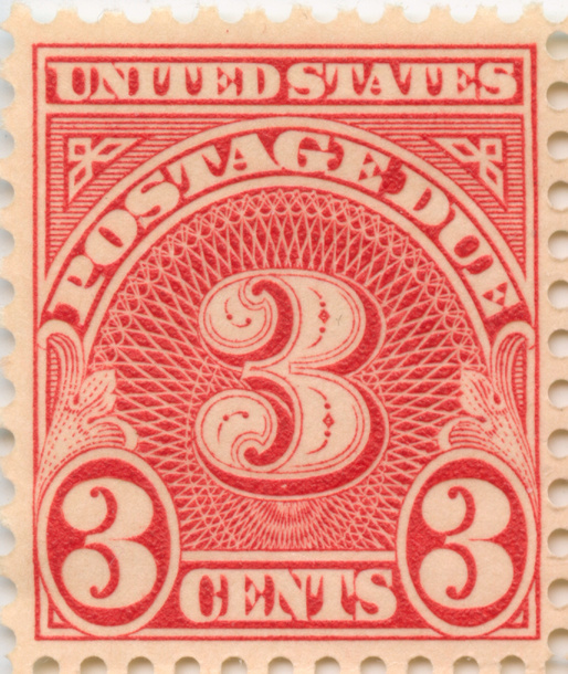 |
|
Send note to Staff
|
| Edited by HobbyStamper - 03/08/2024 11:56 pm |
|
|
Pillar Of The Community
6326 Posts |
|
|
Since I was mentioned....
Yes, as you have found, this face-design comes in perf 11 (Scott J72) and perf 11 x 10.5 (Scott J82).
Scott, like all catalogs, rounds the actual perforatiom rate to the nearest half or quarter, so the closest rate is what you have. Most often, when in doubt I pick up a stamp of known rate and use it instead of any gauge.
There are 3 flavors of the "J82 family", which have been listed for the past few years (in chronological order of release) as:
J82, dull carmine, wet print
J82a, scarlet, wet print
J82b, scarlet, dry print
Yours is definitely one of the 2 scarlet's. Because they are fairly easy to ID in person by sight, I have never bothered to do any image-size measurements. Compared to the very common J82a, the J82b has a different "look" to it, whiter and thicker paper, raised ink. Looking at the back, the thinner paper of J82a the front image will be more visible than on a J82b. These observations apply to all of the "a" and "b" subtypes.
If you want to get into the weeds on these, I would recommend buying a plate block of these later two types for reference.
All that said, it looks like a J82b.
|
|
Send note to Staff
|
| Edited by John Becker - 03/09/2024 12:48 am |
|
|
New Member
United States
4 Posts |
|
|
Very interesting, Mr. Becker!
Anyone: Is there any / much difference in value between the J82 and the 'a' or 'b' variant?
Thanks for the help. |
|
Send note to Staff
|
|
|
Pillar Of The Community
United States
1493 Posts |
|
|
The blocks below are, in order, J82, J82a & J82b. Their identities can be verified via the plate numbers.  Added: To discern whether your stamp is J82a or J82b, hold it at an angle to a bright light. The dry-printed J82b should exhibit a sheen ... not so for J82a. I tend to agree with John Becker ... probably 82b. As for value, my 2021 Scott lists MNH copies at 0.40, 0.45 & 0.40 respectively. |
|
Send note to Staff
|
| Edited by JLLebbert - 03/09/2024 09:37 am |
|
|
New Member
United States
4 Posts |
|
|
Thanks, J. Lebbert for the very complete info. My block has no plate number but the stamps do have a sheen. And seeing the three colors side by side it does look like mine are scarlet, not carmine as I'd thought. So, definitely J82b.
No significant value (I'm glad to not be wondering about that either) but I love the color, intricate engraving and elegant old typeface; and after 90 years these are still like new. Pretty cool.
All my questions are answered. Thanks to the community for the effort. |
|
Send note to Staff
|
|
|
Pillar Of The Community
6326 Posts |
|
|
Your stamp is newer than first appears.
Scott is rather vague, but the basic dull carmine J82 is the original shade from 1931.
The scarlet, wet print J82a (and its "a" sisters) was introduced in 1943 as noted in an article about this entire due design in the November 1965 copy of "The Bureau Specialist" as a number of ink formulations changed during WWII.
And the scarlet, dry print J82b (and its "b" sisters) was introduced in 1958. |
|
Send note to Staff
|
| Edited by John Becker - 03/09/2024 5:24 pm |
|
|
New Member
United States
4 Posts |
|
|
Thanks for this and your other input. I was surprised to have such fine stamps from the 1930s.. My father collected but in the 1960s; so the 1958+ date makes perfect sense.
Though I had searched only for info on what range an "11 perf" might be, this became a little primer on this 3-cent postage due design. Maybe someone else will find it by keywords. |
|
Send note to Staff
|
|
| |
Replies: 14 / Views: 970 |
|