| Author |
 Replies: 12 / Views: 688 Replies: 12 / Views: 688 |
|
|
Valued Member
United States
147 Posts |
|
|
|
|
Valued Member
United States
147 Posts |
|
|
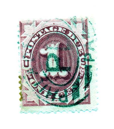
I guess if anything, they look deep claret to me, no brightness to them that I see. |
Send note to Staff 
|
|
|
Pillar Of The Community
6326 Posts |
|
|
First thought ... scrap ypur scans and compare your actual stamps to other images. Your scans are over-exposed and introduce another variable, etc. Nothing beats direct stamp-vs-stamp comparisons when possible.
Second, if you must use scans, then use a neutral background, like a gray card so the scanner software "sees" the stamps more than the background. |
|
Send note to Staff
|
|
|
Valued Member
United States
147 Posts |
|
|
I came to the same conclusion last night and ran scan with black background, hoping for better results: 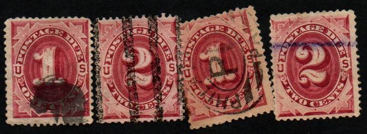 |
|
Send note to Staff
|
|
|
Valued Member
United States
147 Posts |
|
|
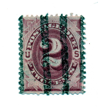
However, this didn't help me. So, I took photos as when I look at stamps I now see red brown. Photo seems to support that: 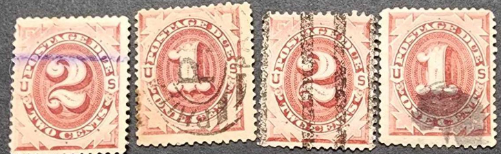 |
|
Send note to Staff
|
|
|
Valued Member
United States
147 Posts |
|
|
Bottom line, I think scans have there place when trying to zoom in on fine details, but basically stinks with colors. I may have to play with scan settings to see if I can get good color images.
Thanks for your reply John! |
|
Send note to Staff
|
|
|
Pillar Of The Community

United States
1055 Posts |
|
|
Fascinating. In your first post, I saw the first 3 cancels especially the Philadelphia one having a green tint, but your later scans show them as ordinary black. In your second scan, all the stamps look claret, then in the last photo they are tending towards red brown. Sheesh. Hard for me to tell. Indeed, having reference copies in-hand is really the best way to identify colors. |
|
Send note to Staff
|
|
|
Pillar Of The Community
United States
3483 Posts |
|
|
I would argue that computers and the internet have taken us backwards with regard to color identification. By the time an image has gone through: a scanner, compression software, different monitors and ambient lighting, one has no idea what it originally was. Subtle color distinctions are almost impossible to be sure of. In the case of this thread, even major color distinctions are way off.
One case that occasionally can work for color, is where a certain color and printing impression often go together -- sometimes if the observer sees what looks like a color and impression that do go together properly, one can (with reservations), make some assumptions about whether the perceived color is likely correct or not. This, however, is the exception and not the rule, and only applies to those who know what proper colors look like for a given issue. |
|
Send note to Staff
|
|
|
Pillar Of The Community
United States
786 Posts |
|
|
I think Scott (Amos) puts out a color chart for somewhat short $$ especially for the W/F issues but might work. There are a couple of vendors that put out color charts for $$$$ and they run the gambit. The problem with color charts is that they deteriorate over time from age, exposure, making a 'new buy' necessary. Maybe a Google search or eBuy search might help. (Honestly, I have a damned hard time trying to distinguish the reds on any early issue, even when comparisons in hand... lake, Carmen, Carmen lake, deep lake.. claret, wait that's a wine.) |
|
Send note to Staff
|
|
|
Pillar Of The Community
United States
5894 Posts |
|
|
Workers in the print shop did not follow a specific recipe for mixing up the ink for each printing run and kind of did it by feel. Thus there can be a wide variety colors found in postage due stamps. |
|
Send note to Staff
|
|
|
New Member
United States
4 Posts |
|
|
The easiest way to identify members of the claret family of Large Bank Note Postage Dues (J22-28), is to place the stamp/s in question under long wave UV. Claret family stamps will fluoresce, giving off a warm orangey glow. Stamps from either the Red Brown (J15-21) or Brown (J1-7) families, will not fluoresce. They will remain dark and "dead." Thus, while direct comparison of shades is often useful, this method will facilitate the separation of the brighter red browns from the darker clarets.
|
|
Send note to Staff
|
|
|
Pillar Of The Community
United States
4276 Posts |
|
|
Quote:
Nothing beats direct stamp-vs-stamp comparisons when possible. I wish to remind folks that damaged, thinned, torn, missing piece(s) stamp have a great use as references. They can generally be had for a song and are perfect comparison references. Such can also be modified (read cut) to work as a template overlay when comparing features. Such even helps when using other methods of comparison such as UV light. |
|
Send note to Staff
|
|
|
Pillar Of The Community

United States
1493 Posts |
|
|
I, for one, fully agree with Dootone348's observation. Long UV is a great tool for verifying that your "claret/red brown" postage dues are correctly identified. For years I had assumed that I had these properly placed by color alone. But, when I eventually got around to checking my stamps with long UV, I discovered that my 10-cent J26 was actually J19. |
|
Send note to Staff
|
|
| |
Replies: 12 / Views: 688 |
|