| Author |
 Replies: 25 / Views: 1,312 Replies: 25 / Views: 1,312 |
|
|
|
Pillar Of The Community
543 Posts |
|
|
You think? Regarding the oval, although in the first photo it is not visible at its visible end, the closure of the oval can be seen... It is true that the letters are not at the same height, but they would be two different postmarks with the same function.. |
Send note to Staff 
|
|
|
Pillar Of The Community

United States
1055 Posts |
|
|
I think both are FD. https://stampsmarter.org/public/Pos...rec&pk0=5335From Cole cancellations book -- 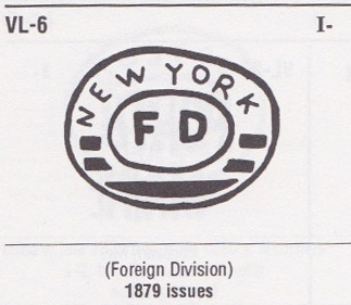 NSK, "A" for effort but I don't think it is right. The vertical bar on your F looks too tall is not straight (not parallel to the F on the cancel). And I think it is an optical illusion that make Franklin's sideburns look like part of the cancel. 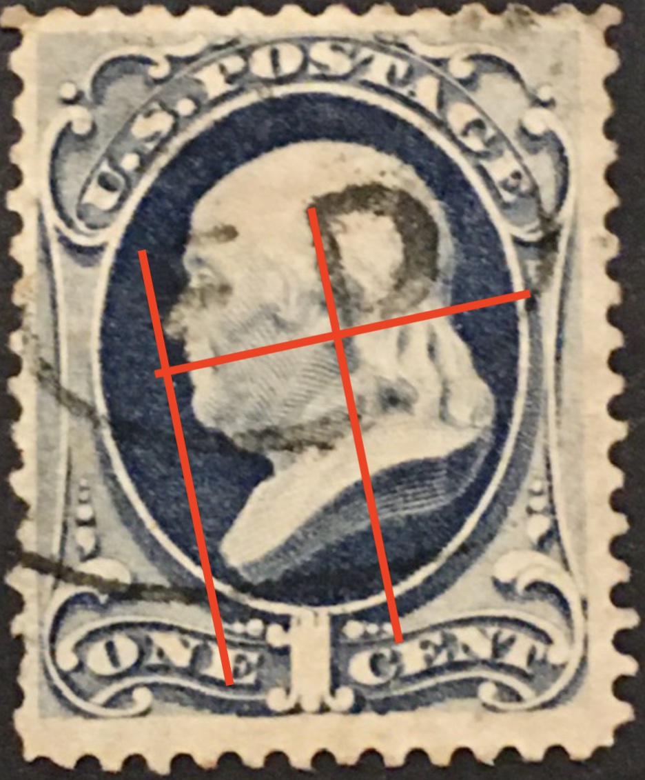 Edit: (OK, so not the same exact cancel as pictured in Cole, because of the black bars in the bottom part of the oval, but the same intent). |
|
Send note to Staff
|
| Edited by ZebraMan - 04/05/2024 4:45 pm |
|
|
Pillar Of The Community
543 Posts |
|
|
Great information!!Thank you very much!!!The Mint stamp are very nice, but there is something they do not have, cancellations....the best part of the stamp used despite its conditions if the cancellation is curious and offers details, at least for my....I reaffirm myself in the +5 for the cancellation |
|
Send note to Staff
|
| Edited by Murasama - 04/05/2024 4:59 pm |
|
|
Pillar Of The Community
United States
4079 Posts |
|
|
I think NSK is being too hard on the cancel
but because of the centering of the stamp it will not grade high |
|
Send note to Staff
|
|
|
Bedrock Of The Community
United States
10590 Posts |
|
|
The cancel has no effect on grading. That you like it is fine, but it means nothing to whoever would be grading the stamp. |
|
Send note to Staff
|
|
|
Pillar Of The Community
543 Posts |
|
|
One of the main and unique characteristics of used stamps is their cancellation, just as its absence is the main characteristic of the Mint, there is no discussion about this...that is why from my point of view, cancellation becomes a very important evaluable factor in the stamp used, regardless of whether it is light or heavy...more, and this is a important detail, there are no words for the richness and variety of classic US cancellations not to be taken into account...it is my point of view, I At least I take them into account because they seem attractive and fascinate me. On the other hand, there are cancellations that can powerfully increase the value of a stamp, even undesirable a priori, an example of this could be first day cancellations or some pre-cancellations... |
|
Send note to Staff
|
| Edited by Murasama - 04/05/2024 9:52 pm |
|
|
Pillar Of The Community
Netherlands
6526 Posts |
|
|
The down stroke on the P is so obvious extended below the red line, even if the sideburn (that is rather black) is ignored. 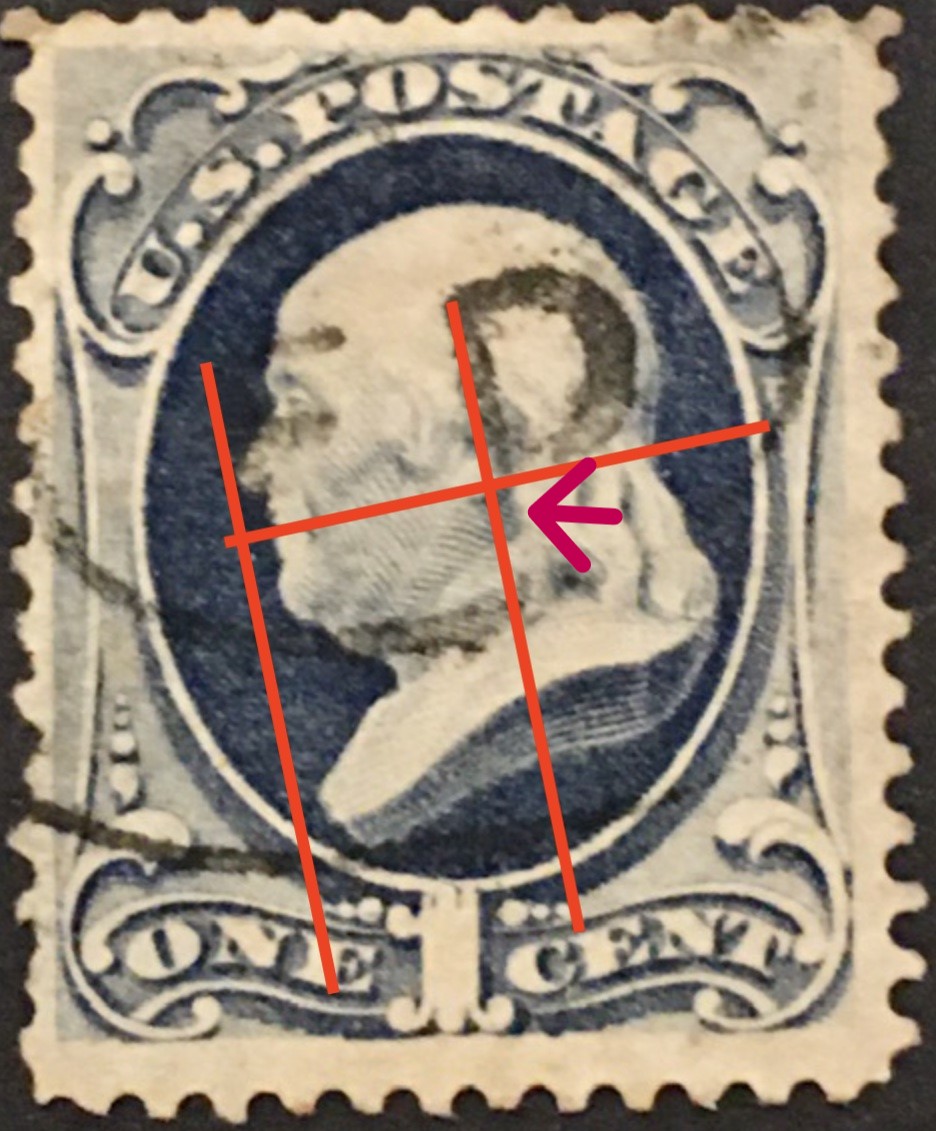 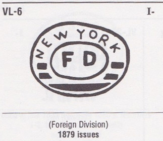 Not a trace of the bars. Where the loop meets the vertical stroke at the bottom, it turns up, not down. |
|
Send note to Staff
|
| Edited by NSK - 04/06/2024 03:14 am |
|
|
Pillar Of The Community
Netherlands
6526 Posts |
|
|
It might be a under-inked 'ghost' strike that causes the effect of the D looking like a P. |
|
Send note to Staff
|
|
|
Valued Member
Switzerland
480 Posts |
|
|
NSK:Why do you insist on something that simply isn't there? There is absolutely no trace of a "P" visible. 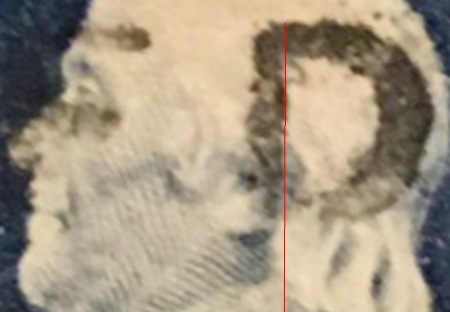 Although a higher resolution scan is needed here, Franklin's sideburns only look like part of the cancel, but are printed in dark blue, not black. |
|
Send note to Staff
|
|
|
Pillar Of The Community
543 Posts |
|
|
NSK I respect your powerful eye, but on this occasion you see a ghost, as I said I also believed at first that it was P, in this photo it can be seen correctly... 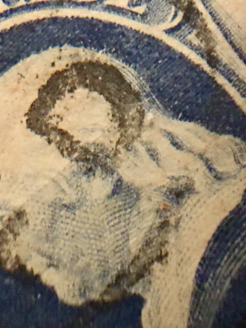 |
|
Send note to Staff
|
|
|
Replies: 25 / Views: 1,312 |
|


