| Author |
 Replies: 25 / Views: 1,311 Replies: 25 / Views: 1,311 |
|
Pillar Of The Community
543 Posts |
|
|
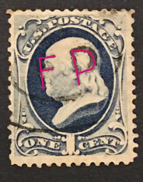
In recent conversations in some posts, and due to the advice of colleague John Becker, I have been seeing about the issue of graduation, something that on the other hand has never worried me much beyond that the stamp is not broken, wrinkled or stained ...without observing details such as the centering or the levels of effect of the cancellation on the design, details that in principle are irrelevant to me since I am satisfied with the stamp in good condition even if it is off-center. Thus, while I cannot find better catalogs , I have found a small Guide regarding grading ( http://psestamp.com/pdf/2009_Gradin..._092009.pdf) with which I have tried to roughly grade some of my stamps (I have not yet read the entire document carefully), I have to admit that it adds a new level to my stamps collection, but it also makes me crazier than I already am... I have graduated this SC#156, but I would like to know your opinion... I am obviously going to go for the high... Soundness: Faul, the main reason is an ugly hinge on the back, the rest is really perfect.Center: VF, it is offset on two sides to the top left, but all the margins are visible and no perforations touch the design.The teeth and perforations are very good.This I would give it a graduation of 40, but considering that the cancellation is light and pretty I would give it +10, and another +5 because the color and the general visual effect of the stamp is very good. In total 55..VF 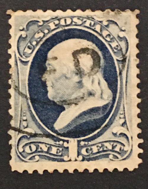 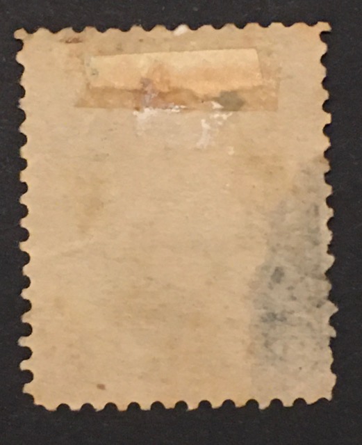 |
|
Send note to Staff
|
|
|
|
|
Pillar Of The Community
United Kingdom
8578 Posts |
|
|
You can get rid of the "ugly hinge", but that appears to be a large thin. Not sure I'd call the postmark "pretty". |
Send note to Staff 
|
|
|
Pillar Of The Community
United States
8956 Posts |
|
|
Yes, I do agree with Geoff. The large thin makes it fairly poor stamp
Peter |
|
Send note to Staff
|
|
|
Bedrock Of The Community
United States
10590 Posts |
|
|
Pillar Of The Community
543 Posts |
|
|
Well, the cancellation seems nice to me with its two large FD, it is the second stamp of this model that I have with this type of cancellation but I still haven't found anything about its origin, it is pretty and diferent for its time, for other cancellations that I can see...perhaps it can be First Day cancellation hehehehe |
|
Send note to Staff
|
| Edited by Murasama - 04/04/2024 8:12 pm |
|
|
Pillar Of The Community
543 Posts |
|
|
Learning to know the stamps and their universe intimately is really a form of enjoyment, it is obvious that, like everything, it is a learning process full of mistakes, but by dedicating time to it I think you can determine very beautiful things with certainty...As I already said, I am not to look at and in my collection I have stamps from the bottom of the graduation table but that, for one detail or another, seem charming and interesting to me...This specimen, within my collection, is one of the best focused hahahaha, it is not an expensive stamp, I could easily get better copies, but as I already said I find the cancellation very beautiful and how it is left in place, this detail is its best curiosity for me and I like it... |
|
Send note to Staff
|
| Edited by Murasama - 04/04/2024 8:25 pm |
|
|
Pillar Of The Community
Netherlands
6526 Posts |
|
|
You should not confuse what you consider pretty because it attracts your attention and what a grader would consider pretty. The cancellation is smudgy and partial. That is not the same as light.
In the end, you decide what you find pretty. But you should not expect another person to do so for the reasons you do.
|
|
Send note to Staff
|
|
|
Pillar Of The Community
543 Posts |
|
|
Pillar Of The Community
United States
2941 Posts |
|
|
Pillar Of The Community
Netherlands
6526 Posts |
|
|
Pillar Of The Community
6326 Posts |
|
|
Likely FD = Foreign Division, from a large city like NYC, soaked from a piece of printed matter sent overseas. Not dissimilar from this "CR", which I believe is confirming "circular rate" contents, as the basic first class surface mail to England would have cost more. 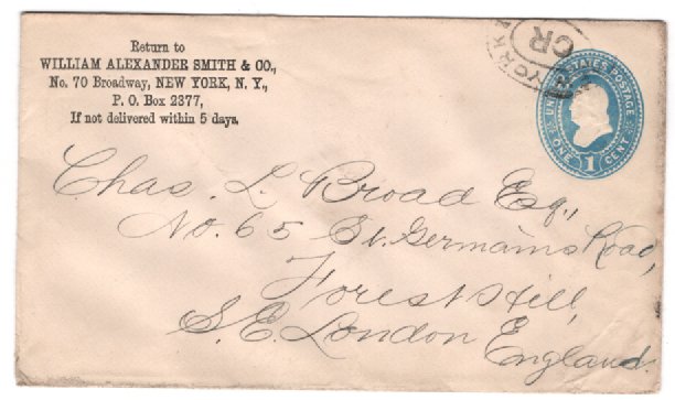 I should clarify my advice, it was to acquire a Scott U.S. Specialized catalog and to study the "Stamp Values U.S. Specialized by Grade" section to understand that the values listed in the main front section of the catalog (and similar websites and lists which give only a single value for a stamp) are for sound stamps with far better centering than typical. Consider Scott as a coin catalog listing only AU-50 values and no other degrees of wear. Scott's Grade section provides the next levels of "wear" valuing for stamps, in this case, values for degrees of centering quality. Then like coins adding for luster or subtracting for scratches or weak strikes; the stamps gain or lose beyond the centering value for gum condition, thins, tears, short perforations ... and exceptional cancels when used, etc., etc,. Most stamps with large faults quickly become "space fillers" regardless of centering. Many collectors have a bias when evaluating their own material skewing toward thinking things better than they are. Thinking more as a buyer than an owner ... I see the centering at about F-70, then a huge thin and a short perf near the bottom of the left side, indistinct cancel. A space filler for the thin aspect alone. edited to correct typo. |
|
Send note to Staff
|
| Edited by John Becker - 04/05/2024 7:34 pm |
|
|
Pillar Of The Community
543 Posts |
|
|
Thanks for all the info John Becker, excellent quality as always!! There is no doubt that it is the same design with a characteristic oval shape and similar typography and abbreviation, you are a Stamp Magister!! That makes me think that...if you, a wise man (not a little.. very wise), haven't gotten a picture of a FD, maybe this is a bit special cancellation after all hahaha. Of course now that I know it better, for me it already is!! Thanks for that!!! |
|
Send note to Staff
|
|
|
Pillar Of The Community
Netherlands
6526 Posts |
|
|
Pillar Of The Community
543 Posts |
|
|
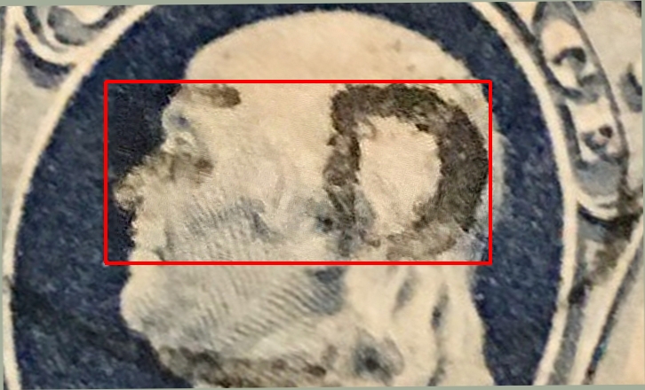
At first it may look like FP, I thought so too, but now I am going to have another copy and in this one the FD and the very flattened oval shape can be seen more clearly... 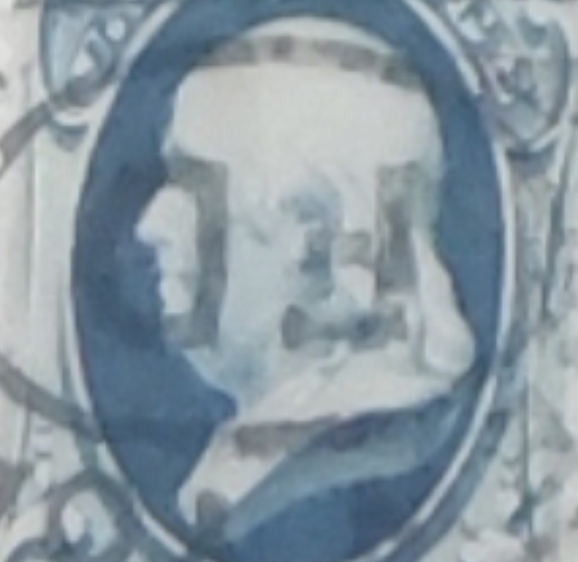 |
|
Send note to Staff
|
|
|
Pillar Of The Community
Netherlands
6526 Posts |
|
|
It is a completely different cancel. The letters are much lower. The top of the oval is nowhere as close to the letters as in that second stamp, if at all it is an oval and not a circle. Note also the second stamp shows FD of the same height. If it would be a D in the first, It is much smaller than the F.
The first stamp, very much, has a P and not a D.
The two cancellations are nowehere near the same. |
|
Send note to Staff
|
| Edited by NSK - 04/05/2024 4:28 pm |
|
|
Valued Member
Switzerland
480 Posts |
|
|
Replies: 25 / Views: 1,311 |
|