@ray.mac This is helpful thank you. I appreciate your posts and your scholarship of the hobby.
Sharing this, in general, on my experience:
I have corresponded with Jack for a decade now and purchased several shade variants from him for my reference collection.
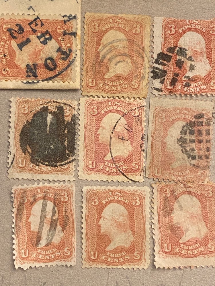
I have physical copies of Brookmans "19th Century" volumes, RH White's "Encyclopedia" and "Color in Philately" with the ISCC-NBS color plates, the Pittsboro "Specialized Color Guides" with the Munsell chips, print copies of the relevant USPCS journals, and various other color guides. The disappointing reality is that most of these publications are old and even high quality lithography still causes some color distortion versus the original stamp, however the print tech is getting better over the recent years.
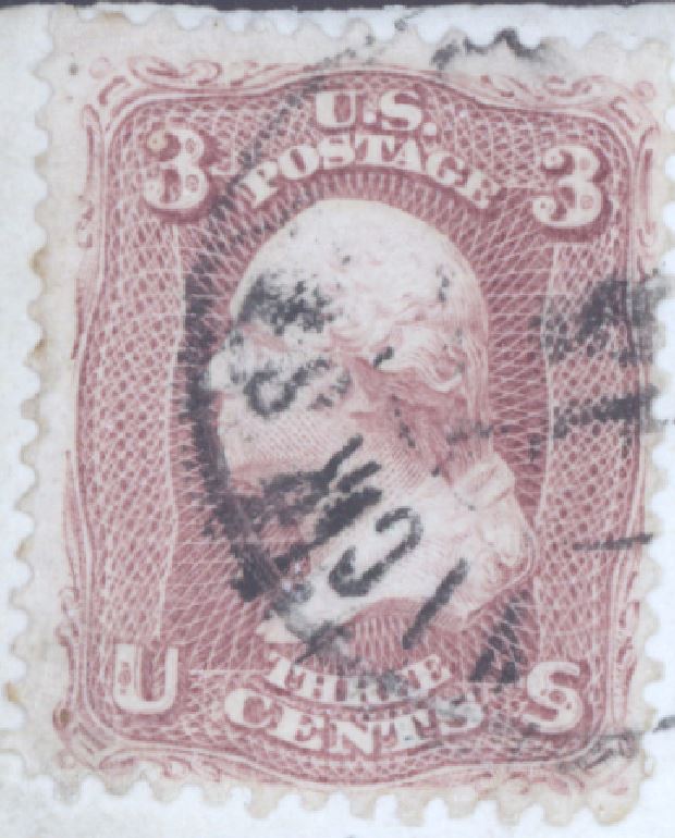
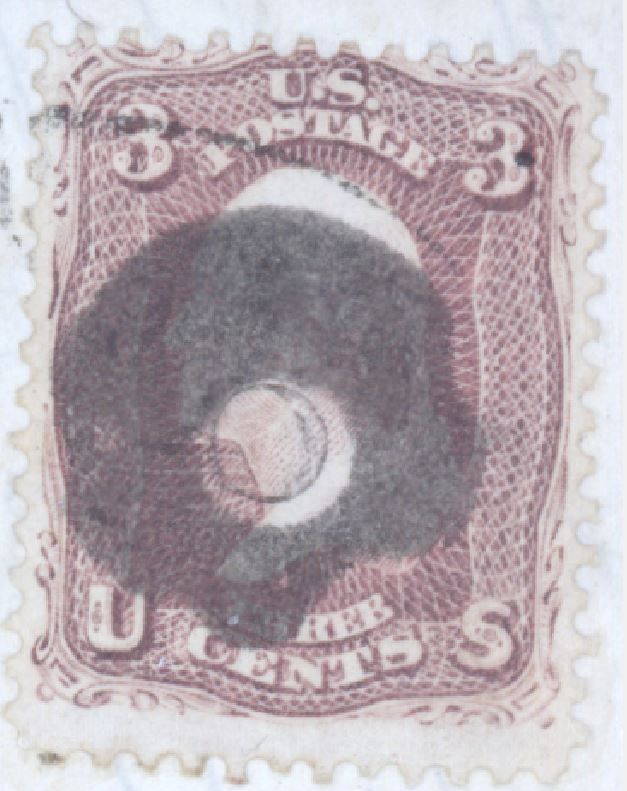
I've auction purchased items that look in hand drastically different than the print catalog, and the website listing, and the description which seems to have been written by an enthusiastic but dubious marketer (especially Aldrich, Kelleher, HarvardMBA). Multiple expensive purchases that simply weren't certified to be what they were sold as. Rose pinks vs pinks, 63 ultramarines versus bright blues, 24c Washingtons, etc.
In fact, purchasing anything from a dealer who isn't extremely accurate and knowledgable here is a total crap shoot. HipStamp,
ebay, dealer sites, whatever.
A quick online scan of "65 cert" will show you PF and Apex and PSE certs of shades that sprawl all over the range, all listed as "Rose". So I have no confidence sending mine off to any of them will result in anything else.
And as is tirelessly noted by the community in this forum, scanned images can be be distorted (viewing) by the calibration and color profile of the monitor its viewed on, which is often set to the users personal preference. Plus the scanner has optional settings to alter the image capture that can obfuscate the eye-observed color. Phone cameras don't even try to be accurate.
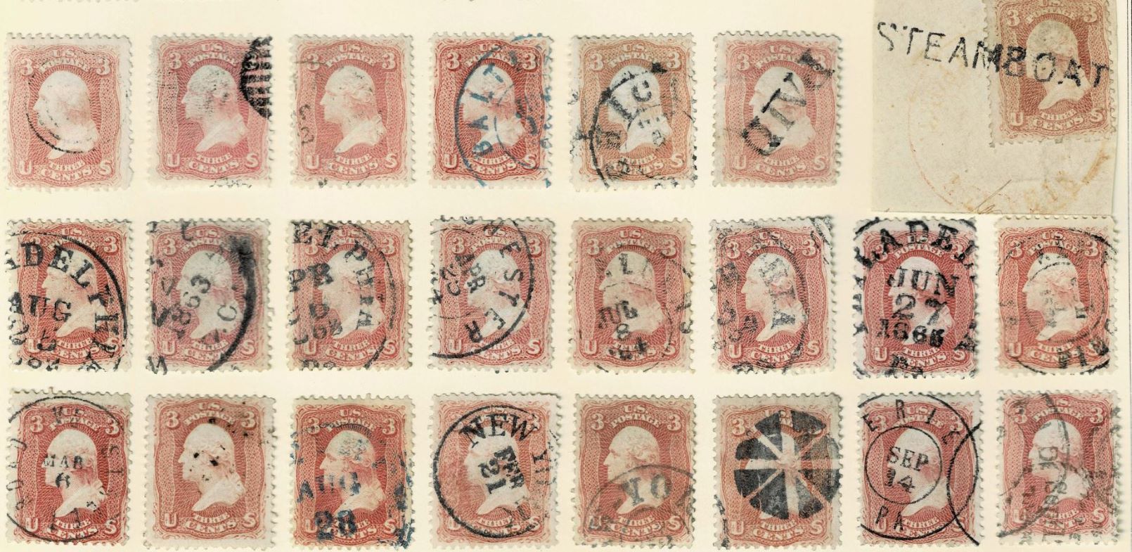
I'm familiar with the 9600dpi scan methodology that Jack used and the Adobe color separation technique. I have those scans for everything that I purchased from Jack.
My challenge at this point in my collection is determining objectively what the minute differences are between similar shades,
...without already owning multiple reference copies, and
...without specific descriptive language by the color namer for each, and
...without a specific color HVC from a specific color system for ANY of them. For example,
- Compare Brownish Red Rose to Brownish Rose Red?
- Compare Lake Rose versus Red Rose versus Rose Red, and describe the differences.
- What is the difference between Lake Brown and Brown Lake?
- What is the breakpoint between Light Brown and Brown?
- Or Pale Brown Rose vs Pale Rose Brown?
- And how brown is Brown, really?
- Reddish Claret Rose vs. Claret Rose vs. Brown Rose vs. Rose Brown?
- Salmon, Lilac, Coral, etc.
I understand the methodology McClung used to assign his names according to cover dates. I have lots of 65 covers. Including Apex certified Red Rose dated 1861, certified pinks dated in late 1862, and ranges of shades for any given 6-month period that fall outside of his date chart but are clearly not any of what is listed to be in that timeframe. So yes dated covers can help directionally, but there are many on cover exceptions and unexplainables which Mike acknowledges in his writing.
So why despite so much frustration do we keep searching for the needle in the haystack?
It's fun. :-)