Not that this will help any, but based on my reference book "Encyclopedia of the Colors of United States Postage Stamps: R.H. White, copyright 1981", there is a page just for the Scott 63. Now there is always discussion about how well a 1981 book survives, and how you can tell different colors on different monitors, but I would like to provide this scan. Each picture is from one page scanned using 1200 dpi settings. I then clipped out the extra data, and combined just these three in one tight group:
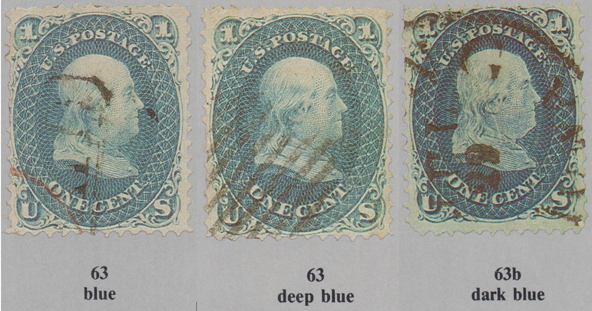
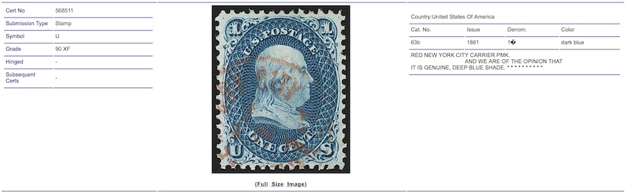
At least on my computer screen, I see almost no difference between Blue and Deep Blue. However, 63b Dark Blue appears much darker (which could be due to the darker cancellation ...)
As some astute observers may comment, the background gray color in the 63b Dark Blue is a slightly different shade than the others, even though it is scanned off of the same page at the same time. In any case, let the stone throwing begin ...