It appears Dulac was not invited to submit for the
next issue, the centenary of the UPU, and the designs
were quite a departure from the usual, excepting
P Metcalf's design, using the linked hands around the globe.
What was pertinent, was the rise of Mary Adshead as a designer,
and her 2s6d HMS Victory and the 5 shilling cliffs of Dover were
in short, spectacular, two of my favourite British stamps,
I am not wealthy enough to afford the higher values
so have not been able to appraise them.
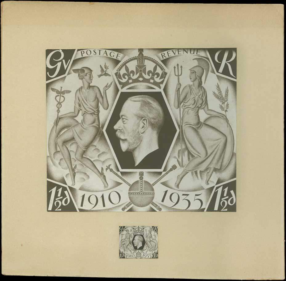
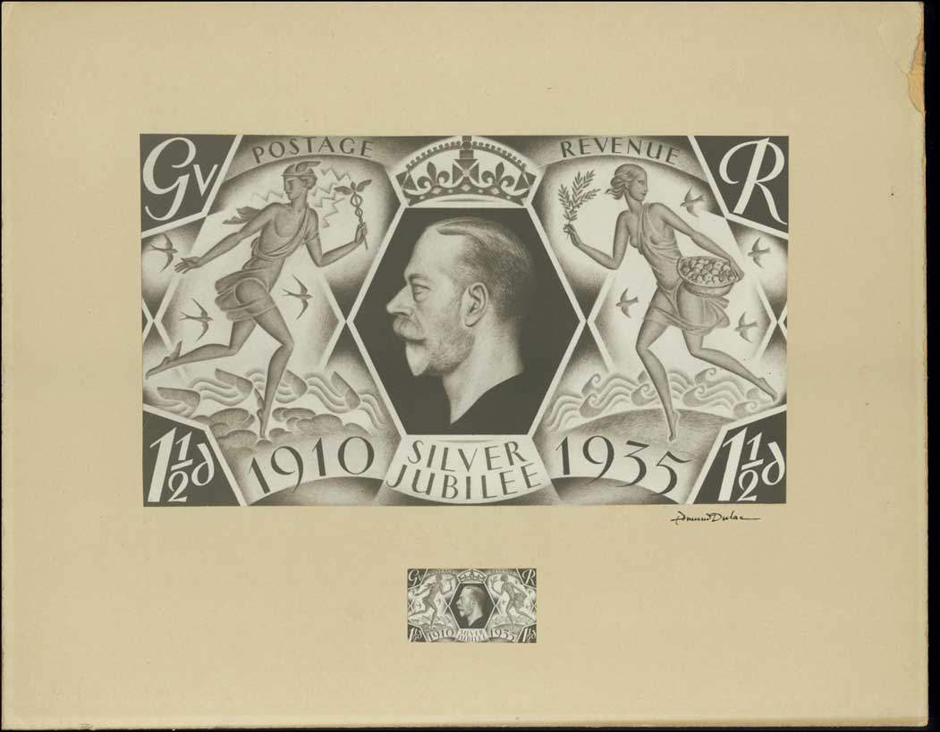
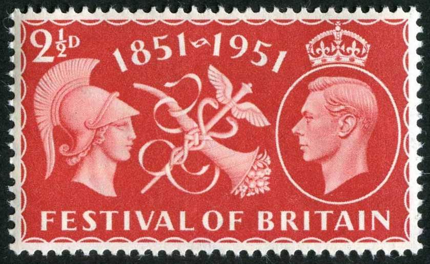
Along came the Festival of Britain in 1951 and Dulac
makes a re-appearance with a lovely design, albeit
a little hackneyed and traditional, having the helmeted
Roman Brittania facing the King, over the Caduceus, and
the Horn of Plenty, signifying Commerce and Prosperity.
Dulac managed to get the colour scarlet this time,
always a crowd pleaser, which enhanced the issue.
For once the cross atop the Edwards crown failed to
rise above the perimeter.
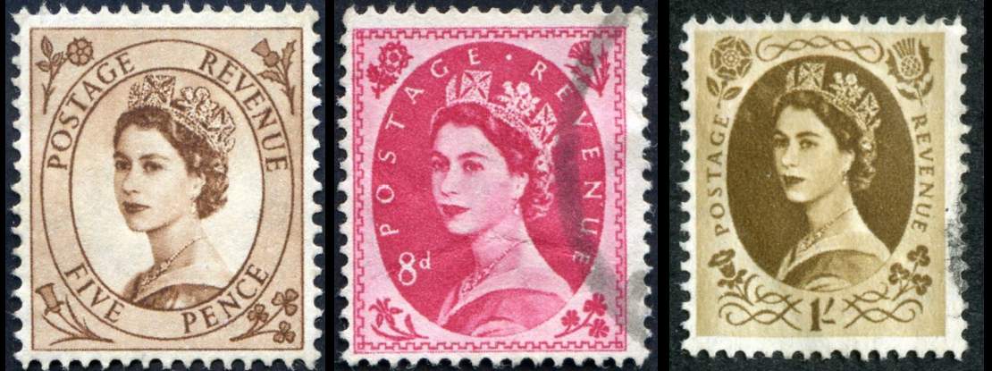
The definitives of QE2 arrived 6th February 1952
and 5 designers were employed, Dulac was up against
4 others, including Mary Adshead, all using the Dorothy Wilding
cameo.
Here I think Dulac bombed out, maybe constrained by Postal
politics, I think the designs although instantly recognisable now
due to the vast volume we see, were all hackneyed.
The designer G Knipe's effort on the five pence shines through,
employing a large value font type, in the ovate belt or garter,
gave the opportunity to expose a large bust of the Wilding study,
yet with a light background, and delineated by the garter, the Queen stood out.
The rest, including Dulacs used a dark background, and all took
the stance of typical ho-hum definitives.
Dulac tried to compensate by giving nicely drawn Regional flowers,
The Rose, Thistle, clover and Daffodil, but that necessitated
a small bust cameo, and the effect was lost.
DESIGNS BY G KNIPE---MARY ADSHEAD--AND DULAC
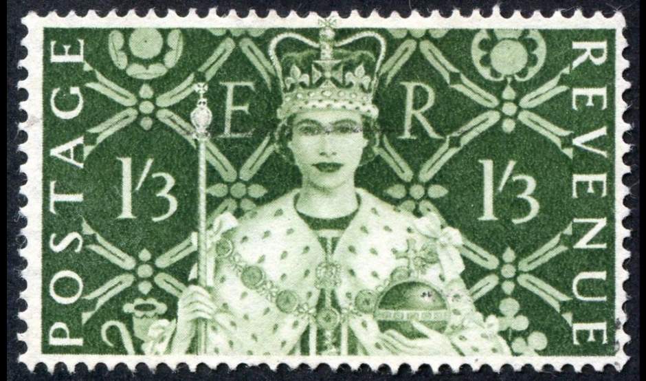
Soon after, Dulac must have been invited to make submissions for
the Coronation issues, and here, my hero, belted the living daylights out of the opposition.
Dulac's design was brave, he had the fair new Queen, facing
her people, face on, radiant and young, with so much
responsibilty thrust on one so young.
Ermine robes, holding the orb and sceptre, with a hint of Tudor
overtones on the background quilting. Super stuff.
I think this is the last marriage of Great Britain postage stamps
and Dulac.
Apart from the following lovely Recess issues
by Waterlow and De La Rue of the Castles, I think British stamp design, went rapidly down hill, culminating in the ghastly (for me) Battle of Britain issues.
To be continued.................