Here are three precancels from Bridgeton, NJ ... the center one being the standard:
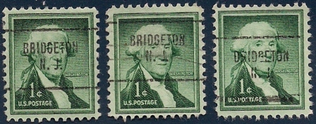
Note the stamp on the left. In my opinion, it has a distinct overstrike on the "R" in Bridgeton, looking as if the name is "BBIDGETON".
On the other hand, the stamp on the far right seems to have a precancel inking problem in that the first letter appears to be a "D" rather than a "B", so it looks like "DIDGETON".
While these are probably nothing special and I can probably chalk it up to very poor printing standards on the part of the post office, I view it as a curiosity, if nothing else.


