Quote:
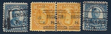
The first one I'm not so sure about. Whether it is or isn't, I cannot seem to come up with the correct city in N.J. being referenced with the partial cancellation ... any ideas?
Other than precancels on coil stamps, there are very few types that have vertical lines in them. Almost all of those are box cancels. The town name is probably Singac, NJ - I often look at this gazetteer site to help solve problems like that. (Note that Singac is now a part of the township of Little Falls.)
http://www.fallingrain.com/world/index.html Quote:
I believe the middle pair is simply an inverted local precancel.
Local in the sense that it isn't a Bureau, yes. But it's actually a federally contracted precancel device in a style used by numerous different towns, so it doesn't get the "L" prefix to the style number (PSS calls that a "Contract Local" device). This one gets style # 632. The Hoover catalogue says the invert isn't worth any more than normal.
Quote:
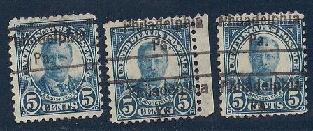
I am assuming the one on the far right is a Philadelphia precancel, although it is quite off-center from where it should be to the point where the precancel name is shown twice on the stamp.
If you imagine that same spacing over a sheet of stamps, there isn't a way to have the same precancel appear on all the stamps. The stamp from the row immediately below your copy would have the city name only once on the stamp - precancels don't generally work that way, they're supposed to have the same design on every stamp (although you can find precancel devices intended for small definitives that were used on larger stamps, like a commemorative, so those don't line up properly).
However, it's still possible that it could have been a double impression of a plate or a handstamp. So, we still need to check all of the style types. Fortunately, most of them rule themselves out because the vast majority use only capital letters. As a quick estimate, it looks like the spacing between lines is around 9 to 10 mm and the length of the city name is about 20 mm. That should rule out type 230, which has a very similar font but a 12 mm spacing.
Type L-13 (Hoover type 27) is a handstamp with a 20 mm city name and with lines 10 mm apart, in a font that looks just like the one shown on your stamp. However, Hoover does not list that precancel on the 5c Roosevelt.
Type L-57 (Hoover type 40) is another handstamp, this time with a 21 mm city name and with lines 9.5 - 10 mm apart. However, that one doesn't look correct to me - the letters are too large, there's not enough space between the city and state names, and the period after "Pa" doesn't line up in the correct place under the "e" of Philadelphia. But it does show up in the Hoover catalogue on a 5c Roosevelt (the perf. 11 x 10 1/2 variety).
And if we go back and look at that electrotype with the 12 mm spacing between lines (type 230), that one does show up in Hoover a on the 5c Roosevelt (perf. 11 x 11), but Hoover doesn't list the double imprint variety, whereas it does for many other values in the series.
Confusing! I would say it's type L-13 and it is missing from the Hoover catalogue in error. However, an exact measurement of the town name length and the spacing between lines is necessary to say for sure.
Ryan