Could the other four surrounding the 2c be faded a little?
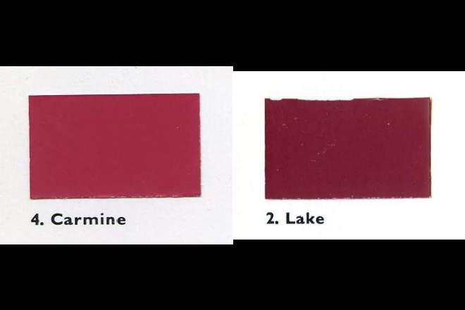
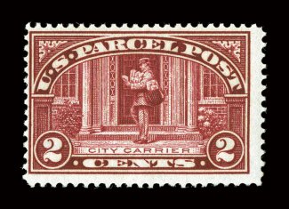
I vote for Deep Carmine. It is carmine but a more vibrant or full colour.
Look at the solid colour in the scroll where it says Parcel Post. Also, put them all on a black matte background (no reflections or glare) in sunlight (only for the look see), or a light that gives out sunlight spectrum colour.
Looking at the stamp on different colour backgrounds will change the colour in human eyes, or at least tint it towards the part of the spectrum that the background has.
White can be called All colours together but has is usually tinted towards a certain part of the spectrum. Otherwise it would be too bright for us.
Russ,
Welcome! Nice pic of Lake! Thanks!

Nice thread. Nice dictionary excerpt Rod, excellent. Love more data. No disassemble Johny 5!
Quote:
<sigh> Apparently it is not just stamps that are afflicted with this handicap.
I have found this same problem in automotive paint. The paint companies call the colours certain names to appeal to the auto buyers, but when different people want different colours they use different names, depending on their own backgrounds.
Fashion oriented or trained people will use fashion colours. Car nuts will use flashy (sometimes) car colours. And then sign makers will have a whole other range of colour names and books and charts. Sign makers are, in my experience, some of the most knowledgeable about colour and how it looks in different conditions and dofferent mediums.


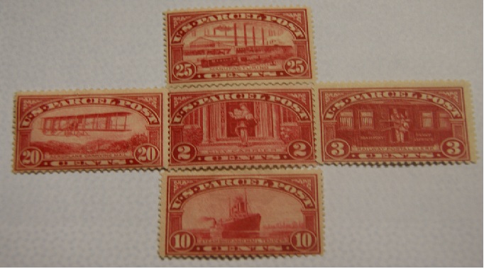
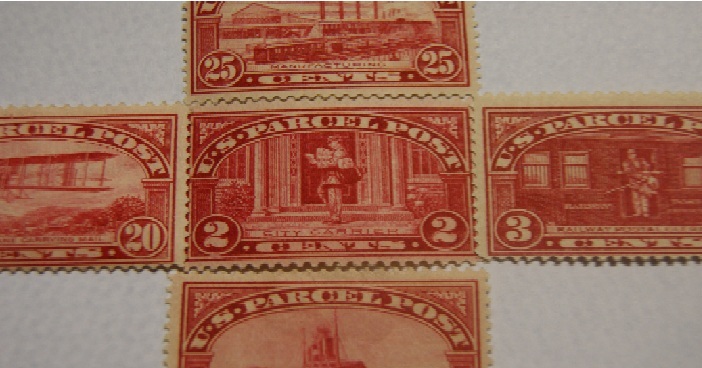
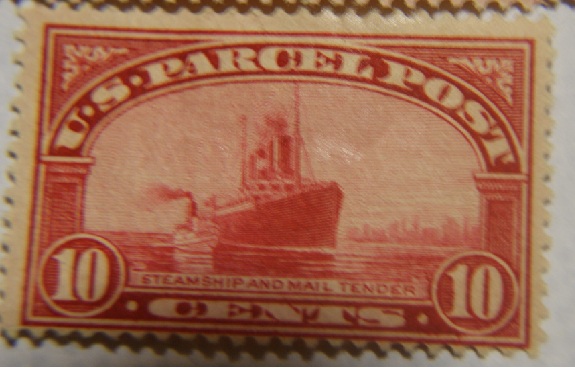
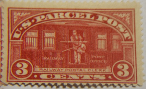
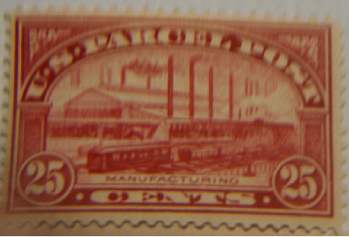
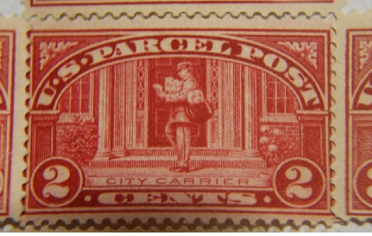 the other Parcl Post I have from the same series. It could help because they are carmine color..