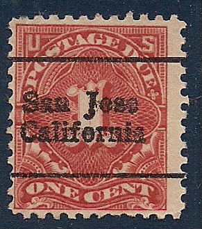
For whatever reason, this precancel looks different from most. Maybe it's the typeface or just that its a local handstamp. In any event, can anyone help identify the style of precancel shown?
I have a 1928 Rotnem precancel catalogue which is very interesting as it gives then-current population figures. Some cities were much, much smaller then than they are now. Cities in the industrial belt were large back then - for example, Pittsburgh had a population of nearly 600,000 and Cleveland had nearly 800,000. But San Jose had a population of less than 40,000 back then. Miami and Phoenix both had less than 30,000 living there. Tampa had just over 5000 people!
So, some of these cities that are now so large might be relatively uncommon on these old precancels, irrespective of catalogue values.
Disclaimer: While a tremendous amount of effort goes into ensuring the accuracy of the information contained in this site, Stamp Community assumes no liability for errors. Copyright 2005 - 2026 Stamp Community Family - All rights reserved worldwide. Use of any images or content on this website without prior written permission of Stamp Community or the original lender is strictly prohibited. Privacy Policy / Terms of UseAdvertise Here