Here is a transcript of emails I had with Bill Cummings who knows 10 times as much as I do. It explain why the items are catalogged like they are.
Bill -
Thanks very much for the explanation!
I see my problem, when the description says 'condensed' or 'extra-condensed' font it is referring to the individual letters, not the spacing of the letters making up the city.
This is logical, but can be misleading for a novice. Another sentence on page one of the style-chart introduction describing that aspect of the 'condensed' concept would be helpful.
CharlieA
From: Bill Cummings
Sent: Thursday, March 10, 2011 7:46 PM
To: Charles Adrion
Subject: Re: PSS 573 or 577 - using NY cities as an example.
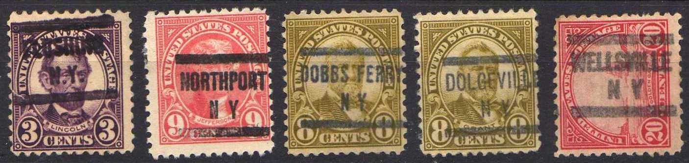
As you say, inking can be a problem here. The best clue is the letter "N". On the three 577s it is noticeably narrower than on the Flushing and Wellsville. Jim Howe could have told you the letter counts that would have led the manufacturer to select the condensed (573) font or the extra-condensed font (577). He actually had an exhibit with these explained. Haven't seen it for 40 or more years! Unhappily the stamps had been removed when I last saw it.
Bill
From: Charles Adrion
Sent: Thursday, March 10, 2011 4:30 PM
To: phil cayford ; bill cummings ; arnold selengut
Subject: PSS 573 or 577 - using NY cities as an example.
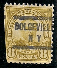
On an online chat forum, I was asked why Dolgeville NY is a PSS-577 when it looks like a PSS-573 to us.
I scanned some other NY examples and it is certainly confusing to me.
On these I would say the Northport NY is an archtypical 577
The Wellesville NY is an archtypical 573
Flushing NY 573 could be 577
Dobbs Ferry is almost 573'ish as Dolgeville
Dolgeville looks 573
I know a lot of variety can be explained away by inking differences, but do they all look properly identified?
CharlieA

once again - you can learn here at SCF!!