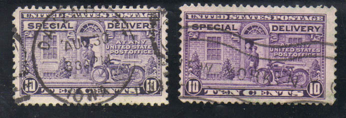
Hello all, was working on the album, I found two identical stamps, but there is a color difference, left one is a lighter color the right one is a deeper color. Which would you use?
This stamp was issue as a flat plate print perf 11(E12)and rotary press printing perf 11x10.5 (E15). The 2 shown are E15b gray lilac and E15a red lilac.
It's a personal decision, but when I'm in your position, I generally give highest priority to a light cancel that doesn't obscure the design. Then I would consider centering.
It's hard to quantify -- you should just look at them and decide which one gives you the overall feeling of "nice stamp"
They make a nice pair. I like to display color variations whenever possible, saving usually the lightest and darkest or largest hue difference, etc. exemplars.
Disclaimer: While a tremendous amount of effort goes into ensuring the accuracy of the information contained in this site, Stamp Community assumes no liability for errors. Copyright 2005 - 2026 Stamp Community Family - All rights reserved worldwide. Use of any images or content on this website without prior written permission of Stamp Community or the original lender is strictly prohibited. Privacy Policy / Terms of UseAdvertise Here