For lack of a better term, I suppose "freaks" are the best way to describe color misregistrations on modern commemorative issues that are visible to the naked eye yet not significant enough to warrant special listing or mention in the Scott catalog.
Every once and awhile, I go through my duplicate used issues and come across some interesting color misregistrations. Here are two examples:
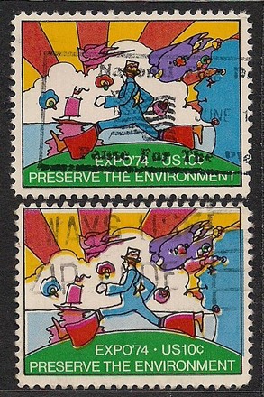
Scott 1527: Color misregistration especially noticeable around black border of second stamp.
Scott 1555: Here again color misregistration is noticeable around "US" and denomination and text, but if you look at the lower handle of the movie camera or stand, you can see where the line of color is shown greatly reduced in width.
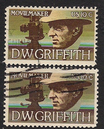
I think I'm going to start myself a small collection of them shown next to the correct version of the stamp. Not that any of these examples are particularly valuable, but it does make for an interesting study in quality control methods used in some of these early to mid-1970's issues.
Anyone care to show any other examples of modern US stamps that show color shifts or misregistrations?