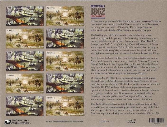
There have been several topics recently concerning "flyspecking" stamps to view what are not really errors, but may appear to be anomalies that just don't look right.
I thought I'd add to this thread, by suggesting that the date shown on the 1862 US Civil War Antietam stamp issued today has an unusual gap of space between the "m" and "b" in the month "September", as shown in this detailed image:

I realize it's clearly not an error, as the stamps are all the printed the same. In my opinion, it's either poor quality control or poor design selection of the particular font used to print the date.
What do you think? (I think maybe I have too much time on my hands looking at all of these minor details!

But that's part of what makes stamp collecting fun!)