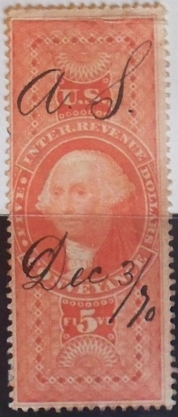
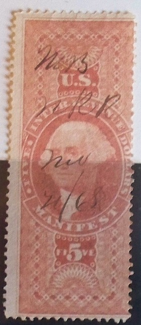
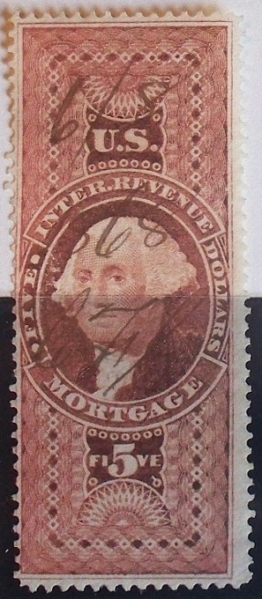
There was a conscious effort to lighten the dark shades and darken the light shades of the first issues over time in an effort to prevent cleaning and reuse and to make the cancels easier to see (this was still the candlelight era). This is most noticeable on the various blue values, but the whole issue was affected to some degree. In addition at the end of the day the leftover inks were refilled the next day with fresh inks which were all hand mixed, probably by several different people. Even something as simple as a cloudy day vs. a sunny day might cause a change in the shade. These stamps were printed as needed to a large degree, so the shade of the day was just the luck of the draw.
There is a definite relationship between certain shades and certain time frames. For example R84c goes from a pale violet in 1863-1864 through various shades of gray lilac/gray from 1865-1869 and finally to brown by 1870. Scott simply calls them all purple; they couldn't care less about the shades on first issues except for ultramarine and the milky blue on the R97cf.
Disclaimer: While a tremendous amount of effort goes into ensuring the accuracy of the information contained in this site, Stamp Community assumes no liability for errors. Copyright 2005 - 2026 Stamp Community Family - All rights reserved worldwide. Use of any images or content on this website without prior written permission of Stamp Community or the original lender is strictly prohibited. Privacy Policy / Terms of UseAdvertise Here