Stamp Community Family of Web Sites
Thousands of stamps, consistently graded, competitively priced and hundreds of in-depth blog posts to read


Stamp Community Forum
 
Username:
Password:
Save Password
Forgot your Password?

This page may contain links that result in small commissions to keep this free site up and running.

Welcome Guest! Registering and/or logging in will remove the anchor (bottom) ads. It's Free!

1st Issue Revenue Engraving Variance?

 
To participate in the forum you must log in or register.
Author Previous TopicReplies: 4 / Views: 2,457Next Topic  
Pillar Of The Community
United States
6433 Posts
Posted 10/10/2013   6:39 pm  Show Profile Check revenuecollector's eBay Listings Bookmark this topic Add revenuecollector to your friends list Get a Link to this Message
I picked up an R3b (or more likely trimmed R3c) because it looked "off" to me with respect to the facial features. Now that I have it in hand, I'm not sure what it is.


First image (a normal R3c):


Second image (A Hart L. Pierce counterfeit I got from Eric a few years back):


Third image (new acquisition. looking at the eyes, nose, and lips, as well as the upturned hair curl at left, it looks to have more in common with the Hart L. Pierce work than the first stamp, not to mention the perforation similarities)


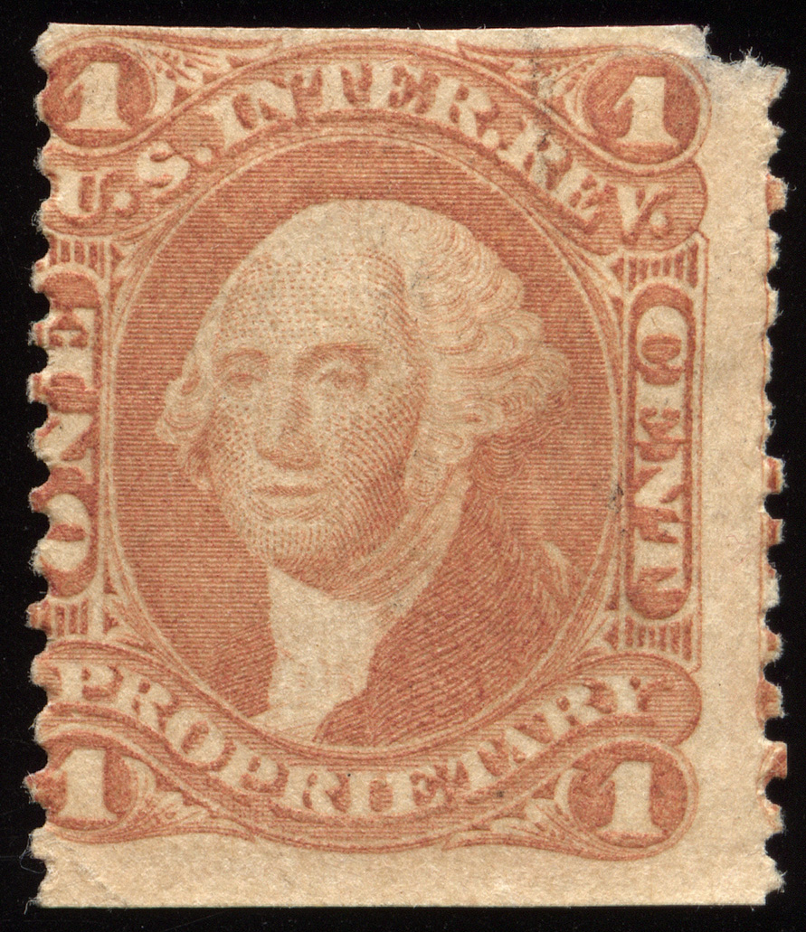
Looking at R3c's and R3b's I have, there is some variance throughout, but that nose and lip combination is fairly distinctive. Just an oddity or something more?

Thanks,

-Dan

Send note to Staff
Edited by revenuecollector - 10/10/2013 6:40 pm

Pillar Of The Community
United States
2555 Posts
Posted 10/10/2013   6:50 pm  Show Profile Check sinclair2010's eBay Listings Bookmark this reply Add sinclair2010 to your friends list  Get a Link to this Reply
Looks like one of the Pierce counterfeits to me.
Send note to Staff  Go to Top of Page
Rest in Peace
United States
7097 Posts
Posted 10/10/2013   7:55 pm  Show Profile Bookmark this reply Add I_Love_Stamps to your friends list  Get a Link to this Reply
Too much difference between the top and bottom image. Hair, lines of the jacket, the lettering, the off center eyes...I'm certainly no professional by an stretch but they do not seem to be by the same hand. Again, just my opinion!
Send note to Staff  Go to Top of Page
Pillar Of The Community
United States
1614 Posts
Posted 10/10/2013   8:15 pm  Show Profile Bookmark this reply Add Mike33 to your friends list  Get a Link to this Reply
the nose in #2 and 3 look identical to me. Looks like he took a punch. Also the right eye(left in pic) of #3 is really weird
Send note to Staff  Go to Top of Page
Pillar Of The Community
United States
1495 Posts
Posted 10/11/2013   08:27 am  Show Profile Bookmark this reply Add Trainwreck to your friends list  Get a Link to this Reply
George looks as though he could use a nap in #2 and #3.

Robert
Send note to Staff  Go to Top of Page
  Previous TopicReplies: 4 / Views: 2,457Next Topic  
 
To participate in the forum you must log in or register.

Go to Top of Page

Disclaimer: While a tremendous amount of effort goes into ensuring the accuracy of the information contained in this site, Stamp Community assumes no liability for errors. Copyright 2005 - 2026 Stamp Community Family - All rights reserved worldwide. Use of any images or content on this website without prior written permission of Stamp Community or the original lender is strictly prohibited.
Privacy Policy / Terms of Use    Advertise Here
Stamp Community Forum © 2007 - 2026 Stamp Community Forums
It took 0.17 seconds to lick this stamp. Powered By: Snitz Forums 2000 Version 3.4.05