Stamp Community Family of Web Sites
Thousands of stamps, consistently graded, competitively priced and hundreds of in-depth blog posts to read


Stamp Community Forum
 
Username:
Password:
Save Password
Forgot your Password?

This page may contain links that result in small commissions to keep this free site up and running.

Welcome Guest! Registering and/or logging in will remove the anchor (bottom) ads. It's Free!

#s 552 & 661, Changlings?

 
To participate in the forum you must log in or register.
Author Previous TopicReplies: 6 / Views: 1,959Next Topic  
Pillar Of The Community
United States
770 Posts
Posted 04/16/2014   3:05 pm  Show Profile Bookmark this topic Add southpaw to your friends list Get a Link to this Message
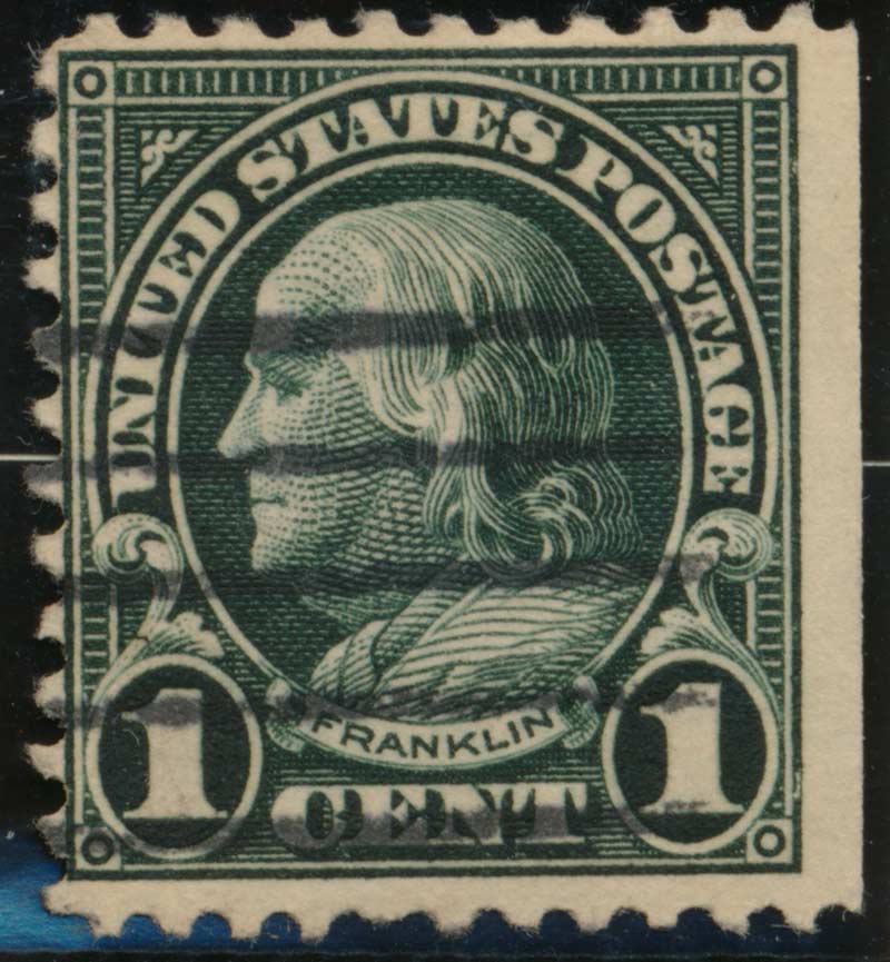
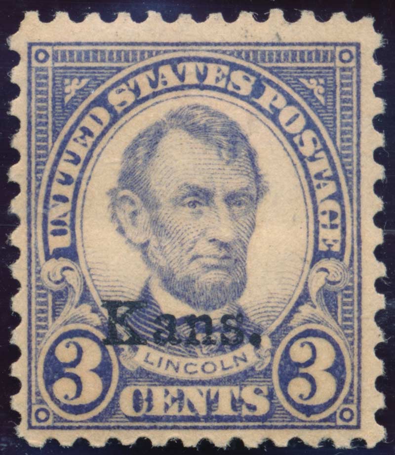
51Studebaker and I had a good lunch yesterday (we live in the same small town, who would have thought) and we each brought our US collections for she-and-tell. He suggested I should post these 2 stamps for some expert opinions. The 661 could be a changeling although the color is pretty consistent across the stamp. It does have a bit of toning to the paper. It is NH. The used 552 is a seriously black-green. How common is this (variety)? Both were scanned with a gray card, so the color fidelity of these scans are pretty good. Thanks!


Send note to Staff

Valued Member
Canada
123 Posts
Posted 04/16/2014   5:33 pm  Show Profile Bookmark this reply Add David Y to your friends list  Get a Link to this Reply
Please explain scanning with a grey card. I use a Canon MP Navigator.
Send note to Staff  Go to Top of Page
Valued Member
Canada
309 Posts
Posted 04/16/2014   8:23 pm  Show Profile Bookmark this reply Add Cul_Lector to your friends list  Get a Link to this Reply
White Balance assist you to get the colours in your images as precise as possible.

There are a few ways how you can adjust your white balance and make your pictures look more natural.And it is using grey card. All you need to have is a grey card either purchased from a photography gear shop or you might have some neutral grey paper yourself (make sure it's non reflective though). Hope this helps, David...
Send note to Staff  Go to Top of Page
Pillar Of The Community
United States
770 Posts
Posted 04/16/2014   11:21 pm  Show Profile Bookmark this reply Add southpaw to your friends list  Get a Link to this Reply
I've been using an ancient Kodak 18% gray card for years. I'm sure there are more precise digital tools now but in Photoshop levels you have your neutral gray eyedropper. Just click on a known neutral gray (that would be the gray card in the scan) and color casts will be removed. You can still adjust your highlight and shadow for best detail. My Cannon CanoScan 9000F actually does a really good job and doesn't need much help, I just use the gray card to quickly make accurate adjustments.
Send note to Staff  Go to Top of Page
Moderator
Learn More...
United States
12330 Posts
Posted 04/17/2014   06:16 am  Show Profile Bookmark this reply Add 51studebaker to your friends list  Get a Link to this Reply
While looking through Southpaw's album these two stamps really jumped off the page at me. The 1C Franklin is incredibly dark. Like most of you guys I have seen thousands and thousands of them including those which were over inked; but while this one does carry some extra ink the shade is darker than any I have ever seen.

The Kansas overprint, which has single gum break, also seemed unusual in that I could not see any subtle shade variation of a typical color changling. The toning made me suspect but the uniformity of the color across the stamp made me wonder.

So I suggested that Southpaw post a few images here for feedback.
don

Send note to Staff  Go to Top of Page
Rest in Peace
United States
763 Posts
Posted 04/17/2014   9:56 pm  Show Profile Bookmark this reply Add Bill Weiss to your friends list  Get a Link to this Reply
Assuming that the colors shown in the first posting are 100% accurate, my opinion is;

1. That the color of the 3c is simply faded, and this is sot of "proven" by the fact that the overprint is also much lighter than usual. If you have a mint K-N stamp that is mint, compare the intensity of the ink on the overprints and see if it is lighter on this stamp. If so, then the color is faded for sure. If not, then we can talk about it again, but in any case, the only other possibility is a slight dry print caused by under inking.

2. The color of the 1c does indeed look much darker than usual, but "black green" or "blackish green" seems like on overstatement of the color. I just see a very dark green. Since this is a flat plate stamp, there should be set-off (offset) ink on the back. See if the color on the set-off is exactly the same color as on the front or is it different (lighter)? This should be checked with a 10x magnification or more. If the set-off is exactly the same color as on the front, than it is indeed likely a very dark color variety, but if not, then it is likely a bit oxidized. Hope this helps!

Send note to Staff  Go to Top of Page
Valued Member
United States
82 Posts
Posted 04/18/2014   9:53 pm  Show Profile Bookmark this reply Add wash 500 to your friends list  Get a Link to this Reply
Bill, great post. A person should always look at the back of a flat plate printing before judging color. Excellent info. for everyone.
Send note to Staff  Go to Top of Page
  Previous TopicReplies: 6 / Views: 1,959Next Topic  
 
To participate in the forum you must log in or register.

Go to Top of Page

Disclaimer: While a tremendous amount of effort goes into ensuring the accuracy of the information contained in this site, Stamp Community assumes no liability for errors. Copyright 2005 - 2026 Stamp Community Family - All rights reserved worldwide. Use of any images or content on this website without prior written permission of Stamp Community or the original lender is strictly prohibited.
Privacy Policy / Terms of Use    Advertise Here
Stamp Community Forum © 2007 - 2026 Stamp Community Forums
It took 0.43 seconds to lick this stamp. Powered By: Snitz Forums 2000 Version 3.4.05