| Author |
 Replies: 15 / Views: 5,953 Replies: 15 / Views: 5,953 |
|
|
Rest in Peace
United States
7097 Posts |
|
|
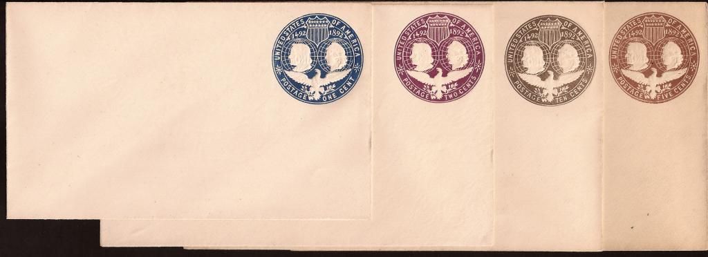
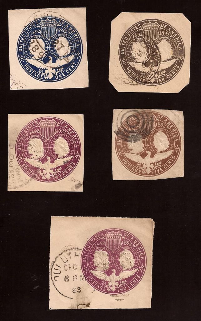
A friend recently sent me a selection of mint covers and used covers with the Columbus and liberty designs. These are not cut squares but full covers that I cropped out for clarity & definition of the design. I never owned this design before so never really looked into them. Is there anything I should look out for like variations, errors etc...?
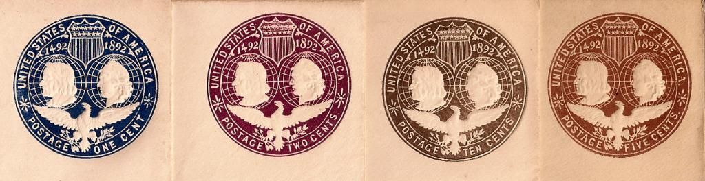
Here are the full covers-
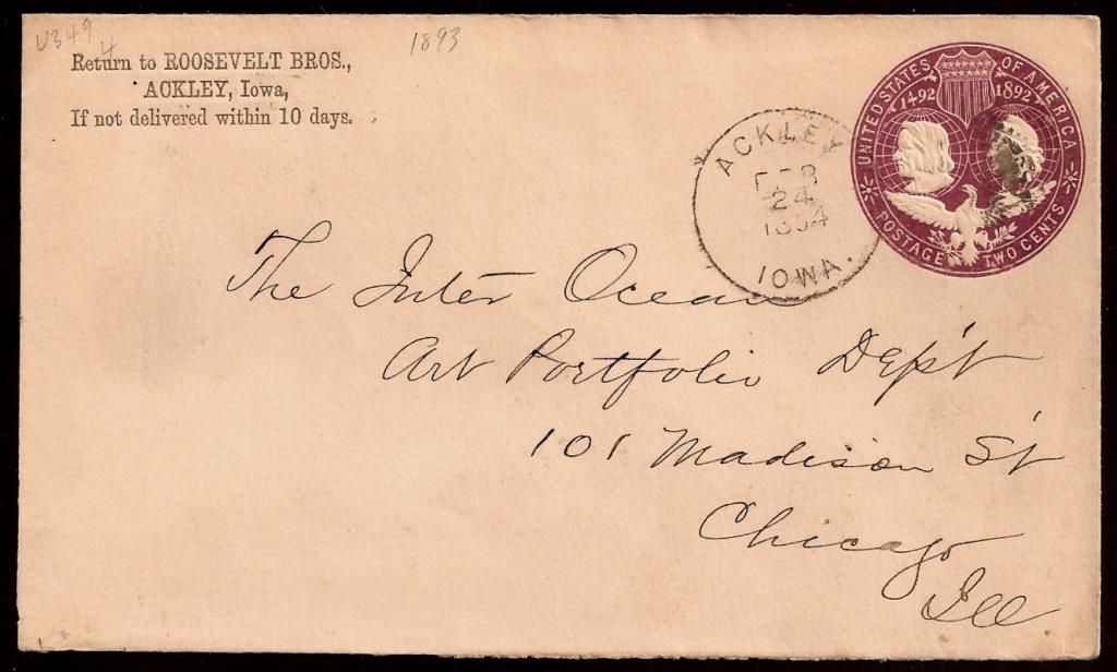
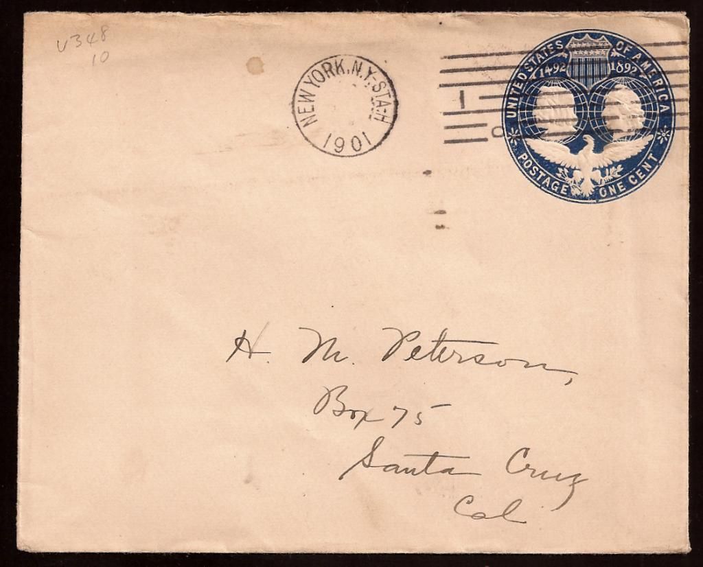
Two used covers:
Cut Squares:
|
|
Send note to Staff
|
| Edited by I_Love_Stamps - 04/19/2014 05:38 am |
|
|
|
|
Pillar Of The Community
United States
1947 Posts |
|
|
I am not familiar with varieties. Have you looked in the Scott US specialized? I think you have a really nice collection of these. |
Send note to Staff 
|
|
|
Bedrock Of The Community
United States
12128 Posts |
|
|
There are some varieties of the Columbian Envelopes noted in the Scott Specialized Catalog. The real valuable ones are those printed in the wrong color which, of course, are quite scarce (none shown in your scans, unfortunately). Other varieties you can search for are in the details, since the envelopes were printed using four (4) different dies for the envelope series. Unfortunately, none of the die varieties are listed as having any premium value, so it's more a flyspecking exercise than anything else. Using your mint envelopes as an example, the 5c variety is using Die 2 as shown in this image cropped from your original scan: 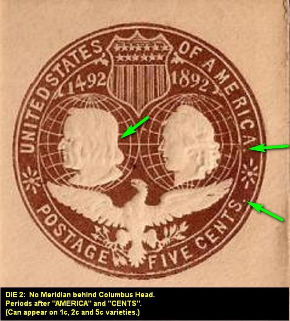 Incidentally, the remainder of your mint envelopes are Die 3 (with Meridian behind Columbus head, but with no periods after "AMERICA" or "CENT" or "CENTS". This die variety was used on the 1c, 2c and 10c denominations only. |
|
Send note to Staff
|
|
|
Bedrock Of The Community
United States
12128 Posts |
|
|
I'm not sure why this would have made "news" ... and on the front page no less, but just a curious article I interposed on the cover you show from Roosevelt Bros., Ackley, Iowa, as they were apparently cousins to President Theodore Roosevelt: 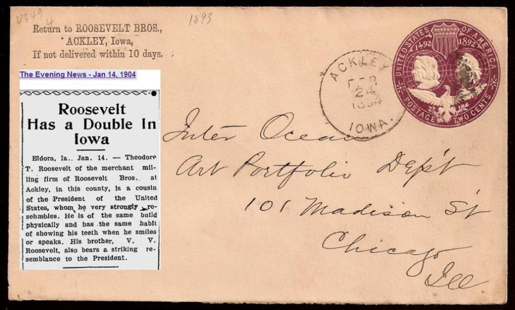 Another minor item, is the incorrect pencil notation next to the return address that reads "1893". Obviously, the postmark ends in a "4" so the date of that postmark must, in fact, be "1894". |
|
Send note to Staff
|
|
|
Rest in Peace
United States
7097 Posts |
|
|
Wow that's some neat information! Thank you wt1. I also wish to erase the notations. |
|
Send note to Staff
|
|
|
Bedrock Of The Community
United States
12128 Posts |
|
|
In case you were wondering what Theodore T. Roosevelt of Roosevelt Bros. looked like, here's a photo: 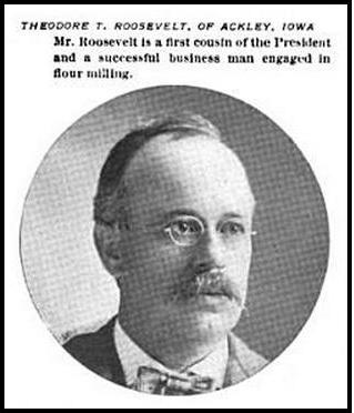 |
|
Send note to Staff
|
|
|
Pillar Of The Community
621 Posts |
|
|
The "1893" probably refers to the fact that these envelopes were issued in 1893.
In addition to the four basic varieties mentioned (but not listed nor priced) in the Scott Specialized, the UPSS 19th Century catalog has a separate section in the back for detailed die varieties (with prices ranging from $1.25 to $440).
The e-book version of that catalog is only $13. Heckuva deal! |
|
Send note to Staff
|
|
|
Rest in Peace
United States
7097 Posts |
|
|
Wow he really does look like Theodore Roosevelt! Thomas I'll look into that reference material. Thank you both! |
|
Send note to Staff
|
|
|
Bedrock Of The Community
United States
12128 Posts |
|
|
Here's a U348 (Die 1) cropped and enlarged from an unused cover. Has anyone encountered the issues circled? It seems the "E" in "AMERICA" has the bottom line obscured and the Meridian line behind Columbus' head looks as if it is not shaped correctly. Even if it is common, it looks a bit unusual: 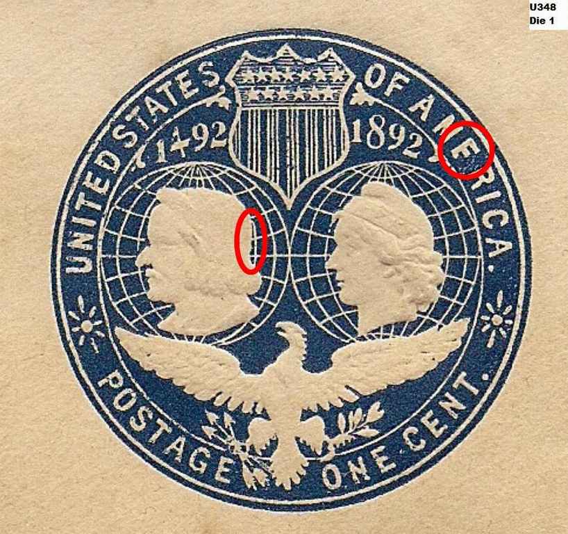 |
|
Send note to Staff
|
|
|
Pillar Of The Community
621 Posts |
|
|
I have four scans of the 1 cent Columbian in my scan locker. This one would seem to be what you are expecting for a "correct" meridian, no? 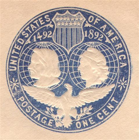 The other three that I have are just like yours. |
|
Send note to Staff
|
|
|
Pillar Of The Community
United States
5894 Posts |
|
|
Your interesting example, wt1, has the period after America like the die 2. This leads me to think that it was supposed to be an improvement on the die 2 design by adding (in strange fashion) a grid line on the back of Columbus' head. |
|
Send note to Staff
|
|
|
Bedrock Of The Community
United States
12128 Posts |
|
|
Quote:
The other three that I have are just like yours. Thanks. I guess the shape of the Meridian line behind Columbus' head is apparently normal for that issue (even though it does look a bit odd). However, the "E" in "AMERICA" still looks to be abnormal. Do we just chalk these early issues up to primitive (by today's standards) printing methods that cause such anomalies? |
|
Send note to Staff
|
| Edited by wt1 - 05/06/2014 12:39 pm |
|
|
Pillar Of The Community
621 Posts |
|
|
The meridian thing is a result of a working dies that are not exact duplicates.
The other flaw (short lower bar in E of AMERICA) is simply a filled die. These were very common up through the mid-20th century. Ink, or ink combined with paper dust, filled part of the embossing die such that it was able to impart an extended part of the inked image onto the envelope. |
|
Send note to Staff
|
|
|
Bedrock Of The Community
United States
12128 Posts |
|
|
Pillar Of The Community
United States
599 Posts |
|
|
The Columbian envelopes have numerous inking problems, all are considered to be freaks, and while interesting, are not catalog listable material. |
|
Send note to Staff
|
|
|
Rest in Peace
United States
7097 Posts |
|
|
Columbus' nose sometimes looks very exaggerated or caricature like. Part of their charm I suppose? |
|
Send note to Staff
|
|
| |
Replies: 15 / Views: 5,953 |
|


