| Author |
 Replies: 22 / Views: 4,939 Replies: 22 / Views: 4,939 |
|
Pillar Of The Community
United States
5894 Posts |
|
|
I see three faint lines around this end of the stamp. Lines a, b and c. I have seen faint lines like this around the design of a few classic US stamps. This past weekend I was talking to one of the more experienced US collectors I know and he reminded me how the printing plates were made. They were impressed into an annealed sheet of steel by a roller that had usually 3 impressions on it. So the roller would roll down a column, 3 stamps at a time (or less as need to get to the edge of the sheet. So I was thinking. These faint lines I am seeing are because the plate was a little too warm, and the edges of the roller die are making a faint impression on the steel as it imprints the stamp design into the plate. But then I look at this stamp and I am even more confused. Here it looks like there are faint lines on 3 sides at least. What exactly are they? Are they related to the roller die? Am I right and was the sheet a little too warm and took an faint impression it shouldn't have? 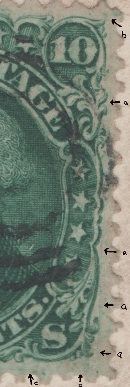 Any insights into this mystery would be very welcome. Thanks. |
|
Send note to Staff
|
|
|
|
|
Pillar Of The Community
United States
5894 Posts |
|
|
Rest in Peace
United States
1225 Posts |
|
|
First you have the engraved die then the transfer roll and then the printing plate. I suspect the transfer roll took on too much from the die. Irregardless, it's a nice example of the stamp and having that stamp on cover is even better.
Art
Edited for spelling. |
Send note to Staff 
|
A well regulated Militia, being necessary to the security of a free State, the right of the people to keep and bear Arms, shall not be infringed. (The exact & entire wording of the 2nd Amendment to the U.S. Constitution) |
| Edited by artlaunier - 05/13/2014 07:08 am |
|
|
Pillar Of The Community
United States
2941 Posts |
|
|
Pillar Of The Community
Guatemala
1500 Posts |
|
|
The lines intersect perfectly with the positioning dots. Might the lines be related to positioning? |
|
Send note to Staff
|
|
|
Pillar Of The Community
United States
5894 Posts |
|
|
Pillar Of The Community
United States
1125 Posts |
|
|
To make a plate: Take a blank sheet of steel. Mark off the spaces where the stamps should go on the plate. Set up the transfer roller with an indicator that lines up with the layout dots to properly position the transfers. Roll the transfers into the plate Clean up any burrs that may be raised by rolling in the impression Burnish out any impressions that are out of place or bad and reenter that transfer (and if you don't do this well, you get double transfers or visible re-entries) Clean up any visible lines or dots or parts of the transfer that don't look good (and if you don't do this well, you get the lines and dot visible in this scan) Recut any lines that need strengthening as a result of the transfer (and you end up with some positions in the plate having recut lines (especially noticeable on the 1851-57 issue, where many stamps have recut frame lines or recut lines at top and bottom of the transfer). Print stamps and distribute - providing much fodder for future generations of fly-speckers. 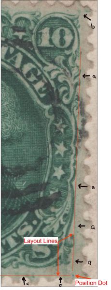 |
|
Send note to Staff
|
|
|
Pillar Of The Community
United States
5894 Posts |
|
|
So the layout lines and position dots are scratched impressed onto the plate to guide the application of the transfer roll when transferring the design to the plate. Thanks Chip, another piece of the puzzle filled in. :) |
|
Send note to Staff
|
| Edited by smauggie - 05/13/2014 1:06 pm |
|
|
Pillar Of The Community
United States
1125 Posts |
|
|
Pillar Of The Community
United States
2226 Posts |
|
|
Pillar Of The Community
United States
644 Posts |
|
|
A lot of what you're seeing is from what I believe to be from just a bit too much ink on the plate. That's a neat cover and a very nice stamp as well.
There's really only one variety on the 68 that gets much attention; the "TAG" defective transfer in "POSTAGE". Plating dots are pretty common on these, but not all positions show them (My father tried to plate the stamp at one point). That being said, and since we're discussing 10c 1861s.....
If you have any Type 1s (62B) watch for a defective transfer, there's a transfer of the 90c on one position of the Type 1 plate, it can be seen easily as a small "V" just below the "C" in "CENTS" under the bottom frame line. They're quite uncommon and I do believe bring a handsome premium.
Bill |
|
Send note to Staff
|
|
|
Pillar Of The Community
United States
5894 Posts |
|
|
Bill, thanks for that information. I was wondering if that didn't play a part, given that there are areas where there should not be ink that are light green, and some of the lines of engraving are so bold you can hardly see the spaces between them. |
|
Send note to Staff
|
|
|
Pillar Of The Community
United States
5894 Posts |
|
|
I was reading Brookman's The United States Postage Stamps of the 19th Century Vol.II regarding the printing of the 1861 series and I was fascinated with the stamp printing/preparation process used. He says: Quote:
One of the bottlenecks in production was in the gumming of the sheets, which was done by hand after the sheets were printed and dried. After gumming by hand, the sheets were again dried in small canvas covered frames after which they were smoothed in a hydraulic press. One wonders how this hydraulic press process worked/looked like. I imagine the irregularly (brushed on by hand) placed gum caused the sheets to wrikle a bit. |
|
Send note to Staff
|
|
|
Pillar Of The Community
United States
8956 Posts |
|
|
Smauggie, if you are interested, there is an article about these lines and dots in The February 2011 issue of "Coil Line", the journal of the Plate Number Coil Collectors Club ( PNC3 ). To read it just go to www.PNC3.org and click on the 'reference' section. Click on 'Coil Line Archives" and then on 'February 2011'! Peter |
|
Send note to Staff
|
|
|
Pillar Of The Community
United States
5894 Posts |
|
|
Pillar Of The Community
Canada
6525 Posts |
|
|
Quote:
Irregardless, it's a nice example of the stamp and having that stamp on cover is even better. Hey Art, it has been pointed out to me many many times that 'irregardless' is not a word! I used to work at a magazine and the literary types always corrected me. So, I found the word in a dictionary! My argument to them was, if it's in the dictionary, then it's a word! They grudgingly conceded, though the dictionary pointed out that irregardless is a double negative, and should never be used unless one is deliberately trying to be humorous. Irregardless of that, I applaud my fellow double negative user! Cheers!  |
|
Send note to Staff
|
|
|
Replies: 22 / Views: 4,939 |
|


