| Author |
 Replies: 55 / Views: 18,804 Replies: 55 / Views: 18,804 |
|
|
|
Valued Member
92 Posts |
|
|
ray.mac, thank you so much. You are precisely the reason why I started this discussion. I was looking for an answer that eluded me; one that was both logical and grounded in one's personal experience..
At one time or another, each of us crosses paths with a stamp that seems somewhat unique, but we cannot effectively explain why. We instinctively know that there's something there, something compelling. So, we ask for help, hoping to receive answers. What you said makes a great deal of sense, because the color of the stamp I presented here didn't seem to match any of the colors Scott presents effectively. It was a mystery wrapped in an enigma! Thanks |
Send note to Staff 
|
|
|
Pillar Of The Community

United States
1272 Posts |
|
|
Pillar Of The Community
United States
1352 Posts |
|
|
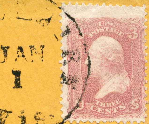
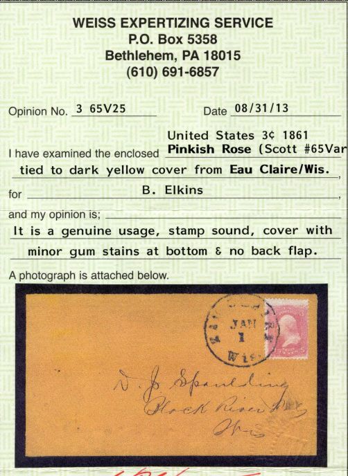
Mizar, here is the cover and stamp I referred to-- Jack Daley says "pinkish rose" even though it has in pencil on the reverse side Rose Pink from a Siegel sale in 1967..... 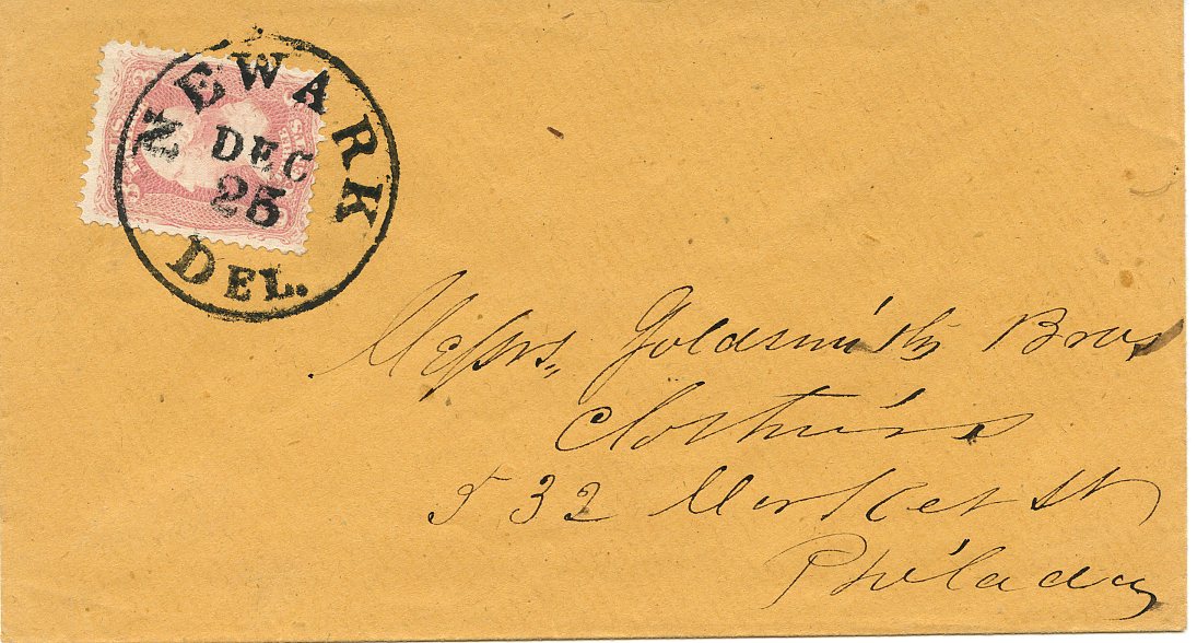 And here is the stamp at 400dpi: 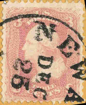 The stamp that my good friend Dave (Al E.) posted is a lot lighter than mine, and mine is more like yours. I wouldn't doubt that mine is a 64b, but Jack Daley is the expert....and check out the date on my cover :) And Dave, you'll have to show me that one sometime!! Nice stamp! Glad I could help....Ray |
|
Send note to Staff
|
|
|
Valued Member
92 Posts |
|
|
Thanks, Ray! Oddly enough, my stamp also has a pencil mark on the back that says 64b, but I don't think it is a 64b. How would I be able to contact Jack Daley? |
|
Send note to Staff
|
|
|
Pillar Of The Community
United States
4110 Posts |
|
|
Quote:
With the 1863 date on the stamp, there isn't any way that any expertization service would ever give a cert as pigeon blood or as pink If that is true, I am going top call them out as being stubbornly pigheaded. While an 1863 use is unlikely, it is not impossible, and the ONLY question is whether the color is pigeon blood pink or some other color. I've heard there is a lot of controversy over the pigeon blood pink, and have to question if the shade is that hard to ID, should it even be listed? |
|
Send note to Staff
|
|
|
Valued Member
92 Posts |
|
|
The myriad "poetical" and "non-poetical" descriptions of the colors extant in philately is enormously daunting, not only to the novice collector, but to many experienced philatelists too. Think about it! Pigeon Blood Pink, orange, vermillion, orange red, orange brown, deep orange brown, pale orange brown, et al . . . ad infinitum!
To make matters worse, those myriad original colors can change. This is where time and the elements alter a stamp's color to the point where mistakes in identification are often seen and identification is very often reduced to something more subjective and speculative, rather than something readily defined. That, unfortunately, reduces color identification, in many cases, but not all cases, to who happends to be looking at it; one collector, for example, sees a particular stamp as one color, while another sees the color of the same stamp as something astonishingly different. That, friends, for all our liking or disliking, is the nature of the beast and the present state of the art we call philately.
Why not get rid of all the "poetically" descriptive names of the colors and get a little more precise by giving the colors numbers, i.e. Red - 2, Red - 5, Green -1, Green - 2, etc., each of which corresponds to a particular displayed color? And make this "chart" the standard for all of philately? The only problem I can see with this is that involving stamps already integrated into our collections as already accepted, rightly or wrongly, to be a particular color. Hmm! Then what? Chaos? It's all an unfathomable mystery, isn't it? |
|
Send note to Staff
|
| Edited by Mizar - 07/11/2015 08:58 am |
|
|
Moderator

United States
12330 Posts |
|
|
One of the most basic understandings needed when discussing color perception is that different people 'see' colors differently. How in the world could a color standard be implemented if this is the case? For example, men and women have different abilities when it comes to seeing colors; and of course there is a percentage of the population which are color-limited in their vision. Here is a good study and write up on the delta between men and women color vision; http://jov.arvojournals.org/article...leid=2191999. The research concludes, "In summary, our experiments demonstrate the existence of a sex-related difference in color vision in the near peripheral retina. This difference takes the form of losses in the perceived saturation of greenyellow stimuli that are significantly greater for male than for female observers." And then many folks seek to use this medium to help better understand color shades. This is very difficult, bordering on impossible. There are literally hundreds of variables that make this almost impossible (i.e. scanner light sources, differences in video cards and driver software, post image manipulation by software, monitor deltas, etc.). But even in years past establishing a color standard was quite difficult. Inks always fade; finding and using a hardcopy medium which will not change over time is as impossible as its digital equivalent. Add to this that no matter what we do, our stamps themselves will change color over long periods of time. No ink lasts forever. Even if stored in the dark; things like out-gassing can change the color shades of inks. (Consider sulfurization of US orange colored stamps.) But even if we put aside the fact that stamp ink colors change over time, I know of no good solution for color matching and the development of a standard. I supposed we could all buy some expensive color comparator equipment, keep it fully calibrated, and then all decide on the nomenclature/names. But the equipment is not cheap and this effort does not seem to be within reach of the average hobbyist. I think I tend to agree with eyeonwall; should we even be trying to differentiate these subtle shades of colors on hundred year old stamps? Until and unless we develop a way to analyze ink chemistry to accurately identify a ink shade, perhaps we are better off leaving this undefined. Don |
|
Send note to Staff
|
|
|
Bedrock Of The Community
United States
10669 Posts |
|
|
Pigeon Blood Pink does exist, and it should be listed, and if you ever see one you will understand why most pinks are obviously not one. It has a peculiar bluish cast to the pink that no other shade has. No computer monitor will ever show it right, it must be seen in person.
The pinks are very light sensitive and can change easily if not cared for properly. |
|
Send note to Staff
|
|
|
Pillar Of The Community
United States
1352 Posts |
|
|
Mizar, the answer is to send for expertization.
I send my "pink wannabe's" to Bill Weiss all the time, and received 2 from him 2 days ago.
You can't tell from the screen, and the only way to know is to expertize.
Hope this helps....Ray |
|
Send note to Staff
|
|
|
Pillar Of The Community
United States
4110 Posts |
|
|
I know pigeon blood pink does exist (I've seen certified examples), but I don't have a photographic memory and seriously doubt I would recognize another one without a reference copy. My question is whether the shade is different enough to warrant a listing. You are convinced it is, I recall not being all that impressed with the difference between a pink and a pigeon blood pink (but perhaps the stamp changed since it was certified? - I no longer recall if the cert was brand new or old). |
|
Send note to Staff
|
|
|
Pillar Of The Community
United States
4110 Posts |
|
|
The problem goes beyond the fact that one person may be more sensitive to green and another more sensative to red. Our trainging comes into play too. Unless our parents were artists or serious stamp collectors, we were just taught very general terms and a wide range of shades were referred to as red, another wide range referred to blue etc. There were no standards in our teaching for shades and we weren't taught carmine, rose, scarlet, etc. - they were all just called red. And Scott is not entirely consistant in naming colors either. The the violet on 20th century stamps is very different than the violet on the 19th century 24c Washingtons.
On top of that, what the clor in question is on or next to plays a big role in what shade we perceive. what background do you have around the stamp? Is the paper very white, or somewhat grayish, or toned? A cancel can have a big effect, especially if it is not black. On and on. |
|
Send note to Staff
|
|
|
Pillar Of The Community
United States
4110 Posts |
|
|
One more thing - It isn't just us who struggle with pigeon blood pink. I overheard a conversation earlier this year with someone from one of the authentication services (forget whether PSE or PF, but if you force me to say, think it was PSE) and they were having issues with it. |
|
Send note to Staff
|
|
|
Valued Member
Italy
5 Posts |
|
|
Pillar Of The Community
United Kingdom
8601 Posts |
|
|
eyeonwall
Agreed. When I first looked at Gibbons' colour guide, I couldn't believe how far many of the colours and shades were from what I'd conceived. I think there are also cultural differences around colours too - i.e. what might be deemed a particular colour or shade in GB might be categorised as something different in continental Europe.
I do like the name "pigeon blood pink" though. I'll pay more attention the next time I fry a pigeon breast!
Geoff |
|
Send note to Staff
|
|
|
Valued Member
92 Posts |
|
|
I'd like to thank everyone for the wonderful response you've given this topic I've posted. You've all been most helpful! My sincerest regards to you all - James |
|
Send note to Staff
|
|
|
Replies: 55 / Views: 18,804 |
|