| Author |
 Replies: 37 / Views: 4,572 Replies: 37 / Views: 4,572 |
|
Pillar Of The Community
United States
4092 Posts |
|
|
3 different 184's to pick from: 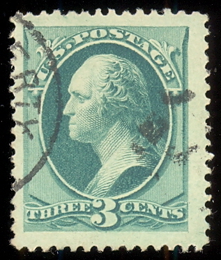 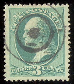 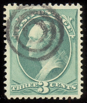 The first one is ginormous and I like the cancel, but has a corner perf crease (which is hid by the cancel). The second one is large and better centered, although it also has a faint corver perf crease. The third one is normal sized with decent centering and no corner perf crease. I haven't been quoted any prices, so its just which one do you like best? |
|
Send note to Staff
|
|
|
|
|
Valued Member
United States
82 Posts |
|
|
The third one! I like the cancel design. The one on the top is the least attractive to me. |
Send note to Staff 
|
|
|
Valued Member
United States
17 Posts |
|
|
Pillar Of The Community
United States
2423 Posts |
|
|
Bedrock Of The Community
United States
10629 Posts |
|
|
Valued Member
United States
344 Posts |
|
|
One of the things I like most about Classic US is that we all see something different in judging "best" for our own collections!
To not quite echo revcollector...
number TWO and it's really not close.
The first stamp, despite some big margins, seems unbalanced to my eye and I already own a well-centered jumbo.
The third stamp, albeit the nicest of the three, has a run-of-the-mill three-ring bullseye, of which I own at least a dozen.
My "best" stamp has a very interesting non-symmetrical target (an eyeball?) which I have seen but do not own. |
|
Send note to Staff
|
|
|
Pillar Of The Community
United States
1179 Posts |
|
|
Pillar Of The Community
United States
628 Posts |
|
|
I think the third cancel you could make sets out of if you wanted, I would choose 1 clean face and a bit jumbo
|
|
Send note to Staff
|
|
|
Valued Member
United States
161 Posts |
|
|
I would definitely pick #2. The design really appears to be "framed" within the jumbo margins, which gives it spectacular eye appeal.
Though the cancel isn't great, it doesn't detract from the overall eye appeal that much. |
|
Send note to Staff
|
|
|
Pillar Of The Community
United States
2830 Posts |
|
|
#3 has the best combination of perfs, centering, and cancel. I personally dislike creases. Interestingly, #3 looks comb perf at NE and NW, but line perf at the bottom corners. I assume this Scott # is line perf? |
|
Send note to Staff
|
|
|
Pillar Of The Community
United States
2226 Posts |
|
|
#1 because I think the face-free cancel makes the stamp more attractive than the other two. The face, especially the eye, is the prime focal point of a stamp with a portrait/bust.
A perf crease reduces the technical grade. But if I'm building a collection for eye appeal, I'll forget about the perf crease, especially for a low-value stamp. A cancel obscuring the face, however, would nag at me forever.
Selecting stamps with cancels that are the least obtrusive regarding the face is a lesson I learned decades ago.
This all comes down to personal priorities, of course. |
|
Send note to Staff
|
| Edited by Classic Coins - 11/04/2015 11:49 pm |
|
|
Pillar Of The Community
United States
6661 Posts |
|
|
Pillar Of The Community
United States
789 Posts |
|
|
I like the # 1 because the portrait is clear of the postmark. Then #3, finally #2. When given a choice & condition is not a major issue, which in my opinion is not here, I choose the stamp which allows the design perspective to be the priority factor when choosing, (especially when price may be a secondary factor). I like to think that there is always a 'nice' issue within my price range that is both aesthetically pleasing & in very good condition. (Some issues of my collection look very nice, while some here may think they are nice as space savers.) |
|
Send note to Staff
|
|
|
Pillar Of The Community
United States
2423 Posts |
|
|
Hahaha, we can't agree on anything! |
|
Send note to Staff
|
| Edited by KGB - 11/05/2015 11:14 am |
|
|
Pillar Of The Community
Norway
1661 Posts |
|
|
 Luckily we don't need to agree. Interesting thread, God knows how much time is spent doing such assessments? No. 2 for me please ...centering, nice margins, SOTN and not the most common cancel. Downside is the 'black eye' but in my view that's the price to pay to get it SOTN. |
|
Send note to Staff
|
|
|
Pillar Of The Community
United States
2423 Posts |
|
|
Blaamand, good to see you!
And, yes, we need not all agree. And thank heavens for that! |
|
Send note to Staff
|
|
|
Replies: 37 / Views: 4,572 |
|


