| Author |
 Replies: 11 / Views: 1,740 Replies: 11 / Views: 1,740 |
|
|
Pillar Of The Community
United States
1163 Posts |
|
|
|
|
Pillar Of The Community
United States
8956 Posts |
|
|
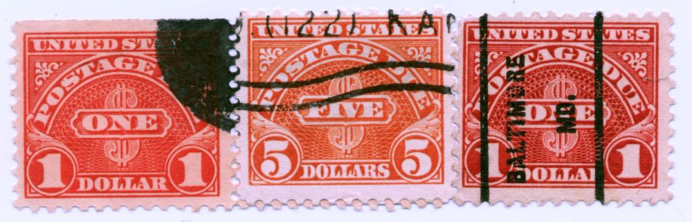
Almost impossible to tell if one does not have a known color to go by. I do not really know which color any of them are, but the middle one looks light orange on my computer screen.
Peter |
Send note to Staff 
|
|
|
Pillar Of The Community
United States
1163 Posts |
|
|
Well I have hundreds of the other two colors in all denominations but the $5 is the only one I have seen in that color. |
|
Send note to Staff
|
|
|
Pillar Of The Community
United States
8956 Posts |
|
|
The only two colors Scott mentions for this stamp are carmine and scarlet.
Peter |
|
Send note to Staff
|
|
|
Pillar Of The Community
United States
7239 Posts |
|
|
The paper does not look right on the middle stamp. I'm guessing that this stamp has been bleached at some point. |
|
Send note to Staff
|
|
|
Valued Member
129 Posts |
|
|
Pillar Of The Community
6329 Posts |
|
|
The $5 in the middle is likely the dry printing version, which is on a slightly thicker, whiter paper. The $1 value can only be wet. |
|
Send note to Staff
|
|
|
Pillar Of The Community
United States
2423 Posts |
|
|
Well, it looks like carmine rose, but that's not possible. I think it's a monitor/scanning thing. |
|
Send note to Staff
|
|
|
Pillar Of The Community
United States
628 Posts |
|
|
I have alot of these postage dues and its not unusual for them to vary in color due to fading etc. |
|
Send note to Staff
|
|
|
Pillar Of The Community
United States
1163 Posts |
|
|
The one under is a pair for the one to the left. This color on the middle stamp is very orange. I have never seen this color and it is a sharp clean stamp. paper is whiter. |
|
Send note to Staff
|
|
|
Valued Member
United States
447 Posts |
|
|
I think bookbndrbob has it...middle stamp looks bleached. Or printed on a whiter paper.
Since the unused versions of the scarlet or carmine $5 is not that great I am surprised if someone bleached a cancellation.
However, the whole issue of identifying printing ink colors on monitors can't be dismissed. Viewing colors on electronic screens is very iffy compared to the visual color corrections that can be done by printers on press. When approving a press run, the art director or print buyer can direct the pressman to make ink fountain adjustments which can "flood" the printed image or lighten it. Also, your ink will appear different when printed on a "whiter" or darker paper stock since most printing ink is translucent when applied.
|
|
Send note to Staff
|
|
|
Pillar Of The Community
6329 Posts |
|
|
I don't believe there is any bleaching or fading. This thread is trying to compare apples and oranges. The $1 stamps are wet-print, rotary products. And I believe your $5 is a dry-print, flat plate product. The shades are not unexpected in a series printed for nearly 30 years. There are shades of the earlier dull carmine production of 1931 to the early 1940s, and of the later scarlet shade printed of over 15 years into 1959. Please see the notes in the Scott US specialized catalog following #1029 regarding dry printings, as they recommend. Also note the dry printings of J78 and J80-84 were printed in very small quantities compared to the wet printings, so it is likely that you have only a few of them in any given accumulation of due stamps. |
|
Send note to Staff
|
|
| |
Replies: 11 / Views: 1,740 |
|