This is a follow-up to something I opened up in an earlier thread:
https://goscf.com/t/47859I am repeating a particular image and certain details here.
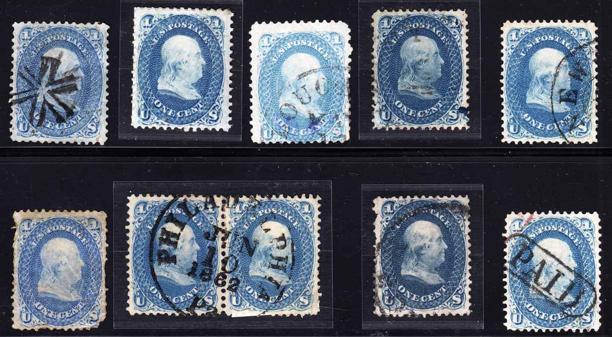
In the original thread I had posted an image of a page from an exhibit by Richard Drews and the photograph below showing a group of 1c Franklins from my own reference collection.
Last night I finally had a chance to discuss these items with Rich Drews in an environment with good lighting. Rich had brought along about ten more pages of various 1c items from his reference material and exhibits. We were there to talk color!!
Let me share the details he showed me on the stamps in this group. Although monitor screen differences will not allow you to match these items with your own examples, the fact that all were scanned together in a single pass will allow you to see the
RELATIVE color values.
Four of the items in the group were not directly discussed. The two stamps at the extreme right, top and bottom, the pair in the bottom row, and the unused single above the pair are all close shades of the basic "blue" intended for this stamp, but we did not go into any detail about them. Rich did show me proofs and such attesting to the nature of the blue, which is made from a Prussian Blue ink base plus additives. Four our purposes, the other five stamps are more interesting.
One point Rich made that I particularly want to mention, is that when comparing colors he feels it is best to place the subject stamp and its comparison copy side by side on the same WHITE background. When I showed comparisons of my stamps on a black background next to the target colors of his stamps on a white background, the background differences exaggerated the differences in the color shades.
In the original group, the stamp in the top center is in fact "pale blue" as we had surmised. Like the basic blue it is devoid of the color additives that give rise to differences in hue, but it does contain more white pigment than normal.
The stamp in the lower left corner is true ultramarine, also as we had imagined. We looked at the stamp in comparison not only with his exhibit stamp, but also with a number of proofs and essays that were only ever made in ultramarine. The shade is no accident. The normal proper shade for the Premiere Gravure, which was the original plan for the 1c, is ultramarine. I have a proof of the Premiere Gravure 1c which I did not show you before, but I will do a scan on a white background for certain of these stamps, and I will include that. My example for that is a dark ultramarine shade.
This brings us to the stamp at left in the upper row, which I had thought was a deeper shade of ultramarine. It is not. Rich showed me plenty of examples of the various shades of ultramarine alongside the blue shades close to them, and I was able to see that the tint of red that distinguishes ultramarine from Prussian blue was not much present in this stamp. Nor is it dark enough to be classed as a dark ultramarine or dark blue variety. Rich places it between untramarine and the normal blue.
The two darker stamps near the right end of the group were interesting. The upper stamp is in fact a 63b dark blue as we had said (per the cert we have for it). But the lower stamp is not quite the same. It too is a shade of 63b, but Rich said it is actually very close to the shade of indigo, without being actual indigo. He calls it "near indigo" and that is how he shows one on the exhibit page I showed you. I do not recall that Rich showed me any examples of indigo stamps, but he did have some indigo proofs, and they are most impressive in a block.
So that is what's going on with that color group I showed you. Without an actual reference collection, I don't think I would be able to sort out a group of these - and I'm not confident I could do it on my own even WITH a reference collection.


