| Author |
 Replies: 30 / Views: 3,238 Replies: 30 / Views: 3,238 |
|
Pillar Of The Community
USA
2877 Posts |
|
|
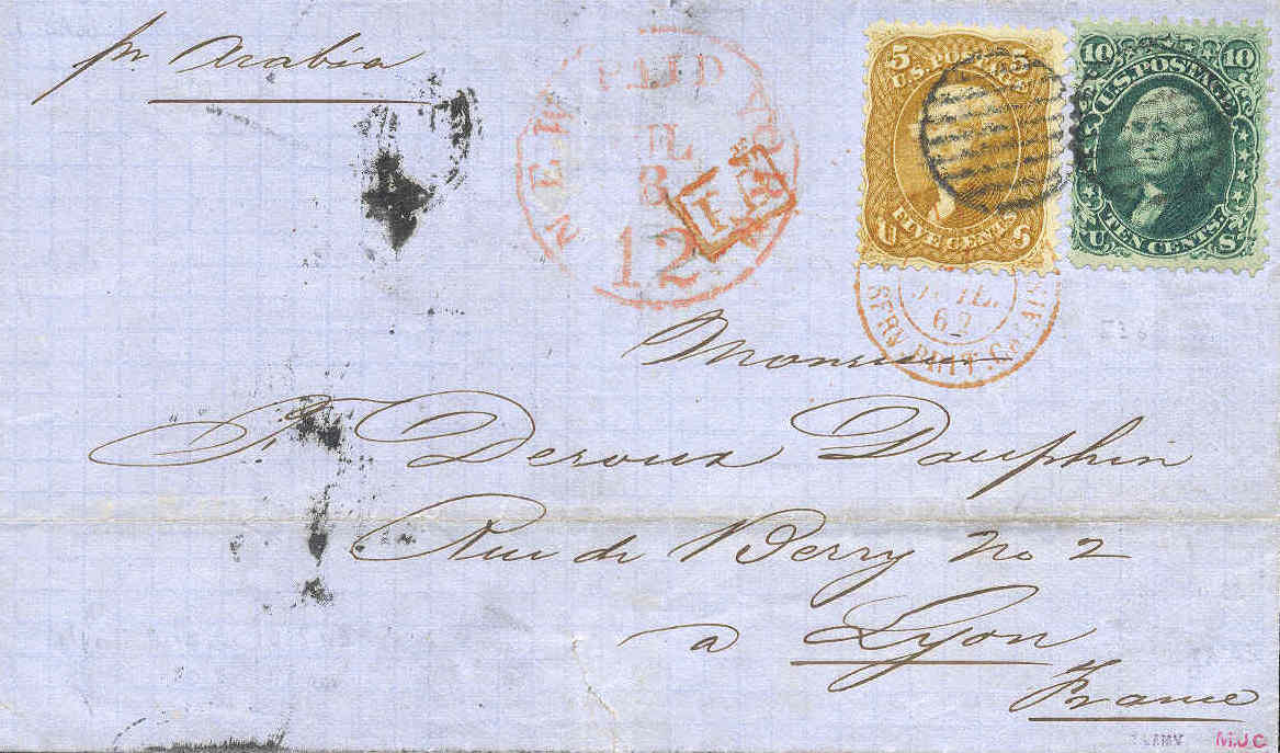 A recently acquired 1862 cover to Lyon, France featuring Scott #67, the 5c Thomas Jefferson in the early "buff" color. Later this design was issued in red brown and brown. A 10c George Washington (Scott #69) accompanied Jefferson to France. 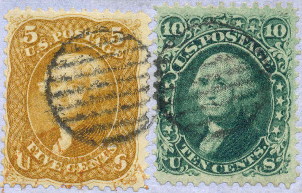 |
|
Send note to Staff
|
|
|
|
|
Pillar Of The Community
United States
6756 Posts |
|
|
Catchy thread title.  [I was hoping it was Mrs. Jefferson, though.] You have an amazing ability to acquire really good quality stamps/covers that are clean and have good strikes! Thanks for sharing! I need to start following you around!  k |
Send note to Staff 
|
| Edited by khj - 12/13/2009 11:16 pm |
|
|
Pillar Of The Community
United States
6756 Posts |
|
|
I noticed the cover has graph-paper like gridwork. How common is that for that era? |
|
Send note to Staff
|
| Edited by khj - 12/13/2009 11:17 pm |
|
|
Pillar Of The Community
2664 Posts |
|
|
t360 can you format some of my titles please? my stamps are nto selling for some reason. |
|
Send note to Staff
|
|
|
Valued Member
Canada
223 Posts |
|
|
Pillar Of The Community
2664 Posts |
|
|
Pillar Of The Community
United States
1947 Posts |
|
|
What is a fascinating cover.
What is the rectangular red cancel to the left of the buff Jefferson and in the circular cancellation? |
|
Send note to Staff
|
|
|
Rest in Peace
United States
1806 Posts |
|
|
I spotted the same thing rohumpy. The FB cancel peaked my interest. Any extra information on this one t360. Also, the Jefferson has great well defined lines on the engraving. A barrel cancel postmarks and more. Today we complain when a letter gets all marked up but look at all of the cancels on this one and it just makes it even more desirable. Beautiful cover, thanks. |
|
Send note to Staff
|
|
|
Valued Member
Canada
75 Posts |
|
|
Quote:
Nice cover, but I was expecting something else... Me too, me too. Much nicer images in the end though. |
|
Send note to Staff
|
|
|
Rest in Peace
United States
1806 Posts |
|
|
Just looked at the cover more closely and looks to have expertizing marks down in the right hand corner. |
|
Send note to Staff
|
|
|
Pillar Of The Community

Canada
3963 Posts |
|
|
Wonderful Cover Tom Thanks for sharing. Dianne  |
|
Send note to Staff
|
Don't grumble that the roses have thorns, be thankful that the thorns have roses |
|
|
Pillar Of The Community
Australia
1658 Posts |
|
|
Great pick up Tom ( said with green envy  )I haven't got a #67 as yet and the #68 is a nice rich green like mine I've got to get a #67  I've got to get a #67 |
|
Send note to Staff
|
|
|
Pillar Of The Community
Canada
1755 Posts |
|
|
Tom:
Very nice!
An American trading friend in WV sent me a packet of 3-cent green, Geo. Washington pre-1900 stamps with different coloured postmarks. I'm starting into early American stamp (thanks to the book you sent me for becoming a pillar of SCF). You'll be getting lots of questions from me in 2010!
David |
|
Send note to Staff
|
|
|
Pillar Of The Community
USA
2877 Posts |
|
|
Thank you everyone for the keen observations and kind remarks.
There is a large "JUL 8 NEW YORK PAID 12" mark and a smaller "21 Juil 62 Calais" (France) routing or receiving mark.
I believe the red "PD" is an accountancy mark meaning 'Paid to Destination' and was applied in London or Calais.
The manuscript "Per Arabia" in the upper left corner indicates the letter was intended to be carried on the transatlantic steamship Arabia.
The initials in the lower right corner are either authentication marks from prominent philatelists or just previous owner's marks.
They look like "AMV" and "MUC". Anyone recognize these?
|
|
Send note to Staff
|
|
|
Pillar Of The Community
United States
6756 Posts |
|
|
I have a 2nd question, as I am not that familiar with covers.
Is it normal for expertizer marks to be made on the front of covers, instead of the back. On stamps, they are always on the back.
I have not seen AMV, before, but I am not an expert on expertizer marks.
The initials in the lower right look like an unidentified mark that has been found on some Bavaria area material, oddly enough. In that case, the initials are "M.JC". It looks a lot like what you have, downward right sloping letters, period only after the M, elongated tip in the lower half C. Except that your mark is in red, not black. Also, you said MUC. You have a better look than I. Can you verify that it's MUC and not MJC.
Thanks! |
|
Send note to Staff
|
| Edited by khj - 12/15/2009 02:03 am |
|
|
Pillar Of The Community
USA
2877 Posts |
|
|
Replies: 30 / Views: 3,238 |
|


