| Author |
 Replies: 18 / Views: 2,526 Replies: 18 / Views: 2,526 |
|
Rest in Peace
Canada
6750 Posts |
|
|
|
I was just going through an old (1895) stamp catalogue and album all in one little book (not as many stamps back then) printed in Paris. So, not being a really good French reader, I was looking at the pictures (in black and white) of the stamp designs.
Because there were no colors to distract me visually, I was forced to concentrate on the designs. It struck me, after a while, that the designs were amazing. Very detailed. If all you have to work in is one colour then the design and shape and placement of items is critical.
Usually I look at the colors and general real-life-ness of a stamp, having gotten used to modern printing and all the nice photos and composites of pictures on stamps.
I think some of today's stamp designers could take a lesson and perhaps learn a thing or three from looking through some old stamp catalogs from the 1920's and before.
I'll post some black and white pics tomorrow.
Doug
|
|
Send note to Staff
|
| Edited by Puzzler - 01/21/2010 08:47 am |
|
|
|
|
Rest in Peace
Canada
6750 Posts |
|
|
Cape of Good hope overprinted British Becunanaland: 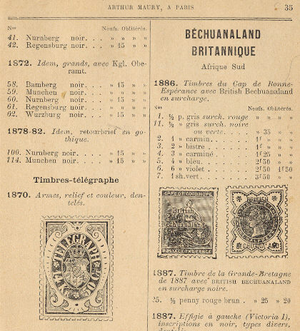 Canada: 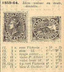 United States: 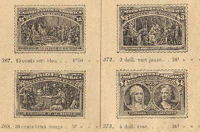 I think I will buy from this supplier, the pricing seems very good!  |
Send note to Staff 
|
|
|
Pillar Of The Community
United States
7076 Posts |
|
|
That's a fun item. Back before telegraph stamps were kicked to the curb by "philatelists." Thanks for sharing part of that.
Collin |
|
Send note to Staff
|
|
|
Pillar Of The Community
USA
1881 Posts |
|
|
Hi Doug.....
I agree......the old engravings were wonderful.....still my favorites.
|
|
Send note to Staff
|
|
|
Moderator

United States
4788 Posts |
|
|
Pillar Of The Community
United States
752 Posts |
|
|
I have two Scott classic specialized catalogs: one from 1998 that was in B & W and the 1995 version which is in color. There is no comparison. Stamps that I might pass over in the black and white catch my eye when I see the color. |
|
Send note to Staff
|
|
|
Rest in Peace
Canada
6750 Posts |
|
|
funcitypapa,
I agree that to find a stamp is much easier in a colour catalogue. No question. Humans are visual and tuned in to colour to a large extent.
But when the colour is removed and you are left with the the black and white design only to look at it does make you pay more attention to the design rather than the colour. Different aspects of the design jump out at you in a different way than with the stamps' colour over-riding your sensory input.
|
|
Send note to Staff
|
|
|
Valued Member
119 Posts |
|
|
I like the Telegraph and agree the designs are appealing. I flipped through a 1920's Scott Brown album and was impressed with not only the stamp designs but all the fonts and general theme of the design...very elegent and vintage. |
|
Send note to Staff
|
|
|
Valued Member
United States
428 Posts |
|
|
I am actually beginning to think that some of the monochromatic stamps are really the most beautiful. Especially if the quality of the engraving is good. I think was those qualities that still keeps me interested in stamps. I thought I might upload one of my favorites, the Swiss 50 year anniversary of the UPS issue. Although it is blue on white background, it really is a black and white stamp, and is a lovely one, in my view. And, obviously loses nothing if shown in a BxW catalog. 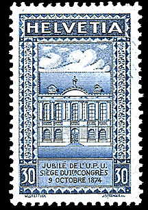 |
|
Send note to Staff
|
|
|
Rest in Peace
Canada
6750 Posts |
|
|
Beautiful stamp ldhaber, thanks for uploading! More telegraph hexagonal shaped stamps in this post: https://goscf.com/t/6830&whichpage=2Cjd, here is the cover of the old catalogue I am pouring over. Postage Stamps and Telegraph Stamps. They were important enough in 1895 to warrant a mention. 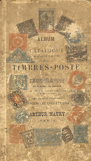 |
|
Send note to Staff
|
|
|
Pillar Of The Community
United States
752 Posts |
|
|
Agree that the Swiss stamp is beautiful. As far as monochromatic stamps are concerned, I think that, at least as far as US stamps are concerned, the 15 cent Lincoln depicted on Scott #77, 91,98 or 108 and the 12 cent Pictorial Adriatic from 1869 are hard to beat. |
|
Send note to Staff
|
|
|
Rest in Peace
Canada
6750 Posts |
|
|
I don't know the catalog number of this but I like it.  It is amazing to me what can be done with a little engraving here and a little design there. Wow. |
|
Send note to Staff
|
| Edited by Puzzler - 01/21/2010 3:26 pm |
|
|
Moderator
United States
4788 Posts |
|
|
It's from the Pan-Pac issue; 399 or 403 depending on perfs... 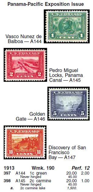  [2008 Scott Catalog] KirkS |
|
Send note to Staff
|
|
|
Pillar Of The Community
USA
3315 Posts |
|
|
The golden age of stamps, the engraved stamp era, is absolutely my favorite. There have been a number of US stamps from the last decade that have mimicked the old engraved stamps and they are the best of the recent issues.  |
|
Send note to Staff
|
|
|
Pillar Of The Community
Philippines
505 Posts |
|
|
just curious, what do they do with the metal print dies of the stamps when it's no longer to be used? bided out or smashed up? |
|
Send note to Staff
|
|
|
Rest in Peace
Canada
6750 Posts |
|
|
Thanks Kirk, good info. Nice stamp laswabbie! The newer Canada large animals stamps are engraved and are quite popular because of it. I think since Canada Post has made a profit for the last few uears they could afford to put out some more excellent stmps like those or yours. It's probably a money thing. Can't wait to see the $10 Whale of that series due out this year I think. |
|
Send note to Staff
|
|
|
Replies: 18 / Views: 2,526 |
|


