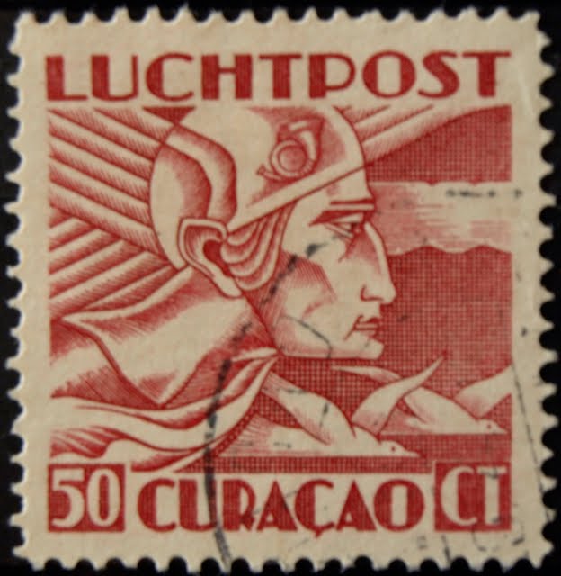
Stamp Community Family of Web Sites
Thousands of stamps, consistently graded, competitively priced and hundreds of in-depth blog posts to read


Stamp Community Forum
 
Username:
Password:
Save Password
Forgot your Password?

This page may contain links that result in small commissions to keep this free site up and running.

Welcome Guest! Registering and/or logging in will remove the anchor (bottom) ads. It's Free!

Curacoa -- One For Rod

 
To participate in the forum you must log in or register.
Author Previous TopicReplies: 6 / Views: 2,306Next Topic  
Valued Member
United States
305 Posts
Posted 09/03/2010   7:48 pm  Show Profile Bookmark this topic Add Gaff to your friends list Get a Link to this Message
This guy reminded me of the art deco style on the Swiss Airmail C6 of "The Phantom."

See: https://goscf.com/t/9467&whichpage=1


The horn curled up over the ear is on the Swiss editions as well.

Same designer by chance?

(photo a little blurry -- sorry)
Send note to Staff
Edited by Gaff - 09/03/2010 7:58 pm

Bedrock Of The Community
Australia
38679 Posts
Posted 09/03/2010   11:31 pm  Show Profile Bookmark this reply Add rod222 to your friends list  Get a Link to this Reply

G'day Gaff,
very nice attempt at art deco, but for me, fails
in the severity of the facial features, art deco is supposed
to be a tad atmospheric, yet the severe lines in Hermes face,
irritates me somewhat, so I put these at the bottom of my art deco choices.
In fact I get an uneasy feeling Hermes chin and lips also
have a feminine edge.

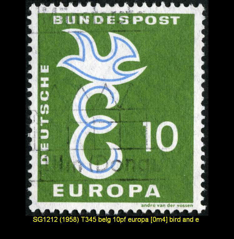
That's really all I have on this issue, designed by the Dutchman
Andre Van der Vossen.
I'll pass you over to Mr. William Finlay............

Elsewhere in Europe there were isolated examples of Art Deco. The Netherlands was a devotee of this style,
especially in airmail stamps. Chris Lebeau, better known for his Art Deco glassware, designed the three air stamps
of 1921 and followed this with the 'pigeon and Edam cheese' design in the same idiom. The latter series had a
remarkably long life, making its debut in 1924 and surviving as late as 1946. P. A. H. Hofman's set of 1924
marking the centenary of the Dutch Lifeboat Institution, with its stylized boats and unusual double-lined lettering,
is pure Art Deco. The 2 cent value of this set, incidentally, bears no name of the country. Chris Lebeau's treatment
of the cockpits featured on the two air stamps of 1928 is essentially moderne; note the cunning use of close parallel
lines and curves in the shading of the background. Both Curacao and Surinam followed the mother country in
adopting Art Deco concepts for the airmail stamps of 1930-31, both featuring a modernistic interpretation of
Mercury by A. van der Vossen. This artist also produced Art Deco designs for Surinam's Green Cross charity
stamps of 1928-9, but in his later work reverted to more conventional styles.

Mr. Van Der Vossen's Europa Issue...back to the more mundane.


Send note to Staff  Go to Top of Page
Rest in Peace
Canada
6750 Posts
Posted 09/04/2010   01:52 am  Show Profile Bookmark this reply Add Puzzler to your friends list  Get a Link to this Reply
The 'curly horn' is better known as a posthorn. On a lot of airmail stamps. On a lot of older European stamps, a symbol of the Universal Postal Union. Used to signal the arrival or departure of a post rider or mail coach.
http://en.wikipedia.org/wiki/Posthorn

Mercury, a Roman God known for his swift flights from place to place (his characteristics were borrowed from Greek mythology's God Hermes, the messenger of the Gods), is usually depicted with wings on his feet and helmet. His image used on a lot of airmail stamps also, to signify the extra speed at which your letter would be delivered.


http://en.wikipedia.org/wiki/Mercur...mythology%29
Send note to Staff  Go to Top of Page
Pillar Of The Community
Australia
3547 Posts
Posted 09/04/2010   05:29 am  Show Profile Bookmark this reply Add tonymacg to your friends list  Get a Link to this Reply
Rodney, on a point of - ahem - art criticism ... I think I'd describe this stamp as Streamline Moderne, rather than Art Deco

From Wiki:

As the depression decade of the 1930s progressed, Americans saw a new aspect of the Art Deco style emerge in the marketplace: Streamlining. The Streamlining concept was first created by industrial designers who stripped Art Deco design of its fauna and flora in favor of the aerodynamic pure-line concept of motion and speed developed from scientific thinking. As a result an array of designers quickly ultra-modernized and streamlined the designs of everyday objects. Manufacturers of clocks, radios, telephones, cars, furniture and numerous other household appliances embraced the concept with open arms.

The style was the first to incorporate electric light into architectural structure. In the First Class dining room of the SS Normandie, fitted out 1933 – 35, twelve tall pillars of Lalique glass and 38 columns lit from within illuminated the room. The Strand Palace Hotel foyer (1930), preserved from demolition by the Victoria and Albert Museum during 1969, was one of the first uses of internally-lit architectural glass, and coincidentally was the first Moderne interior preserved in a museum.

The Streamline Moderne was both a reaction to Art Deco and a reflection of austere economic times. Gone was unnecessary ornament. Sharp angles were replaced with simple, aerodynamic curves. Exotic woods and stone were replaced with cement and glass.

Art Deco and Streamline Moderne were not necessarily opposites. Streamline Moderne buildings with a few Deco elements were not uncommon but the prime movers behind streamline design (Raymond Loewy, Walter Dorwin Teague, Gilbert Rohde, Norman Bel Geddes) all disliked Art Deco, seeing it as effete, falsely modern, essentially a fraud.)

The Dutch seemed to rather take to it. The lobby of the old Savoy Homann Hotel in Bandung had the most marvellous '30s bas-relief mural of modern streamlined trains and aeroplanes streaking across Moderne skies. Haven't visited Bandung for years, but I hope it's still there.
Send note to Staff  Go to Top of Page
Bedrock Of The Community
Australia
38679 Posts
Posted 09/04/2010   05:46 am  Show Profile Bookmark this reply Add rod222 to your friends list  Get a Link to this Reply
Interesting Tony,
not really au-fait with streamlining,
I am incurably art decocentric, so I see it whenever, and wherever
I can, I still get a bit mixed with Art Nouveau.

I can see what your saying in a lot of styles esp in Australiana,
I come from a real estate background, so anything with an oblong curve, and a blade shaped sand blasted glass was "Art Deco" :)

I don't really mind, I like what I see in the art deco,
but I have an issue with the nay sayers, "false"
what a load of cobblers.

I'll try and take in Streamline Moderne when I next appraise
and do some homework.


Send note to Staff  Go to Top of Page
Valued Member
United States
305 Posts
Posted 09/04/2010   4:32 pm  Show Profile Bookmark this reply Add Gaff to your friends list  Get a Link to this Reply
Thanks for the input. Stamps -- gateway to an art history lesson, among other things.

On second look at this stamp, I agree, Hermes hair-line jaw is problematic...

Alas, he resides in my stock book with 11 denominations present from 10c to 70c and even a connected pair in 15c.
There are a handful of bi-color airmails mixed in, so not a loss by any degree.

Again, the insights above are much appreciated!
Send note to Staff  Go to Top of Page
Bedrock Of The Community
Australia
38679 Posts
Posted 09/04/2010   9:48 pm  Show Profile Bookmark this reply Add rod222 to your friends list  Get a Link to this Reply
Gaff, remember, just a design critique with personal opinion,
they remain great looking stamps, especially as the sets grow
and look so attractive on a page.
Curacao is a very, very nice niche collection area.
Unfortunately, for a non ebayer like myself,
they only come up at auctions in dribs and drabs.
Send note to Staff  Go to Top of Page
  Previous TopicReplies: 6 / Views: 2,306Next Topic  
 
To participate in the forum you must log in or register.

Go to Top of Page

Disclaimer: While a tremendous amount of effort goes into ensuring the accuracy of the information contained in this site, Stamp Community assumes no liability for errors. Copyright 2005 - 2026 Stamp Community Family - All rights reserved worldwide. Use of any images or content on this website without prior written permission of Stamp Community or the original lender is strictly prohibited.
Privacy Policy / Terms of Use    Advertise Here
Stamp Community Forum © 2007 - 2026 Stamp Community Forums
It took 0.16 seconds to lick this stamp. Powered By: Snitz Forums 2000 Version 3.4.05